Anaheim, California
“Lower your head!”
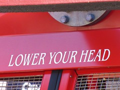 This is the first official line of instruction one will hear not upon entering a concentration camp, but upon entering the Happiest Place on Earth, the Disneyland Resort. Keep your head lowered, eyes averted, stay in line, don’t question authority, and if the Big Mouse comes by you better wave back and act like you’re happy to see him. Of course, this order of submission was not barked by a gruff armed guard with chin stubble, but by the friendly disembodied voice of the tram spiel reminding visitors of the low hanging roof as we stand up to exit from the trolley. Nevertheless, it was a striking turn of phrase, seemingly deliberately chosen for the emphasis on the commandment of an action verb over other commonly used, passive action alternatives (i.e. “Watch your head.” “Beware the low roof.” Or, my perennial favorite when visiting England:
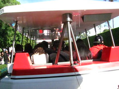 “Mind your head”). It set a slight authoritarian mood as we navigated through the narrow, claustrophobic cattle corrals of construction walls to make our way into the gated fortress that was California Adventure. But there was no reason for an air of paranoia when the weather was this clear and pleasant, as I had done nothing wrong, right?
Right?
“Oh shit, what if they interrogate me? I say my zip code is 90291, not 49643. But what do I do if they ask for ID? Can I say that I’m living with my aunt and not reveal it’s only for ten days? Do I lie and say that I’m a student at USC and simply haven’t renewed my driver’s license yet? No, if I’m going to lie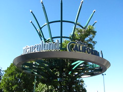 I’d better say I don’t have my wallet with me at all. Can they detain me if I fail to produce proper identification? I don’t think so, but you never know because it’s freaking Disney, man! I’ve heard those legends about the lady being sued for millions for attempted copyright infringement just because she asked to see the Mickey Mouse cookie recipe…”
Disneyland generally sells their deepest discounts on day passes to residents of Southern California, and for this month a visitor from Santa Monica would hand over a full $50 less for the same two-day, two-park pass that a visitor from Lansing would purchase. Since my aunt was accompanying me for the two days and she qualified for the discount, we ended up buying two passes online at the discount rate, ignoring the stipulation that ID would be required to receive the tickets at the front gate, and that the ID in my pocket had a big fat old “Michigan” stamped across it. Never mind that we were both getting the exact same value experience for our money, the marketing caveat meant I was probably intended to volunteer for the higher price. Now as we approached said front gate I realized I was imminently about to cheat one of the world’s most powerful corporations at their own money-making game. Imagine if I had tried to steal a $50 bill from one of their cash registers the world of hurt I’d be in; essentially this was no different! I’m at the turnstile now, handing in my print out. Oh good, they scanned it and are issuing my ticket! Yes, I’m in the park now, I’m all clear, I’m-
“Can I ask you folks a couple of questions?”
My lips said “yes, of course,” while my eyes surely screamed “HOLY FUCK!!!”
“Is this your first day using your two-day Southern California residents discount pass?”
“Yes.”
“May I ask what your zip code is?”
“Nine-oh-two-nine-one.”
The official entered the sequence in a black digital handheld device as I tried not to piss myself.
“Okay, thank you very much. Have a wonderful visit!”
Swoosh. I took on The Man, and I won! My gait freely sauntered down Buena Vista Street, a veritable Danny Ocean riding in style. I almost felt bad for Disney, because they never even got to appreciate how much awesome just went down. I mean, I bought a discounted ticket online when I was technically not part of the marketing initiative it was intended to reach because someone who did qualify bought it for me and Disney apparently has an honor system when it comes to borderline cases such as mine. That’s what I’d call a real smackdown! Of course, now that I’ve confessed it all publicly I guess I just have to hope that no one from Disney will be reading this; or, if they do, they’ll rightly fear my power of the press,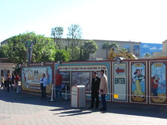 as I usually recount in every detail even my slightest annoyances to a growing audience who dutifully and unquestioningly believe everything I tell them, as evidenced by the lack of any critical comments. Should that fail, my only hope is that they won’t take offense that I began my review by comparing a visit their resort to the Jewish experience at Birkenau.
The entrance in its current state of construction does remind me a bit more of the aesthetics of concentration camps than of a Disney theme park, but once finished it should finally live up to the standards it was always expected to meet. While I can’t personally comment on the original California Adventure before the start of the billion-dollar-plus expansion and renovation that is only halfway complete, I’ve read from many fans and commentators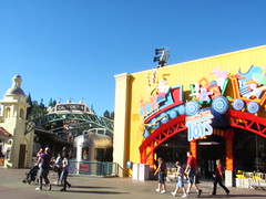 that the place was done on the cheap and lacked the Disney ‘magic’. When it was first announced, I wasn’t even certain if I understood the purpose of the renovation. To me, the descriptions of the two lands sounded more like substitutes for one another than upward improvements. Sunshine Plaza had to be converted to Buena Vista Street for no reason other than one would be new and the other would be old, and the old park had a bad stigma attached to it. The only other distinction I could make was that the old appeared to lack the complete osmosis of recognizable franchised characters into every aspect of the park’s design that the new was attempting to correct for; if you’re not constantly aware of a marketing push designed to reinforce the brand image and sell Mickey and Minnie plush, then you’re not really experiencing what Disney is all about.
I’ve since understood the purpose of the changes a little better. I looked more closely at the artist’s renderings for Buena Vista Street and they do look a helluva lot classier than the gaudy Sunshine Plaza. Beyond my initial cynical reading, the emphasis on incorporating more Disney characters in the new Paradise Pier ride themes, World of Color, Little Mermaid, Cars Land etc. shows that the worst flaw of the original park was that it made realism too high of a priority. This may sound odd considering the aesthetic was a bit too eager to use the Crayola colors, but the original design ignored the creative interpretation of the California philosophy, and instead just tried to duplicate in three dimensions a miniature, airbrushed postcard of the real thing. This poses a few problems for an Anaheim-based theme park, not least of which is an attitude of “who cares” when both locals and tourists alike are facing scenes and props that imitate the exact things people saw out their window when they woke up that morning. Disneyland at its best tells a little joke in everything you encounter, but the only thing found at the original California Adventure that told jokes were horrendously corny,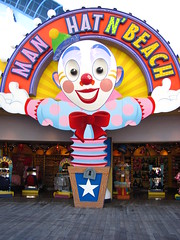 obvious, look-at-me puns for shop names. With thematic inspiration limited to postcard visions of the Sunshine State, the park was never anything more symbolic or meaningful than a parody, and cheap parody begins to feel derivative and desperate awfully fast. A visitor’s interpretation of the park was that it was sort of like the real thing in California but really wasn’t; even when presenting an improved vision of California, it still tried to be (i.e. replace) the California outside its gates. Maybe this strategy of simulating a model of the Golden State would have worked in the same way that Tokyo DisneySea’s mostly straight-faced realism works, but combined with the fact that it was built cheaply (well, $600 million is cheap by Disney standards; compared to the fact that the park’s fix-it plans totaled $1.1 billion) it just felt more like a mediocre knock-off.
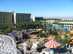 The lack of focus could also be to blame for the failure. The first question that should have been asked when adding a second gate is, “how will this be
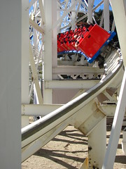 strategically different but complimentary to our first gate?” The answer seemed to be that it would be built as a high class thrill ride park that would compete more or less directly with Knott’s Berry Farm and Six Flags, bumping the average household age
 level that visits the resort upwards a couple of years. Especially because I stepped off the Disneyland tram having originally come from the thrill ride side of the enthusiast spectrum, I found this a valuable strategy. But after laying out the roller coaster and rapids rides in the early stages of blue sky development, this goal lost its focus and the rest of the park became a grab bag of the same old shit Disney has always been doing, but spread too thinly over too tight a budget. Would California Screamin’ and Grizzly River Run alone really be enough
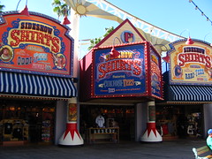 to win over any of Knott’s or Magic Mountain’s clientele? Would the themed family environments really win over the existing customer base at Disneyland? No, and as a result they were sitting on a major gated attraction that was the favorite theme park to absolutely no one.
What it really came down to for why the bottom line was suffering wasn’t even that the quality of attractions was particularly low, but that quantity of attractions wasn’t up to snuff. Especially when you’re charging the same ticket price as the gate across the plaza, you can’t let your guests get halfway through their visit and realize they’ve run out of meaningful activities to do, which did happen to my aunt and me. Since I knew I was writing a review afterward I was able to get creative and find activities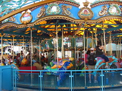 that probably wouldn’t have indulged in if I was an ordinary vacationer here for my own personal immediate entertainment (and in retrospect there’s even one or two things I missed out on). I’m sure in the Imagineer’s planning phases in the 90’s it appeared as though they had accounted for enough to be a complete ticket gate, because if you take your time and do everything on the map then, yeah, you probably could kill a full twelve hour visiting day. But people don’t do everything in a theme park. Certain attractions are targeted for certain audiences, and people generally only experience the side of the park that is targeted to them. The park was pitched for an older audience but there’s barely a half-day experience in there for those visitors, because a lot of resources were diverted to making sure other audiences were catered to at all.
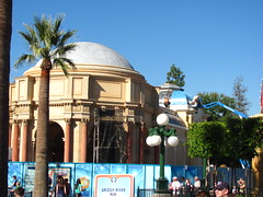
They also seemed to think that themed areas in and of themselves will pad out a visitor’s day, regardless of if there’s any attraction anchoring it. This could explain why the original Hollywood Studios Backlot was a nice, atmospheric setting that had almost nothing worthwhile to do. The situation has improved with the additions of Tower of Terror for the upper crowd, the Pixar dark rides for the middle crowds, and A Bug’s Land for the lower crowd, and will likely finally be fully realized once the expansion is complete and Cars Land opens it gates. (Unrelated thought: why isn’t this land called “Radiator Springs”? That’s what it is in the movie. For copyright reasons because it must contain the franchise title?)
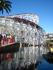 If I could have been a senior member on the Imagineering team for the original design, I would have replaced the California Screamin’ with an actual wooden replica of the Long Beach Cyclone Racer (dual tracks is good for Disney-level capacity and guest interaction, too), making the entire Paradise Pier area more historically authentic and less annoyingly retro-modern colorful. Then that wouldn’t have made redundant a Rock ‘n’ Roller Coaster style indoor launched looping design to anchor the Hollywood Studios (if you’re going to go after the thrill seeking market you need more than one major roller coaster or high speed attraction), although I frankly hate both the theme and the layout of RnRC, so I might have replaced it with a custom film noir storyline and craft a layout more akin to Disneyland Paris’ excellent Space Mountain. (Now I have to daydream for a half hour planning out all the details of that ride in my head…)
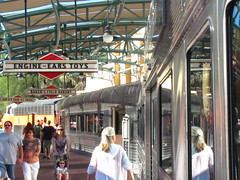 Despite the improvements made since the 2001 inauguration, even once I got beyond the construction walls my initial impressions weren’t doing a lot of impressing. The midway infrastructure is a rather peculiar “butterfly” shape that doesn’t manage crowds between halves very well, and when I arrived at the end of the main Sunshine Plaza / Buena Vista Street entry midway, I was pretty much at a dead end with nothing of interest pulling me in either direction. The park lacks a centerpiece icon, which I don’t insist on every planned theme park to have, but if you’re going to forego one, they had better make the midways a lot more intimate than the current swaths of concrete are. I thought the Grizzly Peak
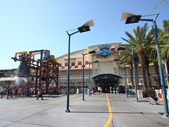 would be a significant icon, but it’s actually off to the right side and is fairly difficult to view from most angles.
Turning off into this direction we find ourselves inside the section of the park known as the Golden State, supposed to represent the majesty of California’s natural splendor, but are really a disjointed collection of mini-sections that are basically each support environments for the entrance area of one attraction apiece. The first is Condor Flats, of which the second term is the most descriptive. The goal is to simulate an airfield landing strip, and at this they’re successful as there’s more than enough flat, undecorated concrete around to park an Airbus. The gigantic hangar belongs to the zone’s sole attraction, Soarin’ Over California.
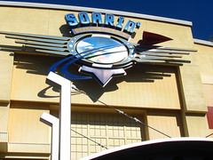 Situated as the nearest major attraction to the entrance gate, it clearly seems designed to be a visitor’s introduction to the California Adventure experience. Soarin’ frames the beginning of a day’s visit with a redundant reminder of all the great things we already knew about California set to a sweeping musical score, just as World of Color now frames the other end of the day with a redundant reminder of how great Disney is set to a sweeping musical score. (It’s the Adventure I’m interested in!) But if there’s one Disney attraction that has me continually scratching my head over its continued popularity and desire for multiple rerides among guests, it would be this one. All it really amounts to is a flight simulator with an IMAX screen. Don’t get me wrong, I like IMAX a lot, but I can find theaters a whole lot closer to home that don’t require
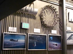 me to stand in a succession of waiting rooms for twenty minutes, and these locations usually play something more narratively compelling than five minutes of B-roll aerial footage.
The main selling feature of this attraction is the suspended seating configuration, in which three rows of hang glider seats are attached to a giant cantilever to rack them up into a vertically stacked viewing position from the horizontal, platform-level loading position. This is an effective technique because I’m not used to having my field of vision immersed by the screen also below my feet, although I might like to have known ahead of time which row we were going to be directed into, as we got seated on the far left side of the theatre and the image appeared distorted as a result.
The rows of seats very gently pivot and sway with the curves of the glider; none of the violent, jerky thrashing around that most motion simulators do, although there was occasionally a slight but noticeable mechanical shuddering that indicated some of the fluids might need to be checked. Actually, the main movement the seats make during the ride is a vertical rise and fall of the seats, but this is done so slowly it’s virtually undetectable by the inner ear, and with the constantly moving projected scenery there’s no reference point to tell that you’re now ten feet higher in altitude than you were a minute ago. Unless you’re looking at the edges of the screen like I was prompted when I realized something was going on behind our seats, which if you’re a good and obedient Disney visitor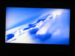 who wants to be immersed in the magic, you’re not supposed to do. I was also under the impression that a number of extrasensory effects would be in use, although the only one I noticed was the strong scent of citrus for the Soarin’ over orange groves scene, which stuck out as being the only time that sensory fourth wall was broken.
The film is unusual because it breaks the rule of simulators by introducing the cinematic montage. Normally for a simulator attraction there’s a continuous, unbroken perspective, but because Soarin’ uses real, live-action footage of California they need to jump from one location to another, and they achieve this spatial displacement with a simple hard cut. The problem is that when the screen takes up your entire field of vision, this hard cut can be momentarily disorienting and breaks the realism of the experience. In traditional cinema, editing works without confusion because the cut emulates the biological function of the eye making a quick scan (you’ll notice that in a dialogue scene using a back-and-forth two shot to film each actor, the camera always stays on the same side of the blocking because if we jump to the other side of the actors for the reverse shot, our sense of individual perspective will be intuitively broken). The amount of freedom an editor has to make hard, fast or unusual cuts generally depends on the level of immersion with the image. Watching a film on a videophone, the editor can get away with almost anything because they don’t destroy one’s sense of individual perspective when the image takes up only a fraction of the viewer’s field of vision. But on a screen like in Soarin’, that entire field is taken up by the image and so the audience has no independent sense of place beyond which the filmmakers provide. This why the experience can feel so exhilarating and life-like, but also why the editors need to be extremely careful not to disrupt the viewer’s sense of having a singular point of perspective.1
Yet I can’t think of any alternatives that could solve this problem that I would prefer. Trying to do something like have the flight path disappear into a CGI cloud between scenes would look absurdly tacky. Making a CGI environment that puts all the scenes together in one space would also inevitably look fake and cheap. And trying to confine the experience to a localized area would definitely rob the attraction of much of its grandeur and thematic purpose of taking us to all the best sights in California. And in fact, I really like that Soarin’ becomes more symbolic in nature due to its “unreal” cinematic qualities, rather than trying to literally simulate a hang gliding flight. The music by Jerry Goldsmith is the same grandiose symphonic noise that we’ve been hearing in big budget films that hire John Williams or James Horner to cover up sloppy or uninspired storytelling and win an Academy Award, and whether that is a bad or good thing for Soarin’ I will leave the reader to decide.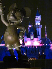
The question I had throughout the film was “how will it end?” There is no real narrative advancing to an expected conclusion, but there obviously had to be some sense of finality to give the experience closure; it won’t just arbitrarily end on a scene of Soarin’ Over Compton. However, whatever subject is given the honor of the Final Scene will be implied to be the acme of California, the very zenith of wonderment in a state that we are right now witnessing to be full of locations only wondrous enough to belong shuffled somewhere in the middle. We already had the Golden Gate Bridge at the beginning… so it should have come to no surprise to me that Soarin’ would ultimately advance a narcissistic agenda by making it’s Big Finale an aerial soar-over of Disneyland itself, fireworks ablaze and the fanfare its most triumphant. Hey, I won’t complain because I was so enchanted by the other scenes of nature, modern architecture and sport that I was beginning to question why the hell I chose to spend my vacation time on the west coast in Anaheim, and this final act of Disney’s self-hurrahing helped me and the many other schmucks walking out the exit doors to vindicate ourselves of our choice. “Oh yeah, I guess California Adventure is more spectacular than Yosemite National Park after all…”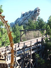
This is true. While Yosemite only has El Capitan which requires the better part of the day to see and only sort of looks like a big rock formation, California Adventure has Grizzly Peak, which can be reached from Condor Flats with a minimum of footsteps and looks so much like a big grizzly bear, one almost wonders if it had been designed that way. This area is much more visually pleasing than the previous Condor Flats (real pine needles densely coat the soil next to the pathways, and it’s one of the few places in California Adventure where one can escape the sun by standing in the shade of trees), although for an area themed to a 700,000 acre national forest, my aunt and I certainly breezed in and out of it quickly. Probably less than five minutes in my estimation. The Grizzly River Run was closed for its seasonal rehab. Despite the gorgeous weather, this was evidentially the wrong time of the year to visit for water rides: both Perilous Plunge and the Timber Mountain Log Run the previous day at Knott’s were closed, and tomorrow’s visit to Disneyland would have Splash Mountain also down for the count.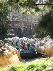 What remained was a kid’s playground and the entrance to the Grand Californian Hotel, neither of which had any value to us. There was, however, a Fast Pass booth issuing tickets for preferred World of Color viewing areas, which I didn’t know existed and was lucky to stumble across early in the morning as these would sell out quickly.
With the still at-the-time under construction Little Mermaid: Ariel’s Undersea Adventure in Paradise Pier replacing the former Bay Area, the only other part of the Golden State left to see are the Golden Vine Winery (a Napa Valley styled Italian restaurant and the Blue Sky Cellar, a showcase of all the upcoming changes to California Adventure that I somehow missed seeing, though all the art can be found on online fansites anyway) and the Pacific Wharf. The latter is a large outdoor food court stylized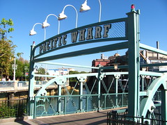 to San Francisco’s Fisherman’s Wharf and Cannery Row, and was where we would elect to take a lunch break. The eclectic, earthy appearance is a bit of a contrast to the rest of Disney, but they envisioned it very well even if I’m slightly bemused by the irony of how “perfect” the rust and stains appear. There are several choices for eating establishments spread out over a large indoor and outdoor seating area, including the Cocina Cucamonga Mexican Grill, the Pacific Wharf Café (primarily serving salad and soup in bread bowls, where my aunt Chris decided to get her meal) and the Chinese-style Lucky Fortune Cookery. It was the latter that I got my meal from, mostly because I wanted
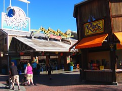 more experience using chopsticks before I’d be arriving in Hong Kong in less than a week’s time. One of ways in which Disney exceeded my expectations was in the value of the food. Not that it was necessarily all that cheap (drinks are still flirting with the three dollar range), but I was able to get a complete meal bowl for under $10 and the portion and quality was at a level that I’d generally be happy with in a non-theme park setting. Plus, they weren’t afraid to make patrons ask for a fork if they found the included chopsticks too scary, a bit of catering cojones I’m highly appreciative of. Especially after spending a significant amount of time in Asia, and then returning home to Panda Express, being given a fork and looking at it awkwardly wondering “what the heck am I supposed to do with this thing?”
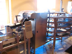 There are a few other diversions to be found among the Pacific Wharf in the form of some “factory tours” of the cooking process for a few of the restaurants. I believe now the featured tours are for the sourdough bread bowls and a Ghirardelli chocolate making tour, although at the time of my visit the latter was still for the Mission Tortilla Factory. It was a fairly brief tour reflective of the fact that the factory only needed the output for one food outlet, but relatively entertaining and a unique respite from more traditional forms
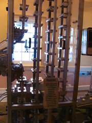 of theme park entertainment. I was particularly entertained by the preshow video’s children describing the history of the tortilla as “shared” between Native Mesoamericans and Spanish explorers, with big cartoon smiles on both parties’ faces… in much the same way I suppose they happily “shared” small bits of lead and introduced each other to their favorite microbial friends. After this we were led into a room with a real tortilla press (both my aunt and uncle have extensive experience working on the finance end of the food industry, so she was appreciative of the highly precise mechanical process involved) and at the end of it we got a free tortilla sample hot of the press. While explicitly not homemade, there is something to be said for sampling a tortilla that’s so fresh it still has that moist pliability in your fingers. Plus if the normal food outlet prices are too much for your budget, you can always run around and do the free food tours several times.

Footnotes and Annotations
[1] On a somewhat related note, 3D films have experienced similar editorial difficulties due to the heightened immersion of the experience. A lot of younger editors (especially those working for Michael Bay and co.) like to edit their action sequences by throwing all the footage into a wood chipper and pasting together the results on the other side, but when done in 3D this style can literally make people sick to their stomachs. The problem is that in order to ‘understand’ the third dimension the eyes need to adjust to the distance to the focal point, which may vary in range from five inches away to five miles away, depending on what we are looking at. In movie theaters, however, there is a conflict between the imagined variable focal length between subject and object, and the actual, unchanging focal length between subject and screen. It takes a couple seconds for the eyes to artificially adjust for this discrepancy, and if the editor is holding shots for shorter than three seconds one’s brain will literally be unable to process where they are in the scene and become motion sick. Traditional 2D cinema doesn’t have this problem because the focal length is always the same, and so editors can cut as fast as they want to and viewers will be able to keep up… not that editors necessarily should cut as fast as they want to. It’s a shame that the Academy Awards always mistakes Best Editing for Most Editing; and yes, I’m one of those nerds who find the race for the Best Editing Oscar more compelling than any of the acting awards, if not only because no one else cares about the award and so the contest has not become totally politicized by the time they get to the winner’s announcement.