Disneyland – Anaheim, California
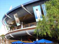 There’s a contrast in themed environment design philosophies between the eastern and western hemispheres of Disneyland. The lands in the western side (Adventureland, Frontierland, New Orleans Square) are all about hyperreal imitation of real-world environments. Their goal is to copy the look and feel of the Congo, Old West, or New Orleans as perfectly as possible, such that one might be tricked into forgetting they’re even located inside Disneyland. The eastern hemisphere (consisting primarily of Fantasyland and Tomorrowland) in my opinion has a much better design philosophy. In these lands the Imagineer is given freedom to invent and create from a blank canvas, rather than simply imitate an already familiarized picture with only occasional creative flourishes. Because these environments exist nowhere else
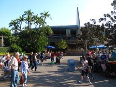 in the physical universe, we’re allowed to see the theming “as it really is”, unique and singular to Disneyland. One’s aesthetic judgment is therefore not as limited to how well it mimics the real thing, but can include a much broader set of criteria such as creativity, color selection, architectural innovation, etc. What does Fantasy look like? What does the future hold? There are no pre-established rules, and so Disneyland is given the freedom of interpretation.
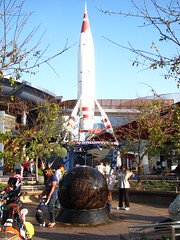
That’s the theory. However, the dual aspect of this creative freedom is that the Imagineers now also have a much greater creative responsibility in these lands to make environments that are as vivid and beautiful as those based on real world locales. The beauty of French Quarter New Orleans is the ultimate product of centuries of aesthetic and architectural development by a myriad of great minds and even diverse cultures, while the look of Tomorrowland must be birthed from a single scratchpad during a relatively short development period. And to be honest, I’m not sure if the Imagineers have proven themselves to be up to this task. The eastern hemisphere has not nearly as many trees as the western side, and is generally lacking in the same degree of texture and depth found in Disney’s rendition of Africa or the Old West. In particular, Tomorrowland is very two-dimensional, vanilla color schemed, and with lots of open concrete areas. There are few trees or plants, and where they are present they look very out of place with this sterile vision of future architecture. Disney’s land of the future, sleek though it may be, seems to be founded on an idea that biology is too messy to have any function other than in test tubes.
 A note to future readers discovering this page deep in the cyber archives: please, have better aesthetic tastes than what Disneyland believed you would have! All the hard work we’ve done in our contributions to history was made in the hope that the world you’d proudly inherit wouldn’t look like a dull, bastard descendant of architectural brutalism (but with less practicality). We invented for you pastel and earth tones for a reason!
In short, Tomorrowland is not a particularly interesting place to walk around and explore. A lot of people like to note that the ironic problem with Tomorrowland was that it quickly became “Yesterland”, but I don’t think that’s a problem anymore since the design has shifted from a showcase for future technologies to a science-fiction version of Fantasyland. (If that is true, then Children of the Future, you can partially disregard my previous warning.) However, I think the area would be benefited from a lot less George Lucas and a lot more Jules Verne. More color, more texture, more whimsy. Disneyland Paris’ Discoveryland is a step in the right direction.
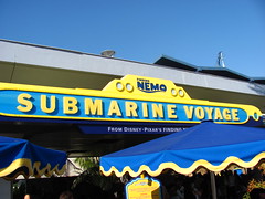 The first attraction in Tomorrowland might have taken its original inspiration from Verne’s 20,000 Leagues Under the Sea, but has been pretty well replaced with Finding Nemo paraphernalia. I speak of course of the Finding Nemo Submarine Voyage, situated between the Matterhorn and the rest of Tomorrowland as we enter from Fantasyland. Although intrigued by the dramatic possibilities should a leak form in our vessel requiring a mid-ride Titanic reenactment, at first I was skeptical that the concept could work as a worthwhile attraction. The clear water pool takes up a sizable chunk of real estate in the land-strapped Disneyland, yet from a spectator’s position I was unconvinced that seeing a pool
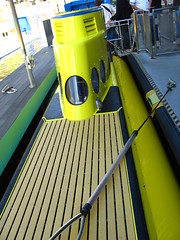 of this size from beneath the water level would really be anything
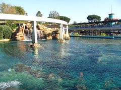 worth queuing 45 minutes for. My reasoning was that since a submarine voyage is limited to passive spectatorship of amazing vistas from an unusual vantage point, a theme park attraction would have to be done on a much larger scale than Disney could afford before it would start attain any worthwhile value. A glacially-paced tour of a swimming pool filled with artificial coral and our vantage distance limited to a few meters squinting out of a tiny porthole didn’t exactly seem like a formula for great entertainment no matter how you dressed it up.
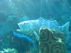
After giving it a ride, I found I had underestimated Disney’s showmanship ability. First of all, climbing down into a dark, claustrophobic ride vehicle via a small opening on the top is a very different loading procedure than anything I’ve encountered in a theme park attraction before, and much of my interest was sustained just by observing all the unusual tasks required to make the Submarine Voyage work. That’s true of many attractions Disney, as they rarely buy off-the-shelf attractions so there’s often a sense of discovery for uber-obsessive theme park geeks. There are also numerous animatronics and effects not visible from the surface, and I forgot that there would probably be sound played inside the submarines as well. This becomes the attractions’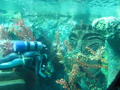 most valuable asset as there’s a complete, reasonably involved storyline… although, most of the story elements are lifted directly from the film (of course). It even takes a “dramatic” turn near the end when the submarine enters a tunnel and we encounter a deep-sea angler fish and an underwater volcano (we can’t see the tunnel, of course, but the water becomes much darker). The attraction is still quite limited as an experience (Tokyo DisneySea’s “dry” submarine dark ride involves guests a bit more by giving them a flashlight control) and I think it’s a good thing more Submarine Voyage rides haven’t been built, but it’s still worth a voyage if the queue is short, just for the quirky differentness of whole thing. If only they could make the portholes a little bigger and build it at a place like SeaWorld where we wouldn’t have to pretend to ooh and awe at robotic fish.
(A quick note, due to the limited time in the park, we ended up skipping a number of Tomorrowland attractions such as Buzz Lightyear, Autopia, Innoventions, and the closed-for-renovations Star Tours. All of these attractions could be found at Hong Kong Disneyland or Tokyo Disneyland except for Innoventions, which I will cover there.)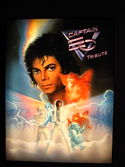
I’m not exactly sure why they call it the Captain EO Tribute since it’s exactly the same thing as the original Captain EO except for the world outside is no longer in the 1980’s, but regardless of how it pays tribute to itself, it was a big attention grabbing rerelease (for a limited time… hopefully) so I would be obliged to see it. For those who don’t know what I’m talking about, Captain EO is a 1986 George Lucas produced 4D science fiction musical film that ran at Disney parks until the mid-90’s, starring Michael Jackson as the titular El Capitan. Supposedly the most expensive film frame-for-frame at the time, it’s the ultimate nostalgia and cheese fest for Generation Xers still reeling from the collective shock of the King of Pop’s death. My aunt Christine (a big Michael Jackson fan) loved it. It’s got dancing and music and comic relief puppets and Michael going “ah hee hee!” more than once, as well as a call for social consciousness that’s incredibly vague but still lends it more depth than the pure idiocy that’s de rigueur for most of today’s 4D theme park movies. Plus it’s directed by Francis Ford Coppola and includes Anjelica Huston in the cast, two positives that couldn’t be claimed by Honey I Shrunk the Audience.
From my Generation Y perspective, what made the price of admission worth it was the humorously absurd sight of an attacking robot army getting transformed by the King of Pop’s magical palm light beams into a leotard-and-big-80’s-hair clad dance troupe during his space mission to conquer an evil space warlord through the power of music and love (or something like that).1 Granted, perhaps I’m not the best person to review Captain EO since most of the cultural achievements of the 1980’s that I admire are better categorized as either holdovers from the 1970’s or early forbearers to the 1990’s, and Captain EO is certainly neither of these things. Whatever. It’s silly, feel-good fun that you can tap your toes to, and it’s one of the rare cases of Disney pulling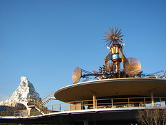 something less than polished out of their closet for the sake of remembering a bit of our cultural history. Not that my remembrance of Captain EO would ever be a specific reason for me to dread the onset of Alzheimer’s.
My tour of Disneyland is nearly complete, and before wrapping it up I should give a quick summary of what I’ve learned. The amount of creative design and money spent per square foot of land the park occupies has to be some of the highest density anywhere on the planet. Almost nothing is accidental which is what makes it so great for analytic park fans such as myself and Disney’s many, many devotees. The Anaheim park in particular has the best and most complete set of attractions at any Disney theme park worldwide.2
Yet when forced to choose the best of these attractions, I often found myself preferring rides in which the least amount of capital investment was spent. The Matterhorn and Pinocchio are my favorite roller coaster and dark ride at Disneyland, a selection I suspect I share with extremely few other individuals. Both utilize relatively simple technology to tell a story or craft an experience. The difference between these and higher profile attractions I was far less charitable towards (Big Thunder Mountain or Indiana Jones Adventures) is that their allowed to tell their stories and focus on their experiences as theme park attractions, rather than as a imitation of something that wants us to believe it has no affiliation with the artificial world of the theme park. In my opinion the best rides at Disneyland embrace their artifice, and in doing so it allows the potential to create art. Which brings me to:
Space Mountain
I must first ask: How do we visualize a “space mountain”? The name creates a paradox. The “mountain” implies something huge, concrete, and physically dominating, but then “space” multiplies it by zero and turns that mountain into a strange physical manifestation of the intangible nothingness. Perhaps we’re supposed to visualize a planetary mountain like Olympus Mons, but the presentation is far too clean and man-made for that connotation to work. The white, conical structure with a few steel icicles dangling away from gravity gives the basic impression of a mountain, but a very abstract, conceptual one that looks like nothing else found in the known universe. Except, of course, for Space Mountain itself.
 The nebulous name and appearance is well-suited to the roller coaster contained within, which has a similar ineffable quality. There’s a beautifully orchestrated story arc to Space Mountain, but it’s not told using ordinary language. Any literal “space adventure” narrative is underplayed and abstracted to the point that it nearly ceases to exist, instead relying on music and our non-visual senses to create a compelling experience, only loosely tied together by a general sci-fi aesthetic bookending the beginning and end. Before riding Space Mountain I imagined that it would have been filled with dioramas of planetary scenes and deep space nebulae lighting effects to keep our eyes busy and stimulated, but in a display of restraint uncommon to Disney, the core of the ride experience is highly minimalistic. Once inside the main dome
 where all the gravity-driven track is located, there is virtually nothing to be seen except for small pinpricks of swirling lights and maybe a dim, half-glimpsed outline of the rails ahead.
What happens once we’ve been totally deprived of reliance on our visual faculties is we’re forced into to a heightened awareness of our other senses; primarily our auditory faculties and inner ear sense of acceleration changes, although even the feel and smell of the difference in air temperature once we enter the main dome becomes a noticeable sensation. Accordingly, the music is a defining feature that makes Space Mountain the ride that it is. A very cinematic onboard soundtrack (courtesy of Michael Giacchino, who composed the music for the Incredibles as well as virtually every Pixar and J.J. Abrams production in the time since) gives shape and structure to what otherwise might have been a very disorganized roller coaster experience.3 Although you only need to provide musical cues at a few key points in the ride to create a sense of synchronicity, the soundtrack so perfectly complements and elevates Space Mountain to the next level that I’m nearly able to forgive Disney for the number on California Screamin’. It’s difficult for me to imagine riding this coaster without the soundtrack, just as it’s difficult for me to listen to the soundtrack on my computer and not visualize some of the key moments of being on the ride. Like image and sound fuse together to create cinema, Space Mountain is a singular entity of music and coaster.
 The layout is in many respects similar to the Matterhorn Bobsleds, in as much as it’s composed of a long downhill run that wraps around itself with a variety of direction changes to fill a conical structure. Also like the Matterhorn there are a number of block brakes scattered throughout the layout which don’t interrupt the ride’s pace. In fact, on my very first ride (in the front row) I developed a bizarre fear because it seemed we were moving too fast and with too many direction changes for there to be any block brakes whatsoever. Normally I expect little “pauses” for brake runs throughout a coaster with dispatches of less than thirty seconds, but here the safety blocks were almost invisibly integrated in the flow of the ride layout. I worried that we would not be able to safely decelerate if there was an e-stop, and squinting through the darkness I realized if there was a stopped car we’d collide into it and I wouldn’t be able to brace at all. It’s such a nerdy technical minutia that I doubt it’s a phobia I’ve shared with many other first time Space Mountain riders. I wondered after getting off if the safety braking was set up in a way that each car had to have two clear blocks ahead of it to advance. Even though a lot of the sense of speed is illusory due to the dark surroundings,
 it seemed that the brakes were too short that a single section could bring a train to a complete halt without discomfort to the riders. Regardless, it’s a technical achievement that succeeds at creating a sense of increasing, non-interrupted action for a solid two minutes that extremely few other coasters are able to achieve.
I also must commend the shaping of the track itself. I know this sounds like a minor point, but it’s really essential to the successful integration of music with the track. Although the track runs very smoothly with precise calculus in the rotation of the banking transitions in the curves, it nevertheless has a very distinctive feel that gives a strong sense of orientation and velocity changes. The banking transitions for example, while smooth, are also sudden and not completely heartlined, so you can easily feel when you’re navigating a turn. The same goes for the drops, which have sharp crests and valleys with flat ramps spaced between them rather than continuous parabolic crests. So many modern steel coaster designers use a free flowing force-vector style of design to produce inversions and overbanked turns that, if put in a dark room, would feel like absolutely nothing.4 Space Mountain achieves a tremendous sense of speed and directional changes despite a top speed of 35mph and maximum banking and track grades of less than 45°, precisely because it retains a more antiquated, geometry-based track design, even after its 2005 refurbishment.
The result is a roller coaster that feels musical. Each of these somewhat hard transitions function as an individual note or beat, and the small bits of flat track between them is what gives it a rhythmic flow. Just as music is defined not so much by the noise itself but by the silent relationships between the noises, so is this style of sudden stop-and-start track design that is becoming increasingly obscure in favor of designs that feature continuous, dynamically changing curves and elements. The layout is simple and repetitive, yes, but this matches the minimalist visual style and it allows the music more freedom to shape the experience, such that anything more would have been less.
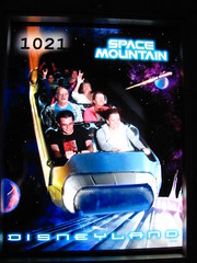
Originally I didn’t want to do a play-by-play of Space Mountain because it’s not so much about a sequence of events but rather a sustained aesthetic state, and words cannot fully describe the experience anyway; but I realized for those that have never had a chance to ride it (and, more importantly, for those who may never be given that opportunity) there are virtual no good visual representations of the ride that can be found online, and so Space Mountain is probably one of the best coasters for providing a written account. I shall try. To start, we enter the station from overhead, where the queue then descends along the edges of the station walls to the platform level. We’re ushered into the vehicles, two six-passenger cars coupled together, which are spacious and easy to climb in and out of, and feature a simple hydraulic lapbar with a rubber pull tab which makes loading so fast they don’t even need a dual-loading station to keep up the fast dispatch rate.5
[audio:http://www.rollercoasterphilosophy.com/wp-content/uploads/2012/01/Space_Mountain_Music.mp3|titles=Space Mountain Music]
In order to understand the full Space Mountain experience from this text, be sure to have a listen to the music as you read along. During the opening preludes we begin with a short lift up a red-lit incline. As the stringed instruments come in (0:26) there’s a flat turnaround with a series of flashing blue lights. At the (0:40) mark, we start the ascent up the second (and larger) chain lift, which is enclosed in a special effect “vortex tunnel”, with a projection at the far end showing a spiraling galaxy that collapses into singularity. Emerging from this tunnel (0:58), we find ourselves inside the main space dome, an awesome visual experience of rushing and swirling stars that’s amplified by the musical intensity. There’s a small left turn (around a rather fake-looking plastic asteroid, the one regrettable prop I could have done without) and then we climb the short final lift hill as a voice counts down to takeoff.
We linger over the top for a contemplative moment of silence (1:15), before gravity kicks in and the soundtrack dives into a more aggressive symphonic space-rock style. This is when the music synchronization works the best, as the first big brass notes (1:24) correspond exactly with the first high-speed turnaround, and then the frenetic strings at (1:27) come during a quick hop up into the first block section; a moment that should seem slow but is transformed into an epic and adrenaline-boosting opener, one that still gives me slight chills when I hear it. From (1:30) the music establishes a more consistent pace, which matches with the fact that the coaster track is doing a series of shallow descents and curves without any particularly big moments that stick out.
There’s a progression in both the music and the coaster at about (2:03), when there’s a sudden uphill hop into a block section that produces a little bit of airtime in the front row. A fast dip and curve anticipates the big “turning point” that kicks off the second act (2:07): a large midcourse drop that gives the coaster a sudden burst of acceleration. (“Large” is relatively speaking, as I doubt it’s any deeper than 20 feet at a 35° slope, but the context makes it feel huge.) From there we motor into a series of more curves and dips that make up the majority of the Space Mountain experience, but with more power and intensity than before. At around the (2:25) point the music picks up in agility to match the coaster track, which starts a few very fast, tight turns and switchback around the floor of the mountain, reaching the lowest point of the layout while sustaining the maximum speed for the big whirlwind finish.
Finally, around (2:37) we fly into the final brakes housed inside a warp tunnel. A few bright strobe lights simultaneously disorient us while our photograph is snapped, and we come to a smooth stop by magnetic brakes. As the music shifts to the coda (2:41), there’s a very odd effect where the dim holographic lights that line the tunnel follow the ride vehicle, which at first made me think we had come to a complete stop (my pupils were still recovering from the bright strobes seconds before), but then we went around a final turn back to the station platform and I realized we were still moving. Even after the first couple of re-rides, this effect still always managed to head-trick me, which is a neat little device to end a spectacular coaster.
I realize how lame it must seem to describe a coaster like Space Mountain in detail as I have just done. There’s a sense in which no explanation of the ride can ever truly capture it. This is true of all roller coasters – indeed, of all phenomenal experiences, to an extent – but Space Mountain exaggerates this gulf between language and experience by its limitation of sight and restricted use of typical, “meaningful” plot and storyline, and instead abstracts it to an orchestrated experience intended almost exclusively for the outer and inner ears. At a fundamental level, I think this is why roller coasters are so important. They are some of the most phenomenologically rich experiences mankind has devised, and by equating the roller coaster experience with the musical experience, Space Mountain possibly raises the bar a little bit higher on the potential of roller coasters to become their own unique artform.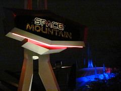
The phenomenal experience is irreplaceable by language or empirical sciences. The question of “What is it like To Be”, that is, to have experiences, whether of colors, smells, music, or roller coasters, is one of the most central to human experience, and also one of the biggest roadblocks to accepting the typical scientific view of reductive materialism as a solution to metaphysics. It has been tried and largely deemed impossible to give a true and complete account of raw phenomena in the absence of firsthand experience. “How do you explain the color red to a person who’s been blind all their life?”, is a favorite thought experiment among philosophers.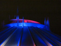 That’s before we open up the Pandora’s Box that is the experience of meaning in our phenomenal experiences. We don’t experience the world simply as receptors of sense data, but we’re constantly in a state of interpreting and emotionally responding to the world around us. Space Mountain tells a deep, meaningful story to me, as I’m sure it does for many others, albeit one that takes no literal or concrete form. Can we possibly share this story? I don’t think it is possible without experience. We can only make obtuse, generalized gestures in the direction we want others to look. However, once we’ve found what we’re looking for, we’ve located what I think is at the core of the authentic theme park experience, one that transcends the shallow confines of hyperreality.
A complete discussion of phenomenology and roller coasters would require a full dissertation to even scratch the surface, so I will leave you with this: Jean-Paul Sartre, early in his career and sitting at a Parisian café, held up his drink and said “phenomenology will allow me to make great philosophy out of this glass of wine”.
I say the exact same can be said of roller coasters.
Footnotes & Annotations
[1] Admission to Captain EO, like all Disneyland attractions, is free.
[2] Although Disneyland Paris is a close runner up for that distinction, especially with its spectacular Big Thunder Mountain that makes a mockery of the smaller California version. Perhaps surprisngly I would not consider Tokyo DisneySea for that distinction, and not just because it has the worst roller coaster selection out of any Disney theme park worldwide.
[3] I’m really disappointed Tokyo Disneyland’s Space Mountain was closed when I visited, as from my understanding it’s mostly the same layout as the Disneyland/Hong Kong Disneyland Space Mountains, but without the soundtrack. It would have been tremendously interesting for me to compare just how much music affects the overall experience.
[4] I’m reminded of Hades’ then-record-breaking 90° banked turn underground, and when it opened people couldn’t even tell that it wasn’t a flat, straight piece of track if they didn’t know it was there (or even if they knew it was there).
[5] Another interesting feature is there’s a transfer track just after the main loading platform for handicapped riders, so that they can take their time getting in and out of the car without slowing down the cars stacked behind them. Gotta love Disneyland’s efficiency at keeping queues moving, which on my visit were barely more than 15 minutes during the afternoon, and a walk-on at the end of the night.
This is another interesting review. I don’t know if you’re aware but a new version of the Submarine Voyage has been created at Legoland Windsor since your trip there. Unlike the Disney original the tank has been designed to support living fish. The portholes have been replaced by full glass windows (although annoyingly at kid height so still not perfect). It would indeed be interesting if SeaWorld adopted this design.
Thanks very much for the review of Space Mountain. I actually tried reading the description in time to the music and it’s mostly doable. It certainly evokes the mood more than a flat out description. I would also like to note that when I was trying to describe Mystery Castle in one of your earlier reviews this was what I was getting at; a ride which doesn’t have a strict plot but leaves the experience open to the senses (although in that case a lot more inner ear and less audio based).
It is unfortunately that this need to experience a ride to fully understand it is something the theme park industry suffers from more than any other form of media. Location seriously restricts the types of rides people will experience and thus their opinion on them. Are you aware that the Merlin UK parks refuse to build wooden roller coasters because wooden rides are considered to be a dated concept? In the eyes of the public only the old seaside amusements have them therefore they must be inferior to modern rides.
As a side note (because I wasn’t sure where else to write this) I also wanted to mention what you added to the recent updates page. I think The Dialogues is a good idea. I am not a member of many forums. With the exception of TowersTimes I follow most as necessity rather than to be actively involved. But this is something I believe could be worth my time. I feel there’s a level of debate here that other sites wouldn’t be able to achieve.
Enjoy your next trip. I am intrigued to hear your views on the Harry Potter Forbidden Journey ride. Many of the people I know have claimed the ride to be the best out there but I remain sceptical. The story seems to be a basic rehashing of the most popular film moments and I feel they might have wasted an opportunity for a compelling narrative. I’m sure you’ll be able to shed some light on this.
I have heard of the Legoland subs though I’ve not looked at it too closely, but it seems like probably a good fit for that park. Your description of it sounds like a definite improvement over the Disneyland submarines.
The idea of interpreting rides as meaningful sense experiences I think drives the majority of reviews for attractions which aren’t strictly story-based. Music helps a lot to give organization and structure to those experiences, but certainly you can do a lot without it, as in your Mystery Castle example.
The thing on why Merlin won’t build wood coasters in the UK is one of those enthusiast memes that spread like wildfire because they confirm our prejudices, not that I have any reason to doubt its veracity. It’s both a curse and blessing that theme parks experiences are restricted to a specific location. On the one hand it severely limits the accessibility of these experiences, and therefore the ability to compare and make critical analyses of these attractions. On the other hand, in an age where almost any artistic work can be infinitely reproduced by digital mediums, there remains that sense of pilgrimage that gives these experiences an aesthetic holiness that’s long since been missing from, say, encountering a painting in Italy or a rare foreign film at a festival. The question is whether parks can learn to leverage these unique abilities to their advantage.
Thanks, I’m looking forward to the trip, as I’ve not been to a park in Florida since 2001. I’ve avoided spoilers for Harry Potter and the Forbidden Journey, but despite the many “best-of” accolades its been awarded, I’ve got the sense from more than a few people that there’s not a whole lot that really can be spoiled, at least in regards to a coherent plot and storyline. I guess I’ll find out on Wednesday.
Ah, I guess I’m kind of responsible for that meme spreading so far. It was my dad who first asked John Wardley why all the UK wooden coasters were scrapped.
I realised as I was typing that part of the response that the feeling of discovery is a valid reason for keeping experiences to a specific location. Having read through your journey to ride Montaña Suiza it is clear that the struggle to get there was just as much of the experience as actually ridding it. I guess my issue comes from the enthusiast’s community and how many rides are judged more by their location than the merits of the ride. It makes some rides very hard to debate about when the person you are debating with has a limited pool of knowledge for that type of attraction. Even staples of the industry such as Space Mountain require a lengthy trip if you aren’t positioned conveniently to make the journey. This becomes even more of an issue when trying to talk to someone you meet on the street who might have only been to 1 or 2 theme parks.
Memes can be true and interesting; there’s generally a reason they become memes in the first place. Arguably any type of breaking news is a meme, at least in the Dawkins-ian sense of the term rather than the recent internet social networking phenomenon which seems hellbent on proving Dawkins’ hypothesis is true. Basically it was just a long way of saying that, yes, I was familiar with the tidbit on why Merlin don’t build wood coasters from several sources already.
The struggle to get to (and, more so, back from) the Montaña Suiza I’d say was significantly more part of the experience than the ride itself. 😉
I agree with your assessment on the discourse on theme parks and attractions, but I think it goes both ways. While on the one hand people become experts only by experience (notice the shared roots), I’ve also noticed that too much experience without critical distance produces some pretty dumb results as well, although it often comes with a side effect of acute narcissism (this is true of all disciplines but especially prevalent amongst coaster people, where the experience is much more vivid but the theory is very much on the fringes of discourse).
You even sort of get that viewpoint reflected indirectly in Mitch Hawker’s poll, where rides are ranked not based on people’s absolute opinion of them, but rather in relationship to other rides you’ve ridden, so that people who have ridden more have an exponential amount of weight in the results. I actually think that a lot of the most interesting, prescient writing I’ve read about theme parks and coasters come from non-enthusiasts who are simply good writers and thinkers. (Umberto Eco’s Travels in Hyperreality, which I’ve cited several times, I think is a perfect example).
Ultimately I don’t think it’s as much a function of riding more and experiencing more, but of writing more and thinking more. If there is a correlation between the two, I think it has more to do with the fact that we tend to think more carefully about the activities that occupy a larger share of our time, rather than that more experience necessarily gives us more expertise.
nice finale to an incredibly in-depth review of my home park.
I really enjoyed reading your opinions on space mountain. It’s really a great “experience ride.”
A point of interest, here was a test video I shot on roller coaster tycoon 3 of my recreation of the ride:
http://www.youtube.com/watch?v=VFcajOg5mLU&list=UUdM3lGdurSdmSWfyAY0xY_w&index=1&feature=plcp
It gives somewhat of a good idea of the layout, although the speed of the teaser video can make it disorientating.
Hope you have fun in Orlando. While not the greatest dark ride, the Forbidden Journey is my personal favorite. It always left my with a smile.
David, thank you very much for the complements.
It does seems like the Space Mountain layout is well-suited to RollerCoaster Tycoon’s horribly limited, boxy design method, which I’m still not entirely certain why it retains a large devoted fanbase. Looks like you’re doing a fairly good job of capturing it virtually, however.
(By the way, I am, or at least, was, a NoLimits loyalist.)
Haha. Advances have been made to the crappy, 7 year old game. German users created “custom track” that allows for tons of flexibility compared to the limited, original track.
This video explains it:
Slightly off topic but I don’t even get why there is a NoLimits vs RCT3 debate. One is a simulator the other is a management game.
As a RCT loyalist I will quite happily convert to NoLimits when it allows me to design a whole theme park. Likewise if you could run NoLimits in RCT3 (something which is just about becoming possible if you know how to import the files) the NoLimits fan base will do the same.
Sorry I just couldn’t resist adding my thoughts on the matter. It’s the first time I’ve actually disagreed with something you’ve said.
Oh believe me, I love Roller Coaster Tycoon, although more 1 and 2 than 3. I’ve easily spent more hours on RCT1 over the past two years than I have on NoLimits. It does however seem like I’ve seen RCT3 used more as a simulator and less as a park management strategy game in recent years, and to me that will always be NoLimits’ domain. I’ll grant there’s a few features in RCT3 that you can’t get in NL even if you limit your use of both as simulators, but I think that’ll change whenever NL2 comes out.