Urayasu, Chiba, Japan – Tuesday, June 28th, 2011
After a day swimming the sprawling concrete oceans at Tokyo Disneyland, dipping toe into Tokyo DisneySea felt like a revelation. Walkways were properly scaled, shaped, and graded, the level of detail and texture was excellent across all visible surfaces, landscape design was applied thoughtfully and naturalistically, contrast is created between compression points and reveals, and holy shit there’s a giant fire-spewing volcano across the water lookit lookit lookit!
 While Tokyo Disneyland often comes across as somewhat crude yet no doubt overwhelmingly populist in appeal, Tokyo DisneySea takes the opposite tact as a park willing to challenge its audiences with a higher degree of complexity and sophistication that ultimately wins them over by demonstrating complete mastery of its immersive environments. This is a theme park made not just to be enjoyed and loved, but also admired and appreciated. The fact that it’s the most expensive theme park ever built (estimated around $4 billion in 2001) has also allowed it to serve as a testament to what Disney’s Imagineers could accomplish when they’re given the freedom to design without being subject to quite so many rounds of budget cuts and value engineering whenever the suits get nervous and begin to question the better judgement of the designers.
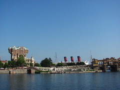 It’s little wonder that Tokyo DisneySea is consistently rated among theme park fans who have visited Japan (and even acknowledged among those who have not) as the world’s best theme park.
Yet, as easy as it was to admire and appreciate Tokyo DisneySea, I found it a little more difficult to fully love and enjoy. The park is spectacular at scale and stunning in detail, two qualities that, almost by default, make it a Very Good Park and easily launch it to within the top five Disney theme parks worldwide. (Having visited them all, I’d peg it as my 4th favorite Disney park to be precise, which is still high praise.) Most other parks must work very hard to achieve even a fraction of the scale and detail as Tokyo DisneySea, but as the world’s most expensive theme park it achieves those two qualities seemingly with ease. Almost too easily.
There are other qualities that make a good theme park, such as its charm or storytelling, and oftentimes the techniques behind these qualities have been borne out from and honed by the practice of creative thrift. Limitations are often essential to the creative process. Having a big budget to work from can sometimes be as much of an obstacle as having too tight of a budget, because it’s easier to simply add more and be done with it than figure out how to accomplish more with less. Being told “no” on the first round requires deeper thinking and problem-solving to get to “yes” on the second or third round. Starting from a blank page can easily result in a monologue, whereas responding to someone else’s prompt leads to dialogue.
I don’t doubt that there was lots of collaboration and revisions that led to this park’s development, but as a visitor looking at the final product I could sense how this theme park was allowed to become a monologue of things that please theme park designers. Its choice of themes and stories are a fairly transparent reflection of the kinds of fascinations (and also the privileges) of the particular kinds of people that would have been drawn to (or allowed to participate in) themed design work in the 80’s and 90’s before this park’s development cycle. Indeed, despite all the praise this park gets in theme park fan circles, the park reportedly struggled to connect with local visitors for several years after opening until character presence and festival programs helped refresh its identity, suggesting a design process that failed to fully consider and listen to the diverse stakeholders and audiences it was supposed to serve.
The resulting park is undoubtedly beautiful, yet not always as meaningful in equal measure, being the product of a somewhat random collection of deep cuts that, as much as audiences might love them, I get the sense that their creators probably love most. Many of the lands and attractions are recycled from older concepts for different projects that had to be told “no”, undoubtedly breaking a few hearts within the halls of Walt Disney Imagineering… until redemption was found in the blank check written by the Oriental Land Company for their second gate. Indeed, the entire park was once envisioned for Long Beach, California, with the Queen Mary as its literal anchor, before Disney’s California Adventure got the greenlight instead.
As a result, many of the lands or attractions don’t clearly fit the seafaring thesis for the park. It’s not clear how much editorial discipline the thesis actually inspired throughout the design process as opposed to just being reverse-engineered to find the right question for the set of answers which had already been decided upon. World travel seems to be a defining characteristic of many of the lands, until you get to one where it isn’t, based on an original narrative or a whimsical cartoon aesthetic instead. “Adventure” is the closest it gets to an actual unifying theme, but that’s already the broadest and most overused trope in theme park design. The nautical motif helps narrow the theme somewhat, but it only works half the time, with the other half in a “damned if you do, damned if you don’t” situation that either feels like an awkward attempt to squeeze the idea back into the seas motif, or else simply not connect it at all. (The addition of Fantasy Springs seems like an even more obvious example of a concept grasping at ways to find a link back to its supposed organizing theme.)
Indeed, if there’s one thing that most frustrates me about the seafaring concept, it’s that the park’s location overlooking Tokyo Bay, which clearly provides DisneySea its most obvious and authentic connection to that theme and was the likely genesis for the entire concept, instead became one of its biggest missed opportunities. The bay is mostly blocked from view by a giant concrete seawall that’s not actually a seawall but serves as the park’s berm for sightline control. There are a few vantage points along the secondary circulation routes from which the water beyond is barely visible, and this seems sufficient for many fans to declare it a masterful way to design a berm to create the impression that the park is on the sea. The problem is, the park actually is right next to the sea!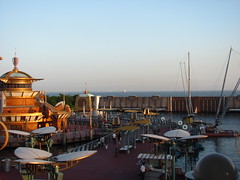 But because modern theme park masterplanning and design standards are so deeply rooted in principles of control and containment, that singular authentic connection is instead treated like it’s yet another optical illusion of themed design. (And an ugly one, too, since it’s still mostly a concrete wall you’re looking at.) It also ignores and erases the rich history of seaside amusements, of which Tokyo DisneySea is a part of and even pays tribute to, while denying itself the most valuable asset those parks have long shared: an unrestricted connection to the sea.
That’s just one example of the many ways in which the park is both too much, and yet not enough. Too much berm yet not enough sense of place. Too many resources yet not enough resourcefulness. Too big a concept, yet not enough conceptual integrity. The thing is, if Tokyo DisneySea truly could be called a weird, expensive passion project, a product of unrestrained creative freedom where the flaws only make it more interesting, then I’d probably be a much more vocal champion of it. But that gets to the central contradiction of this park: that the way it expresses that passion through design (however spectacular and detailed it may be) is also often just so… tasteful… restrained… basic.
As a theme park designer’s theme park, Tokyo DisneySea often feels like it was a chance for the designers to say “this is how we could’ve made that other (park, land, attraction) done right, if so-and-so person or such-and-such restriction didn’t get in the way of the vision.” For all it’s ambition, DisneySea doesn’t set its sights very much on challenging the concept of what a theme park could be or to expand the idea of who it is built for, but rather wants to elevate the existing theme park tropes to dispel the stereotypes that theme parks are all princesses and popcorn. (Although the popcorn is still a big deal here, too, and the princesses are on their way.) Most of the lands are ideas we’ve seen in other theme parks before (especially other theme parks built in the 80’s and 90’s), but on a bigger scale and with a more refined design pedigree than previous iterations. An Italian world showcase. A classic New York street. A tropical adventure. An Arabian desert adventure. A steampunk retro-futuristic sci-fi zone. A steampunk Jules Vernian-inspired sci-fi zone. Gone is the kitsch and chaos that often defined the original versions of those tropes, in favor of designs guided by principles of consistency, uniformity, and realism to signify itself as a more highbrow form of entertainment.
Yet, with few exceptions, Tokyo DisneySea seems to have very little new to say on its themes to actually elevate them above their predecessors. The park opened at the dawn of the 21st century, but the worldview is still firmly entrenched in the 20th. Its themes of adventure, exploration, and discovery are interpreted within a very western-centered framework, nostalgic for a historical ideal of “adventure” while ignoring that ideal’s inextricable link to colonialism that colored much of the previous century’s adventure fiction. Italy and New York are placed up front as “home ports” and afforded heavy amounts of romanticism for their respective bygone eras; places signified by the park as beacons of civilization and enlightenment. Arabia and South America are hidden in the back of the park, depicted as exotic lands full of mythology and mysticism, there to be explored despite the risk of danger. Even the two science fiction lands both look backwards to decades-old European and American ideals of futurism and their associated design forms. There are a few interesting challenges to this perspective added in later expansions, but for a park with so much ambition and potential, it’s a little disheartening to realize it still leans conservative at its core.
In the end, although I believe the design qualities of Tokyo DisneySea are not above critique, if I were to honestly account for the biggest factor behind my inability to full-heartedly love this park, it would probably come down to the more quotidian issue of rides. Simply put, if you were only to compare the selection and quality of rides, Tokyo DisneySea would rank as a mid-tier Disney theme park, at best.
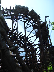 The roller coaster selection in particular is abysmal. With an Intamin copy of a compact Pinfari looping coaster layout and a Togo-built kiddie coaster, Tokyo DisneySea quite possibly has the worst coaster collection of any major theme park with at least one. The rest of the ride selection doesn’t fully pick up the slack, either. Two of the three non-coaster thrill rides are semi-clones from other Disney parks (and one comes with a much more uncomfortable safety restraint). There were only two decent family dark rides as of my visit in 2011… and already that rounds out the highlights of the park’s attraction roster. The rest was filled out by a lousy motion simulator, an odd proof-of-concept attraction, some transport rides that might be better to look at than actually use, plus a few kid’s rides.1 Many fans will note how a good theme park is more than just rides, which of course is true… but although ride quality alone may not be a sufficient condition for a good theme park, it’s still a necessary one.
Mediterranean Harbor
Still, any attempt to critique Tokyo DisneySea will certainly not happen during the moments of first impressions. Entering through the Mediterranean Harbor, one is immediately struck by what a beautiful, luxurious park this is, from the grand vistas across the harbor down to the immaculate shine of every tile, marble, and cobblestone detail. Especially with the Hotel MiraCosta giving life and character to the facades, the point of comparison for Mediterranean Harbor is less the “real” Italy than it is other Italianate luxury resorts found in Europe, Vegas, or even at Universal Orlando… but here done correctly, according to the most rigorous principles of hyperreal themed design. It’s immediately clear that Tokyo DisneySea is a luxury experience in a way that few other themed attractions are. What makes it so?
I’d posit that to be “luxury” means using design to go beyond simply serving its function well (in the case of theme parks, creating a compelling sense of place and story, which can be achieved at many budget levels), but in which the design also actively signals itself to guests as a product or experience of superior quality. “Look at how good this all is!” It’s similar to the pleasure of mimesis (that is, admiring the craft that makes an artwork almost seem lifelike), but with a socioeconomic dimension as well; pleasure not just from the artistry, but also from one’s proximity to signals of social status and wealth. Of course, the beauty of Tokyo DisneySea is that, while it acts like a luxury experience, it’s actually quite accessible, with one-day ticket prices still much lower than their equivalent American parks.
Fortress Explorations
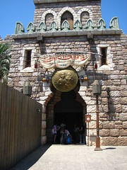
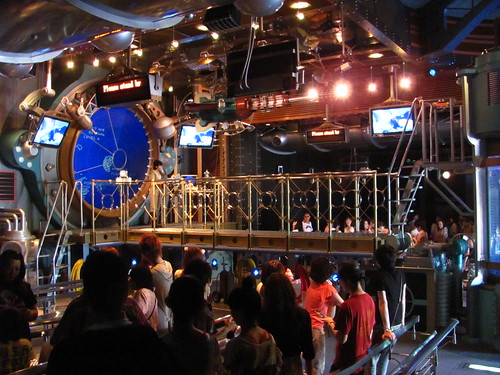
For all of the fine detail throughout the park, Tokyo DisneySea actually doesn’t have that many hidden explorable areas of small discoveries away from the main circulation routes, a contrast to other detail-rich Disney parks like Disneyland Paris or Disney’s Animal Kingdom. The big exception is Fortress Explorations, which seems to contain enough explorable spaces to spread across an entire theme park contained within its small footprint. It’s almost overwhelming how much there is to find; a happenstance encounter inside a room with a Foucault’s pendulum, or an entire planetarium and orrery quickly leads to a determined search to make sure there’s nothing even more amazing that you might not have found yet. Although there’s clues about the fortress’ story through the Society of Explorers and Adventurers (S.E.A.), being on seemingly abandoned island featuring an otherwise pristine collection of structures and inventions from the late middle ages makes it feel akin to a physical, European version of Myst, with much of the same sense of wonder and existential puzzlement.
Mysterious Island
If there’s only one reason to travel around the world for a pilgrimage to Tokyo DisneySea, it would likely be for Mysterious Island. As the centerpiece of the park, this is where the most money is on show for the biggest “wow” factor, set within the caldera of the fire-belching Mount Prometheus. A larger-than-life setting combined with a vintage sci-fi aesthetic makes for the one land inside the park that feels totally without precedent. From a story point of view, that’s not quite true, as the Disney parks have longed appropriated Jules Verne’s writing (Nautilus Subs, Paris’ original Space Mountain). But what’s different here from the architecturally-oriented Tomorrowlands, Discoverylands, and Future Worlds that have represented science fiction in Disney parks in years prior was just how grounded in a specific, consistent place and time Mysterious Island is. You’re not 100% sure when or where you are, but it feels like a concrete place instead of an abstract concept.
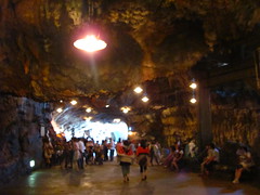
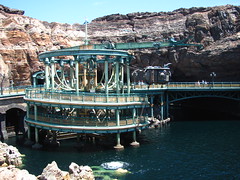
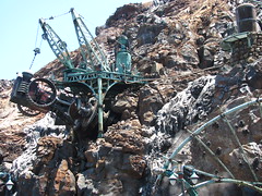
 Perhaps the most unprecedented aspect of Mysterious Island is how it actually disregards or subverts many of the established rules about themed land design, yet largely gets away with it. To start with, there’s almost no actual “land” within Mysterious Island; every surface area consists of either water, rock, or iron, with nary a living plant in sight once inside. Architecture is similarly almost non-existent. The land works almost entirely on a monumental scale, drawing the eye upwards to survey the immense caverns or craggy volcano top, or down into the watery caldera, with relatively little at close-range eye-level. The usual program of secondary dining, retail, and other services is cut back to the bare minimum. And wayfinding is quite difficult, with the completely immersive circular layout easily disorienting one’s sense of direction. The first several times I walked through Mysterious Island it was almost like a game of roulette to guess which side of the park I’d eventually exit towards. This isn’t how anyone else should design a themed land, yet it all works just because it’s so unlike anything ever experienced in a theme park before, and the commitment to the concept is absolute.
20,000 Leagues Under the Sea
I’ll be totally honest: the first time I rode this attraction, I didn’t pay close attention to how the underwater effect was achieved (a double pane of glass filled with water and strategically timed bubbles) and just presumed for most of it that the ride actually went underwater. Depending on your viewpoint, this could make 20,000 Leagues Under the Sea the ultimate themed experience by virtue that its illusion was, for me at least, 100% effective at suspending my disbelief. Yet, it may have actually lessened my ability to fully appreciate the craft behind this attraction. It’s obviously different for everyone, but for me, getting close to experiencing an illusion that fully “succeeds” only moved it deeper into an uncanny valley of illusions: good enough that at first you don’t even realize it’s an illusion (and thus treat it as natural, and less remarkable, phenomena), but not good enough to sustain existing inside the world created by the illusion forever, leading to a fleeting flusteredness and moment of hurt pride as the illusion’s final pay-off. Not that this is a critique of this attraction specifically, but rather just some thoughts on what it is we’re actually looking for from the experience of theme park effects.
Clever as the underwater illusion might be, the ride lacks some interest when it comes to the actual underwater voyage, a rather sedate scenic tour of a series of dark, cluttered vignettes of mostly corals and scattered shipwrecks. An encounter with a giant squid is the highlight of the ride as the one memorable moment of conflict, plus the one place where the movement of the dark ride is used to reveal a larger sequence within a scene. The finale features a visit to Atlantis that seems to have been intended as a fantastical reward at the end of the voyage, but the creepy character design and dark setting underscores it as a ride that registers almost entirely in the coldness of the minor key. And at only four and a half minutes, it lacks the gravitas and commitment of an extended quarter-hour journey beneath the waves as on the original submarine rides at the U.S. parks. This is what a “C-Ticket” attraction experience looks like at Tokyo DisneySea: more lavish in special effects and set design, but it’s not fundamentally any more essential than most other mid-tier attractions found at other parks.
Journey to the Center of the Earth
This, on the other hand, is what an “E-Ticket” attraction at Tokyo DisneySea looks like. Journey to the Center of the Earth is possibly the most inventive of any major modern Disney attraction in terms of original storytelling and art direction. Discovering an underground ecosystem rich in bioluminescence, the ride uses the full spectrum of colors and blacklight to maximum effect. At one point we’re presented with a vast vista of a subterranean sea crackling with static electricity, an unfamiliar concept that should be confusing for how briefly it’s glimpsed, but I instantly understood what I was looking at. Shifting into the molten red hue of the earth’s core, there’s a well-placed bit of misdirection setting up the reveal of the lava monster, one of the most impressive animatronic creations ever witnessed.
It’s a powerful climax to the visual story of the ride, and the slot car ride system wastes no time launching into the kinetic climax as it accelerates into the darkness, spiraling up and out an opening near the top of Mount Prometheus. Bursting through to daylight with a flash of fog, one might feel just a brief pop of airtime, a true rarity at a Disney park. It’s a thrilling way to conclude the ride.
Yet as the vehicle decelerates back to the loading platform I can’t help but feel that the ride was over a little too soon. A sign at the exit proclaiming that “life is an astounding journey” doesn’t quite feel earned, given the journey it alludes to lasted barely three minutes of our lifetime. After a couple of rides, I sensed something missing from the journey, ironically missing from right in the middle of what’s unquestionably the highlight of the whole experience. Journey to the Center of the Earth is really two separate halves that never quite join together. There’s the beautiful, slow-moving dark ride portion, immediately followed by a speedy thrill portion, and while they sit very close next to each other, there’s never any actual overlap between the two modes. One ride abruptly ends just as the other abruptly begins, and neither ride is quite complete to stand on its own.
It doesn’t help the cause that the high-speed portion feels a lot more like “now we just have to drive away really fast” instead of “now we escape by erupting from the volcano,” which was the original creative intent and ostensibly the impetus of the entire attraction. The sensation of speeding forward up a dark spiral just doesn’t sync with the intent. It’s not a matter of suspension of disbelief if it’s not even clear what the doctrine is supposed to be.
I would still call Journey to the Center of the Earth as the best attraction at Tokyo DisneySea, or at least the single “must-do” attraction given that there’s very little else quite like it anywhere on earth. It’s a testament to the ride’s many strengths, while the fact of its remaining weaknesses is indicative of the overall weaknesses of the park’s ride collection.
Mermaid Lagoon
Mermaid Lagoon is one of those lands that’s beautiful to look at, yet offers few incentives to stay for very long. The impressively whimsical facade to this indoor and outdoor land is always worth a photograph, and the Flounder’s Flying Fish coaster is worth a ride for the credit (and for the Togo-built creation to prove that it is possible to build a less interesting layout that the standard Vekoma junior coaster model found next door at Tokyo Disneyland). But apart from a Little Mermaid stage show (which I regrettably didn’t see this time), the issue facing lands that consist mostly of children’s flat rides is that those are the types of attractions that generally have both the lowest capacity and the shortest dwell times; meaning fewer people will get to spend time here and, of those that do, they won’t stick around for as long.
While I only rode the one coaster, I did take a few minutes to explore the rest of Mermaid Lagoon. For a park that otherwise seems so committed to hyperrealism, the loopy pastel expressionism of this land makes for an odd contrast to the DisneySea thesis even if it’s the one land that most literally expresses the stated theme. As always there’s some beautiful detail to enjoy exploring, although I was perhaps most bemused by a plaque left by King Triton welcoming guests “to magically enter the realm of my daughter Ariel,” an odd way to phrase that piece of show writing that instead brought to my mind to a particularly Disney-unfriendly South Park episode.
Arabian Coast
How Imagineering managed to get an entire Arabian themed land approved in the 1990’s with Aladdin relegated to a live show, while the major E-ticket anchor of the land was instead based on a classic story at the time being developed for film by their competitors at DreamWorks, feels like a complete mystery for those of us living in the current decade of Disney’s hyper brand-focused approach to their Parks & Resorts division.
 Of course it makes more sense in context: Sindbad is a mariner so his story should be the main attraction within a land where the connection to the sea is fairly tenuous… but where the connection to the smaller Arabian-themed efforts at Disneyland Paris and the Magic Kingdom surely yielded a lot of unused ideas the designers were eager to explore further on a larger budget. Much like how the Adventurelands at those two parks combine an Arabian section next to a jungle section, the same concept applies to Tokyo DisneySea, only here the effort was taken to give the locales two separate names and land identities.
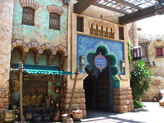
Of the lands at Tokyo DisneySea, this is the one I feel most ambivalent about. There’s nothing wrong with it, and it all makes sense on paper as one of the park’s ports of call, but there’s also nothing particularly original or interesting about it either. Much of the land consists of variations on the same palatial architectural motifs that connote it as “sophisticated,” and clearly no expense was spared. But it also lacks the authenticity, intimacy, or sense of discovery that might be found in, for example, the Epcot Morocco pavilion (which also demonstrates a much more efficient use of space). I wandered between the massive columns, archways, and fortress walls of Arabian Coast for a short while, but for all its surface splendor I soon realized there was little within the land that compelled me to further engage or explore… apart from riding its magnificent flagship attraction a couple times.
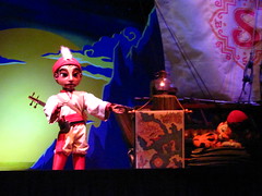
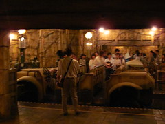
Sindbad’s Storybook Voyage is among the most impressive examples in the world of the highest qualities of showmanship applied to a theme park attraction. And I mean “showmanship” in the traditional sense, with song and dance and no expense spared in the production’s every effort to always please its audience. And pleased we most certainly are, given the luxury of spending over ten minutes on a boat journey admiring this most elaborately orchestrated of attractions. While the production is in Japanese, the story isn’t hard to follow (especially if elements of the source material ring as familiar to you), following the Arabian explorer Sindbad and, since 2007, his tiger companion Chandu on a voyage across the seven seas to encounter giant Rok birds, giant hordes of monkeys, giant whales, and, most memorably, a giant musical Giant. Frankly, the most annoying thing about Sindbad’s Storybook Voyage is how, with around 150 fully animated animatronic figures, this ride, more than any other, has been responsible for setting fans’ expectations too high regarding the use of animatronics at other parks and attractions around the world. Why do you have to make everyone else look so bad, Sindbad?!?
In all honesty, if I do have a criticism of the attraction, it’s that the current Sindbad’s Storybook Voyage may have swung the pendulum a little too far towards “eager to please” compared to the darker tone of the original Sindbad’s Seven Voyages attraction during its first six years. Many of the changes are undoubtedly positive and reflect the park’s efforts to listen more to its target audience. The most notable change to the ride is the addition of the song “Compass of Your Heart,” a song custom composed by Alan Menken specifically for this attraction to bring the Disney show tunes tradition into the modern era of themed attractions. But it’s also a little too much of a good thing. What happens is this same celebratory anthem gets used in all but a single scene, leaving the whole attraction to feel like it’s part of one never-ending showstopping grand finale. It needn’t scare kids, but a little more emotional variation would still be welcome! After all, you can only continue smiling for so long before your cheeks begin to hurt.
Lost River Delta
While Arabian Coast was a chance for designers to explore some smaller ideas from previous Adventurelands within a full-sized land, Lost River Delta is basically just a regular full “Adventureland”. The biggest difference between Land and Sea is that here they actually pick one specific location in which to set the adventure, being somewhere in Central America. While the integrity of the Story might be made stronger from the narrower focus, from a guest experience standpoint I’m not certain it’s actually a beneficial change. If the land had the same sense of curiosity and attention to unexpected details like might have been found at Disney’s Animal Kingdom it could have been much more successful, but here it comes off as a very generic jungle setting.
From a design standpoint Lost River Delta has virtually no sense of exploration or discovery baked into the infrastructure that one might expect from an “adventure” zone, since the entire land consists of two long and broad straight-shot pathways along either side of an open river with a couple bridges connecting the two banks. On one side of the river are the two big entrances to the main attractions, both thrill rides based on the same concept of oversized stone temples with spirits angered by the presence of excavating archaeologists. On the other side of the river are the necessary dining, retail, and restroom facilities housed in unremarkable wooden colonial shacks. It can be amusing when the Japanese cast members, dressed in their khaki explorers garb, all shout their Spanish catchphrases in unison such as “¡Adios!” when a ride vehicle is ready to depart. Yet it also underscores how, throughout every facet of this land’s design, “adventure” has become intrinsically linked to themes of colonisation and imperialism which define this land’s dual conflict between native and foreign identities, while giving the guests’ point-of-view entirely to the colonizer’s perspective. Clearly these are themes that Lost River Delta knowingly and explicitly appropriates for dramatic irony within its storytelling, yet it never stops to consider them for long enough to explore the cultural or historical implications of the story it tells. Which goes back to my perennial critique of Tokyo DisneySea writ large: that it always finds a way to provide both too much and not enough.
Raging Spirits
 I guess this was the closest the world ever came to getting a major theme park attraction based on the Emperor’s New Groove. Sigh. Raging Spirits certainly looks impressive with its elemental battle between water and fire on the steps of the temple ruins, while mine carts careen around scaffolding behind it as one of the most kinetically activated major attractions inside the park. Still the joke’s ultimately on riders when you discover that, for all its attention to show detail, the ride underneath it all is a re-creation of a Pinfari TL-59 transportable coaster! Given that it’s the very same layout used for Disneyland Paris’ oft-maligned Indiana Jones et le Temple du Péril, one wonders what lessons, if any, Disney had learned in the twelve intervening years. At the very least the manufacturer of both, Intamin, had learned a few lessons, as Raging Spirits indeed tracks about as smoothly as expected from a mid-2000’s Intamin creation with giant horsecollar restraints. But it’s still a copy of a freaking Pinfari TL-59, which will never not be the height of cringe for Imagineering as far as anyone with even the slightest enthusiasm for roller coasters is concerned. With only a basic Togo kiddy coaster to share in the glory, Raging Spirits and Tokyo DisneySea have rightfully earned their award for the Worst Coaster Collection Ever at a Major Theme Park. Congrats?
Indiana Jones Adventure: Temple of the Crystal Skull
While it’s the same layout, same story, and most of the same effects as the Temple of the Forbidden Eye at Disneyland, Temple of the Crystal Skull also feels surprisingly different. Swapping the location from Southeast Asia to Central America is more than just a change in name and a few key icons, as the entire art direction shifts to a cool blue tone, and the temple becomes realized not as a dusty relic of an ancient Old World empire suddenly reawakened, but rather as a heart of darkness that has always been pulsing deep within the misty rainforests of the New World. It’s a subtle but significant shift for Indiana Jones, moving the hero closer towards both science fiction and ecological horror genres, especially considering this attraction was opened a full seven years before the similarly titled Kingdom of the Crystal Skull realized many of these ideas on film.
Temple of the Crystal Skull is undoubtedly the more interesting of the two Indiana Jones attractions, if not only for the presence of improved special effects like a fog vortex in the main chamber and a smoke ring in the later tunnels, along with other upgrade (such as Forbidden Eye’s cheesy blacklight painted spear hallway becoming a fully dimensional set in Tokyo). Yet in becoming the more original interpretation, Crystal Skull also becomes more challenging to mentally set the many visuals in terms of instantly recognizable genre archetypes (e.g. the recognizable hood of a striking cobra becomes the sleek profile of a venomous tree snake, both oversized), which is an important trait of a fast-paced Indiana Jones attraction that has always wanted to throw the kitchen sink at riders. Getting off Temple of the Forbidden Eye for the first time a few months prior, I shrugged and said, “Welp, that’s everything I could ever expect from an Indiana Jones ride within three minutes or less.” Getting off Temple of the Crystal Skull, I pondered, “Well, that seemed almost like the exact same ride, yet everything feels just slightly different than what I’d expect from Indiana Jones.” Sometimes it takes writing it down years later to figure out why.
Port Discovery
Theme park designers spend a lot of time thinking about how to balance all of the lands inside the gate, eliminating as many redundancies as possible between lands so they all feel different while making certain they all match the pattern of the park’s central theme. For example, worlds of “Yesterday, Tomorrow, and Fantasy” represents a set of themes that very intuitively has that balance, as each one is very different but also recognizably relates to one another.2 Port Discovery is the one land at Tokyo DisneySea that to me feels most out of balance with the rest of the park.
On the one hand, the retro-futuristic sci-fi steampunk look of this land gets more than a little too close to the central idea behind the more directly Jules Verne-based Mysterious Island next to it. It’s especially true when you consider that the closest point of comparison to Port Discovery is likely Disneyland Paris’ Discoveryland, which itself was an explicitly Vernian version of Tomorrowland… and that’s yet another sci-fi land that also already exists at the park next door. What Port Discovery as a theme really brings to the Tokyo Disney Resort that it didn’t already have in Mysterious Island or Tomorrowland feels questionable at best.
 On the other hand, the qualities that Port Discovery does distinguish itself from Mysterious Island make it not as great a fit for Tokyo DisneySea as a whole. It’s the only land in the park that’s based on a more abstract sense of time period or architectural stylization and not on any particular sense of place in the world.3 I mostly interpret Port Discovery as an inescapable artifact of WDI’s 90’s-era obsession with all things retro-futurism. It’s perhaps understandable, given that the aesthetic and architectural influences of this style are exactly what you’d expect a bunch of themed entertainment professionals living in Los Angeles at that time would naturally be drawn to, and they continued to find ways to use it until Disneyland ended up with a dirty bronze Space Mountain and park guests had to beg them to stop. But we still have Port Discovery!
My appraisal of Port Discovery might have been kinder if the attractions themselves had a more compelling reason for being, but unfortunately this land sort of feels like the dumping ground for a pair of attractions that ended up on the park-wide program list for reasons involving technical proof-of-concept or budgetary reasons, but couldn’t find an adequate home anywhere else. In 2017 the motion simulator I describe below was transformed into the Nemo & Friends SeaRider, and it would honestly make a ton more sense to transform the rest of Port Discovery into a more naturalistic Finding Nemo-inspired marine sciences zone, rather than keep one toe dipped in the science-fiction waters. It’s the rare case where IP really would be superior over an “original” concept.
StormRider
A large motion cabin simulator taking you on a flight into the eye of a storm. The thing I most remember from my one experience on this ride was getting pissed off over how our pilot was an absolute cretin.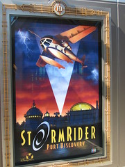
Anytime you see something solid in the far distance you’ll want to avoid hitting, our pilot always manages to find a way to fly straight towards it and only narrowly misses it at the last second. From the beginning of the flight when it’s still a tranquil sightseeing trip, all the way to the end when we’re in the middle of a life-or-death tempest escape, the dramatic suspense of virtually every scene involves whether this time we’re not going to fly directly at that one thing we should obviously avoid, and then being disappointed in our nameless pilot Every. Single. Time.
At one point we actually do hit the thing and it pierces into the cabin with a physical prop gag, which should have been more memorable but was just yet another example of the same dumb trope. Universal is known for the screen-based attractions, but Disney proves they can compete at about the same level as SeaWorld’s Wild Arctic rides. I’m so glad this was replaced so I don’t have to experience it again on my next visit to this park.
Aquatopia
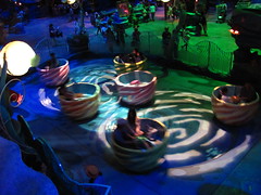
A year after Tokyo Disneyland demonstrated the potential for LPS tracking technology applied to dark rides for Pooh’s Hunny Hunt, Tokyo DisneySea opened Aquatopia to demonstrate the same technology’s potential for outdoors while submerged in two inches of water. It’s an oddly specific application that’s as technologically impressive as it is utterly pointless. The attraction takes some inspiration from older Disneyland Tomorrowland attractions such as Autotopia (obvious from the name) or the Motor Boat Cruises; but what it misses from those attractions is either the sense of going on a journey somewhere you can’t already see, or at least the sense of having some nominal control over that journey.
On Aquatopia, you can see the entire aquatic field your vehicles are permitted to wander as soon as you approach, and there’s nothing more for you to do than sit tight in your seat and wonder what your vehicle is going to do next. The ride has a peculiar start-stop rhythm as the LPS is constantly halting the vehicle to check its position and tell it what to do next, which is usually something silly like ‘spin around a couple times’ or ‘sit and watch a water fountain for several seconds.’ This is the “Simon Says” of theme park attractions: a frivolous guessing game of what the ride might randomly decide to do next, still just as fun as it is non-essential. Heck, I might even rate Aquatopia in the top half of Tokyo DisneySea’s attractions.
American Waterfront
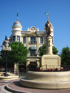
 New York has been depicted in lots of different theme parks before, especially at the Universal parks, but it usually boils down to a fairly generic architectural vernacular of brownstone facades featuring pizza quick service restaurants. Despite its generic name, American Waterfront is by far the most interesting of these interpretations. The focus is much more on evoking the rhythm and textures of a city rather than dwell in literally re-creating the obvious architectural forms. Instead, the built environment is allowed to get more expressive and fantastical with its mix of revival styles accumulated from across the globe, including plenty of greenscaping around the urban portion while a coastal dock area (anchored by the landmark S.S. Columbia ship-building) offers a grittier but vital counterpoint about a world in motion.
This is Tokyo DisneySea at its very best, and if there’s only one problem with American Waterfront, it’s what it says about the other lands in the park by contrast. Even a small Cape Cod-inspired annex across the western side of the land (with not much more than a shop and restaurant) feels all the more perfunctory and unnecessary by contrast.
DisneySea Electric Railway
I’m of the opinion that if a theme park includes a point-to-point transport attraction, it should function as a reasonably efficient public transportation option, and after that it should offer an experience you couldn’t otherwise have. The DisneySea Electric Railway probably isn’t a great example of that philosophy. The two-car trams are somewhat limited in capacity, and the short straight stretch between Port Discovery to American Waterfront (or vice-versa) doesn’t seem to particularly demand or benefit from a separate transit route. Most of the attraction’s purpose seems to be aesthetic in nature (if I were to guess, an elevated rail appeared in concept art for American Waterfront which everyone liked and thus made room in the attraction program for), although the elevated setting does work as a benefit for both spectators on the ground and riders up high. And in my case, I didn’t have to wait long at all, so apart from the somewhat short route it did indeed check most of the boxes I was looking for when it comes to transport attractions. Good thing too, considering that for its first five years of operation American Waterfront had no other rides apart from transport attractions.
DisneySea Steamer Line
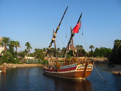
 During my brief research about the park the night before, I saw someone state that a Grand Circle Tour aboard the Steamer Line was an essential DisneySea experience. Having just arrived from Port Discovery aboard the Elevated Rail, I next wanted to take the steamers ¾ around their route from American Waterfront to Mediterranean Harbor. One of the small boats was just departing from the quiet station as I arrived, but the host assured me I had only a few minutes to wait for the next one. Twenty minutes later, the only reason I haven’t already bailed has been under the surefire knowledge that the instant I exit the (now full) queue would trigger the next steamer to finally arrive; plus, being first in line I figured I’d at least get first choice of seat for my circle tour.
 When the steamer finally did arrive, we were assigned seats in an efficient loading order, meaning that for my extra long wait I was required to take the far back left seat, with a prime view of the back of everyone’s heads and the concrete retaining wall along the park perimeter; meanwhile the latecomers were rewarded with seats on the front right side of the steamer with the clearest views into the park. This first leg of the journey was quite unrewarding from this vantage point, but I figured my portside view would improve on the next legs approaching Arabian Coast and, especially, through the center of Mysterious Island.
However, as we pulled into the Lost River Delta port, the captain’s Japanese spiel was immediately followed by everyone on the steamer rising in unison and departing; apparently you’re required to exit and re-board at each port to do the Grand Circle Tour? In either case I took one look at the huge queue spilling out along the pathway and decided my tour ended there. I’d have to hike halfway across the park, backtracking on the same route I’d just done to get to where I’d hoped the steamer would take me. While acknowledging I probably got very unlucky with the steamers this time, if I were to rank based strictly on my own personal experiences, the DisneySea Steamer Line would sit neck-and-neck with Stitch’s Great Escape at the Magic Kingdom as the most regretfully unpleasant Disney attraction I’ve ever experienced. And at least Stitch didn’t waste half as much of my time or energy when it was over.
Tower of Terror
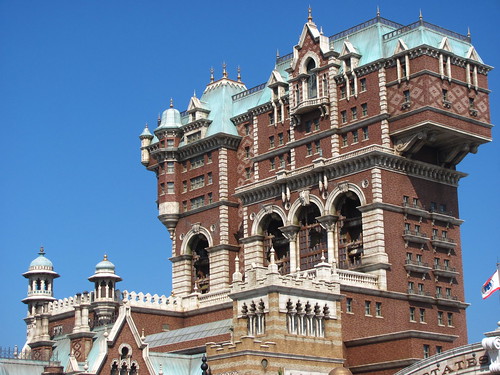
Of course the one ride with a strong anti-colonialism message would also feature Joe Rohde. Tokyo’s Tower of Terror, here absent the Twilight Zone branding and storyline, is a fascinating contrast to the sci-fi film noir style of the original, not least because this unbranded version actually commits to the kind of ironic and moralistic storytelling exemplified by the Twilight Zone (and which the branded versions generally lack in favor of mysterious supernatural vague gesturing).
 Harrison Hightower (modeled after Rohde) is a member of S.E.A., the Society of Explorers and Adventurers. Within his luxury hotel in New York he has amassed a collection of rare and valuable artifacts gathered (stolen) from around the world. The lobby appears like a warehouse for the British Museum (an institution with its own thorny relationship to the spoils of imperialism), with a stained glass window quoting Shakespeare: “The world is mine oyster, which I with sword will open.” Hightower has returned from Africa with the invaluable Shiriki Utundu idol, rumored to be cursed. Sure enough, when guests are given the chance to view the newest object in his ill begotten collection, the idol comes to life (with a toothy grin reminiscent of an airplane-eating gremlin) and promptly disappears from plain view in one of the best theme park magic effects ever devised.
The dark, moralistic tale against cultural imperialism and reckless adventurism serves as an interesting dialectical counterpoint against the nostalgic opulence of American Waterfront and even the entire thesis of Tokyo DisneySea itself, yet Tower of Terror is still very much representative of a theme park that’s often too reliant on pleasing the tastes and sensibilities of theme park designers first and foremost. (The deliberate prominence of Rohde as Hightower, despite his otherwise having no formal involvement with the project, is as much a form of idol worship for the small tribe of theme park fans and designers as any African deity.) Contrast this Tower to the Twilight Zone versions of the attraction, which all retained a canny understanding of genre and how to cross elements of horror and science fiction to instantly engage audiences within the story even if the narrative never made much sense. Tokyo’s Tower of Terror, on the other hand, largely rejects genre from its visual storytelling, replacing it with the exotic eclecticism of the S.E.A. storyline. This “Everything Gathered Here” trope highlights a very particular storytelling mode that, surveyed across all the arts, seems to appeal most specifically to the theme park folk. I suspect it’s out of the impulse to thematically organize and balance a disparate collection of identities within a single setting, an artistic approach unique to theme park design and thus often bleeds over into narrative writing as well.
 The result is not only a lot of excess visual and thematic noise trying to harmonize into a single note, but the resulting note isn’t even quite the right key for the whole piece. It’s possible I’m missing some detail from the Japanese narration (although anything visual is still in English), but placing so much focus on a small foreign idol causing hijinks seems to isolate and remove much of the symbolic resonance that should have been contained within the architecture of the tower itself, the far more important element of the physically constructed themed design. The elevator is practically incidental to the whole story, the nearest piece of technology for the Shiriki Utundu to curse… and why anyone would return to the elevator after getting such a detailed demonstration of the curse from the ghost of Hightower is a question left unanswered by the otherwise proactive narrative.
The ride itself is fairly similar to the California and Paris versions of Tower of Tower, including the main two show scenes before the drop sequence (only with Shiriki Utundu popping up for an appearance in each), somewhat blunting the attraction’s claim for a completely original storyline. Yet the biggest issue I had with this version of Tower of Terror isn’t anything related to the intriguing if inconsistent narrative, but a purely technical issue with the safety harnesses. Instead of the simple lap belt found on the other versions, Japan requires a three-point belt harness (just like a car seatbelt) that, combined with the low seatback design carried over from the other Towers, creates a rather tight fight for anyone over 5’. I’ve dealt with uncomfortable shoulder restraints plenty of times before, but the real problem is the fact that the restraint is completely one-sided, putting heavy lateral compression on my increasingly lopsided shoulders and spine during the G-force intensive program. Consider the subsequent chiropractor’s bill the real curse of the Shiriki Utundu.
Evening at Tokyo DisneySea
Returning to Mediterranean Harbor, I staked out a prime viewing spot for the nightly show of Fantasmic.
For the very last time I was in Asia, I watched the sun set over Mysterious Island.
I didn’t take any photos of Fantasmic!, focusing instead on just watching the night spectacular show and feeling present for my final evening after more than five months in Asia. (Plus my camera had consistently proven to suck with low-light photography involving any movement whatsoever, and I wanted to spare myself the aggravation.)
With still a couple hours left I made a final night round on several attractions now that most of the queues were cleared out.
By the end of the night here’s how I’d rank all the attractions at the park (as of 2011):
- Journey to the Center of the Earth
- Sindbad’s Storybook Voyage
- Indiana Jones Adventure: Temple of the Crystal Skull
- Tower of Terror (seatbelt knocks it down a couple)
- 20,000 Leagues Under the Sea
- Aquatopia
- DisneySea Electric Railway
- Raging Spirits
- Flounder’s Flying Fish Coaster
- StormRider
- DisneySea Steamer Line
But I still had one final task left ahead of me before heading back to my hostel. With a few unused Japanese yen bills left in my wallet, I wanted to get a souvenir before I left. Specifically, I wanted a refrigerator magnet with a “Tokyo Disney” logo, as I had already collected one from Disneyland Paris, Disneyland California, and Hong Kong Disneyland. (I’d later collect my Walt Disney World and Shanghai Disneyland magnets on my first visits to those resorts in 2012 and 2016.)
 So I checked several smaller gift shops around Tokyo DisneySea. Nothing that met my needs. (I do recall finding a single t-shirt for Journey to the Center of the Earth I briefly considered until I noticed the price tag equated to over $50USD.) I went to the main gift shops in Mediterranean Harbor as the park was closing. Still no magnets, let alone anything branded to the Tokyo Disney Resort. As a last resort, I spent nearly a half hour scouring the massive souvenir store outside the park gates. The only magnets were a generic Mickey Mouse collection, and I couldn’t find anything with the word “Tokyo” printed on it, or references to any other attraction or experience at the parks. Just rows upon rows of the kinds of generic Disney Store character plushies, tchotchkes, and edibles.
Finally, along one lonely shelf, I found a collection of bumper stickers on the bottom row which included the TDL and TDS logos. That would have to do. These never went on my car because I didn’t have a car of my own at the time, and by the time I did these stickers had long gotten lost.
Even if the reasoning for this merchandising selection is because the audience is like 98% Japanese and those visitors only want Disney characters, across thousands of merchandise items and millions of annual guests I find it hard to believe that they’re not leaving money on the table with this retail strategy. I certainly walked away appreciative of the irony that I couldn’t find a way to spend money in a Disney gift shop when I was practically begging to give them my cash. A surreal way to conclude my time in Asia.






















Footnotes & Annotations
[1] I’m not counting shows, which I didn’t see myself but have heard are Very Good. Also since my visit, copies of Toy Story Mania and Soarin’ have been added; not exactly game changers to the ride lineup I’d book a future trip to Tokyo for.
[2] This is also why introducing an IP-based land to a previously non-IP park can upset that sense of balance for fans.
[3] Mysterious Island and Mermaid Lagoon also don’t quite fit the park’s thematic pattern for some of their own reasons, but in terms of place, Mysterious Island still feels like a real albeit undiscovered island, while “under the sea” counts for Mermaid Lagoon.
Great article! It was a lot of fun to read! Normally, I find your park takes to be really interesting and thought-provoking but I seldom find myself in full agreement. But you seem to have hit the nail on the head for what’s bothered me about this park (at least, from vantage point of having never actually visited…).
A lot of Disney park fans sing DisneySea’s praises, but it’s always seemed kind of cold and intellectual to me, in a way that even Epcot doesn’t. I think a lot of people place a lot of weight on how expensive something looks when judging the value of it – it infects AAA gaming, Broadway, film, and theme parks, and it drives me crazy. DisneySea looks extravagant, but that’s about all. Watching park visit videos, it just sort of feels like the huge budget mostly served to mute the sense of fun, charm, or relatable character that I like in parks like Disneyland. Sometimes theater is more fun when you can see the strings, after all 😛
Your description of the park as a place for Imagineers to go hog wild on their pet projects feels exactly right, too. I shouldn’t say that like it’s necessarily a bad thing, as arguably that’s all Disneyland was in 1955 (minus the budget), but it has the feeling of a nerdy 7th-grade theme park fan carefully plotting out a well-reasoned theme park layout on the back of a notebook and being given the budget to actually make it happen.
I have to ask, though – if TDS is your #4 Disney park, what are the top 3? From elsewhere in the article I would guess Animal Kingdom and Disneyland Paris, but I can’t figure out the other.
Hey Chris, sorry for my delayed response. Those are some great points you make. Of course there is more to a park like this than just extravagance for extravagance’s sake (which I think might more aptly apply to a critique of something like the Atlantis water parks), but it doesn’t help that the extravagance does often feel like it’s getting in its own way. Absolutely correct about wanting to see the strings!
In terms of my own ranking of the Disney parks, the original Disneyland would round out (and likely top) my top three. I made a somewhat snarky Twitter list some time back that laid out my exact rankings and thoughts on each: https://twitter.com/RCPhilosophy/status/1284214410274238466
Nice lol. What, no Walt Disney Studios, Paris? 😛