Given the title of this website (at least the “philosophy” part of the title, not the “roller coaster” part), the EPCOT Center should have been an ideal subject to critically review, and maybe even champion. EPCOT Center was the rare theme park in which the word “theme” referred to underlying ideas and an overarching philosophy, rather than simply the decorations that simulate some sort of Baudrillardian fantasy environment (although there was also plenty of that at the EPCOT Center as well). Public intellectuals such as Ray Bradbury lent a hand in the design process, and their goal was perhaps the most ambitious ever envisaged for a theme park: to change the world for the better. Split between Future World and the World Showcase, the narrative of a visit to the EPCOT Center was designed to ask the audience two very important questions. First, where are we going? And second, where did we come from? One eye to the future and one eye to the past, and this epic story of human’s capacity for wonder and enlightenment unfolds over the course of a single day. Here’s food for thought: why did the designers choose a park layout in which you would encounter these philosophical themes in “reverse chronology” rather than the other way around?
One possible interpretation I’d like to offer is that, as an “Experimental Prototype Community of Tomorrow”, EPCOT Center wanted to represent the best aspects of capitalism, communism, and fascism within a single master plan for a utopian community. And before I get any complaints in the comments, please note I said the best aspects. From capitalism you get a technologically determined civilization in which the best people with the brightest ideas are enabled to rise to the top for the economic betterment of all society. From communism you get a global community of multicultural citizens all working for the common good of mankind within a (superficially, at least) classless society. And from fascism you get the centralized mechanism that organizes it all, directing humankind towards a singular agenda (which is not “let’s exterminate the Jews!”). The EPCOT Center was to be the 21st century’s shining city upon a hill, built in a state where the sun shines brightly but there are no hills.
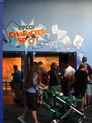
 I refer to this all in the past tense, of course, because the EPCOT Center is no more. In its place we have Epcot, a theme park built upon great optimism that has become faded by about two decades of compromise. Cartoon characters or famous faces abound, based on a criterion that included them wherever they could be rather than wherever they should be. Attractions frequently have little or no thematic purpose for the message of the park and its individual chapters, seemingly added to Epcot on the belief that if you build it they will come.1 And for a park founded upon an ideal of universal connectedness it’s become oddly segregated into three distinct marketing demographics, with Future World East aimed at thrill seekers, Future World West appealing primarily to children, and the World Showcase becoming the adult hangout, with its emphasis on touring the world through food, drink, and culture porn. (More on that later.)
Although Epcot is still arguably one of the most experimental theme parks in the world today, missing from it is a sense of challenge, where deeper levels of engagement with the park’s narrative will provide greater reward. Everything goes too far out of its way to intentionally please our sensibilities, as if management is overcompensating to reverse the perception that the original park was too serious and not enough fun (which I’m not suggesting couldn’t also be a legitimate criticism). Much of Epcot has unfortunately settled into an awkward intermediary between popular entertainment and pop-intellectualism, where an educational pretense is outwardly projected, concealing an interior ride, show, or game in which the primary function is amusement, and with a single obvious token message spelled out in big letters that doesn’t require (or even request) any thought in order to accept its apparent validity. The “educational” aspect is frequently too conspicuous to ignore, yet too superficial to reflect on. If the delivery of Epcot’s messages was doing what it was supposed to do as a “Permanent World’s Fair”, then upon finishing an attraction the question should be “What did I think about it?” or even “Do I agree with it?”, not simply “Did I like it?”. This seems to be the dividing line that separates the way we respond to work labeled “art” versus “entertainment”. However ambitious or visionary Epcot might be, it’s still a theme park and in this culture theme parks wear a fixed label
 that reads “escapist entertainment”. It should be no surprise that after thirty years Epcot would eventually follow the lead of market demand.
Is it better to have tried and failed than to have not tried at all? I’m sympathetic to the frustration felt when an ambitious work that I admire is harshly criticized for its shortcomings, especially when the same critics lavish praise on other works that are plainly by-the-numbers crowd pleasers that only succeed at what they’re supposed to do and nothing more. When creating something original it can often be extremely difficult to find the right combination of words, or arrangement of imagery, or chord progression that is able to express what has never been expressed before. Nevertheless I don’t think Epcot can be excused of its flaws so easily just because it tried something new. For one, it’s abundantly clear that Epcot is not the creative vision of one individual, but the result of many hundreds of visions across several decades of time. Good and bad influences can be identified without disrupting any sort of holistic artistic process, and Epcot still has the capacity to be a better park tomorrow than it was yesterday.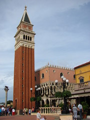
But even acknowledging that such bad influences exist, it’s easy to hypothesize that if Epcot had stayed true to the original vision put forth by Walt and resisted commercial compromise, it would have been great. Perhaps for some it would have been, but at its core Disney’s ideology has always been a brand of conservative populism that, even if communicated flawlessly, I doubt I’d ever find myself a full supporter of. Disney parks in general and Epcot in particular are designed to be very manipulative places. I don’t mean to imply a negative connotation, since that manipulative quality is very much part of the popular mythology that makes Disney loved by so many people (but also hated by some). Everything is clean and controlled at a Disney park, and it’s fun to look for the cracks within the perfectly orchestrated show only because everyone knows you won’t be able to find them… and if you do that’s a very bad thing. There have been plenty of attempts throughout history, both before and after Epcot, to create a utopia on Earth by means of urban planning, and have been done under the banners of capitalism, communism, and fascism. What most of them have in common is the plan wants to be in control, so it can lead us flawed humans to realize our full potential and discover the ideal solution without any dissenters that become radically disruptive. Sitting in our privileged seats at the edge of postmodernism it’s easy to see why these plans never completely work, and I have no reason to believe that Epcot, if done right, would have been the exception. My answer to Epcot’s grand questions about itself: this is not where we should go from here, or who we all are.
Future World East
It’s ironic that a place called “Future World” would be so obsessed with the past. Many of the original attractions such as Spaceship Earth were much more about the history of technology rather than presenting a vision of the future. Perhaps the designers just didn’t want to repeat themselves with the never-ending updates required for Tomorrowland, but by showcasing the history of communications or transportation or agriculture and then naming it our “future”, Disney again sets themselves up for more easy criticism from the intellectual sphere that they promote a version of history that views technology as the primary driver of cultural progress that societies must adapt to. Perhaps they could have spared themselves from misinterpretations and simply called it Disney’s Museum of Science and Industry, but then no one would want to pay nearly $100 for a one-day ticket. Besides, most of today’s Future World, particularly Future World East, consists of thrill rides that use rather free definitions of modern science and industry. In my opinion the best thing that can be said about Future World is the number of structures that could be of some interest to students of architecture and design. Most notable among these examples is Epcot’s magnificent centerpiece that leaves contradictory impressions of an impossibly enormous mass effortlessly suspended in space.
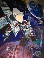
What is the great difference between man and the animals? Assuming the answer is not just man’s hubris that makes him so cocksure there is a great difference, it would seem to be found somewhere in Homo sapiens’s ability to symbolize both concrete objects and abstract ideas to others of his species through the shared meaning of language. This is the premise of Spaceship Earth, which presents the history of civilization (from cavemen to Steve Wozniak, even giving the Phoenicians a brief shout-out) from the context of information and communication; the yin and yang of the technological world. Could this choice of interpretation be a philosophical statement about the forces that guide the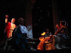 development of society, or is it just the result of the ride’s sponsorship by telecommunication companies? Probably some of both, although refracting such broad subject matter through this thematically narrow prism brings the risk of anachronistic historical reductionism, such as the narrator’s (voiced by Judi Dench) claim that the Roman roads were the first information network, as if the ancient Romans were already anticipating the invention of the World Wide Web in 200 B.C. Has communication been the driver of history, or are there other forces at work as well? It’s a fair question, although I won’t be offended if Spaceship Earth leaves a few things unanswered as it’s such a tremendous aesthetic vision that it’s hard not to be impressed regardless. There’s a point at which we’re looking up at a starry night sky, then our seats rotate and the stars transform
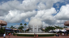 into a fiber optic digital grid that we fall backwards through, and my mind hasn’t been this blown since I first saw the “Jupiter and Beyond the Infinite” section of 2001: A Space Odyssey. Unfortunately this is immediately followed by a silly interactive cartoon short that shows our choice of future selves, and while the ability to make faces for the camera offers some reride value for jokesters, the bright puerile tone is a jarring contrast to the dimly austere attraction we had been riding before that point. WWRBT: What Would Ray Bradbury Think?
Innoventions
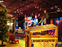
The Innoventions West pavilion appeared to be mostly a character meet-and-greet hall when I walked through, but Innoventions East was home to a few interactive exhibits that seemed more worth my time. Most notably The Sum of All Thrills, which lets you design your own virtual roller coaster on a touch screen and then ride a simulation of it on a Kuka Robocoaster arm. The mission of the exhibit is to inspire the next generation of mathematicians, engineers, and scientists, although I couldn’t help but feel they were setting up kids for disappointment by representing the coaster design profession as run by chicly dressed 20-somethings who play on swivel chairs and listen to rock music all day in an expensive contemporary office filled with state-of-the-art touchscreen computers. Nearby is the VISION House, a guided tour through the home of Hugo and Nadine Monteverde to demonstrate the latest and greatest in environmentally friendly home technology. The tour is almost entirely a direct sales pitch for various products, recalling Future World’s original purpose of corporate showcasing, updated for 21st century consumers. I have to admit they did a pretty good sales job as not only did they have our group gather around to admire a smart-eco-toilet, but people were eager to feel and sit on the toilet for themselves after the presentation was over. For me however the tour was far more exotic: a simulation of a
 green upper-middle class domestic lifestyle that I doubt I’ll ever attain, nor do I particularly desire.
Grade: C
Universe of Energy
There’s a lot of acclaim associated with the title of the world’s biggest and longest roller coaster, but the title for world’s biggest and longest dark ride goes relatively unrecognized. If there’s one thing I admire most about the Universe of Energy, it’s how stunningly big it is. The show takes place within several massive cavernous rooms filled with either animatronic dinosaurs or wrap around projection screens. Three cars travel together either inline or side-by-side, and each car can seat approximately a hundred passengers, making it less of a dark ride and more of a moving auditorium. We’re warned before boarding that the ride will take thirty seven minutes to complete (so make sure you won’t need to go to the bathroom), and this time doesn’t even include the eight minute preshow film. Even the most jaded must feel a few subliminal stirrings deep down when immersed inside anything of such unquantifiable scale. I also enjoy that the narrative is relatively non-conventional amongst theme park attractions, as the long runtime allows it to go down some unexpected tangential paths, and it can be hard to predict what will happen next. Part of this is due to hosts Ellen DeGeneres and Bill Nye, whose improvisational acting style
 (supposedly all taking place within a lucid dream of Ellen’s) seems to have heavily influenced the show writers as well. And while I appreciate that Disney allowed one of their major attractions to contain so much irreverent humor, there’s also a lot irrelevant humor. The 1996 makeover into “Ellen’s Energy Adventure” can seem eerily dated for today’s audiences, hurt mostly by the ironic lampooning of 90’s-era sitcom and game show tropes, but also because Ellen and Bill, both still popular media figures, clearly don’t look the same now as they did over a decade ago. There’s a few things to learn along the way (e.g. the pros and cons of various electric energy sources, or that the Big Bang was an event that probably happened), but spread across forty five minutes it can start to feel educationally flimsy, with too much time
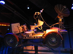 devoted to directionless comedic rambling. Should the Universe of Energy ever get a third incarnation, let’s hope Imagineering can fine tune the story beats to strike a more careful balance between information and entertainment.2
Grade: C+
Mission: SPACE
There are two reasons to do Mission: SPACE. The first reason is to do it for America. Because there are incredibly brave men and women who spend years testing their physical endurance to put their lives at risk so we can learn more about how awesome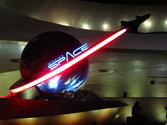 space is. But the other reason is to do it for Gary Sinise. We’d make him proud. It’s the image of Gary looking wistfully beyond us as a lone heroic trumpet croons in the background that I keep in mind as I try to concentrate on pressing the auxiliary supply button when I’m told to, otherwise our mission could fail. Or maybe the computer will override if I miss my cue, as it did for all of my incompetent crew mates. Or maybe it doesn’t matter because I think this was a training simulation anyway. They sort of changed their mind halfway through on whether this mission is a (fake) fake training exercise or a (fake) real mission to Mars, which would be good to know before we’re frozen in liquid hydrogen for eight months. Whichever it is, the journey is astonishingly lifelike… meaning if life were like an action sequence from Captain Video, complete with
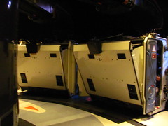 a literal cliffhanger ending where you have to hold your breath to not fall off the cliff, because physics works like that. Another way that physics apparently works is that if you look down or to the side during four G’s of linear acceleration force you will instantly become incredibly nauseous, a sensation that one would normally associate with being in a centrifuge. Once we’ve landed I’m pleased to hear I made Gary proud… otherwise there’s no other reason why I’d want to sit in a claustrophobic room that does nothing but simulate the sensation of being sat on while watching a tiny video screen sixteen inches from my face with some inconsequential Quick Time Events thrown in, and it can’t even manage decent capacity.
Grade: D
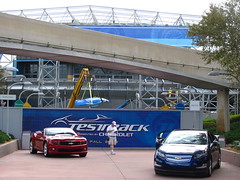
…was closed for its refurbishment into the TRON-influenced Test Track 2.0 at the time of my visit. I had been on the original version back in 2001 and was the only ride that day I loved enough to immediately go around again, so it was simultaneously disappointing but also fortunate that this would be the only major attraction I’d miss due to rehab between all four Disney World parks. I’m uncertain how I feel about the new Test Track from looking at videos since its reopening, since the digitized aesthetic appears to conflict with the nuts-and-bolts mechanics that gave certain scenes from the original ride their purpose, although obviously I’ll have to return to see for myself.
 Future World West
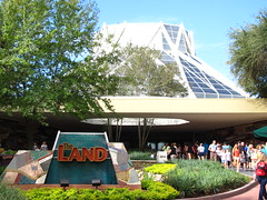
Epcot seems to have been designed specifically to mess with my capsule review format. Rather than easily defined individual attractions, Future World West consists of three large pavilions, each of which contains one or two conventional attractions alongside a number of displays or interactive exhibits that tie each pavilion’s organizing theme together. They are “The Seas with Nemo & Friends” (an aquarium with a dark ride), “The Land” (sort of a natural history/ecology museum that also features the ever-popular Soarin’), and “Imagination!” (a children’s discovery museum). Of the three, “The Land” is the most fully realized with some pleasing artistic flourishes free from overt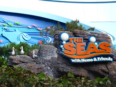 Disneyfication, while “Imagination!” is the most in need of a reimagining, and the extensively cartoonified “The Seas” seems more appropriate to the Magic Kingdom than a discovery park like Epcot. There are plenty of aquariums, natural history museums, and children’s museums across the country that do this sort of thing much better than Disney, albeit without rides.
The Seas with Nemo & Friends
This is where Epcot jumps the shark. It’s the moment of recognition that whatever values Epcot was once founded upon have been so thoroughly compromised by marketing gimmicks in a desperate scramble to retain popularity that a recovery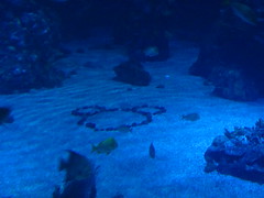 to whatever the ideal once was is now beyond the reach of possibility. The Seas with Nemo & Friends starts with a five minute omnimover dark ride through the film Finding Nemo. The show writers make no attempt to integrate the narrative with the rest of the pavilion’s sea life, it’s merely a chance to mime favorite quotes or scenes from the movie, and during the musical finale they can use the aquariums filled with living fish as backdrops to project holographic singing CGI fish in the foreground, leaving us with no doubts about Disney’s ranking of importance between nature’s creations and their own. The brand awareness continues once we’re back on our feet in the pavilion with the Turtle Talk with Crush digital puppet show, although there are also some aquariums to look at for those who want to. The main aquarium, despite the remarkable size of the tank,
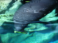 is exceedingly perfunctory, filled with a rocky gravel bed, a few non-descript schooling fish and, most thrillingly, a hidden Mickey. A few smaller aquariums in side chambers are much more interesting, filled with things like eels and lionfish, all creatures we’ve probably seen before at any moderate sized public aquarium, but always cool to look at up close nonetheless. While most of the pavilion feels like a forgotten relic of the EPCOT Center with a contemporary overlay designed to move Nemo plush off the shelves at the exit, the manatee room proved to be a refreshing exception. A quiet atmosphere removed of all cartoon references, there was at long last a sense of real urgency in their message about these endangered Floridian creatures, themselves content to gracefully float through the water chewing on their lettuce heads
 with a complete lack of urgency.
Grade: D+
Living with the Land
This could have very well been called “It’s a Green World”. Like “Small World”, Living with the Land is a (very) slow-moving boat ride past repetitive scenes depicting a utopian ideal for future generations, in this case Sustainable Agriculture instead of World Peace. Doesn’t quite have the same ring, does it? Of course there are major differences as well: instead of an endlessly looping theme song there’s actual on-board narration to describe what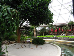 we’re looking at and to make the thematic concepts perfectly obvious; and in place of the expressionistic sets, Living with the Land strives for total scientific verisimilitude by replicating a hydroponic greenhouse that we’re led to believe is where real research is being carried out by Disney’s elite team of ghost scientists. This is one of the few “serious” attractions left in Future World, unsullied by cartoon characters, comedians, or flashy visuals to periodically distract us from realizing we might be learning something. However this begs the question of what Living with the Land has to teach? We’re barraged by a series of facts for the nearly fifteen minute ride time, although by the end of the boat journey I had to wonder how these individual facts could be summed into an overarching message. Most of the narration is focused on how science has
 advanced to the point that we can grow a food surplus efficiently and responsibly anywhere in the world, thanks to the many unspecified “scientists” working for never-named agricultural companies and research labs across the globe. Why do millions of annual visitors need to hear this message in particular when there are so many others that also have important relevance to the land? One interpretation could be that this is a superficial “peek behind the curtains” intended to assuage any doubting consumers that everything you buy on today’s shelves is clean and green, as there are plenty of smart people working for socially responsible corporations that have figured out all the ethical complexities for us… so stop worrying, stop writing to your representative, and keep eating whatever it is Big Agra puts on your table. Sometimes I think Disney is overrated in its
 abilities to tell a story, but perhaps I now realize that the message is always communicated brilliantly, it’s just not the message I originally thought to look for.
Grade: C-
Soarin’
I should give up. This review mystifies me. People love Soarin’, and I have no clue why. I can perfectly understand and sympathize with why people enjoy Soarin’. It dangles you in front of a huge movie screen and shows a five minute reel of aerial footage around California accompanied a typical heroic orchestral soundtrack. But that doesn’t explain why Soarin’ is seemingly the most loved ride of, not only Epcot, but the entirety of Walt Disney World. While the other rides in Epcot had ten minute waits all day with Fast Passes generally valid between a half hour to an hour after the current time, Soarin’ requires a Fast Pass pick-up first thing in the morning just to secure an afternoon timeslot, and if you’re starting later in the day then you’re shit out of luck unless you feel like joining a two hour stand-by queue. The only other ride in the resort that comes close to this type of crowd pattern is Toy Story Mania at Disney’s Hollywood Studio, interestingly yet another attraction that consists of sitting in front of a video screen, doing what you could already do at home only with much more peripheral immersion. Even granting that it hits the “appropriate for all ages” bull’s-eye
 while gleefully ditching any semblance of educational value, this sheer amount of popularity can’t be explained. It’s hidden far away in the back corner of the basement floor of The Land pavilion, with the most inconspicuous, off-the-beaten-path entrance imaginable at Epcot. There’s no external visual icon to identify the ride by, as there is for pretty much every other major attraction in the park. It’s not even thematically appropriate for The Land, since they copied the exact same short film from Disney California Adventure, and in Florida there’s almost no justification or even mention for why our flight will take place exclusively around random, sometimes
 not entirely remarkable west coast locales. Oddly, I don’t recall Soarin’ over California ever being nearly this popular, which is kind of odd given that there it’s one of the park’s centerpiece attractions that establishes the core theme of the entire park. It’s like the odd K-pop song that was nothing notable on its home shores, but the process of exporting it abroad created a surprise viral hit through an unexplained snowball of word-of-mouth. There’s not much I can say or do except go along for the ride… or avoid it entirely, given the posted stand-by wait.
Grade: D+
Journey Into Imagination With Figment
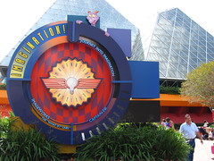 Less than a minute into it I was already racking my brain trying to figure out if this dark ride was a physical theme park example of Poe’s Law or not. Clearly the purple dragon named Figment was a parody of the flamboyant kid’s show personality that’s a little too eager to stuff your face full of happiness. The theme song was obviously manufactured to poke fun at those upbeat, endlessly repeatable tunes that burrow deep inside your brain like a parasitic worm. We’re supposed to be a little annoyed by it all, and these first scenes are just part of a big conceptual comedy skit. Dr. Nigel Channing, the beleaguered straight man character against the cartoon Figment’s overbearing personality, was surely going to break down at the end, do something to interrupt Figment’s hijacking of the show, or at very least direct a subtle
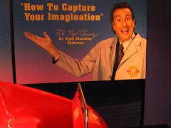 nudge-nudge wink-wink to the adults in the audience while their kids remain distracted by the bright colors and lights. He had to, as they clearly cast Eric Idle in the role to appeal to those familiar with his extensive background in satire that goes to the extreme before pulling the rug out from underneath, rather than waste his celebrity on children who think Monty Pythons can be found in the Amazon. This ride can’t be serious about its utter nonsensical ridiculousness. Can it?
Grade: D
World Showcase
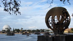 The World Showcase has a reputation of being a theme park for adults, probably because of the relative disproportion between children’s entertainment and alcohol consumption for a Disney park. Apparently this implies that the main pleasures to be discovered in adulthood involve eating and drinking, as well as sedentarily looking at cultural objects. From the perspective of a theme park patron, my biggest criticism is that the World Showcase can’t all be enjoyed in a single visit, as the primary way to experience each of the nation’s pavilions is by sitting down at a table and sampling the local cuisine. But even if you’ve got the money to spend and the
 waistline to expand, it can be hard to stretch this out over more than three or four of the eleven countries. I suspect this makes the World Showcase excellent for annual passholders who visit frequently and are in no rush to “see it all”, as the food and beverage options are considerably more diverse than can be found in a typical retail village and the showcase requires a more relaxed pace to appreciate it in full. However from the perspective of a general cultural observer there might be bigger criticisms about the stereotyping of national identities, the largely Eurocentric selection of pavilions that preferences America’s top trading partners, or the appropriation of symbols of high culture for middle class entertainment. Perhaps the World Showcase isn’t so much a theme park for adults as it is a theme park for the petty bourgeoisie.
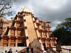
Mexico (Gran Fiesta Tour Starring The Three Caballeros)
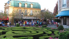
Although credited as the Three Caballeros, this slow-moving boat ride (Disney has a thing for slow-moving boat rides) is more specifically starring Donald Duck on center stage, with supporting roles by Panchito Pistoles and José Carioca, and Mexico cast as a background bit player. Unsurprisingly this ride (re)opened the same year as The Seas with Nemo and Friends, the other Epcot attraction that feels most distinctly like the brainchild of a particularly dispiriting marketing department meeting. Stylistically the zany, high-energy hi-jinks of the Three Caballeros does not mesh well with the languid pacing of the water canals and atmospheric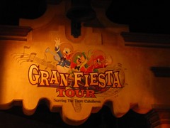 sets left over from the former El Rio del Tiempo. The rest of the Mexico pavilion is nice to explore as it’s mostly located indoors and perfectly demonstrates Disney’s mastery of controlled environmental spaces. However it is a little weird to walk into a Mayan pyramid during the day, only to find inside another smaller Mayan pyramid under a night sky, like a strange Mexican-Russian stacking doll.
Grade: D+
Norway (Maelstrom)
Norway is the newest expansion of the World Showcase, although it’s still older than I am which should tell you something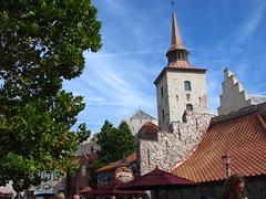 about the relative importance of the World Showcase to Disney executives in recent decades. Doing my research online, I’m surprised by how many new attractions and pavilions have been seriously proposed over the years, and yet none of these proposals since Norway have ever seen the light of day (e.g. both Germany and Japan had large show buildings built behind their pavilions to house rides-through attractions that thirty years later have yet to be filled). Anyway, Norway is a glimpse of the World Showcase that might have become, containing the area’s first and still only foray into the world of moderately pulse-quickening thrill rides that define Future World with Maelstrom. Trolls and Norse mythology figure heavily into the flume ride’s storyline, along with a backward section and a 28 foot plunge into the North Sea. It could almost be the
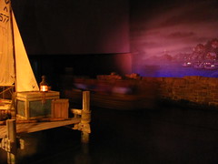 missing link between Pirates of the Caribbean and Expedition Everest, if only it wasn’t so brief (just over four minutes long) and promises more adventure than it can actually muster. While it’s still probably a favorite of many ride aficionados who visit the World Showcase, I’d like to see how many of those enthusiasts stick around for the six minute post-ride Norwegian promotional film.
Grade: C
China (Reflections on China)
Anyone worried that the World Showcase pavilions might be treated as substitutes for actual world travel can be assured that there is often little similarity between the original nation and its Disneyfied replica in Florida. Case in point: the real China isn’t anywhere near this clean. Cover the sky with a milky film, pack the homes and shops like they’re all owned by pathological hoarders, and throw a couple used condoms on the sidewalks, and that will much more closely approximate an actual visit to China. You know what else? I prefer that version of China. Looking at important landmarks or admiring stereotypical Chinese culture (at least by Westerner’s assumptions of what “Chinese culture” is like) usually makes up only a small percentage of time spent abroad, and it’s in that other larger percentage that the most interesting things are usually discovered, especially if the traveler is receptive to ambiguities that challenge their need to comprehend everything witnessed
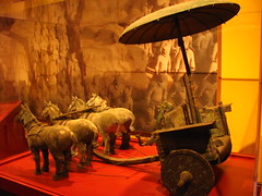 around them. By itself this isn’t a criticism of Disney, since if treated as a massive, interactive, and spoiler-free travel brochure, the World Showcase does an excellent job at either selling airline tickets or allowing a half hour’s escapist fantasy for those who can’t afford transoceanic travel. Still, I worry that the World Showcase pavilions might manufacture a visitor mindset that becomes too focused on “Culture” while deemphasizing a personal appreciation of culture.
Grade: C-
Germany
I’m not the best person to comment on this pavilion’s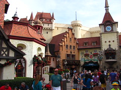 verisimilitude to the actual Germany, as I’ve only visited the country once for a couple days, and only to go to German theme parks that featured simulacra of German culture. What I can comment on is that Disney’s portrayal of Deutschland is somewhat more romanticized than the German meta-theme parks I’ve been to, borrowing heavily from internationally recognizable imagery from Grimm folk stories, with several of the façades decorated to evoke a three-dimensional children’s picture book more than anything found in reality. With limiting constraints there will always be a need to selectively interpret the depiction of any nation, it’s just too bad that Epcot selected one that most readily recalls the Magic Kingdom’s own Fantasyland. No krautrock, no deal.
Primarily a re-creation of Venice, with the Doge’s Palace and St Mark’s Campanile as the main landmarks. It’s fitting, since modern Venice is basically a theme park already: a 100% tourism-based economy with a single entrance point, cultural attractions ranging from A- to E-tickets, and navigable primary by foot with map in hand or occasionally by novelty transport. The menu I checked out in front of the restaurants had a lot of hard Italian that provided limited translation, which I appreciated as a chance to check my reading proficiency after several months since my last practice. Too bad I had already eaten in China, so I’ll have to wait till next time to try to impress the waitress by ordering un bicchiere d’acqua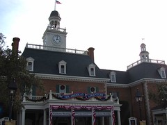 and become the thousandth douche bag tourist to do so.
The American Adventure
The United State’s placement at the center of the world (showcase) is an eyebrow raising bit of political subtext, although I suppose it’s hardly unexpected as Disney had to give the center pavilion position to someone, and they sure as hell weren’t going to inadvertently suggest anything by giving it to China. The American Adventure consists primarily of a single “Independence Hall-ish” looking building that contains an animatronic stage show of the same name, making it the least interesting pavilion for explorers to discover, yet the show is also one of the most essential of the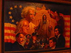 World Showcase. At least, it’s the most elaborate, and stunning if only for its technical complexity. Our hosts for the show are none other than Benjamin Franklin and Mark Twain, who are introduced without a hint of irony; of course who else should they be? The show takes us on a whirlwind summary of American history, organized around a central theme of the spirits and ideals that make America the greatest country in the world… which, by the way, it totally is. It seems that Disney stereotypes no nation better than its own, as the revolutionary American backdrop for a nationalistic civics lesson about the triumphs and compassion of white males is most faithfully reproduced from their own Liberty Square at the Magic Kingdom. There are many spirits that represent Disney’s version of America, but the spirit of diversity of thought is not one of them.
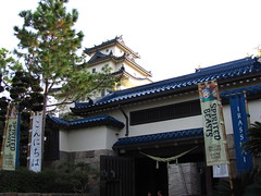
Grade: C
Japan
My vote for the “most realistic” of the World Showcase pavilions, probably in part because Japan is already as clean and efficiently organized as a Disney theme park, and because there’s less reliance on forced perspective design techniques to make the buildings look taller and more magnificent than they actually are. Or it’s just because as a westerner my eyes are less sensitive to inaccuracies than in the European or North American pavilions. Small flourishes of contemporary Japan make an appearance alongside the customary pagodas and shrines (e.g. the crisp angular architecture of a sushi bar, or a modern museum currently housing an exhibit on Japanese manga and anime), a rare exception within the historical mythology focus of the rest of the World Showcase. Then again, this pavilion was built at a time when Japan was a global economic powerhouse and looked poised to lead the world into the 21st century,3 so perhaps these design touches are Epcot’s way to include some forward-looking mythology for the benefit of the U.S.’s (former) closest trading partner.
Morocco
I wonder if all the brown people who work here count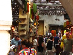 as theming? Does that question make me racist? Of course I know that the Moroccan government sponsors this pavilion, and all the employees are Moroccan citizens participating in Disney’s Cultural Representative Program. Apparently many of the mosaic buildings were even designed by native artisans at the behest of Morocco’s king, in order to ensure the most accurate depictions of Islamic art and architecture. But is it necessarily the case that something is no longer considered “themed” if it succeeds every test of authenticity, even if the contextual environment is that of a theme park rather than its home soil? If so, then that would mean that “perfectly realistic theming” is a logical absurdity and all realistically themed environments are either imperfect or else it crosses an invisible threshold and becomes a genuine Moroccan plaza; if not,
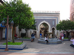 then theme parks that use “found objects” taken from their home environment can still be considered to be “themed”, and everything in it contributes to the theming. But also if not, then wouldn’t the nationality and genetic makeup of the employees be considered (at least from the perspective of the theme park and its patrons) as a more detailed extension of the costumes that cast members already don to make a themed environment more believable? Isn’t our simulated sense of immersion into a distant place enhanced if the people serving us have different complexions from us and speak with a different accent? Perhaps we should just find a new nomenclature that avoids the word “theming” altogether, and the can of worms it can potentially open up.
France (Impressions de France)
This is some high quality culture porn. And I’m not calling it that only to make a joke. This eighteen minute five-panel widescreen film is quite literally pornographic. The content is obviously quite different from traditional pornography (although the World Showcase is aimed for “adults”, Epcot is still a family theme park, after all), but the aesthetic form and purpose of Impressions de France shares much in common. It’s the fetishization of an idealized image for instant gratification; only instead of sexual gratification it’s cultural gratification. You sit down as an anonymous spectator in a dark room, where celluloid images are projected on a screen to simulate various objects or activities of desire, even though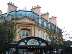 we can’t personally participate with these images beyond the boundaries of our voyeuristic imaginations, and however unrealistic the possibility of living out these images might be. We want to have the version of France we see on the screen. This function is why I think pornography is the closest cinematic comparison, since as a documentary there’s little of informational value, and as an impressionistic art film “Impressions” skimps on artistic innovation in favor of overly aestheticized montages accompanied by a popular selection of French classical music and occasional voiceovers by Pepé Le Pew. The biggest formal distinction between porn and “Impressions” I could find is that the typical angle of the “money shot” replaces the extreme close-up with wide aerial panoramas of French landscapes and landmarks, although the
 close-up angle makes some appearances as well, notably in the early money shots of pastries.4 At the end of the show we rise and exit from the dark privacy of our seats, everyone’s appetites for French travel and lifestyle momentarily satiated, but a few of us also sharing a bit of dirty guilt for having gotten off on a theme park simulation, rather than putting in the extra effort to get the real thing.
Grade: D+
United Kingdom
 Probably the most drab and boring of the World Showcase pavilions, although I suppose that makes it a perfect representation of the U.K. Perhaps part of it could be a matter of sequence. The U.K. was already going to have difficulty following any act put before it, but if you go clockwise around the World Showcase lagoon like I did that means you’ll start fresh with the fiery allure of Mexico and then go troll hunting down waterfalls in Norway, but must finish here with sore feet and the jaded eyes of a make-believe globe hopper. Go counter-clockwise, and the brick walls and thatched roofs might somehow appear exotically exciting, as the only other nation that has a chance to upstage England’s green and pleasant lands in your world tour so far would have been Canada. Speaking of which…
A tribute to Martin Short starring Canada, and I’ll have to spend fifteen minutes of my life just waiting for the next show to start? Uhh… sorry, no thanks. I know there’s the critic’s duty to see everything with impartial eyes before making a judgment, but this is asking too much from me. I’ll just look at the pretty Canadian Rocky Mountain landscaping for a few minutes and try to resist making a Canada joke.
IllumiNations: Reflections of Earth
Nighttime spectaculars are the perfect opportunity for Disney to show off what it does best: making us wait nearly an hour for several minutes of high-concept entertainment with perhaps some overreaching grandiosity. Usually these types of shows allow for a bit more theatrical abstraction than you can normally find at a theme park, and IllumiNations has a decade long reputation of considerable prestige in one of the best locations to hold a nightly show on U.S. Disney property, so I was expecting a spectacular that would be pretty spectacular. Things start off good with some big explosions perfectly timed to thumpin’ percussion, supposedly representing the creation of earth from the primordial cosmic soup. The second act slows things down when they float out an LED globe over the water that shows various images and clips that seem mined from a stock footage repository to give a
 generic “international harmony” impression, and is honestly a pretty dull segment. I’m sure there are some statistics that can make the globe seem impressive, but stuck way out in the middle of the expansive World Showcase Lagoon it’s just too small to even see many of the images displayed on the sides, let alone to make it the solitary focus of the show for the long middle portion. The fireworks make a comeback for the big grand finale (it’s a general rule that the dramatic structure of a nighttime spectacular show must resemble a night of love making with an orgasmic climax), but by that point I’ve already mentally checked out of the show and am making
 plans for how to fight through the crowds back to the parking lot.
Grade: C
Summary
After thirty years Epcot still has a unique presence in the world of theme parks as an innovative original, even if much of what it originally innovated turned out to be interesting failures rather than the zeitgeist-changing experimental destination it once sought out to become.
Overall Grade: C


Footnotes & Annotations
[1] And in the case of Soarin’ do they ever!
[2] And if that happens, let’s also petition Disney to get Neil deGrasse Tyson and Stephen Colbert to host it. Sure they might alienate some of their Bible Belt demographic, but are such people ever going to appreciate an attraction that has the Big Bang occur anytime more than 6000 years ago anyway?
[3] The EPCOT Center’s debut in 1982 was the same year Blade Runner was released, which depicted a future Los Angeles seemingly dominated by a globalized Japan. Today’s noir science fiction (e.g. Looper) seems to give China the role Japan once had. It remains to be seen if 1.3 billion people will make that prophecy come true through sheer might unlike how Japan’s future world leader position was undone by a decade of stagflation, or if in twenty years we’ll all forget about China and be worrying about the growing cultural and economic influence of India or Brazil.
[4] “Food porn” is possibly an even more infamous example of the hardcore pornography format used outside a sexual context. Extreme close-ups in which you can see the juices glinting off the morsel’s money shot are followed by the expressive reaction shots of people (mostly attractive women and men) as they sensuously swallow and emit guttural moans of deep satisfaction. The culture porn of “Impressions de France”, by contrast, more closely resembles softcore erotica, with idolized beauties isolated in an image with warm, diffuse lighting.
In my opinion, what EPCOT Center started out as really wasn’t a theme park. There was a push at the time to call it a ‘Discovery Park’, and I really wish it was term that stuck (and could be applied to other places like Futurascope) primarily because so many of the rules of theme park design which should be applied to Disneyland-type places are entirely inappropriate for Epcot. Unfortunately, the past two decades have shown that many people don’t realise or agree with that, and it has gradually been turning into a Magic Kingdom 2.
The best design team for Epcot would only be supplemented by theme park designers, and should instead be heavily made up of exhibition designers who’d cut their teeth on real World’s Fairs. I actually think the whole design of World Showcase is a mistake. When you’re telling fictional stories (as in the castle parks), I have no problem with heightened reality and storybook architecture, but when these pavilions purport to be communicating real cultures, the environments that have been designed for them (which I’m sure the Imagineers of the time were doing with good intentions) are terrible examples of water-downed, overly fake pastiche. I can’t imagine anyone going into their home pavilion and remarking that it feels in any way representative of their culture; I know I don’t feel that when I go into the UK pavilion. If Disney is attempting to portray real culture, they’re doing a poor job of it. If Disney is not attempting to portray real culture, then World Showcase is a terrible example of cultural appropriation.
It’s not all bad. There are some things of value inside the pavilions (and I don’t have a problem with the communication of Culture; it’s diluted, but at least it’s exposing a wide audience to it in a way that might prompt real learning). Some of the exhibits are tremendously good: Reflections of China I think is great, Illuminations is strong (but could do with some updating), and I haven’t eaten in the restaurants but I hear good things about them (I hope for the right reasons; I hope they are genuine parts of the host nation’s cuisine – my only experience has the been the fish and chips sold in the UK pavilion. Those aren’t.) Unfortunately, World Showcase comes across to me as ‘theme parky’ in the worst sense of the term; properly representing culture isn’t creating fake mashups of national architecture.
In response to your Moroccan paragraph: these pavilions should not be themed. I have a great suspicion of any themed environments that attempt to duplicate reality, unless they’re doing something that couldn’t be done in the real world (if they’re not, they’re simply an infinitely inferior version of a real place, and it’s the real place the tourist should be visiting if they want to see that stuff.). No matter how accurate the elements are that were brought together, the very fact that it is in Florida, that it is entirely removed from Moroccan society, and that it’s managed by an American company mean that whilst individual elements may be real, the whole is clearly fake. World’s Fairs learned a long time ago that simply duplicating architecture doesn’t work, and whilst embassies of culture can exist, Disney’s pastiche method is not the way to do it. I also know that various foreign craftspeople were brought in to work on their home pavilion, but with the Imagineering’s control over the work, I can’t imagine they permeated WDI’s mediation of their culture – the product certainly doesn’t seem like they did to me.
Just on some of your other points: American Adventure at the centre of World Showcase; it’s the host country, I don’t have a problem with that and I don’t particularly read it as political. Another thing on layout; I don’t know how much the reverse chronology is particularly designed. I do remember that at one point there was going to be an entrance where the American Adventure is now, with the American pavilion being moved to the center of the park as the gateway to WS from FW. I don’t know at what point they cut it to one entrance.
Oh, and the UK is drab and boring? Bloody colonies, you need a monarch to teach you some respect.
I have come to the conclusion that I am obviously not a real theme park enthusiast. How else to explain the polar disconnect that I feel with so many reviews and opinions I read online? This review, Jeremy, is a hard one for me because for the first time I feel that you have abandoned your objectivity. I know we debated long and hard around precisely this issue over the Magic Kingdom review but usually I can respect your opinion even if I don’t agree with it. But at several points in this review I felt not just that you had a different viewpoint to mine but that you were deliberately being provocative at the expense of the rational persona I have grown to admire. This throws up so many issues I don’t suppose I’ll address them all in this response. I don’t even really know where to begin but maybe I’ll begin at the moment when I thought ‘that’s it – he’s lost my respect’, at least as far as this park is concerned. And that point was in Canada.
“I know there’s the critic’s duty to see everything with impartial eyes before making a judgment”. Yep. You know it. And I can’t begin to wonder how many hours you have spent in line waiting to ride wacky worms around the globe. And yet you can’t wait 15 minutes and choose to dismiss an entire country on some prejudice about a comedian? (For what it’s worth I think the ‘O Canada’ show is 15 minutes well spent. It showcases the natural wonders of a country that is frankly one of the most scenic and diverse in the world, references much of the unique culture and society, and manages to do so with a sense of humour. Impressive as the offering is in the American pavilion at least the Canadians don’t take themselves so god-damn seriously and I warm to them all the better for that). And as for your abuse about the UK, “probably the most drab and boring of the World Showcase pavilions, although I suppose that makes it a perfect representation of the U.K.”, well gee thanks for that insightful and philosophical opinion. Way to insult my country, (and therefore me). Inaccurate and lazy writing and that’s something I NEVER thought I’d say about anything you produced. Shame on you.
The thing is I actually agree with you about much of Futureworld. Or at least some of it. Why Soarin’ is so popular is beyond me. I enjoy it but unless I get a fast pass I will not ride it, and frankly once is enough. The annoying thing is t could have been stunning – for me the abrupt changes from one location to the next destroy any sense of reality and that could have been so easily fixed. And Ellen’s Universe of Energy is definitely showing its age, but as you say it’s hard not to be impressed with the sheer size of it. But I think you are overly harsh about Living with the Land. For me it does exactly what I expect it to do – showcase the real work going on behind the scenes. And for me Mission Space is Disney at its most innovative. The first time I rode this 8 years ago I was disappointed, but that was when they were trying to pretend that you were really on a mission to Mars and yet you clearly did not board any kind of rocket… These days they present it as a training exercise, thus giving a reason for the centrifuge and making the whole experience coherent. It’s not my favourite attraction but I think it’s honest and thrilling and original and I don’t really expect much more…
However rather than nit-pick further I want to take issue with both you and David’s approach to the World Showcase. I wonder again whether this is an age thing or not as for both my wife and I this time around Epcot, and in particular the World Showcase, was our favourite place out of all 9 theme parks we visited and the one we returned to most often. You both seem really exercised by the fact that these pavilions are too fake, trying to convince you they are real and somehow short-changing us all by being fake or even patronising to the original country. But I have never seen them as trying to recreate anything. What each country has is an opportunity to present a brief ‘tasting menu’ of themselves if you like – images, structures, tastes, scents, personalities that give us hints of what the place is like. I’ve been to quite a few of the countries represented in the Showcase and in each case the pavilion does a good job of suggesting elements of that country to me. The Italian pavilion for instance:- actually only the façade is based on Venice with the Doge’s Palace and St. Mark’s tower – both stunningly good mini-versions of the originals, (I have my pictures of the originals to compare), but the bulk of the hinterland is a generic Italian piazza with food at the centre of things, some random sculptures and fountains and a ludicrously stylish and over-priced shop. It’s nothing like the real Italy and yet it screams ‘Italy’ in my face and brings back happy memories of being there. And that’s all I expect from these pavilions – hints of the original. Facets of the countries. Images, impressions, tangents. For that reason I think your dismissal of the Impressions de France film is also off the mark. They’ve eschewed the traditional ‘best of’ travelogue in place of a series of dreamy vignettes showcasing elements of French life, French culture, French landscapes and French people, all set to the dreamy impressionist music of Saint Saens. To me it captures the essence of France perfectly – even down to their innate arrogance, manifest in the almost smug tone of the whole thing. Again it positively SCREAMS France at me and thus succeeds brilliantly in doing what it is intended to do. AND it makes me want to visit some of the places I’ve not been to.
I love the fact that Epcot is too big to do in a day. Bravo that there should be a theme park that takes multiple visits to experience whole, and that is so full of details that you can come back time and time again and still find new things to explore. Bravo too that they re-invent themselves several times a year – we were lucky to be there during the food and wine festival and that was fantastic. We spent two separate lunch times snacking our way tapas-style round the world. Wonderful.
However a big ‘boo’ to Disney for the woeful under-investment in Epcot over the last two decades. I am sorry we missed the new version of Test Track which looks like it has taken a decidedly under-whelming attraction and given it a little bit of ‘wow’ again. Now all they need to do is the same for much of the rest of the attraction line-up. And yet, despite those complaints and despite my acknowledgement of its failings Ecpot STILL remains my favourite park of the moment and is still the one park I would happily go back to again and again – partly for the food but as much for the atmosphere, the buzz, the ‘feel’ of the place. I think it’s a park that defies rational analysis because it isn’t aiming to do what every other park does.
Ah well – that should generate some discussion…..
You’ve just repeated my issue with World Showcase there: “It’s nothing like the real Italy and yet it screams ‘Italy’ in my face and brings back happy memories of being there. And that’s all I expect from these pavilions – hints of the original.” I expect a lot more than hints of the original, and I expect something that really is representative of the country. Sure, condensing a national culture into a few acres is difficult, but pastiching the country through an American lens is not the way to do it. World’s Fair pavilions do deliver on this; Disney’s pavilions don’t. I don’t understand what I’m supposed to be impressed by with the recreation of St. Mark’s Campanile: am I supposed to be impressed by the skills of the Imagineers who recreated it? If so, then it’s not Italy on display. Or am I suppose to appreciate it as a piece of Italian architecture, in which case I should get a flight to the real one, not stare at a infinitely inferior copy/fake.
Please don’t misunderstand me: the concept of World Showcase is fantastic, the ability to experience culture, architecture, cuisine, etc. of a range of countries is great, but barring the exceptions I mentioned (and a few others) in my last post, the execution is lacking. As a fellow Brit, do you really see the UK pavilion as truly representative of our country? It’s one of the few areas of Disney where the artificiality really screams out at me, and I can imagine the same happens to every other guest visiting their home pavilion – and that knowledge stops me from taking WS seriously.
As for “I think it’s a park that defies rational analysis because it isn’t aiming to do what every other park does”, I unfortunately disagree. EPCOT Center as it began aimed to do something very different to what everything else does. What we have now leans far closer to being a traditional theme park. I want it refocused back on its original goals.
A lot has been discussed in a single day, so I’ll try to address ideas and concerns in order:
David: I agree with nearly everything you say, and in fact I’m impressed that your critique of the World Showcase is more forceful than my own, and you succinctly summarize a lot of good points. I’m glad we agree that simple simulation of real-world cultures and locales is problematic for theme park design. The thing I’ve always noticed about the most direct examples of hyperrealistic simulation such as you get at the World Showcase is that I’m always going to be aware of the falseness of it. It seems to be this dialectical cognitive process, where the more “Like-China” a pavilion might seem, the more it paradoxically reflects how much it’s also “Not-China”. As you note the theme parks that incorporate more wholly fictional stories have less of a problem with this, and it becomes less and less of a problem until there’s no apparent original referent object on any level of construction… which is why I tend to admire structures such as Spaceship Earth or Space Mountain more than other areas in a theme park.
One thing I’m a bit surprised by is that you would single out Reflections on China as one of the “great” aspects of the World Showcase. I found it the most underwhelming of the “attractions” included in a showcase pavilion, which is why I didn’t bother to mention it and focused on the China pavilion as a whole. Having been to a number of the places depicted in the Circle-Vision 360 show, I can say it does a really good job at promoting tourism to China, but what else is its purpose beyond the impressive visuals that keep your eyes constantly working in 360 degrees? I honestly was expecting Cathay-Pacific or someone to hand out pamphlets at the end of it.
A quick comment about the food: I was on a budget so I just did the walk-up counter in the China pavilion. It was good but very westernized, although since I know I didn’t give the dining a fair shake I’m still willing to give the sit-down locations the benefit of the doubt and refrained from critically commenting on the dining aspect of World Showcase.
About the center position of the American pavilion: I get that it’s the host nation and I would probably have expected the same if Epcot were built in any other country in the world. However as a U.S. citizen I’m often very aware and discomforted by this countries sometimes extreme ethnocentrism especially when we present ourselves outwardly on the world stage, and even if this attitude was not the intention (although rarely are these attitudes consciously intended anyway), I wish the placement wasn’t so easily open to an interpretation that could give critics more ammunition that America sees itself as the center of the world. Personally, with Liberty Square already in the Magic Kingdom I would have been fine with a different country in place of the American Adventure, with maybe a dignified but humble display at the entrance that recognizes the U.S. as the host country. Of course a lot of Americans would probably disagree, and complain at the exclusions, so I perfectly understand why it had to be the way it is.
A question for any non-U.S. readers (David & David?): do you find the unapologetically proud (and public) patriotism of The American Adventure at all awkward or strange, or do you still enjoy the show and agree with its overall message?
Oh, and the thing I love about Brits is that I’ve never met one who wouldn’t take an opportunity to wax self-deprecatingly poetic about some (if not many) aspects of their home soil, yet the moment anyone else (and in particular it seems Americans) even so much as nods in agreement then the gloves come off and they’re ready to defend the Queen’s honour. 😉
(BrynMelyn) David: Oh dear, please I don’t want you to think at all that you are somehow not an enthusiast. One of the most important tests to determine whether or not one is an enthusiast is, well, enthusiasm, which in my conversations with you I’ve sensed possibly the most honest and genuine enthusiasm for parks and attractions of anyone I’ve met. The critical analysis that David and I do that sometimes leads to unpopular opinions about a park or attraction isn’t really a part of “being an enthusiast” in my opinion, although I’d like to think that we both (I know David does at the very least) have some enthusiasm for the medium that we often tear apart. Please remember I welcome all perspectives on this site with open arms, and even if you sometimes feel like you’re unable to convince me, there are many other people who (hopefully) read the comments even if they don’t leave any, and they might find your opinions more agreeable to them than my own.
As for the accusation that I’ve lost my objectivity… well, obviously I disagree, but then again I also obviously wouldn’t be the most objective judge of that so I will try to keep an open mind. First of all if you go back to the very first reviews I wrote on this site you’ll see that I’ve always included provocative rhetorical flourishes pretty much for the purpose to stir the pot, hopefully to spark further discussion on topics underneath it, and I’m sorry if that technique worked a little too well in this case. I do think most of what I wrote about Epcot is honest to my feelings and has objective validity; yes, the France and Morocco reviews did open with some intentionally confrontational lines, but I hope the points I laid out after I got the readers attention are valid for consideration. (I mean, I personally find it really interesting how the aesthetics of pornography has recently crept into parts of culture where you wouldn’t expect to find them, and I don’t consider the equivalence of Impressions with porn to necessarily be an insult by itself.)
England and Canada: I have a number of friends from both, and as I said in reply to David what I love about both countries is that the people who live there have terrific senses of humor and are often the very first to make self-deprecating remarks in jest. It was the end of a long review and I wanted to have a bit more fun. The fact that I was a bit brief and flippant with their pavilions was more a bit of subtextual criticism about the way Epcot is laid out and how I suspect many people who visit it in clockwise order (which I think is more than 50% due to the popular appeal of the Gran Fiesta Tour and Maelstrom) become tired and ready to move on by the time they reach the last two, and neither pavilion rises to the occasion to reignite our interest. I will concede that the line about the U.K. was a cheap shot and even intended as a jest I should have done better, so you have my apologies and no offense was intended. I love the diversity of modern Britain and the tradition of British arts and culture is one of the best in the world, and I think the U.K. pavilion at Epcot does a very poor job at representing those aspects to people who have never been there, which was the real intended target of the (bad) joke. Also the point about my “dismissing Canada” I think is very misplaced. I’m not dismissing Canada at all (Michigan is pretty much Canada Minor and I feel more familiarity in the Canada pavilion than in the American Adventure), I’m dismissing Disney’s pastiche of Canada. I hope everyone recognizes that the two are very different things. I’ve read accounts from plenty of Canadians who’ve reported feeling caricatured by the O’Canada show, and if Disney is going to be dismissive of Canadians then I feel okay for being dismissive of Disney in return. The reason I skipped it was honestly just a matter of trip logistics; I had also just missed the Impressions de France show and had to wait close to 25 minutes for the next one, and then as it was late in the day and my feet were killing me being told that I was “30 seconds late” for O’Canada was simply too much for my patience at that point, especially as I still had a chunk of Future World I hadn’t done and wanted to do before the sun went down and IllumiNations began.
By the way, as you know from reading the review, I am in 100% agreement with you that the American Adventure pavilion takes itself way too god-damn seriously. And the fact that WDI is equally responsible for both the American and Canadian pavilions should say a lot more about Disney’s attitudes towards each country than about the people who live there.
Living with the Land I was initially at least lukewarm positive towards, but doing research while working on the review and considering in more depth the exact function of the narrative I came to some rather unsettling conclusions. In the U.S. (I can’t speak for other countries) there is a lot of messages sponsored by big tech and engineering (especially on television) that try to create a positive image about the work supposedly being behind the scenes, and the reason these messages are created for mass audiences isn’t to convince anyone to buy their products (how does an individual consumer at home buy clean coal or sustainable agriculture?), it’s just a way to keep public opinion neutral to positive so there’s no outcry for government oversight of these industries. Watch the documentary Food, Inc. and you’ll see that Living with the Land doesn’t tell the whole story about the work being done by Big Agra, not that I ever would have expected them to.
“I think it’s a park that defies rational analysis because it isn’t aiming to do what every other park does.” I think you’re wrong on the first part, and correct on the second (at least for most of EPCOT Center), and I’ll leave it at that because I think we already know what conversation that follows will look like.
Please David, I sincerely hope you remain engaged and I don’t lose you as a reader.
OK – I have two fronts to deal with here and limited time this evening so this may a) be not as coherent as I’d like and b) be briefer than it needs to be, but hey….
First Jeremy, don’t worry – I have no intention of removing myself as a reader, nor not engaging with the debate here, even though I generally feel like I’m on the wrong side of it. This is still the most intelligent theme park site on the planet. However I sometimes feel that it is TOO intelligent and ends up disconnected from the real world. You might argue that’s a good thing but I think there’s a limit to how useful concepts that are removed from reality are in grappling with that reality….
Let me address just a few items at this stage:
You’re right – we Brits are very self-deprecating and also quick to defend anyone else assuming that privilege. My comment wasn’t so much that I couldn’t take the joke – just that I know you’re better than that and it was a cheap shot for you when I’ve come to expect better. You set a high bar and I’m afraid when you fall short of it you kind of have to take the stick. But to address the UK ‘pavillion’, (not sure that is the right word for any of these areas but we’ll use it to define what we all recognise by it)….
I muttered something about age being a factor in my first comments above and the more I think about it the more I actually believe that age is a serious factor in the perception of Epcot. The first time I went there some 8 or 9 years ago I was almost insulted by the UK area. Where was the style, where was the culture, where was the history? It looked fake and didn’t for me represent my home country at all. But my reaction this time was very different and I honestly believe that the intervening 8 years and the onset of middle-age partly explain the change. It’s still the least exciting of all the pavilions. I have no idea if they had no budget or whether the UK top brass couldn’t be bothered to play theme parks with Disney but there is so much potential that could have been realised in a stunning attraction. However, put that aside… This time round our vacation was much slower-paced than before. We spent time just, as we would say here, ‘mooching’. Ambling around, soaking up the atmosphere of wherever we happened to be. And I warmed to the UK much more than before. But it goes to the heart of what David is trying to argue against. What are the pavilions for? And I really think David that you are wrong here. You ‘expect more than hints and something that really is representative of the country’. But reading your comments I can’t think of anything that would measure up to that aim. To take your example I don’t think we are meant to be impressed with the recreation of St Mark’s Campanile. Nor do I think we’re supposed to admire the imagineers who created it. I think it’s there as a signpost. Nothing more. It’s just another hint that says ‘this area is about Italy’. It’s recognisable to most people and it does the job of placing us mentally in the country. I actually think you are way to harsh on the creations of the countries. A few years ago I did a quiz type of thing to about 100 people. I did a ‘where in the world am I’ type of thing with pictures of buildings and scenes and got them to tell me where the pictures were taken. The catch was all of them were taken in Disneyworld but not one of those 100 people realised it. They all said ‘Venice’ or ‘China’. Not one got it right. You see things through very different eyes to 99.99% of the public and you seek the fake. They know it’s fake and they see that but it doesn’t worry them because they aren’t expecting to have just walked from Japan into Italy…. They are in a theme park and they can cope with that construct and simply enjoy it for what it is.
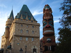
Back to the UK area:- This time around I was struck by how many references there were to English architectural types, to bits of English culture. But what I liked was how ‘ordinary’ a lot of it was. A pillar box, an old phone booth, juxtaposed alongside Hampton Court. The little square with the Regency terrace. It’s in no way real, but I saw a lot of home there. The same is true of Canada. You can’t recreate the Rockies in a theme park. But there is much in the Canada space and the film that resonates from my time there 15 years ago. The architecture of the Pacific Central building, the self-deprecating humour so evident in the film, the garden hinting at Butchart, the totem pole, the waterfall. It’s so not Canada and yet it triggered so many memories and references.
Now the thing is it didn’t do that as much 8 years ago. I have noticed that the average age of people around Epcot is noticeably older than at the other parks and I don’t think that’s a surprise any longer. I take pleasure is simpler things than I did 8 years ago and certainly than I did 30 years ago in my early 20’s. The world is a very different place to me and I see it very differently.
One more thing. Jeremy you ask: “do you find the unapologetically proud (and public) patriotism of The American Adventure at all awkward or strange, or do you still enjoy the show and agree with its overall message?” The honest answer is no – I actually admire it. I wish we Brits could be so united in our pride of our country and be so ready to celebrate it. One of the highlights of Epcot, and indeed of the whole holiday, was listening once again the the Voices of Liberty in the American pavilion before the main show. They are stunning vocally so I enjoy that aspect of it but they finished with the American national anthem and everyone stood up. You could hear a pin drop. That would not happen in the UK and for all our bravado and our sneering at American culture I envy you that pride and confidence. Yes it can be arrogant but at least you BELIEVE in yourselves. I wish we did.
“In my conversations with you I’ve sensed possibly the most honest and genuine enthusiasm for parks and attractions of anyone I’ve met”. That’s nice. Thank you.
I’m way past bed-time and I have breakfast to cook for guests tomorrow morning. That will have to suffice for tonight. Badly expressed and rushed. My apologies but life gets in the way….
One thing I want to comment on:
“What are the pavilions for? And I really think David that you are wrong here. You ‘expect more than hints and something that really is representative of the country’. But reading your comments I can’t think of anything that would measure up to that aim.”
David’s the expert on this and would know more about this than me, but reading his comment he does give one very specific example of something that would measure up to that aim: real World Fairs, which are what Epcot as a whole is pretty expressly derivative of.
For a long time, you’ve discussed the concept of “hyperreality” in the space of theme parks, and EPCOT’s World Showcase is certainly a shining example of such a thing. As a backdrop or place to get beer, I like the World Showcase, but as actual entertainment, I….I dunno. I like it I guess but I feel like a lot of people who are well traveled in that I see things and go “Wow, I sure wish I was looking at the real thing instead of _______________”. The Three Caballeros overlay onto ancient footage is pretty weak, the post Malestrom movie needs to badly be updated to reflect the Norway of now, the lack of actual attractions at many pavilions or the lack of additional pavilions caused by a marked non-interest by non-participating nations gives it kinda an old feel. The best part of WS: The restaurants, many of which are outsourced and serve decent food. Why lie? I probably like it so much because there are fewer kids. The Kim Possible game (now something else) was also a lot of fun to play in the area, though it didn’t really do anything positive for the World Showcase.
(I actually also like Impressions De France. I mean, I like France. A film about France with a good soundtrack consisting of something other than Disney cartoon music that reminds me of things I liked in France is something I enjoy.)
Future World I think you described pretty aptly. I’ve heard people refer to the new Test Track as being more in tune with what Epcot originally was and not what it was pushed into being in the 2000s. I’ve always considered Soarin’ acceptable as an attraction but thought it more a technology demo and more detrimental to Epcot than anything since it reminds me of a Disney park I like more.
And then there’s your opinion of Living With The Land; I don’t disagree, I just thought that this was clearly obvious from the get-go. The same thing is present at Universe of Energy – Industry will provide us with the clean energy solutions we need because we have scientists working on it, promise! That was kinda the situation with Horizons, World of Motion, and so on back in the day of the original, more beloved EPCOT. As corporate sponsors began to leave, Disney decided to bring in the characters and bullshit to re-imagine EPCOT. I don’t know that it is any more vapid now than it was then, it just comes with 100% less corporatespeak convincing us subconsciously to feel better about our consumption via exercising 15 minutes a day and cutting our 6 pack rings before throwing them in the trash. Now we get random Pixar characters speaking in a cadence that 25 years from now will probably get tons of lulz.
I don’t deny that World Fair pavilions can be deeply impressive, (although not having been to one I can’t really comment). I guess my problem is that I don’t recognise the failing that David and you see in the Epcot ‘pavilions’. I think they set out to achieve something altogether more modest and that’s fine by me. Clearly it isn’t for either of you, but it makes debate difficult as we can’t recognise each other’s parameters.
World’s Fair/Expo Pavilions are actually at an advantage over Disney’s EPCOT too, for the record. Generally they’re built as conceptual spaces intended to last a calendar year, then they’re generally torn down or repurposed into something that isn’t a glorified tourism booth. The stuff at World Showcase has to last forever (or at least as long as EPCOT itself).