Bloomington, Minnesota – Monday, August 1st, 2016
 How do you tell the difference between an amusement park and a theme park? While there’s lots of ways to analyse the distinction, one easy yet not infallible shortcut is to look for the presence of a high-profile intellectual property (IP). Not just in the kid’s area or on a single dark ride, but everywhere in the park… especially if it’s also part of the marquee at the front gate. If it says “Disney” or “Universal” or even something like “Lego” or “Ferrari” or “Plopsa” on the front gate, you can probably call it a theme park.
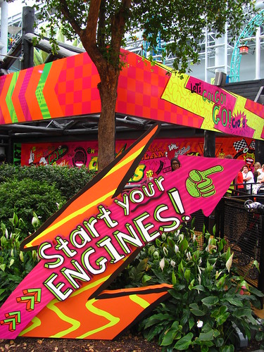
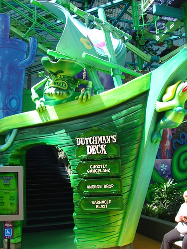
Nickelodeon Universe at Mall of America, which for several decades since it opened in 1992 was the United State’s largest indoor park, seems to want to prove to be an exception to that rule about IP and theme parks. The Nickelodeon IP is omnipresent as soon as you step inside, yet it’s not constructed in the way you might expect from a true blooded theme park. There are no “lands” of a cohesive identity, and even the individual rides themselves are less “themed to” than they are “decorated with” Nick IP. If you don’t know who these characters’ faces are, or what their story is about, you’re unlikely to learn very much at this park. Ironically, the couple of attractions that do have some dark ride scenes or media-based storytelling potential are all the ones that, for whatever reason, are completely without any Nickelodeon branding whatsoever. (As I’d discover, that’s probably a good thing in most cases.) The result is a colorful indoor collection of noisy flat rides and coasters with brands and character faces exploded all over it like some odd postmodern collage… in other words, a branded amusement park.
Speaking of the noise… oh god, that NOISE. Rides are noisy, people are noisier, and everything echoes in here. The constant reverberating noise drains the mental energy out of you after a prolonged exposure. It’s simply too much white auditory stimulus. There’s no place to escape either, since it’s much the same sound quality in the surrounding mall. Some sound-dampening is in place (mostly in the form of the trees and landscaping left over from the old Knott’s Camp Snoopy days) but they need to be a lot more aggressive about it. Sound design is mostly non-existent save for some zones playing Top 40 mixes. There were a couple rides that had custom audio tracks with them (voiceover or soundtrack), but the levels were all turned way down. You couldn’t clearly hear these tracks even when standing right next to them, but you could still hear traces of their soft echoing murmur from halfway across the park, all mixed together into a chattering cacophony.
Anyway. Onto the rides.
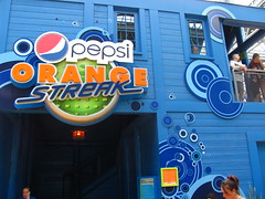
Pepsi Orange Streak
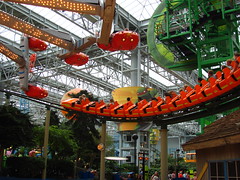
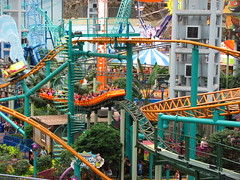
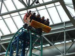
A deceptively long train for a deceptively long ride. This sprawling park-wide centerpiece coaster was the only one to be integrated into the mall’s original masterplan in 1992, a fact that helps it make the most of the limited indoor setting. As the spiritual older sibling to the similarly Knott’s affiliated and Zierer-built Jaguar in California, Pepsi Orange Streak (formerly Pepsi Ripsaw) feels like an odd mix that’s part American mine train, part Japanese jet coaster, and part German portable coaster. A tunnel with dark ride elements and a second lift halfway through serves as a nice surprise on the first ride, while the rest of the layout full of wandering zigzags and helices that are nearly impossible to memorize ensure that each subsequent ride maintains a few surprises as well. I’m not certain if it’s objectively the best coaster at Nickelodeon Universe, but if you’ve had to trek far out of your way to Bloomington then it’s at least certainly the most uniquely essential.
Fairly Odd Coaster
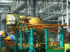
The first Gerstlauer spinning coaster, this ride would be much more of a treat if its site-specific layout hadn’t been copied five times over since its 2004 debut, making it technically the least odd coaster at Nickelodeon Universe. The spinning layout works best at this original location, where the integration with the scenery, support columns, and surrounding attractions is the tightest out of necessity. Always a snappy and dynamic experience with an added social factor due to its face-to-face seating and semi-random spinning, it’s a good counterpoint to the more drawn-out family thrills of the Orange Streak.
SpongeBob SquarePants Rock Bottom Plunge
My coasterhead brain looks at the stats sheet for Rock Bottom Plunge and automatically assumes it’s the park’s signature attraction. A beyond-vertical drop with a vertical loop, cutback, and heartline roll in rapid succession? Pretty good for a design that had to fit a preexisting indoor space. Yet, after a couple of rides, I came away thinking this 75’ tall Eurofighter felt ever so slighter than the previous two coasters.
Despite having what should be a more thrilling lineup of elements, this coaster is also much briefer and on a much smaller footprint than either Pepsi Orange Streak and Fairly Odd Coaster, and as a result it’s over before it ever had a chance to make much of an impression. The thick shoulder harnesses don’t play well with the super-tight pivots the layout needs to make to fit its small footprint, meaning once you skim the rafters and begin the rock-bottom plunge, you’re in for about 30 seconds of defensive riding postures. Being stuck next to a wall in the corner over an empty pad with nearly no theming doesn’t help the impression that it’s less than a top tier attraction at the park. Good for a quick thrill, but if there’s time for re-rides I’d suggest one of the non-looping options for a bit more substance.
Avatar Airbender
Opening the same year as Rock Bottom Plunge, it suffers a similar challenge of trying to pack all its big thrills into too small and limiting of a package. This Intamin Surfrider, which launches back-and-forth along a 70’ tall U-shaped track, feels less like a roller coaster and more like a flat ride. Which is a fine criteria to judge it by—it’s not a bad ride by any means, with some nice weightlessness at the top of each spike—but even by that metric there are probably a handful of other flat rides in the park that are still a better experience.
Log Chute
Still hasn’t found a new name or theme since the Nickelodeon re-branding… which honestly makes it the best ride in the park, and probably by a comfortable margin. It’s reminiscent of a Minnesota version of Knott’s Timber Mountain Log Flume, complete with two drops, multiple caves and tunnels, a few rustic dark ride scenes, and even a signature Paul Bunyan and Babe the Blue Ox animatronics (although a few of the more neglected figures were missing their pupils when I rode, adding an unintentionally creepy layer on top). They’re even so kind as to make the splashes more moderate, recognizing the indoor environment isn’t ideal for walking around with soggy shoes. If there was one downside, it’s that the ride’s popularity exceeds its limited capacity, giving it the longest wait of the day.
Teenage Mutant Ninja Turtles: Shell Shock & Shredder’s Mutant Masher
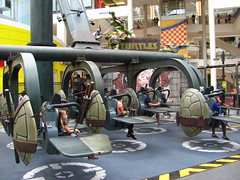
The two big TMNT thrill rides are oddly located at opposite ends of the park from one another. Shell Shock was the one I was most looking forward to, being my first time to experience a Gerstlauer Sky Fly attraction. A fleet of free-rotating winged seats is lifted by a large arm and spun around in an inclined rotation. Riders can control the wings attached to their seat to adjust the airflow, allowing the seat to spin upside down. In theory.
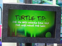
In practice, despite paying close attention to the overly complex instruction videos and signage which few other people in the queue had the attention span for (heavy emphasis on throwing your weight around within your seat), once the ride began I found getting it to actually invert all the way proved an impossible challenge. At first I thought I wasn’t throwing my weight into it hard enough, but after I nearly whacked my head on the shoulder harness I realized the designers probably shouldn’t emphasize so much hard, physical squirming and jostling in one’s seat while the ride’s in motion. Did my body just have the “incorrect” center of gravity? I’m pretty sure no one else on my flight even attempted to spin, using it as a brisk scenic flying chair ride instead. Overall, a huge disappointment for everyone involved.
Shredder’s Mutant Masher was just a fairly typical Chance Rides Revolution model flat ride, albeit with a custom theme and soundtrack. While there’s nothing revolutionary about it, this by far ended up being the more enjoyable of the two TMNT attractions.
Other Attractions
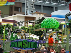
While Valleyfair has the superior coaster collection, and the promised A-list flat ride that was Shell Shock ended up being a big dud, the rest of the B-list flat rides tended to be one of Nickelodeon Universe’s strongest aspects. Mostly because there’s a diverse selection to choose from, but a few of these also rise to be fairly fun in their own right. Jimmy Neutron’s Atomic Collider, a rare (and unfortunately since-removed) Zierer creation, was the best among these. BrainSurge is a Chance-made Unicoaster with a motorized interactive flipping control, proving to be much more effective than the Sky Fly. Splat-O-Sphere was a decent enough family drop tower that seemed inordinately popular with the local youth. Ghost Blasters, despite being the park’s only themed dark ride, went with a generic off-the-shelf theme provided by Sally. Back at the Barnyard Hayride was a tiny Zamperla powered coaster that completed my checklist of Minnesota coasters. An otherwise ordinary Ferris Wheel had a unique location boarding directly over one of the midways. There were too many other smaller rides to keep track of. If you wanted to be a completionist about it you could easily spend a full day here.
FlyOver America
 After finding success in Canada, the FlyOver brand of flying theaters (heavily inspired by Disney’s Soarin’, and in fact led by some of the same talent) opened their second attraction here at the Mall of America in 2016. Despite being physically located in Nickelodeon Universe, the mall’s marketing seemed to indicate they viewed it as a separate entity. Either way, the upcharge and muddled messaging meant few people were drawn to what should have been the park’s signature new attraction. An attendant told me that the weekends could get quite busy, taking 2,000 people in a single day… but if they’re open 12 hours per day, that means an average of 167 people per hour is “busy”?
The preshow consists of one large projected screen overhead, which welcomes us to the ride and goes over all the safety instructions in musical form. The song tries to set up the “Expansiveness and Diversity of America” theme by sequencing several American music styles together; unfortunately they only have time to include folk, country, and hip hop before it’s into the ride. It’s also unfortunate that this theme of American musical and cultural eclecticism doesn’t feature anywhere else in the attraction, since it’s really all about getting a 1,000 foot view of natural and urban landscapes with little consideration of the people who live in these places, set to a single orchestral score.
The ride hardware uses the Brogent system, requiring us to ascend a flight of stairs to reach our seating level. One seated, the bannister in front of us drops down and the seats push forward into the theater, making for a cool reveal when the projection begins, surrounding your entire field of view and making it seem like the platform had simply “disappeared”.
The show itself borrows very much from Soarin’ Over California’s presentational style, with a similar sweeping orchestral soundtrack and scenic progressions. The sequence of locations is roughly an east-to-west migration, but there’s a number of exceptions. The opening sequence is surprisingly low-key and pastoral, sweeping in off the coast of Maine and slowly building to the action, rather than opening out of the gate with one of the big “money shots” (like the Statue of Liberty or Golden Gate Bridge) you might expect.
From there it’s a mixture of familiar locations with some more regional, off-the-beaten path flavors, again similar to Over California’s eclectic travelogue style, with the music accentuating several peaks and lulls. Minneapolis does make an appearance (eliciting familiar reactions from many of my riding companions), but modestly near the middle of the sequence rather than showboating as the grand finale as Disney must always do for its “home turf” scene. There were a few regions that were underrepresented, most notably the American South (excluding Florida), although Alaska in particular makes such a dramatic appearance near the end that it almost upstages the relatively mundane return to New York for the actual grand finale. There’s no scent effects, although mist is occasionally dispensed to simulate flying through the clouds (overkill) or swooping over Niagara (effective).
I found the most effective scenes were the less familiar locations, when they could often dive in closer and focus on individual people or details. The wide panoramas of famous city skylines often felt more like a box-checking exercise, with very little to direct the action and almost no significant movement of the seats. Surfing close to the waves in Hawaii and jumping up and over the spray at the last second will always be more entertaining than just looking at the Chicago skyline from a distance, because there’s a micro-narrative arc to the former shot that’s missing from the latter. Less well-known locations also intrinsically have this advantage, since there’s the sense of discovery and wonderment as your mind works to identify and understand the components of this scene, that’s lacking from the “famous” shots where your understanding and emotional relationship to the scene is already established by the very first frame, and there’s no further progression until the next scene change.
Transitions are mostly soft fades, apparently trying to address the criticisms of the hard cuts in Soarin’, yet in a way it’s almost more like pulling the band-aid off slowly rather than just ripping it off at once to be done with it. A few transitions do use more “natural” swipes, either through clouds or through a plane contrail, but even these have a bit of an artificiality to them that draws more attention to the film’s constructedness than necessary. I’m not sure that any of these solutions are particularly ideal, although I am perhaps growing more fond of the cinematic simplicity of the old hard cuts from Over California as I see these other approaches.
The central contradiction of every “travelogue style” flying theater is that they want to create the most seamlessly immersive media experience possible, yet they’re still done in a way that’s overtly cinematic and presentational, relying on montage to create spatio-temporal jumps in perspective that are otherwise impossible in an immersive setting. I think the only full solution is to get rid of the montage aspect altogether and turn it into a single continuous POV, but then you’re limiting the ability to make any sort of editorial thesis statement (“Look! The magisterial diversity of California/America/Earth!”), especially if you’re relying on real aerial footage instead of a fantasy CG environment.
I think this loosely relates to the other big contradiction of these flying theater attractions, especially as CG elements become more prevalent, which is that the ride films appropriate a hyperreal cinematographic language patterned off of IMAX documentaries as well as National Geographic, BBC Earth, etc.; yet when you recognize the CG elements in the frame there’s a certain sense of betrayal by the film that’s obviously not an issue when you recognize the CG elements in, say, Star Tours, where the guest and the designers mutually agree that you’re meant to suspend disbelief. FlyOver America has its own fair share of CG insertions, mostly in the form of planes that zoom through the frame to spice up what’s otherwise a fairly uneventful scene, and the quality of these unfortunately causes them to stick out rather poorly (including some very fake synchronized jet fighters over the desert that’s right out of the Over California playbook). Again, the immersive hyperrealism of the media forces us to be more actively conscious of the “reality” of what we’re seeing (e.g. “Can you believe your eyes!?!”), and when we realize there’s something false entering the scene, our brain is going to be more likely to zero in and single out the intruding element.
At exit there’s some framed posters showing “behind the scenes” of the making of FlyOver America, including shots of the camera attached to the helicopter and the orchestra recording the soundtrack. This was possibly the biggest departure from Disney, who would never reveal the trick behind the magic, but I think it works well in this context. They also had a large wall graphic in the gift shop that showed on a map the locations and order of all the scenes visited, a nice coda to the experience that helped answer any lingering questions about locations we couldn’t quite put our finger on.
Conclusion
Like its nearby Twin Cities neighbor at Valleyfair, Nickelodeon Universe makes do with a decently solid if not fairly generic collection of coasters, flats rides, and even in this case a pretty solid log flume. Whether or not we count FlyOver America as part of the park, it was undoubtedly the most I’ve enjoyed being inside a mall all day. Which isn’t saying much but, hey, probably no place better in the United States to put a big, noisy indoor theme park than in the country’s coldest and most isolated major metropolitan area.






















Check out the new Nickelodeon universe in new Jersey
E0zl
Top49