Shanghai, China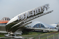
Tomorrowland is one of the most quintessential of Disney’s themed lands, yet it’s also often acknowledged as one of the most troubled. Typically this is credited as the “Tomorrowland Problem,” which states that Tomorrowland perpetually needs to be updated because it’s always at risk of becoming “Todayland”. Even pushing the land out hundreds of years into the future can’t really solve the problem, because speculative futurism is deep down always about today, a reflection on contemporary ideals, hopes, and fears, which of course transform just as quickly as technology advances.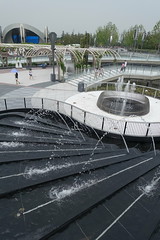
The counterargument is that Tomorrowland’s thesis isn’t the issue, it’s simply that the Imagineers or management never have any confidence in maintaining a unified aesthetic vision for the lands, before renovations and other off-thesis add-ons turn it into a visual mess that has to be completely scrubbed and redone every fifteen to thirty years. While it’s relatively easy to define criteria for thematic appropriateness for lands with a concrete sense of place and era, such as Adventureland and Frontierland, that can be harder to do for Tomorrowland, which is more defined by abstract architecture and cultural ideals, making it easier to become a dumping ground for questionably appropriate IP such as Star Wars, Monsters, Inc., Finding Nemo, Lilo & Stitch, et cetera, et cetera.
As of today, Shanghai Disneyland’s Tomorrowland is the most successful of the Tomorrowlands as a themed environment, pretty much because it’s the newest. Unfortunately this doesn’t get us any closer to finding the correct way to frame the “Tomorrowland Problem”, since its newness contributes both to its thematic timeliness as posited by the first version of the problem,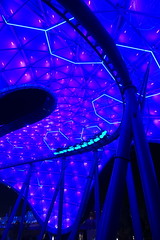 and its thematic cohesiveness as posited by the second version. The real test will be in several years, to see if the land is weakened or strengthened either because of new additions, or because of a lack of new additions.
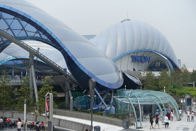
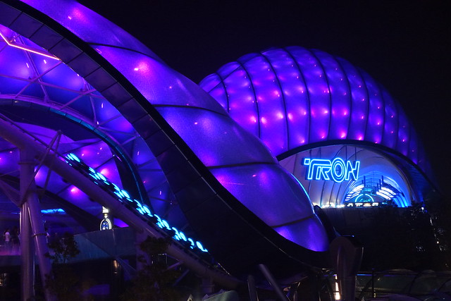
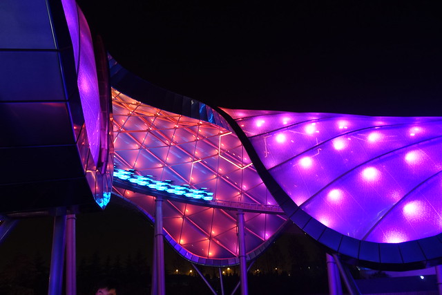
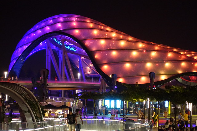
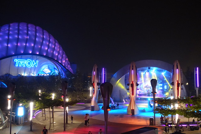
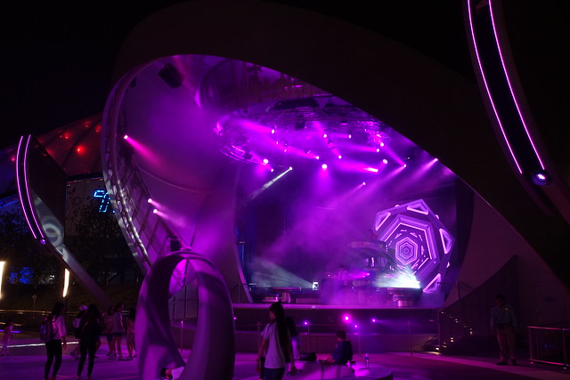
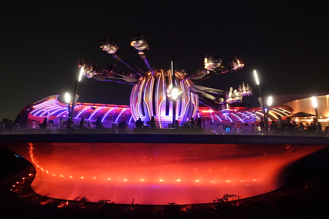
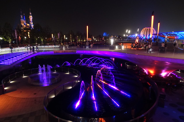
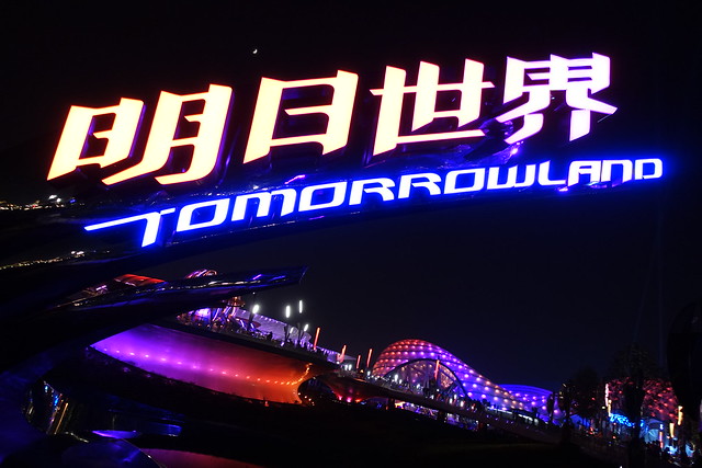
While previous Tomorrowlands were all built for the Space Age, Shanghai’s Tomorrowland is the first to strongly suggest it was built for the Digital Age. Most obvious is the land’s E-ticket attraction theme shifting from outer space to cyberspace, but the rest of the land has a sleek architectural efficiency to it that largely does away with clunky space exploration references (except where directly attached to its C-ticket attractions, more on those later), in favor of abstractions featuring lights and water fountains that suggest an artificial intelligence pulsating underneath. During the day, tucked under the daily blanket of Shanghai haze, the land can appear somewhat oppressively clean and white; but once under the cover of night, the land radiates with crisp dancing colors. The entire land comes alive with a synapse-arousing kineticism of light, sound, and movement that few other Disney lands, with their elaborate yet immobile facades, can compete with.
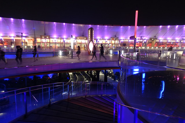
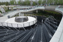 Yet perhaps even more than its aesthetic achievements, the thing I must commend the Tomorrowland design team on the most is simply the fact that they kept it compact. The rest of Shanghai Disneyland often feels like it fell victim to a master planning land grab, trying to fill more space without there necessarily being anything to fill it with. Tomorrowland, by contrast, is nearly entirely visible from a single vantage point, choosing instead to build vertically as the artistic vision required, and leave surrounding land totally unused, rather than only partially unused.
Oddly, the land’s biggest weakness is also related to this strength: the vertical layers get confusing from a wayfinding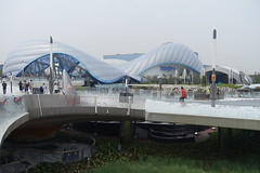 perspective. When you first approach Tomorrowland, you’re drawn down into the central plaza, because that seems like the logical place to get your bearings and where all the visual indicators seem to direct you. Once you’re there, it’s likely that you’ll want to make TRON your next destination. Yet from here there’s no direct path to get to TRON in the direction you’d think you should go. You either have to take a long-ass spiraling ramp underneath the coaster’s outdoor portion that is clearly designed to be the most inefficient way to get from point A to B, or you can turn around and go back up the way you came, and utilize an obscure shortcut around the edge of Tomorrowland that, by the time you’re already down there,
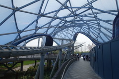 is no longer much of a shortcut. This layout was so counter-intuitive, even after discovering its quirks I still found myself falling into its trap several more times until I finally learned how to effectively navigate it near the end of day two.
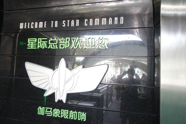
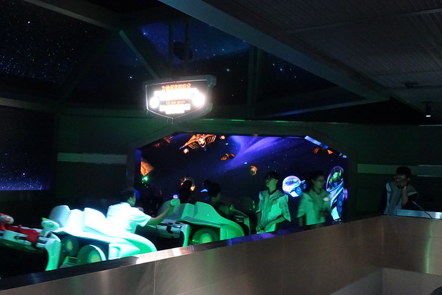
So, screw TRON for now, we’ll start with the stuff that’s actually within reach. The lower plaza in Tomorrowland is home to a live music stage (mostly active at night), the FastPass booth for Tomorrowland attractions,1 and most importantly, Buzz Lightyear Planet Rescue.
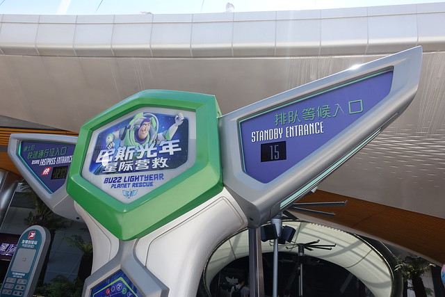
Despite being a FastPass enabled attraction, Buzz Lightyear is possibly the one attraction in the park that most consistently never needed any FastPass. The entrance is so unassuming that I’m not surprised if many people don’t even realize it’s there.
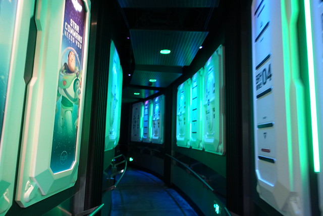
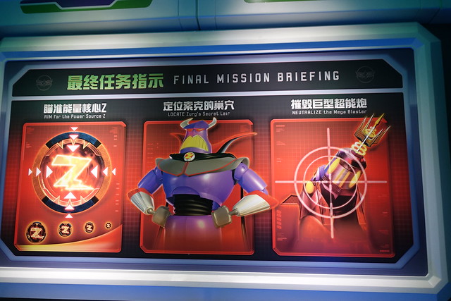
The queue lacks a Buzz Lightyear audio-animatronic found in the other versions of this attraction, but makes up for it with better placemaking and media, that feels better integrated to Tomorrowland than the McDonald’s Happy Meal aesthetic the other versions of this ride seem to channel.
I am a bit confused why they decided to have Buzz Lightyear as an opening day attraction, when plans for a Toy Story Land expansion next to Tomorrowland were already underway.
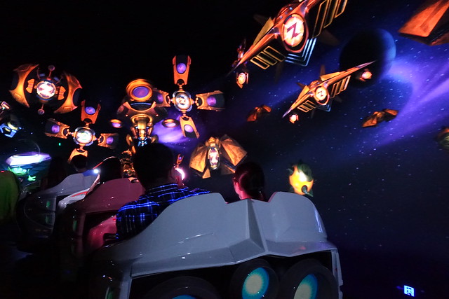
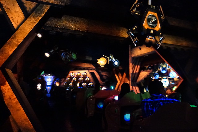
Like the other Buzz Lightyear rides, this one is a shooting omnimover dark ride.
Unlike the other Buzz Lightyear rides, this one… doesn’t completely suck?
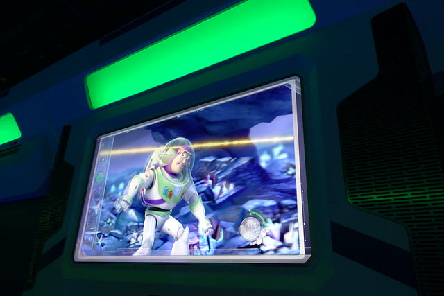
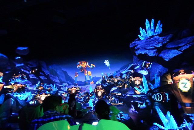
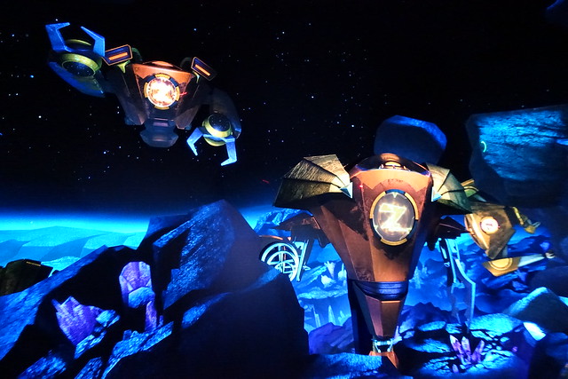
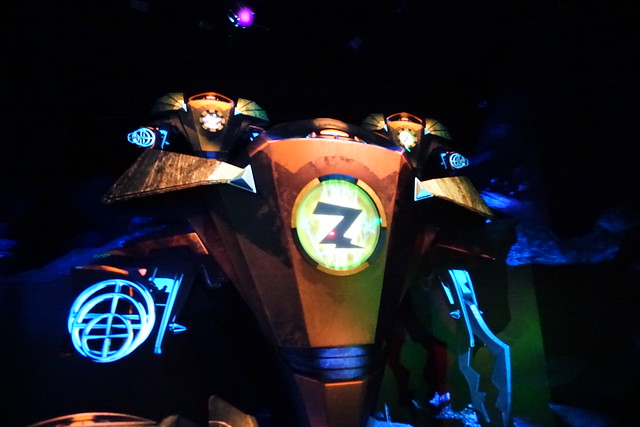
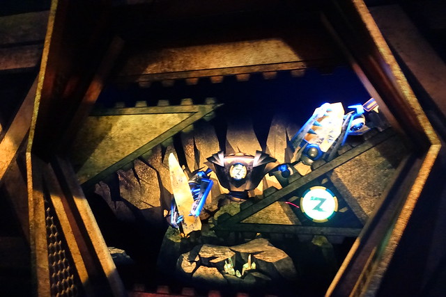
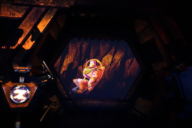
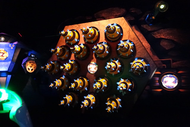
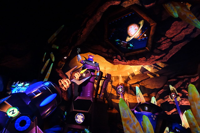
Seriously, the quality of the scenic environments is several steps up, and there are multimedia extensions integrated into the backdrops that help bring the environments to life and keeps a threadbare storyline going.
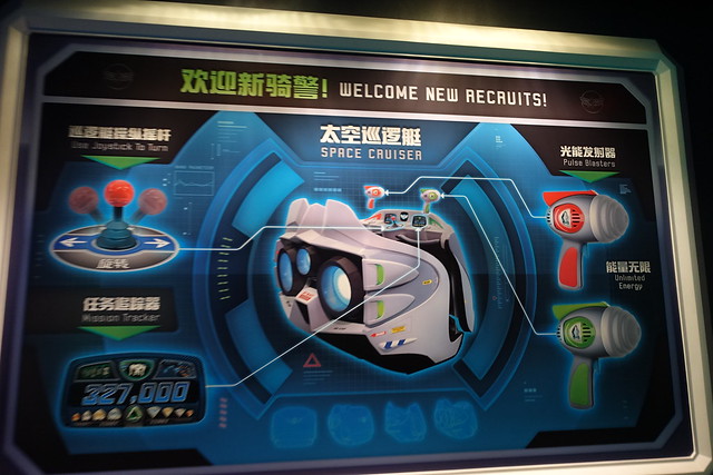
But more importantly, the laser guns actually work in a way that doesn’t become infuriating to use! You can actually follow your own individual laser tracer so you know where you’re aiming, and the targets respond the way you’d expect them to!
The ride has two main locations, going from the the blue-coordinated planet surface to an orange-coordinated mine shaft. At least the use of color and texture is more sophisticated than the typical DayGlo aesthetic monstrosities these Buzz Lightyear rides usually are.
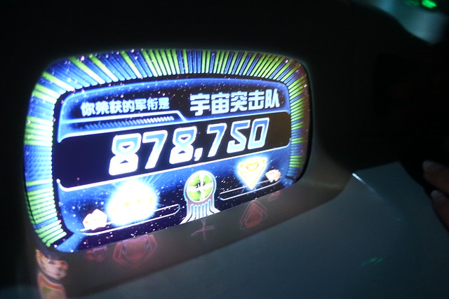
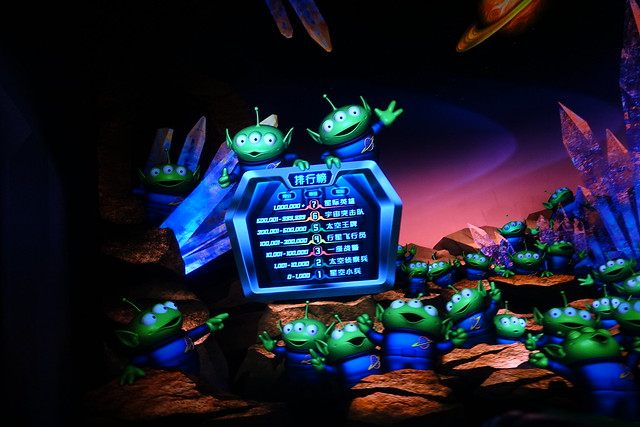
This is the point at which I’m pleased with my final score, only to be told in the next scene that my score sucks.
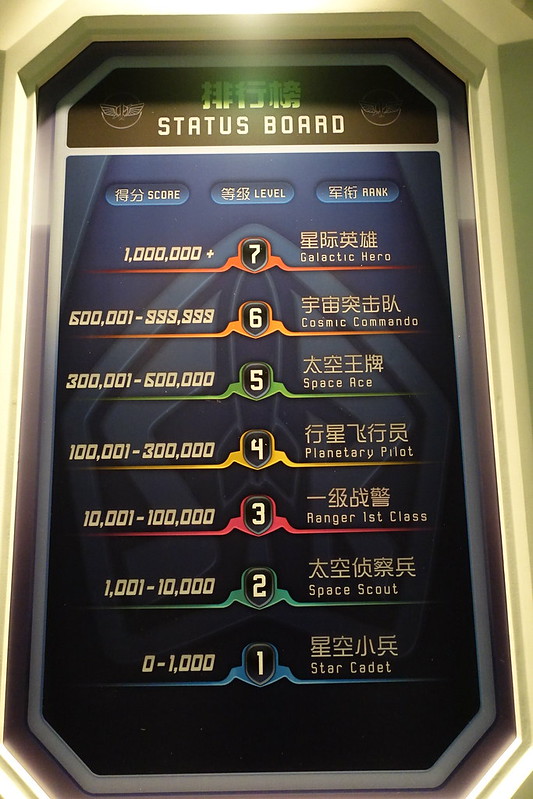
But, lo! The point ranking system has finally been adjusted to levels where it’s possible to play a fun, lightly-competitive game, and still get a ranking that doesn’t make you feel like you’re Helen Keller!
Overall, Buzz Lightyear Planet Rescue is a ride that definitely benefits from low expectations set by all the other worldwide installations. Is this the definitive Buzz Lightyear shooting dark ride? Absolutely! The best of any ride ever based on Toy Story? Quite likely! Does that mean anything special? Not at all!
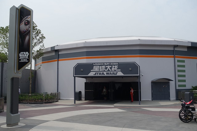
Just behind Buzz Lightyear, at the far end of a cul-de-sac pathway that’s clearly intended for future expansion space, is the very temporary-looking Star Wars Launch Bay.
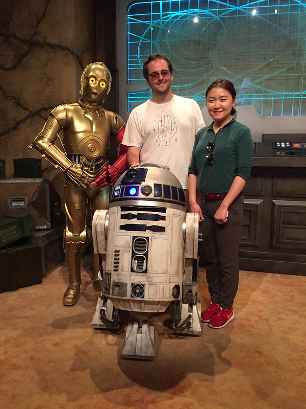
Like Marvel Universe nearby in Gardens of Imagination, this is a box full of movie paraphernalia (more props and artifacts, less interactives) and costumed character meet and greets. I failed to take any photos inside (I figured I’d come back later on day two for more photos, not realizing at the time how little that would interest me in the future), save for one of Yiyan and me with a Mandarin-speaking C-3PO and R2-D2.
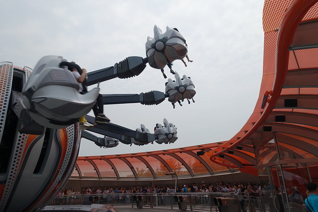
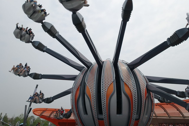
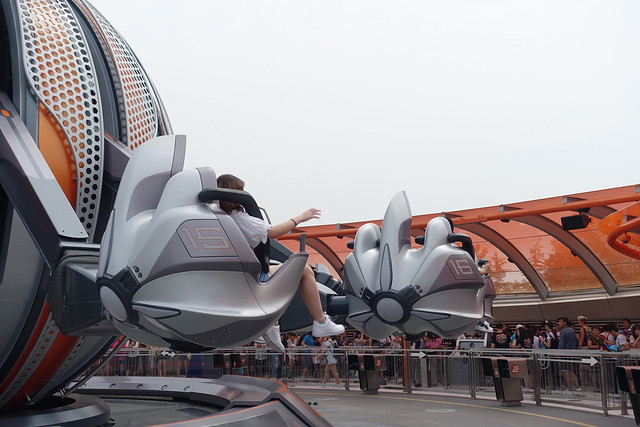
Moving on, in the furthest corner of the upper deck in Tomorrowland is the single attraction in the entire western half of the park not based on a Disney IP, the Jet Packs.
Initial rumors made this sound like a fairly bold new concept for a flat ride attraction, but the final result turned out to be not much more than a floorless variation on the Astro Orbiters spinning rides, with the same lousy capacity and now bulky over-the-shoulder restraints.
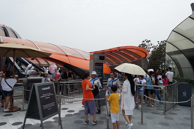
One look at the queue, which was bearing down on 40 minutes, and the ride experience itself, which appeared to barely last 40 seconds at full speed, and it quickly became clear that this would not be one we would ride during our two days at the park.
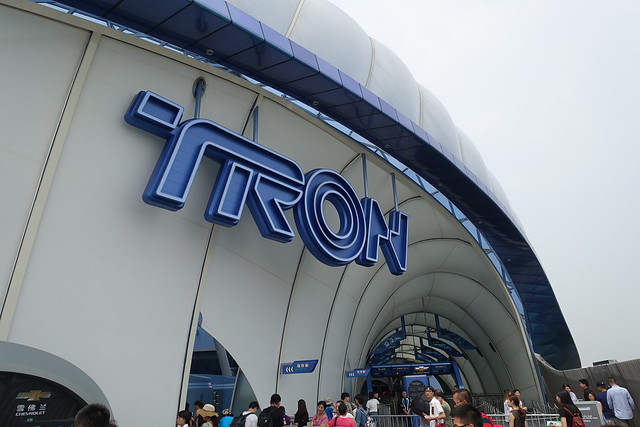
Okay, now back to TRON! TRON Lightcycle Power Run is Tomorrowland’s marquee attraction, and one of the two most unique and highly anticipated new attractions to debut at Shanghai Disneyland.
Notably, I believe this ride, along with the Camp Discovery Challenge Trails in Adventure Isle, are the only two Disney attractions ever built that have a mandatory locker policy for loose items.
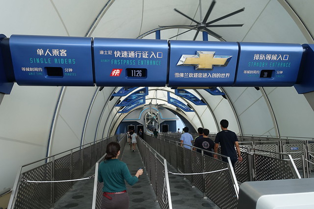
Between FastPass and Single Rider, there are plenty of options to get lots of TRON rides in. I managed seven rides over two days, with six of those rides all on the first day. Despite its status as one of Shanghai Disneyland’s largest and most thrilling attractions, I discovered that FastPasses for TRON don’t go nearly as quickly as they do for the Adventure Isle attractions.
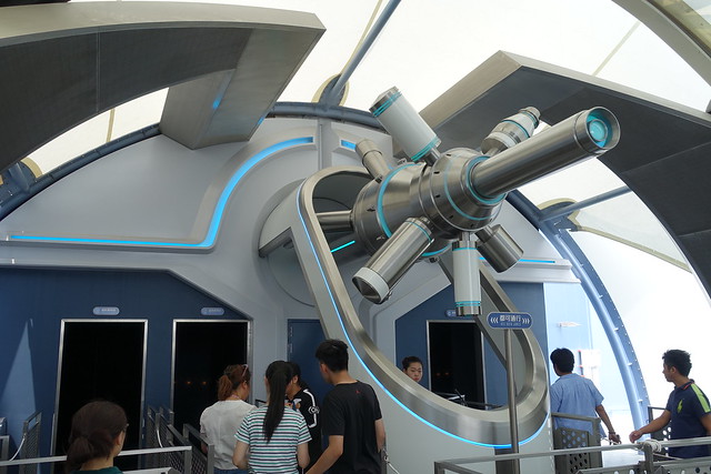
I believe this device is what “zaps” you into the game grid as you enter the show building.
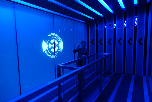
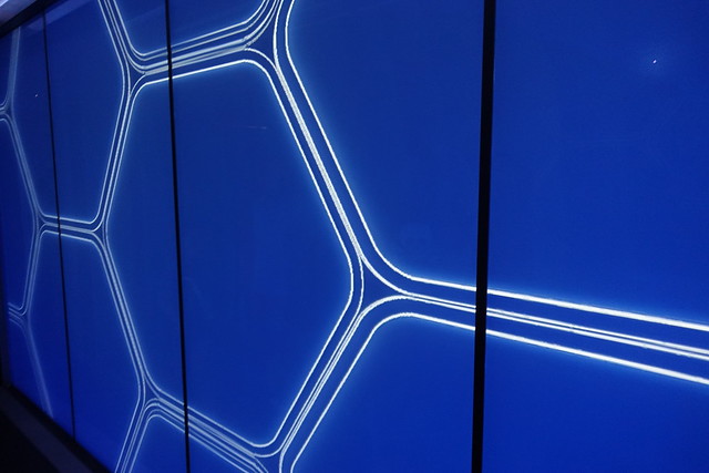
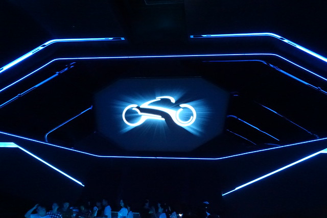
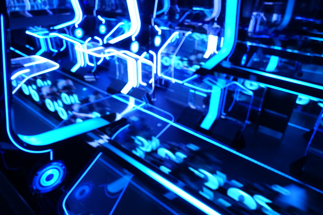
The first thing you see inside the queue is this great reveal. At first all you see is this glowing blue wall.
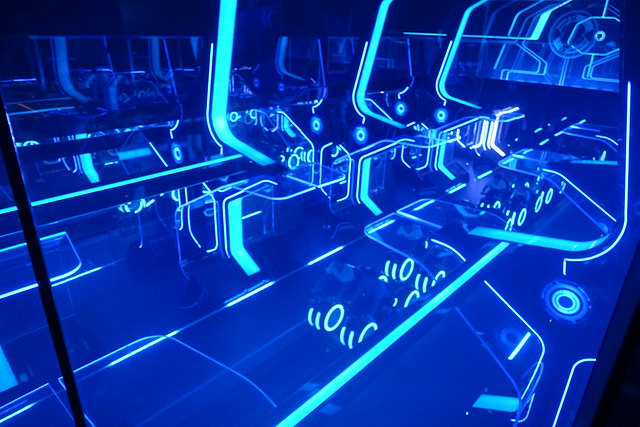
It’s actually a large-scale transparent LCD screen. After a quick visual effect, the wall is “removed”, revealing the launch chamber for the lightcycles moments before they take off.
The only shame is they only had the full effect working as intended on just one of my seven rides. Possibly because I mostly rode it during low-demand morning and evening times?
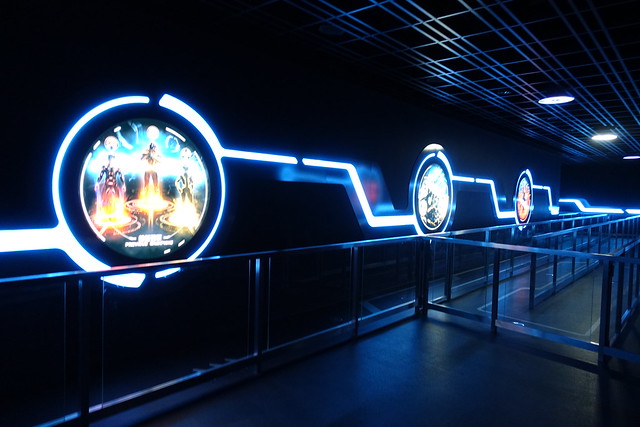
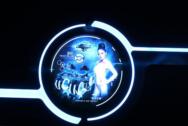
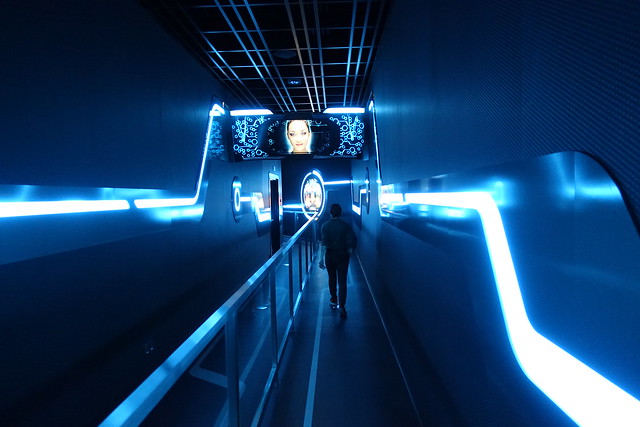
The next section of the queue is less remarkable; mostly dark indoor switchback corridors with some posters promoting the games, and a somewhat creepy female “program” that recites the boarding instructions on overhead monitors.
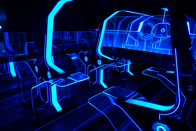
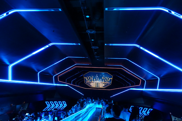
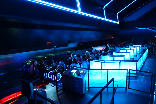
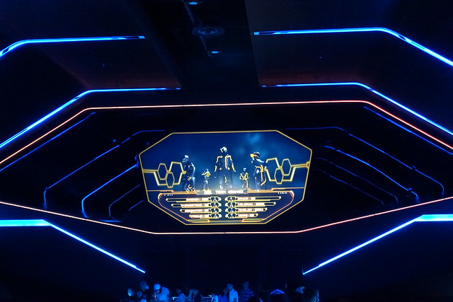
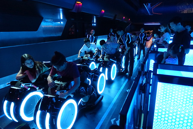
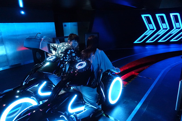
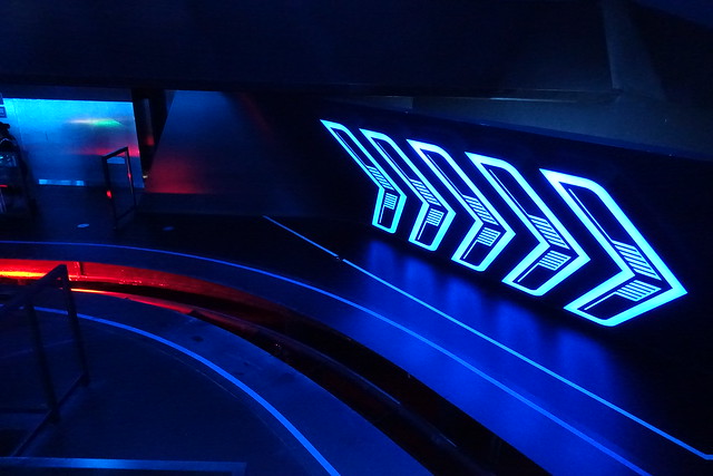
We next arrive in the loading platform, which is perhaps just as remarkable as the first effect, creating a voluminous black and neon space resonating with ominous electronic synth soundtrack, as you descend into the center boarding isle down a narrow catwalk. Having appreciated the unique visual environment from TRON: Legacy in 2010 (and not much else), this abstract, moody environment is exactly what I was hoping for from this attraction, and helped build anticipation for the mystery of the ride experience remarkably well.
An overhead video screen introduces you to the computer team you’ll be competing against and helps visualize the forthcoming lightcycle race in ways that can’t actually be experienced on the coaster (light trails, different bike formations than “inline”, etc.)
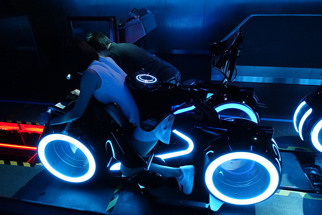
The vehicles are Vekoma’s Motorbike Coaster, heavily enhanced by Disney Imagineering to both look great and not attempt to murder you.
The riding position is even more forward-leaning than on any other motorbike coaster I’ve tried. You’re basically riding on your shins and stomach, which does help make you feel more vulnerable and the ride more dynamic and forceful than it really is.
Appreciate the way the track is hidden in the station, with the contrasting glow of red light from beneath.
Around the bend with a new musical cue from the on-board soundtrack, and we’re off to the launch chamber!
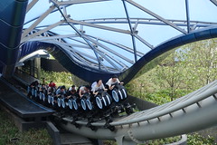 As you may be aware, TRON Lightcycle Power Run launches outside the show building into a daylight portion. Yes, this is not in keeping with the story and spirit of TRON. Interestingly, despite Imagineering’s recent efforts to apply “story” to every single insignificant design detail, this seems like a fairly major design feature that went completely without comment. It’s there because the designers thought it looked cool. And it is cool. It’s a feature that’s proven absolutely essential to making Tomorrowland a kinetic hub of activity (especially in the absence of, say, a People Mover), and it’s the primary feature that gives the land its distinctive identity. Given how many other cases Imagineering has forced
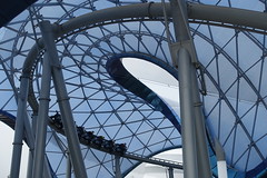 absolute fidelity to literal storytelling to stand in the way of what otherwise could have been good design, I’m disinclined to fault them for making this creative decision.
Yet, across all my rides, it felt abundantly clear that the attraction itself is weaker for it, though not so much weakened that it offsets the benefit gained to the overall area around it. Simply put, after creating such an immersive and unique lighting environment that starts to mess with your eyes and even your mind after enough time, to be thrust back into natural daylight for several seconds almost completely resets the effect, and re-entering the dark building almost feels like we’re beginning a different ride.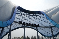 Even at night, the soft fill lights from the surrounding Tomorrowland that fills the atmosphere is enough of a break from the stark theatrical lighting inside the building that the spell is somewhat broken. Yet, it’s a chance to get a sustained high speed moment (approx. 60mph) to start the ride with that almost certainly would not have been able to fit inside a show box.
Unfortunately things don’t necessarily improve that much once we do get back into the main show building. It’s at this point that the “story” abruptly kicks in (on-board audio narration suggests it’s something about racing through a number of light gates before our opponents, all in Chinese), which further highlights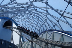 the discontinuity between the heavily-themed indoor and highly-abstract outdoor portions of the ride. The coaster also immediately hits the first block break, which unlike the Space Mountains is accompanied by a significant and noticeable slowdown. This happens again a couple times throughout the layout, contradicting the storyline that we’re in a high-stakes video game race with the fact that we seem to be perpetually slowing down and giving up.
This ties into the ride’s biggest weakness: Vekoma still does not know how to design a good track layout, especially for one taking place in a black box. Besides the constant breaking and obvious reduction in speed throughout the entire layout,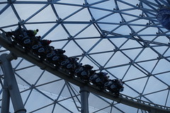 making it feel anticlimactic, the layout feels designed to fit into a black box efficiently using a repetitious formula of dipping curves and helices, with virtually nothing to physically distinguish one part of the ride layout from the next. Despite the constant slowdowns, the coaster is still probably too fast for an indoor coaster, resulting in broad, overbanked curves that feel designed to absorb forces comfortably rather than heighten the sense of speed and direction changes. Ironically it makes the whole layout subjectively feel much slower than the Space Mountains, even though on average it’s probably a bit faster. This is the bad form of roller coaster minimalism. Curves and transitions repeat like clockwork, and even after seven
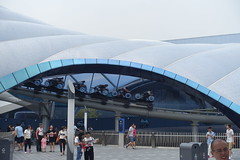 rides I was still kind of surprised when the end of the ride happens sooner than I expected. The layout is shorter than any other roller coaster ever built for Tomorrowland, and with the extra speed in the first segment, the indoor portion gets extremely short-changed.
Theoretically it could make up for that shortness with more special effects and “story” on the inside. There are a couple of good moments here: a long fly-by screen near the end of the layout shows a competing lightcycle crash alongside us (this was the main way I could tell we were getting close to the end of the layout), and there’s another moment in the middle of the sequence when we appear to divert a near-miss with a competing train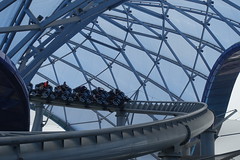 of red lightcycles. We’re actually looking at a mirror, and when our vehicle approaches, the lights on our vehicles all change to red without our noticing, a perfect example of how lighting and misdirection can make for the most simple yet effective tricks in a theme park.
However, I got the strong sense that the artistic direction for the indoor coaster portion was handled by a completely separate team from the queue and station area. Instead of the ultra-sleek neon minimalism of the station, we’re now treated to a smorgasbord of aesthetic gak, the walls covered in UV painted digital circuit boards, and very little to restrict viewsheds inside the dome, where support columns and scenery from previous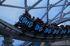 or future scenes remain in open view. It’s a mess to sort through and requires several re-rides to figure out what the purpose of half the stuff must have been.
Arriving at the final brake run for the first time, we were greeted by the unshakable reaction, “that’s it?” The fact that it’s smooth and comfortable means that it’s still worth riding multiple times, and there’s enough good moments, whether in the queue or on the ride itself, that earn it its E-ticket status. But given the promise and prominence of the attraction and reasonably positive early word-of-mouth, I must admit that TRON Lightcycles Power Run was perhaps the one ride at Shanghai Disneyland I felt most let down by.2
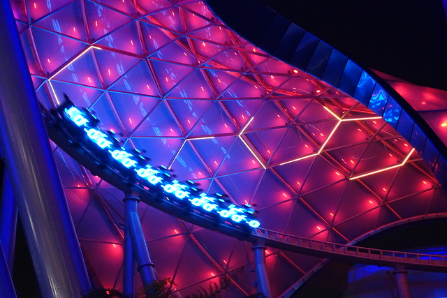
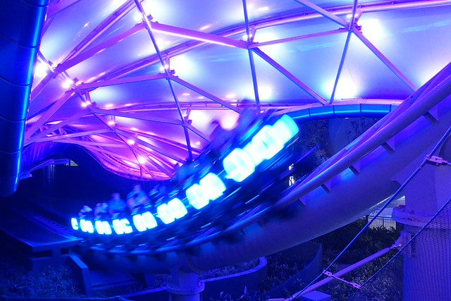
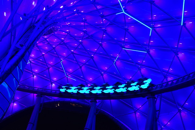
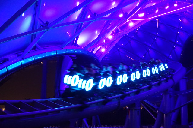
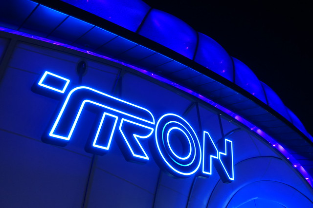
Nevertheless, it’s quite possibly the most beautiful roller coaster Disney has created since Paris’ Space Mountain, especially when Tomorrowland comes alive at night:




Comments