Urayasu, Chiba, Japan – Monday, June 27th, 2011
 My visit to Tokyo Disneyland is tinged with a slight feeling of guilt. In 2011, shortly after the park reopened following damage sustained by one of the largest earthquakes to ever hit Japan, and with the Fukushima nuclear disaster still unfolding every day. These events were not only a stark reminder of “the world of today” outside the gates that I was privileged to leave behind, but also, due to the accompanying tourist slump, led to the realization that the seemingly ideal conditions I got to enjoy at the (once) most popular theme park on earth were made possible because of the catastrophic humanitarian situation unfolding elsewhere.
Of course there was little need to actually feel guilty, since at that point in time the stress was on the Japanese economy, including its tourist sector, needing all the help it could get. But in traumatic times people want to unify around shared experiences, and an escape to a theme park becomes a symbol of hope and reassurance that exists outside the bounds of ordinary discourse, lest that symbolism starts to shatter. So it made me feel just a bit guilty, with everything else happening in the background, to not only take the resources to go to Tokyo Disneyland, but to come away from it just to say that this theme park is honestly kinda shit.
In my view, Tokyo Disneyland is bottom-ranked of the Disney “castle” theme parks, and second-to-last out of the entire collection, clearly besting only the Walt Disney Studios Park in Paris. The park looks a lot like one of those bad “Asian knock-off Disneyland parks,” and that’s because in some ways… that’s actually what it is!
Licensed by the Oriental Land Company, Disney only agreed to the deal because they were hurting for cash while trying to finish Epcot, which opened the year before Tokyo Disneyland’s debut in 1983. WED Enterprises kept all their A-list talent with experience from the previous two Anaheim and Orlando theme parks busy on Epcot, while a less-experienced team was assigned to Tokyo, asked to design a park that was a mix of copied elements from Disneyland and the Magic Kingdom but with little understanding of the philosophy that made those parks actually work. In essence, the same process used by any number of fake Disney-inspired copycat parks out there, only bearing the imprimatur of the real D.
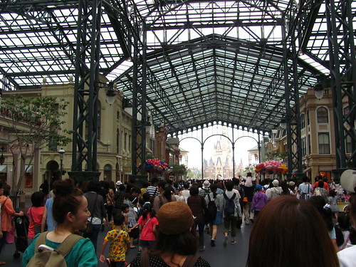
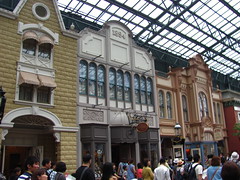
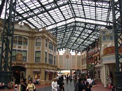
The result is a park full of awkward “knock-off-isms”: weird juxtapositions and sightlines from reshuffled elements, a focus on operations and capacity over show quality, vestigial features copied from elsewhere that have lost their original purpose, and a general lack of care, cleverness, and charm that indicates real thought went into the design. The challenges are most obvious right from the entrance, a copy version of Main Street U.S.A. bizarrely renamed World Bazaar. A steel and glass canopy was added overhead, ostensibly to protect pedestrians from the rain, although it introduces multiple unfavorable consequences:
- It forces the compression of the land to keep it all under a manageable roof size.
- It still ate most of the land’s budget, leaving a Main Street without detail, grandeur, or even street curbs.
- It creates an echoing din that kills any attempt at good music and sound design for arriving guests.
- It’s fugly.
And as if the design wasn’t bad enough, look at a map and that dumb, thematically mismatched name really seals it as exactly what you’d expect from a “cheap Disney knock-off” park… and frankly, there are real fake Disney parks out there that have a better entry zone than this.
From that low, the rest of the park represents somewhat of an improvement, mostly by virtue of having seen more updates since the original 1983 design after Disney got serious about the potential of Tokyo Disneyland. But that also means the boundaries between the old and the new become more conspicuous, and the obviously band-aided and patchworked park suffers from an inconsistent identity as a result. Unlike Hong Kong Disneyland, where the biggest issue was that it opened too small, Tokyo Disneyland was cursed with scale, leaving the sprawling park with infrastructural issues that can’t be ameliorated just by building beyond the original berm.
 One of those issues is that the park was built almost completely flat. Other theme parks use gentle elevation changes to create sight blocks and moments of reveal, and to prevent a distant horizon point to create the impression of an endless mob of people. Tokyo Disneyland not only is mostly on level, but it also intentionally built its pathways to be as wide and unadorned as possible, apparently to accommodate crushing holiday crowds and large parades. An agoraphobe’s nightmare. The themed environmental design suffers as well, as the facades have been pushed far apart from each other with little sense of depth or intimacy, often functioning more like themed backdrops at the borders of the endless paved seas. Despite having lands themed to the old west or the uncharted jungle, natural landscape design is relatively minimal compared
 to other parks, often relegated to planters and small tree clusters along the edges when needed to conceal buildings or transition spaces. And those massive midways themselves are, inexplicably, painted in flat, textureless mono-colors that correspond to the land identification guide, as if the designers literally referenced a Disneyland fun map for their color studies.
While expansions have improved things (and this analysis is obviously from well before the Fantasyland expansion was ever a thing) Tokyo Disneyland feels hopelessly stuck in the 80’s, the Disney theme park equivalent of one of those old dinosaurs of a shopping mall. Even if some of the store tenants have tried to update to the 21st century, it only underscores the anachronism of the whole thing. Not aiding these perceptions of outdatedness is the fact that OLC has also resisted many of Disney’s initiatives to update insensitive cultural content from many of their older attractions, reasoning that concerns around representation and inclusion aren’t as important for a Japanese audience, which… isn’t how that works… but at least western fans can continue to celebrate these parks for having more orderly queues and parade crowds?
For a lot of people Tokyo Disneyland offers a specific kind of 80’s nostalgia that’s not so different from the eras of 50’s nostalgia or even turn-of-the-century nostalgia that have informed so much of the Disney parks’ identity. Even old shopping malls still have dedicated connoisseurs working to preserve their memories. I might have been more amenable to the quirkiness of this particular kind of nostalgic character if Tokyo Disneyland didn’t also demand so much, overwhelm so much, intimidate so much, with its huge size and complex crowd dynamics. Nostalgia is always better in small doses (and without the lingering taint of racism that usually goes with those older eras).
But certainly my explanation of Tokyo Disneyland is missing many of the details that have won it legions of fans, which I suspect may be found more within the “soft tissue” of the park: the characters, shows, parades, foods, and the hyper-local park culture, which I’ll admit were not my main focus. And some of the individual rides are pretty good… but let’s not get carried away just yet. That’s what the rest of this review is for.
Adventureland
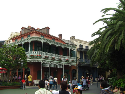
Basically a version of the Magic Kingdom’s Adventureland, but with a section of New Orleans Square around Pirates of the Caribbean, primarily to include the Blue Bayou restaurant popular on the Disneyland version. Equating New Orleans and the jungle together in the same “Adventure” category is one of those things that I can’t help but feel might indicate a slightly problematic intent, even if it will probably be that way forever so long as pink stucco and wrought iron next to tropical palm planters continues to look cute to Japanese teen girls.
Pirates of the Caribbean
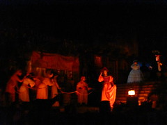
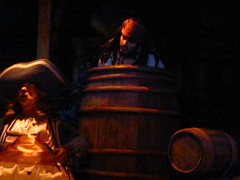
Halfway between the Disneyland and Magic Kingdom versions, but the pirates still chase the women on turntables in this version. (Japan’s gender gap also continues to rank at or near the bottom among developed economies, so there’s that.) Oddly, the detail I most remember about this version was it was the first time I took notice of the then-recently added fog screen where Davy Jones appears and, in response to the haunting refrain of “dead men tell no tales…”, says:
“Ah! But they do tell tales! So says I, Davy Jones!”
Really an all-timer for the worst line of show writing in an attraction script. Just in awe at how succinctly each word is unwanted and unnecessary. The fact that you can watch the fog screen media reset several times is the icing on the cake. (Thankfully this effect has been removed from the Anaheim version in more recent years.)
Jungle Cruise
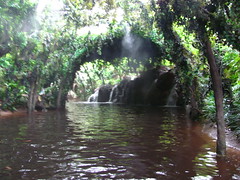
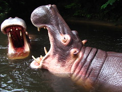
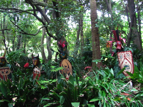
The only version of the Jungle Cruise in the world not offered in English. But chances are you already know the spiel, as all the classic gags are here in this version largely similar to the Magic Kingdom installation. More than an opportunity to see funny animatronic animals and cringey animatronic natives, it’s refreshing to enjoy being surrounded by real trees and foliage for a little while within this otherwise very urbanized Adventureland.
Western River Railroad
Is this attraction part of Adventureland or Westernland? The theming is definitely meant for Westernland and the track is mostly routed through Westernland. But it’s smack dab in the middle of Adventureland, sharing part of the station with the Jungle Cruise on one side and the Enchanted Tiki Room on the other. My guess is a train had to go somewhere because that’s what the other two prior Disney parks had, even though it couldn’t have multiple stations (apparently due to Japanese regulations that would qualify it as public rail transport, thus requiring a set timetable and fares) or even fit the one station it did have inside Westernland. Attractions getting placed in the wrong theme zone, even if they no longer serve their original purpose, just so they could be checked off the list… another telltale “knock-off-ism.” (Also it was closed for refurbishment during my visit so it was all a moot point anyway.)
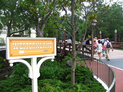
Westernland
Not Frontierland, but Westernland, since “frontier” doesn’t adequately translate in Japanese. (Little wonder, as each culture has its own history and geography for a very different sense of what frontier could mean. One of China’s greatest literary works, Journey to the West, may momentarily confuse western readers when they learn it refers to a journey to India.) Anyway, this land is largely a cul-de-sac leading to Big Thunder Mountain. The design is tighter and more carefully thought-through than pretty much any other land, and the broad paved spaces sorta work to evoke the open expanses of the west. Combined with a few nice corners of natural landscaping around the riverfront and Critter County immediately next to it, this is likely the most successful of the original themed zones at Tokyo Disneyland. Still a far cry from, say, Disneyland Paris’ Frontierland.
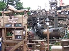
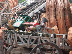
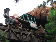
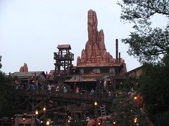
Big Thunder Mountain
Fairly similar to the Disneyland Big Thunder Mountain Railroad, but it fixes the third act problem by actually giving some meat to the section after the third lift. This finale segment kicks off with a drop down into a tunnel infested with flying bats, a great special effect I’m surprised to see was never replicated in the stateside versions. After this tunnel the dinosaur skeleton splashdown is still used to signify the finale, but is combined with a much steeper drop concealing one last speed run through a narrow mine shaft. While not quite on the level of the magnificent Parisian version with its bottomless drop underneath the river, the Tokyo version probably represents the ideal of what the archetypal Big Thunder Mountain experience should have always been. One of my picks for the top three attractions in the park.
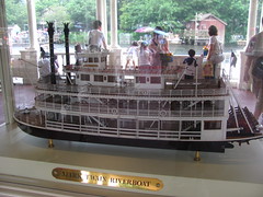
Rivers of America & Mark Twain Riverboat
Along with Jungle Cruise, this is one of the best places to enjoy a sense of nature inside Tokyo Disneyland, making it a welcome respite from the crowds and hot pavement that define much of this park.
Splash Mountain
Turns out, the best ride in the park is the racist one! Back in 2011 I wondered how long Splash Mountain would be sustained in Japan given the very particular cultural meaning behind its Southern folklore storyline that was certainly lost on the Japanese audience. It turns out, being able to understand and remember the cultural significance of its references is precisely what ended the U.S. versions and allowed the Japanese iteration to continue for another zip-a-dee-doo-dah day. Indeed, the Japanese audience seems to have an attachment to their Splash Mountain even more than American audiences do. In the 1998 Japanese movie After Life, the recently deceased are asked to pick one memory to replay for the rest of eternity, to which one teen girl’s first choice was her ride on Splash Mountain at Tokyo Disneyland. That’s just the reputation it has! Whether or not it should eventually lose the Song of the South storyline is not something I’ll take a position on here, but I’m still glad I got to appreciate the weird glory of this ambitious log flume, which is by far the most elaborate of the three worldwide installations (especially for its breathtaking queue). It’s also the only Splash Mountain performed in deep-fried southern-accented Japanese, certainly a zenith of globalism’s effect on culture.
Fantasyland
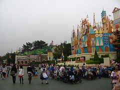
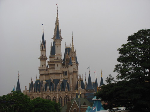
Emblematic of the type of park Tokyo Disneyland is, you turn the corner from one of the park’s best areas, Splash Mountain and Critter County, and are suddenly confronted with: an unadorned Dumbo spinner sadly sitting in the middle of a giant asphalt pad like a parking lot carnival ride, situated in front of an airlifted Haunted Mansion facade from Florida. Putting the Haunted Mansion in Fantasyland is weird but not inconceivable (imagine having “the spooky house at the edge of the woods” as it often goes in these stories) but the whole thing is such a jarring juxtaposition of incompatible elements with second-rate execution it’s hard to believe this is part of what many fans rave to be Disney’s best resort. I’m also not convinced that the large Beauty & The Beast village expansion on the opposite end of Fantasyland will improve the underlying problems with this land; if anything, I might expect it to get worse by further heightening the contrast in build quality and decentering the placemaking by putting a second big castle weenie behind the first one. But I guess I’ll need to return to judge for myself…
The Haunted Mansion
Despite being a massive abode, to me this attraction never seemed to find its home within the Disney parks. Disneyland’s is a New Orleans plantation house, which promises Southern Gothic mystery until you go inside and it’s all the generic haunted house architecture and tropes from northeastern and European roots. The Mansion at least looks the part in Florida, but as the major E-ticket anchor to Liberty Square it twists that land’s patriotic theme into a slightly unsettling and sinister read of American history (certainly not helped following the 2017 renovations to the Hall of Presidents). Paris had to twist the theme into the more story-heavy Phantom Manor to make its western setting work, and Hong Kong invented a whole separate standalone land for it’s Mystic Manor despite looking a lot like neighboring Adventureland. Tokyo’s is certainly the most out-of-place of the global set from the outside, but once you get inside it’s possibly the best preserved of the classic Haunted Mansion experience, including the screaming pop-up ghosts that made for the closest thing to a real jump-scare I’ve ever experienced on one of Disney’s Mansions.
Fantasyland Dark Rides
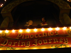
Three classic dark rides are found in the main plaza of Fantasyland, which still retains its medieval faire appearance of banners and tents rather than the quaint European village update that came to Disneyland the same year Tokyo Disneyland opened its gates. Peter Pan’s Flight is pretty similar to the Magic Kingdom version, while Pinocchio’s Daring Journey is much the same as Disneyland’s. Snow White’s Adventures, while losing the “Scary” from the title as in the Disneyland version, actually puts even more emphasis on the spookiness of the adventure. Riders begin inside the witch’s chambers and save the house and mine scenes for the middle, at which point the danger lurking outside is much more apparent. The layout even finds ways to further shorten the time between offing the witch and unloading the passengers by skipping the simple “they lived happily ever after” title card that was at least a nod to a happier resolution after the act of geronticide. I never expected Snow White to be one of Disney’s most hardcore attractions, but here we are.
It’s a Small World
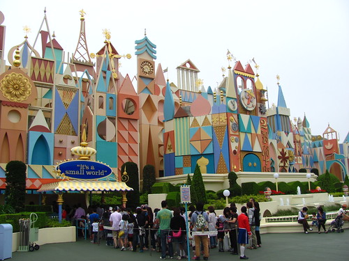
The fourth version of It’s a Small World I’d ridden in just over a year. At least it has the full facade, unlike the Magic Kingdom version, which would be the final version I’d ride the following year. I have nothing more to add. I’ll yield any extra words for this one to give more to say on the next attraction.
Pooh’s Hunny Hunt
 The world’s first trackless dark ride, with vehicles so fleet and agile it’s astonishing to believe it was made all the way back in the year 2000. It’s the rare example of a technologically ambitious prototype where the technology itself still holds up well twenty years later. Often regarded as the best attraction at Tokyo Disneyland with queues to match, as well as the go-to example used to shame the shortcomings of the four tracked “Many Adventures of Winnie the Pooh” versions of the ride around the world, Pooh’s Hunny Hunt has no shortage of adoring fans either in Japan or from abroad. Which is just fine, as it doesn’t need me to count myself among them.
Pooh’s Hunny Hunt is a prime example of a themed attraction getting hijacked by an exciting technology and over-generous budget, which ultimately leads to distractions and the detriment of the story it should be telling. After a boarding procedure intended to trick people into thinking it’s a familiar tracked dark ride experience, the first scene very intentionally blows out those expectations during the reveal of the massive scope of the sets and technological ability of the trackless vehicles. This is a ride that’s not shy to show off its $130 million budget, which really begs the question if the charming, humble stories A. A. Milne are the right fit for such a bombastic modus operandi. More than for the story, so many features of this ride mostly seem included for the intent to make riders think what an elaborate and cleverly designed attraction this is.
The story beats are ostensibly all familiar to the Many Adventures of Winnie the Pooh rides, which themselves are based on the classic Winnie the Pooh and the Blustery Day animated featurette. However, Pooh’s Hunny Hunt differs by mostly excising the blustery day elements from the storyline. To fill the gap it extends the scenes for the initial character introductions in the 100 Acre Woods and, more significantly, the Heffalumps & Woozles “honey hallucination” scene, both of which get massively amped up to show off the capabilities of the trackless technology and increased show budget.
Look, I get it. Everyone loves the Heffalumps & Woozles scene. I like it too. It was Disney’s attempt to explore the psychedelic aesthetics of the acid-induced counter-cultural movement when the original animation was made in 1968. But when that scene alone becomes a full two-fifths of the entire narrative duration, it indicates that the ride both, A): is missing the point of it, and B): has major pacing issues overall. Heffalumps & Woozles drags on way past the point at which the point has been made, thus elevating it from a symbolic third-act turning point into the crux of the entire story. And it’s not like the blustery day scenes are the problem with the other installations. They drive the dramatic conflict, provide the story its moral bearings, and ultimately offer Pooh’s reconnection to his community. Remove that and it becomes a sickly-sweet wish fulfillment narrative. It ultimately gives Pooh all the honey he wants just because he can have it, a moral that underscores the attraction’s own inability to know when to cut back on the sweet stuff.
Toontown
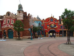
 I might have skipped this land if it didn’t have Gadget’s Go Coaster that I needed to add to the list. Largely identical to the Disneyland version but with a chain lift instead of tire drives and Japanese-mandated catwalks along most of the layout. Why these parks that attract visitation in excess of 15 million per year think a children’s coaster with a single 16-passenger train is a good use of space and resources, I’m not certain. While I was at it, I also checked out Roger Rabbit’s Car Toon Spin. I don’t know if this is the apex of 90’s Disney dark rides, but it’s certainly among the “most 90’s” of 90’s Disney dark rides. The vertical falling scene and stretching portable hole are both simple effects done very well. I never know if I should try to steer my car straight to appreciate the scenes or crank in like a tilt-a-whirl, which it obviously challenges you to do.
Tomorrowland
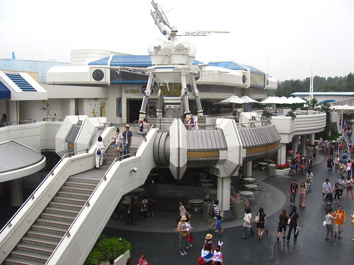
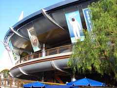
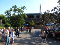
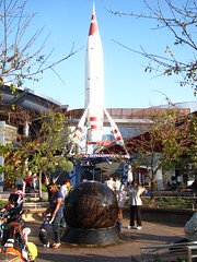
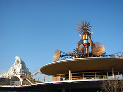
For better or worse, Tomorrowland is the land that feels most distinctly specific to Tokyo Disneyland in all its dated, boxy cream-white modular futurism glory. Although the land shows its age in a way that’s still a little too recent to lean fully into the nostalgic fun of retro-futurism, it at least has managed to maintain its consistency and avoid the onslaught of random neon and awkward character placement that other Tomorrowlands have had to contend with. Plus, it actually manages to make the multi-level design work.
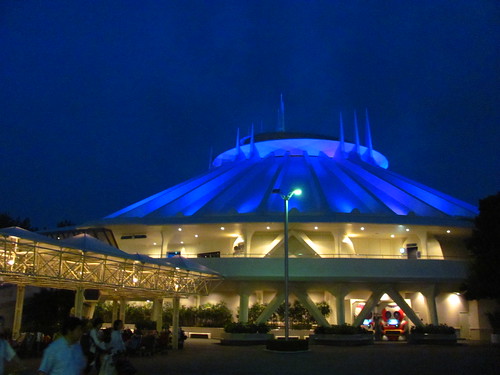
Space Mountain
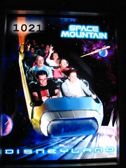
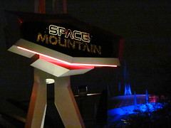
After riding the slick, smooth, soundtrack-synched versions of Space Mountain in Anaheim and Hong Kong, I was excited to see what the original vintage Space Mountain experience would be like. Unfortunately this was the one major attraction on the refurbishment schedule during my week in Tokyo, making it the final coaster (out of many, many before it) that I missed during my Asia travels.
Buzz Lightyear’s Astro Blasters
Rode it because as an omni-mover dark ride it’s a capacity sponge and thus I didn’t have to wait long at the end of the day. I spent five minutes of my life on this version of the attraction, and I don’t feel like spending more than that amount of time ten years later to write about it. This ride grows like a weed at every Disney park around the world, and I don’t know if there’s a way to get rid of it (other than unleashing the ants).
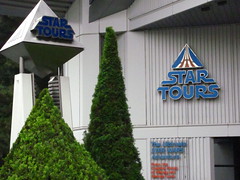
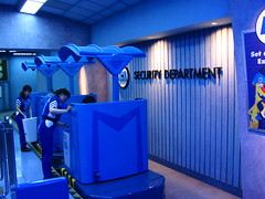
Star Tours
 The second and final time I got to ride the original version of Star Tours, both times narrated in languages I didn’t understand after being introduced to the ride in Paris the year before. For all the debate over the value of introducing lateral content in the newest incarnations of Disney’s Star Wars attractions, it’s interesting to note how much of the original Star Tours was also invention, even as its reputation became a poster child for the ethos of “give the people what they want.” Named for and based around a space tourism agency (which is a level of capitalist development unlike anything seen in any of the movies), featuring a new original character as the lead (voiced by Pee-wee Herman himself), it really ought to feel entirely separate from the Star Wars galaxy seen on film. But you still get to fly around in space and you even get to do the Death Star trench run, which our pilot has “always wanted to do”, a sentiment shared by most riders. No, Star Tours didn’t include everything one might expect from a Star Wars experience, but it did seem to do the most important things near the top of the list, so fans got off satisfied and the new ideas introduced are today largely celebrated rather than scorned. Which begs the question whether there’s a crucial difference in design philosophy between then and now, or if it’s the audience expectations that have changed?
Captain EO Tribute
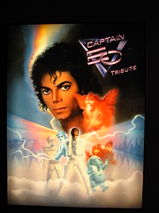
Jackson. Coppola. Lucas. Huston. Has there ever been an attraction that had this much starpower behind it, or one that has relied so much on the names of its A-list talent as the primary reason to get people in the door? Originally running from 1986 to 1998 and brought back for a few years after Michael Jackson’s death in 2009, Captain EO, like so much else in Tokyo Disneyland, was very distinctly an 80’s product, but one with more warmth and heart than most other attractions from that era. I can’t tell how much of the cheesiness of this 4D film was an artifact of its age or a deliberate creative choice by its creators. It’s easy to laugh when Michael uses his energy palm beams to transform the menacing sci-fi henchmen into a dancing troupe with big hair and tight pants. But for the most part, the creative talent involved was all given the budget and freedom to do what they do best on screen, and once Jackson has the space to fully command the stage on screen, it’s hard to be cynical. (Of course, that was a decade ago; there’d be a lot more reasons to be cynical if Disney ever tried to bring the show back for a third run today.) I’m all for giving people more creative freedom to make weirdly personal stuff for theme parks, so I certainly can’t fault Captain EO for that, even if it’s not the kind of weird stuff I’d personally ever think to make.
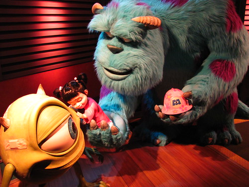
Monsters, Inc. Ride & Go Seek
This ride had the longest lines all day, so I didn’t get to it until relatively late in the evening. Staring up at the monster-sized corporate atrium inside the queue, I was worried that Ride & Go Seek might suffer the same downfall as Pooh’s Hunny Hunt as a modest ride in story and concept that’s brought down under the weight of its own inflated budget and expectations for itself. Fortunately that ended up not being the case. Here, the technological innovation was an interactive dark ride quite literally made dark, with interactive flashlights for riders to illuminate the scenes by their own hand, and with certain effects reacting when lit up. While the ride is no less ambitious than Pooh’s Hunny Hunt, by turning the lights down it brings the focus in much closer, allowing riders to delight in the small discoveries that they themselves feel they’ve made. It’s not interactive in the sense that you’re gunning for a high score, but rather the flashlight mechanic serves as a kind of editing device, allowing riders to direct their own story in real time by finding and framing each scene. And on a more primal level, isn’t playing flashlight hide-and-seek or imagining monsters in the dark exactly the type of childhood fun (completely innocent but has the feeling of danger and transgression if you’re under ten) that a family theme park ride should evoke for people of all ages, especially suited for a story like Monster’s Inc.? A real winner and one of my top three rides at Tokyo Disneyland.
Evening at Tokyo Disneyland
As evening approached I made my final strategy to complete the park. To be honest, I had to learn the crowd dynamics while I was at the park and in retrospect made some downright embarrassing strategic blunders. In the morning I had skipped FastPasses for Pooh’s Hunny Hunt or Monsters, Inc. and got my first for Splash Mountain instead, which I later discovered was one of the few rides that had an even quicker single rider line. Normally if that was the case it’d be difficult to complete the full attraction roster in a single day, yet I didn’t wait more than 30 to 45 minutes for anything, even riding Hunny Hunt twice using the standby queue both times, and had time for several more re-rides.
The first time I queued for Big Thunder Mountain in the morning I ended up next to a large friend group visiting the park who were interested in the lone gaijin in line with them and got to asking me a bunch of questions. Later that evening, in a stroke of pure coincidence, I somehow ended up in line again next to the same group, also for Big Thunder Mountain. After getting a photo together and entertaining them with some more stories and conversation, one of the girls of the group who had been leading the conversations, Aoi, suddenly got embarrassed and had to admit something to me. In what I recall were close to her exact words:
“I just want to say… I love you. Do you want a Japanese girlfriend?”
Wow, I… didn’t know what to say! A little concerned about the apparent age differential (not to mention that I was leaving Japan in 36 hours) I avoided committing to any sort of relationship while offering several compliments, and suggested that we could ride the coaster together. We all had a grand ol’ time together on the wildest ride in the wilderness, but as we disembarked it became clear that our paths were not aligned and it was never meant to be; they were going for dinner, while I had already eaten and had a FastPass to burn. We all bid our farewells, and thus concluded the story of how I had a 15 minute relationship at Tokyo Disneyland.
With the sun fully set and the lights flickering on, Tokyo Disneyland becomes a marginally more attractive space with the darkness hiding more of the ugly corners, although the wide pathways with limited lighting near the center at times feels like wandering into a dark abyss.




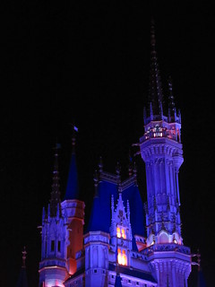


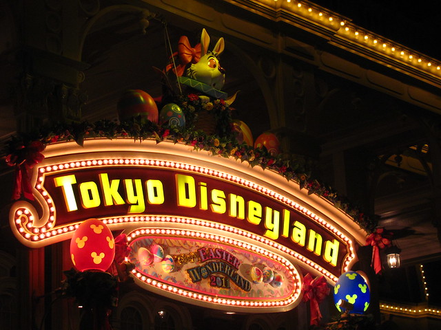 After making my way back down World Bazaar (that will never not sound weird) it was time to call it a wrap on my day at Tokyo Disneyland. While certainly far from my favorite Disney parks in the world, it was still one of the world’s largest theme parks with plenty of good among the not-as-good. It’s a park that clearly understands its niche with local visitors even if more traveled theme park fans might find areas to critique. The final park on my Asia tour scheduled for tomorrow, however, was more clearly designed to please the taste of serious theme park aesthetes. Would it live up to its promise?








































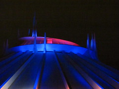
 The nebulous name and appearance is well-suited to the roller coaster contained within, which has a similar ineffable quality. There’s a beautifully orchestrated story arc to Space Mountain, but it’s not told using ordinary language. Any literal “space adventure” narrative is underplayed and abstracted to the point that it nearly ceases to exist, instead relying on music and our non-visual senses to create a compelling experience, only loosely tied together by a general sci-fi aesthetic bookending the beginning and end. Before riding Space Mountain I imagined that it would have been filled with dioramas of planetary scenes and deep space nebulae lighting effects to keep our eyes busy and stimulated, but in a display of restraint uncommon to Disney, the core of the ride experience is highly minimalistic. Once inside the main dome


Comments