When it first opened in 1999 Universal’s Islands of Adventure promised it would redefine the very concept of what a theme park could be. The foamers mostly accepted this as an a priori truism, but revisiting a decade after my first encounter I’m struck by how much the opposite is actually the case. Islands of Adventure does no redefining, no transforming, no advancing of the theme park as an artistically credible medium. Instead, the Islands are a crystallized summary of everything that defined what theme parks had become in the fifty-odd years since Walt Disney introduced us to the term.
The aesthetic principles are the same: colorful hyperreal environments that simulate an ‘escape’ from life in the postmodern capitalist society. The entertainment is the same: a collection of dressed-up mechanical rides as well as some shows and playgrounds, many of which are synergized with recognizable media franchises. And the infrastructure is the same: there’s a gift-shop festooned entry midway leading to a series of themed lands one can traverse circularly around a central point of focus. Really, the biggest innovation of Islands of Adventure was the use of negative space for the lagoon rather than positive space for the castle landmark. Islands of Adventure is basically Universal’s rip-off of Disney’s Magic Kingdom, probably as revenge for Disney’s Hollywood Studios which was a rip-off of Universal Studios.
In the end there’s nothing radically new under the Floridian sun. Islands of Adventure felt radical because it had with a bigger budget and more confidence when using buzzwords such as “immersive environment”, “interactive media”, and the perennial favorite: “storytelling”. Theme park experts looooove to talk about the importance of “storytelling” and “crafting a compelling narrative” (these kinds of ‘experts’ are easy to identity because they always refer to theme parks as “the industry”), even though they don’t have much justification for why storytelling is so important.
If I were to play the part of the cynic (imagine that!) I’d say it’s because there is no real justification, ‘storytelling’ has become just another commodity for the 21st century, a high-class label that brands theme parks apart from regular amusement parks. The content of the story is a cipher; as long as the recognizable structure of storytelling in the abstract is there we’ll commend them for the “creative effort”. Film school and Hollywood are much the same, and they keep us addicted to thinking about life in terms of basic narrative while never facing us with the question of why it’s important to structure shared experiences according to the modes of traditional storytelling. Beyond economics, what role are movies and theme parks supposed to play in society?
Visiting the Universal Orlando complex you won’t encounter stories, you’ll encounter one (1) story repackaged and retold in nearly every attraction that significantly involves narrative. The basic form of the story is this:
“The status quo is disrupted by an outside force, and it must return to the status quo.”
And is usually more directly expressed as:
“Oh no, something has gone wrong!!!”
 Granted, this form is very, well… universal. According to certain authorities there are only seven or eight basic stories ever told in the history of mankind, but after five global theme parks you still can’t find a major attraction with a significant narrative aspect that utilizes one of those other arcs. Even Disney uses at least two or three. I suspect the continual recycling throughout their theme parks is less a deliberate artistic choice than it is a result of following the path of least resistance when it comes to finding a story that matches the emotional response typically generated by thrill ride hardware. An internal status quo being disrupted by external forces for a few moments before achieving a return to stasis pretty well describes the emotional arc on any unthemed roller coaster experience at Six Flags or Cedar Point, which raises the question of whether Islands of Adventure has even completely transcended the ordinary amusement park, or if it’s all an elaborate pig in lipstick.
Technology or scientific pursuits are most commonly employed as the disruptive outside force that causes the mayhem and destruction, which at least signifies a complete reversal of the narrative of utopian technological determinism you’d get in the Mouse House at Epcot or Tomorrowland. This is particularly true in Jurassic Park and Marvel Superhero Island, although it’s also present in attractions such as Poseidon’s Fury. Yet it’s also an odd if not slightly hypocritical choice given how much Universal relies on high technology to exert perfect control over their audience-manipulating environments, if stories are indeed supposed to be “lies that tell the truth”.
However, more problematic is the fact that the sense of agency is reduced if not completely eliminated from Universal’s story form. Even though it’s oft marketed as a chance to “ride the movies”, to completely interact and immerse yourself in the action, audiences/riders are rarely treated as more than passive spectators. Exactly as the inciting action tends to be inexplicable to us (the technology happens to fail at a crucial moment for whatever reason, or an evil spirit happens to be angered by the presence of scientists just as we’re passing through), plots are usually resolved not because you or any other characters took action, but just… because.
 One moment we’re facing hopeless peril, and then the next a deus ex machina is dropped in and we’re told that somewhere a few seconds ago just desserts had been served and we’ve emerged victorious. We nod, satisfied with the resolution but confused as to how exactly it happened. Certainly it was not the result of anything we did personally, but if Universal wants to give us credit for it we’re not going to refuse, and we reciprocate our appreciation in the ubiquitous gift shop.
Port of Entry
The Adventure Begins…
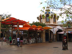 Speaking of ubiquitous gift shops, the tour begins in the Port of Entry, a mixture of Mediterranean, Middle Eastern, and Asian architecture that promises a convergence of diverse cultures and ideas, but delivers much less. The monopolistic micro-economy of a closed-gate theme park means the variety (and pricing) of goods on sale isn’t remotely what you’d find at a real world bazaar, mostly variations on the Universal Globe branded merchandise regardless of where in the world the vendor purports to be from. Nor are the textures that make up the façades quite as deep and rich as such an eclectic ethnic meeting place would suggest. Most of the original Islands demonstrate a lot of artistic talent on the conceptual drawing pads, but to make these worlds a reality they’re almost all sculpted out of styrofoam, fiberglass, and other cheap,
 easily moldable building materials, meaning any textures that are not already inherent in these materials must be painted on. Even when you have elegant Grecian domes standing next to a crumbling Arabian mud fortress, if you look too quickly they all tend to blend together in a way that screams “this is a theme park”. It’s a big idea that proved to be bigger than Universal could build.
Confisco Grill
There was a missed opportunity to make the Port of Entry a unique culinary midway with shops and stands offering a wide variety of exotic delicacies. As it stands, the only option for food is at the Confisco Grill, which now that the Mythos Restaurant in Lost Continent has been reduced to a school catering menu (at least so I’ve been told from a couple sources; on that advice I didn’t bother to see for myself) is possibly one of the better establishments in the park to get a sit-down meal. There’s some diversity on the menu, though nothing more exciting than you’d find at a trendy chain restaurant adjacent an upscale shopping mall; I ordered a French dip sandwich and had no regrets when the bill was paid. The interior decoration is more interesting than the gift shops, with props and references to the other islands scattered around the Mediterranean interior like Easter eggs.
Seuss Landing
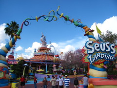 Part of the pain of growing up is the world steadily becomes much smaller and muted than you remember it. In a place where I was once dazzled, I now find myself nitpicking. C’est la vie. Much like Port of Entry, Seuss Landing’s construction has a deficiency of texture and depth that’s exacerbated by the fact it attempts to make an exact carbon copy of Geisel’s artwork but in three dimensional space. It probably looked fantastic in the conceptual drawings, and the finished product can look similarly fantastic in photographs… as long as the medium is two dimensional, there’s not a problem. But actually watching these characters and inhabiting this space in a moving, tactile world, it can feel eerily sterile and lifeless if examined too closely.
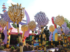 Viewing a cartoon world mediated through a drawing or image, there’s an unbounded quality where the mind fills in missing spatiotemporal information that allows it to coherently ‘exist’ as an independent reality, since information flow is one-directional and there’s no way we can actually have contact with this world. However, in a real environment there’s dialectical interaction between subject and object, i.e. perceiving an object also always reflects back information about ourselves: our location, duties, choices, sensory experiences, etc, which vary depending on the world we observe in front of us, and are absent when viewing a representational image. Because of this interaction, the whimsical structures all become subconsciously bounded to the mind’s expectations of a coherent reality grounded in physical laws,
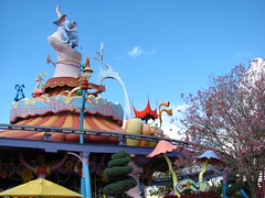 and the limited nature of the design can appear as if something intangible is missing, inviting closer scrutiny than intended.
Or maybe I’m overanalyzing it, and the difference from twelve years ago is that the colors in a fictional cartoon reality need to pop in out-of-this-world fashion. Today’s Seuss Landing, while still vivid, has become subtly sun-faded with time. As long as the kids still find it wonderful, that’s what’s important, right?
The Cat in the Hat
Another dark ride in a long tradition of dark rides that attempt to re-create a cherished childhood story that you can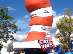 drive a car through in under five minutes… because stories are always better when experienced in the same way as one does a fast food restaurant. Nevertheless, The Cat in the Hat is a bit better than many of its peers because while the format hasn’t changed (five minutes or less of riding past mostly static physical scenes with only basic animated movement), the source material it copies is more appropriate to said format. A ten minute short story with illustrations viewed by turning the page, or an hour-plus fully animated and voice acted feature film: somehow it took until 1999 to figure out that the former is better than the latter at making the translation to a theme park setting. It’s still largely incomprehensible if you don’t already know the original story, and the set design feels a bit undercooked due to a too-literal translation
 of a 2D picture book into a 3D environment. At least it’s faithful to Geisel’s story and is sweet without becoming saccharine… something the recent CG feature length films (also by Universal) have not managed.
Grade: C
The Lost Continent
How is this still alive? It used to be the best island in the park, the one place on Universal Orlando property that retained a franchised purity as if it had actually been born from the imaginations of a few bright-eyed and ambitious creative directors, each burning to share her or his vision with the world. But now it’s just lying there, chopped in half, its vital organs slowly being digested by the media juggernaut that looms overhead while the bottom end of it just barely manages to survive, mostly by producing bile. One wishes Harry Potter would simply finish the deed so we don’t have to watch it suffer in its lame state anymore, before our good memories of it become completely smeared with the raw entrails that have been left behind. But the boy wizard has other dining plans first…
Poseidon’s Fury
Never before has the battle to save not only our own lives but perhaps all of mankind been so tedious. This walk-through stunt show/effects extravaganza tries to tell a reasonably involved story (twenty minutes by theme park standards is epic) and does so with a fair amount of theatrical flourish. The drawback: it only has two good special effects for the entire show… one for each plot point. Most of this attraction is filler and padding, such as an introductory chamber in which our archeological guide does ‘improvisational comedy’ while simultaneously providing backstory and initial developments; both involve the nervous flapping of hands while stuttering for five minutes. Even when the stage expands and we’re caught in the middle of an ancient battle of the gods, the audience is still completely passive despite the supposed stakes at hand, everyone gawking at the fire while waiting patiently for Jeremy Irons to appear in his Halloween costume and give us a few more wham-bang special effects before showing
 us the exit door. Poseidon’s Fury gets interesting when the effect technicians show up for work, but as the story is about an angry, power-hungry deity, the human element by comparison is predictably negligible.
Grade: C-
Eighth Voyage of Sindbad
Here are some examples of the quality of writing you can expect from this live-action stunt show: A noisy comic relief character is named “Kebab”, which gives the handsome protagonist the priceless one-liner “shush, Kebab”. Said comic relief character also farts on one of the bad guys, and kicks or gets kicked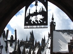 in the groin not once, nor twice, but three times. Meanwhile the hero, Sindbad, has a black belt in chopsocky, and by the end of the show falls in love with the strong and sassy princess whom he sweeps off her feet after saving her from an evil and ugly bitch… er, witch. Some researchers warn that roller coasters have the potential to kill brain cells, but methinks they’re studying the wrong attraction.
Grade: F
The Wizarding World of Harry Potter
In the decade or so since Islands of Adventure opened, Universal Creative appear to have learned a few things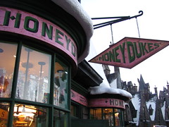 with the debut of the Wizarding World of Harry Potter in 2010. The buildings are made with real masonry and hardwoods (or, at least, more convincing synthetics), which lend the land deeper textures and a richer, even warmer feel, even as it simulates a crumbling village in wintertime.
However, they also seem to have forgotten a few things… crowd management, sightlines, and even a few basics of storytelling, are all fine details that plague the Wizarding World’s claim to representing the worldwide pinnacle of themed design. I remain stumped by the choice to represent Hogsmeade under a blanket of heavy snow and icicles despite the perpetual weather promised by the Sunshine State. Is Universal simply thumbing their noses at the idea that cognitive dissonance could ever apply to them? Or was that choice made in the same daredevil spirit that allowed so many other deficiencies to hide in plain sight? (Further details below.)
Perhaps the biggest question regarding such esoteric aesthetics, as I stand amid gaggles of Harry Potter fanatics and tired middle-class parents policing their children on vacation: am I the only one here to notice, or care? After millions upon millions of dollars, I feel a touch alone in my guilt for thinking that it still needed more.
Dragon Challenge – Chinese Fireball
A few years ago I would have thought the infusion of the world’s hottest property (with all the extra foot traffic and capital spending it brings) would have been a good thing for revitalizing the Dueling Dragons. A few years ago I would have been wrong. Beyond losing the ability to duel, the roller coaster has also lost a certain poetic quality that made the original so pleasurable. Choose thy fate? “Fire and Ice” is a Robert Frost poem; “Hungarian Horntail and Chinese Fireball” is a National Spelling Bee competition. The entrance is literally the difference between a sculpted work of art and a brick wall. The massive queue, from the beginning wasted on the highest capacity ride in the park, at least made an entertaining walkthrough attraction with memorable flourishes like the suspended knightsicle. Now I’m making mental notes that I’ve walked past a hair over fifty bright red EXIT signs on my way through a generic dark and gloomy castle that can just as easily fit the next franchise that moves in.
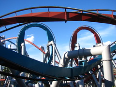
The experience at the end of it is still a big ol’ B&M inverted coaster built over a Florida cesspool. With the dueling aspect now absent, the biggest appeal of the coaster for me is the completely non-standard layout, qualified by the note that non-standard does not equal better, just different. The mandatory vertical loop is now found midway through the configuration rather than at the very beginning, and the Fireball side has a couple maneuvers you won’t find on any other below-the-rails track by B&M: a large camelback hill (not much airtime), and a tilted Immelmann-like inversion with a wrap-around spiral on the way back down (strong positive G-forces on this one, especially in the back). Beyond the bigger serving of geez Fire doles out, a faster maximum speed on the 115’ first drop and a second surprise corkscrew after the signature interlocking corkscrews makes the red track the preferred side of Dragon Challenge to enthusiasts and casual riders alike. Not that it’s significantly better than most single-tracked inverted coasters, even within the same state.
Grade: B-
Dragon Challenge – Hungarian Horntail
The Horntail’s layout is a completely different element line-up from the Fireball’s, but when both are essentially random sequences, so what? Blue used to emphasize the visuals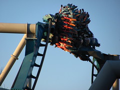 from the front row (the castle-skimming cobra roll, or the long straightaway anticipating the dueling loops) in the same way red emphasized G-forces from the back, but now that synchronized dispatching is a thing of the past the Horntail experience gets the short straw. Not helping is a meandering finish that competes with the Great Bear for most lackluster finale ever on a B&M coaster. On the plus side it makes Fireball seem a more ‘complete’ coaster than it otherwise should, due to the immediate and inevitable comparison.
Grade: C+
Ollivanders Wand Shop
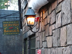 This is a new low: the first time I ever queued to enter a gift shop. There’s a short live show before entering the shop that recreates the famous “wand choosing” scene from the first film with a small child chosen from the audience that’s the cause for this queue, which can sometimes take over an hour. The special effects are all basic light-and-audio cues, although I respect the effort of the gentleman portraying Mr. Ollivander, as it was only momentarily evident that this was his hundredth iteration so far today of his eternal scenario. Given the price of the wands I can only imagine it’s something of a horror show for parents as well: a piece of wood magically selecting their starry-eyed child in front of a small cheering audience, Mr. Ollivander leading them in private to the back room to talk financing options after the show
 is over. It’s a selling technique that’s the envy of car salesmen the world over.
Grade: D
Flight of the Hippogriff
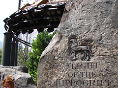
Not much to say here, except that it obviously fared better in the makeover from Lost Continent to the Wizarding World than Dueling Dragons. I’m glad they didn’t try to make the trains look like a real mythological beast even though that’s what we’re supposed to be riding, instead using wicker replicas and keeping the lifelike animatronics off to the side of the track where it can keep the correct proportions. Hey, it’s a Vekoma Roller Skater, are you really going to wait a half-hour in line just so you can hear Robbie Coltrane give the safety spiel?
Grade: D+
The Three Broomsticks Inn
You can buy a plate overfilled with food that reasonably approximates authentic British cuisine. Whether or not that’s a good thing I will leave to the reader to decide. For me I think it was the first time I ever had vegetables not situated in a sesame seed bun in a theme park. Soft beverage options for those who want the full “Harry Potter experience” are basically liquid or frozen butterbeer, which is basically a butterscotch root beer concoction. Purists may want to opt for the liquid variety seen in the movies, but for whatever chemical reason the flavors are much stronger in frozen butterbeer; both are frankly pretty damn good.
Harry Potter and the Forbidden Journey
From a distance the forced perspective Hogwarts castle looks awesome. Walk closer to it and it begins forcing so much perspective on visitors that I worry someone is likely to herniate. Then you notice the rocky outcropping it’s sitting on appears oddly square-shaped as if it’s covering up a big box… much like the white warehouse behind the castle that remains firmly within sightlines from both the overflow queue to the left and the main walkway to the right. The experience inside is much the same as from the outside: dazzling first impressions, but the magical illusion crumbles all too easily with even the most rudimentary critical thinking. One might have hoped the nuances of storytelling and subtleties of character would have transferred to Florida, and under J.K. Rowling’s guidance the Forbidden Journey could have signaled a new era of theme park attractions as an interactive storytelling medium. Instead what they built regresses from that objective, and is a nothing more than a non-stop assault of five of the senses: visual, aural, tactile, olfactory, and common.
The story, as others have analyzed, is moronic. The closest thing to narrative we get is in the very first dragon scene: there’s a micro story-arc from Hagrid’s introduction, the escalating action in the video screen chase, the suspense in the covered bridge, and then an odd climax/resolution combo when we confront the full-sized animatronic dragon… an awkward moment of staring certain death in the face, diffused when it breathes a refreshing mist on us instead, and the plot, realizing it can’t go any further with this strand, yanks us someplace completely unrelated. After that it’s a non sequitur of random, isolated dark ride gags based with no regard for continuity, even jumping from night scenes to day scenes in the span of a few seconds. They’re included for no apparent reason other than they all must have ranked highly in focus group discussions about which scenes from the movie series
 would people most like to ride in a theme park. Dialogue is also non-existent, as the actors only shout single lines of caveman-like exposition to highlight the action already happening in front of us.
The Forbidden Journey strikes me as the creation of a cynical marketing director who believes that uninterrupted stimuli that looks cool and expensive, packaged with a familiar and loved intellectual property, is all that’s needed for a blockbuster hit. And I fear the Forbidden Journey’s success amongst audiences will only confirm that cynicism. When I got off I felt a little bit like retching, although that could have just been from rocking back and forth in front of surround video projections for five minutes.
Jurassic Park
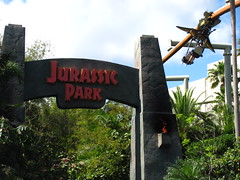
The natural landscaping has helped Jurassic Park age more gracefully than some of the other islands. The vegetation fills in wherever artifice is unable, and any weathering to the edifices generally improves rather than detracts from the appearance. The movie was essentially about a zoological theme park that could plausibly exist with some almost-believable science fiction, so it makes perfect sense that the fictional theme park world would translate naturally in a real theme park environment.
 That is, until they start messing with the meta-narrative too much. Why do the ‘fake’ spinosaurus and tyrannosaurus photo-op statues along the midway look more realistic than the ‘real’ dinosaurs (with droopy latex skin and stilted movement) we’ll encounter along the River Adventure? Are the children riding above the canopy in fake real or real fake pterandons? How much of this island is themed to a theme park, and how much is just plain theme park themeing? And will anyone ever manage to wrap their mind around these questions, let alone the answers?
Jurassic Park Discovery Center
The Discovery Center remains an impressive piece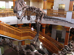 of construction even as it becomes taken for granted among most of the Island’s visitors. The multi-story battle between a skeletal carnivore and herbivore is even more awesome in person than it was in the film, and the center could almost be mistaken for a branch of the Field Museum. However, the center’s primary shortcoming is its mix of edutainment activities on the lower level, which are skewed more towards the second half of the portmanteau. No self-respecting twelve year-old boy will walk away from here having learned anything new, and because a lot of the activities use custom computer programs that haven’t been upgraded since the late nineties, a sense of tedium can often replace the supposed entertainment value. Best is still the live raptor-hatching show that performs every twenty minutes or so, although I’d imagine
 the DNA Mixer (which takes facial scans and a ‘blood sample’ to superimpose your genetic makeup onto a dinosaur) can also be sort of amusing if you try it while drunk.
Grade: C
Camp Jurassic
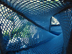
You can get lost exploring in here for hours… okay, maybe lost for one hour, if you insist on scouting out every last trail. The climbing area is a little too idiot-proof to be very much fun for kids or adults (you can thank the lawyers for that), although the subterranean caverns can be a chill place to get away from the heat and humanity for a few minutes, especially when the volcanic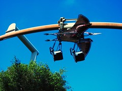 hot springs start performing. It’s more exercise than most theme park nerds will ever get elsewhere, so I won’t complain.
Grade: C
Pteranodon Flyers
I’m not sure which is worse: the fact that this ride exists in one of the world’s premier theme parks, the fact that it was duplicated ten years later at an international sister park, or the fact that real human beings were responsible for greenlighting both projects. Daily capacity on this ride is less than some other attractions’ hourly figures, and their solution is to ban anyone over the 48” height maximum who is not the sole possible guardian of a small child. One young lad just a hair over the limit started to break down in tears when he was told he was not allowed to ride with his younger sisters, which I took a perverse pleasure in visualizing this incident being discussed with an analyst years later. My early morning attempt to sweet talk my way onto the ride when they were still cycling empty cars was met with a surprisingly candid and urgent answer: “I personally wouldn’t mind, but you have to understand… Big Brother is always watching us.” Good to know management has at least a few of their priorities straight.
Grade: F
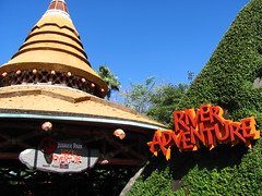
In terms of story, mood, suspense, and thrills, the JP River Adventure is actually pretty good. Like… really good. Themes of man’s isolated struggle against both nature and technology (“oh no, something has gone wrong!”) are represented over an emotional arc from subliminal wonderment to survivalist terror, effectively affecting audiences within a six minute journey that feels much longer. The opening scenes proceed at a slow and contemplative pace, atypical among theme park attractions, and it helps amplify the contrast with the scream-inducing second half. Perched on the cusp with a tyrannosaur bellowing in our face, the climax feels epic because every second from when we first entered the queue was focused on our inevitable arrival at this moment: you know the boat’s gotta drop just as you know you’ve gotta face the T-rex sooner or later. It’s a basic story well-suited for a theme park ride, but you won’t find it done better anywhere else.
Of course, none of this should come as a surprise given that the ride’s story beats are almost identical with the movie. Rather than be entrusted to create an original storyline within the Jurassic Park universe, the designers are simply translators from the cinematic language to a theme park medium where attention spans are compressed and human characters are eliminated as pesky distractions from the beautiful action. It’s not like anyone watched Jurassic Park for the interpersonal drama, right?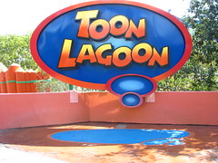 The trick to a successful synergy isn’t to make theme park attractions more like movies, it’s to make movies that are more like theme park attractions, and in the case of this franchise it worked.
Grade: B+
Toon Lagoon
It’s colorful, wacky, phantasmagoric, and funny. Everything a theme park should be, right? Praise for Toon Lagoon’s “attention to detail” means something slightly different here than in other themed environs; it’s not the detailed authenticity of fake rock strata that leaves us awed, it’s the quantity of sight gags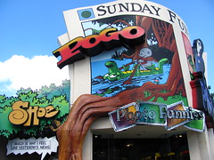 and one-liners the artists and writers had to devise that staggers the mind. With nearly eighty different characters represented on this island it could possibly take someone an hour just to read through Toon Lagoon.
Yet as one of three islands based on two-dimensional illustrations it suffers from some of the same problems of flatness and sterility that plague Seuss Landing and Marvel Superhero Island, especially when the paint starts to fade or crack even the tiniest amount. However, I’d say it’s largely more successful than the other two because the wide variety of contrasting artistic styles, most of which are presented simply as a larger-than-life Sunday paper edition, means we’re not asked to inhabit a singular fictional universe. Around every corner you can still get a laugh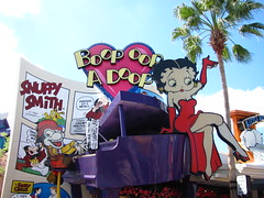 (okay, maybe a grin, seeing as most of the licenses are from the generation-ago King Features) without the suspension of disbelief ever entering the aesthetic equation. No, it doesn’t simulate “total immersion” very well, but as long as the four adjectives that opened this capsule review hold true, few foamers will ever care.
The biggest drawback to Toon Lagoon is that there are only two major attractions anchoring this area, and both are extremely soaking water rides (hence “Lagoon”). My rule is that if I do water rides I do them back-to-back in the hottest part of the afternoon so I’ll only have to dry out once afterward. Resultantly, this island has the lowest overall repeat value for me, and tends to be the most overlooked section in a day at Islands of Adventure.
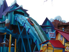 Dudley Do-Right’s Ripsaw Falls
Universal differentiates themselves from competitors by selling storytelling, in roller coasters, dark rides, effect shows, and water attractions. Yet their roller coasters are all generic or randomly sequenced with the story stopping shortly beyond the stations, and the shows and dark rides… well, I point to Sindbad, Forbidden Journey, et al. This leaves the one category that Islands of Adventure unequivocally shines above the competition to be their water attractions. Like on the JP River Adventure, narrative action mixes relatively well with the ride hardware on Ripsaw Falls, using a typical Snidely Whiplash kidnapping saga to underscore the thrills of the big drops and to keep us entertained on the normally dull bits of a log flume. However, compared to Jurassic Park’s mastery of integrating narration with water, the story is a quite a bit busier (and, honestly, more confusing), while the emotional range is much narrower, befitting its Saturday morning cartoon show origins. In spite of some special effects that haven’t aged as gracefully as the rest of the park, there are a couple steep drops (and more) that appeal most to coaster enthusiasts which are what have helped keep Ripsaw Falls’ ranking high in the annual water attraction polls. Plus, from the bridge it offers one of the most iconic photo op locations in all of Islands of Adventure.
Grade: B-
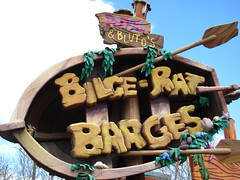 Popeye and Bluto’s Bilge-Rat Barges
There’s a fine art to dumping a gallon of water down the back of someone’s shirt on a rapids ride. During the ride people try to protect themselves from getting wet as much as possible, but they’ll also be very disappointed if they return to the unload platform bone dry. Balancing these contradictory desires to create the most satisfying overall outcome requires a great deal of strategy on behalf of the designers. There are rules: it can’t be arbitrary, it can’t come from a single source, it must fit the narrative arc of the themed storyline, it must be distributed among riders equitably yet not necessarily equally, and it can’t feel like a form of sadism. By the last rule, I mean that the dumping of water down shirts should appear to happen as if it were a spontaneous act of the gods, not as if some engineer decided to lock us into place and hold us under a waterfall for five seconds. Just as in Shakespeare, where man simultaneously has free command over his actions and yet is inexorably tied to his fateful demise, on a water attraction we must feel as though it’s within our power to stay dry, even though subconsciously we know that we’re fated to our ultimate soaking.
Although it started promisingly, Popeye and Bluto’s Bilge-Rat Barges faltered in the final act when the lift hill dragged us under several water spouts that got a few people in unlucky positions really soaked (and nothing they could do about it), and then the climactic drop finale it had been building to failed to get anyone on our raft wet.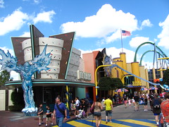 As for the storyline, just replace all the roles from Dudley Do-Right with their equivalent from the Popeye comics, and add a sprinkle more confusion from the spinning while removing the roller coaster drops, and that’s Bilge-Rat Barges for you.
Grade: C+
Marvel Superhero Island
The problem with theme parks themed to urban areas is that they can never replicate the scale of real cities, and most of us, if we don’t live in a city, are familiar enough with them that the comparison is unimpressive. I like the over-the-top Art Deco flourishes around Marvel Superhero Island and the pop-culture energy that gives the island its pulsing lifeblood, but at the end of the day this is the one part of the park that most closely resembles the average Six Flags. Most of the superheroes you’ll see are either 2D cutouts oddly affixed on the front of the buildings, or a scrawny dude in a Spiderman Halloween costume.
Doctor Doom’s Fearfall
Twin stock S&S turbo shots. If the line is more than fifteen minutes long it’s good for only one of two people: those who have never ridden a turbo shot before, or the obsessive fanatics who have ridden copies a hundred times before, and are interested in the little thematic flourishes Universal used to dress it up before it takes off and you’re given a bird-eye view of the theme park’s storage lot. Keeping the towers hidden from eyesight but not earshot prior to boarding is a neat psychological trick, but after the fraction of a second of weightlessness is over as we wait for the compressed air chambers to empty, I’m twiddling my thumbs and thinking how much I’d rather be riding the Hulk (although not the Accelatron).
Grade: D+
The Amazing Adventures of Spiderman
Perhaps the thing I dislike most about the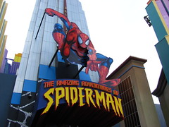 Forbidden Journey is now all theme park hipsters (relatively speaking) can look cool by saying they still think Spiderman is the best dark ride at Universal Studios. And they’d be right. Especially with the 2012 digital upgrades, Spiderman is a much better ride than Harry Potter… but I still find it somewhat overrated. This is the best narrative-based dark ride (featuring characters and a plot, and not simply a sequence of events) in the entire world, possibly thanks to its comic book origins. Comics and dark rides seem like they’d go hand-in-hand with each other, as both have to communicate a short story using an arranged sequence of static visual images that draw the eye through in a certain way. The translation process from one medium to the other seems far more natural in a theme park setting than, say, live-action film, and the fact that there are many
 superhero comics (or graphic novels, if that’s the politically correct term) regarded as great pop-art makes me optimistic that dark rides might make the same claim one day soon.
The problem is, even though the story is quite strong compared to other dark rides, compared to established storytelling media it’s rather primitive and even laughable, barely rising above the level of a bad Saturday morning cartoon show. Spiderman is reduced to a background character who only shows up at the beginning and end to give a few lame one liners, there are four villains when one would have been sufficient for the narration to advance, and the dramatic action must stop cold for a long section in the middle so each member of the crowd can get some individual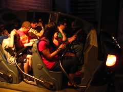 screen time coupled with a special effect gag. Sequences that could be randomly rearranged or even cut with no impact on the rest of the story are a big red flag that the writing isn’t as tight as it should be. Things start to cook when the anti-gravity gun is turned on us, but the resolution to this sequence is a total cop-out by the writers, going from certain death to victory in a couple of seconds with no real struggle apparently involved. The reason the ride has so much emotional impact I think is attributable simply to the concrete aesthetic presence, the fact that the story takes a highly visceral form we’re not accustomed to. The ride is undoubtedly a great technical achievement that conveys an immense sense of scale, unsurprising given the budget. However, the most important rule any other artist working in a narrative-based medium has to
 follow is “story first”, and the Amazing Adventures of Spiderman, burdened under too much technology and stimulating viscera, made story a secondary or even tertiary concern.
Grade: B-
The Incredible Hulk
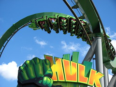
“I think, I think this time it’s going to work. Uh oh… NOOOOOO!!!” Evidentially Dr. Banner and I were thinking the exact same thing, although for slightly different reasons. Of the mainstream superhero characters the Hulk has always been a favorite amongst pop-art connoisseurs for his tragic antihero origins, creating a modern Jekyll and Hyde persona in which the battle against one’s own dualistic inner nature is as dangerous as the massive physical battles against the outside world. It’s a rich character for experienced storytellers to work with, and there are glimmers of this potential partially glimpsed while waiting in line. But then we board the attraction and this potential is wadded up and thrown out in favor of yet another “oh no, something has gone wrong!!!” reaction to technological development. The story effectively ends with the launch tunnel since not much narrative progression in a roller coaster circling around an empty lot, although I suppose something could be said about the catharsis after an adrenal release tying into the Hulk’s story… I’m skeptical many people would read that deeply anyway.
 The big technological innovation that sets the Hulk apart is the upward launch tunnel, but this was misplaced at the beginning of the ride because usually B&M coasters are pretty exciting for the first few maneuvers anyway… it’s in the second half when they need a creative team to make something new that will keep it unpredictable and engaging. Instead the opposite is the case, with both Universal and B&M frontloading all their best ideas while responsibility for the final thirty seconds feels like it was handed off to a low-ranking engineer who grinded out a layout configuration the night before their deadline to send it to fabrication. It gets the job done, but so much more was possible with this coaster.
Summary
Is Islands of Adventure the landmark in theme park innovation it claims to be? Maybe, but it relies more on technological innovation than creative innovation, when it needed to be the other way around.
Overall Grade: C+


Comments