“I think the best way to get the value out of Animal Kingdom is to really slow down, pay attention and sort of read it the way you would read a really complicated and rich kind of novel.”
This quote from Animal Kingdom’s lead designer Joe Rohde, taken from the park’s tenth anniversary presentation, simultaneously encapsulates why this is the most artistically compelling theme park of its generation1 while it implicitly acknowledges one of the park’s greatest weaknesses. Disney’s Animal Kingdom is one of the rare true theme parks, with the word “theme” used as if by a literary critic rather than a prom committee. Rohde equates design with text, in which the park is a story, each land an act, each attraction a scene, and every detail a line that’s filled with messages, ideas, and ethics… many of them surprisingly left-of-center for a company as notoriously conservative as Disney.
Rhode has stated that the “official” dramatic themes are the intrinsic value of nature and the transformative power of adventure, however from my own interpretation I’d argue that these can be further reduced to a single unifying theme: “The Love of Life”, both in the sense of the love of one’s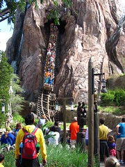 own life that manifests in the will to adventure, and the love and respect for all other living organisms. Is there a better medium to express such a humanistic value than a park space that can only be witnessed in the first-person perspective, shared with others both of and outside our species, and requires our own personal agency to explore? While most other artistic media in the digital age can easily be stymied by ennui and wash right over a passive spectator, visiting a theme park is a continual process of affirmation, as we must intentionally seek out each possible new adventure whether it is safari touring, mountain climbing, or time travel. To treat a theme park as a textually rich work of art is a simple, even obvious, yet surprisingly profound concept, and one that has yet to catch on in the collective consciousness.2
Thus the park’s greatest weakness: few people seem to understand how to “read” Animal Kingdom. The park is frequently denigrated as a “half day” park by people who race down the checklist of the major shows and rides and then shuttle back to the Magic Kingdom by afternoon. Given that one of Animal Kingdom’s major themes is “discovery” (a concept anathema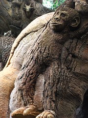 to the purposeful vacation preplanning that has won the bread of many a Disney guide writer) it’s unsurprising that so many people miss the finer pleasures the park has to offer in its many tributaries branching off the main pedestrian channels. Even those who do spend a bit more time are easily prone to notice only the most sermonizing aspects and come away with a bifurcated impression of the park as part entertainment and part ecology lecture, which in my opinion is only true of Animal Kingdom at its worst. But tempting though it may be to simply wag my finger disapprovingly at “those people”, who in the eyes of the theme park connoisseur are the mindless tourists hoards who can’t be bothered with culture and are responsible for all that is crass and commercial in this Disney world… aside from adding nothing practical to the discussion, such flippancy towards the majority of the park’s own audience avoids the larger issues playing out in the philosophies of theme park design and how people use and respond to these spaces.
Perhaps part of Rohde’s dilemma is that in order for a theme park to be treated as a text, we need to be aware that it has an author.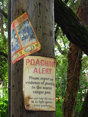 If theme parks are an art, they’re one of the few in which their makers typically go uncredited. Sure, it’s Disney’s Animal Kingdom, but Uncle Walt’s been frozen for some time now and even back in 1955 Disney-land was treated more of a brand label than title card of authorship. While certainly if you’re a fan and can do your homework you’ll discover many of the names involved, most other arts make recognizing their artist a central component of the spectator’s experience of the work, whether it’s the opening credits of a movie, a writer’s name in bold font across the front cover, or the program booklet you’re given to thumb through before the curtains are drawn. Remove these acknowledgments of the humans who create these fantasies, and suddenly you perceive a product (i.e. an object that reflects a solipsistic monologue within yourself about your own values and preferences directed against the product) rather than a creative work (i.e. a medium that sits inside an ongoing dialogue between you and the author(s) that opens up new possibilities about the work). And maybe it’s just that park spaces, especially those that try to blur fiction into reality, are simply too huge and immersive for us to intuitively conceptualize them as having an author in the moments that we experience them. We experience certain
 theme park attractions more as we would a real off-road safari or whitewater rafting trip, and less as a textual work that signifies a clear artistic intent that’s removed from its original subject. After all, stories are reflections of human’s experience on the world, whereas a theme park is presented as part of the world that humans experience and write stories about.
This problem is then exacerbated by the park’s design style. While Animal Kingdom is probably one of the most textually rich theme parks built at least since the original Disneyland and EPCOT Center, it’s also one of the foremost examples of hyperreality in which the purpose of the design elements is absolute imitation rather than free creative expression. I’ll loosely define hyperrealism as the destruction of referents; a hyperreal prop is a symbol that attempts to substitute that which it symbolizes, and a whole hyperreal themed environment is presented as identical to the world it represents. You’re not just seeing a multimedia representation of Africa (as you might in a documentary film or one of Future World at Epcot’s “presentational” style dark rides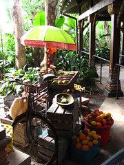 like Spaceship Earth or Living With the Land), you are meant to feel as if you really are in Africa.
I’ll admit that before I visited I was skeptical of how I would view Animal Kingdom’s pervasive hyperreality, especially in the Africa and Asia sections of the park, as I’ve never been very fond of the style which has established itself as the dominant form of decorative presentation in amusement/theme parks since the 1950’s. The problem with something being “life-like” is that it’s fundamentally defined by a relationship to that which it is not, i.e. the thing in “real life”, and thus the more lifelike the object becomes the more it only highlights its relationship to the object being simulated and thus its own fakery. Of course a hyperreal object is a great style for creating spectacle due to the way its lifelikeness self consciously draws our attention to the object’s own creation, transforming what would otherwise be a perception of the banal into a perception of human’s ingenuity at simulating and even bettering reality. I just don’t find that transformation to be of much aesthetic interest in and of itself. There are tons of examples of hyperrealism out there in which the chief purpose of the design seems to be to prove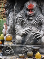 how clever and well-financed the designers are, usually indicated when the area’s theme becomes completely interchangeable with any other imaginable concept without affecting mood and message, or even attractions and infrastructure.3
While it’s true that in most ways Disney’s Animal Kingdom raises the bar of hyperrealism rather than subverts it altogether, unlike the unthinking direct imitation done only for the sake of spectacle that defines so many other parks, Rhode directs the hyperrealism in a way that feels intelligent and well-researched, perhaps as the theme park equivalent to cinéma vérité. The environments are so meticulously crafted, so intentionally natural, that every seemingly ordinary detail breaks through the crude reality and appears new again. Have we ever before paid as much attention to the exact aesthetic form of a cluttered desk or an abandoned bicycle as when they’ve been presented to us in the context of a high-priced theme park? The key difference is that where cinema captures truth, a theme park must recreate it. There is some danger involved in this, as an act of creation carries a different ethical standard than an act of documentation, since the designers are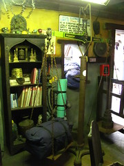 the first and last people accountable for every element that wanders into (or remains hidden from) view. (It’s here that admittedly some sections of Animal Kingdom can stink of a naïve romanticism celebrating Jean-Jacques Rousseau’s noble savagery, presumably to avoid dealing with the actual complexities that face ecological conservation and consumption reduction, even if these issues are only made more glaring by their omission.)
Like filmmakers, the designers wield juxtaposition as one of their primary creative tools, dictating the order with which we encounter the lands and rides, as well as perspective and framing, even as they continually refer to field research and biological experts to form the content of their scenes. The Oasis and Discovery Island are the first lands we’ll encounter at the front and center of the park, and as such they function as the introduction to the text, capturing and condensing all of the park’s major themes while maintaining enough ambiguity that we’ll be able to shape those themes for ourselves in later areas. The Africa and Asia sections in the back of the park are basically the distillations of a year’s worth of travel journals into a living, breathing experiential text, interspersed with some ruminations about the inherent value of life or the spirit of exploration. Finally at the sides are DinoLand U.S.A. and Beastly Kingdom (for the sake of artistic analysis let’s work with the author’s original intent rather than the compromised resultant product), which are more personally imaginative works of fiction built on top of popular mythologies, and it is here that the designers are given the most freedom of expression to share childhood stories and fantasies that directly tie into the park’s tentpole themes. Thus the park-text has a story structure in which the first act is a two-part prose piece that addresses the themes in the second-person; the second act one of two works of fiction told from a storyteller’s first-person perspective, and the third act a work of non-fiction that documents the world from a third-person remove. Then (unique for the theme park medium) these acts fold back on top of each other as we circle through park, eventually ending up back where we started at the end of the day.
Perhaps a theme park is an odd medium to document the world. After all it’s extremely inefficient as a recording tool, and I still think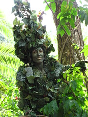 that hyperrealism’s semiotic reversal that replaces the concept of symbolism with substitution introduces a host of subjective difficulties that aren’t found in other representational media. However there’s no denying that in this age of digital media saturation the theme park has become an effective tool to manipulate an audience’s emotions, whether it be based on fiction or non-fiction storytelling, and even if the audience fails to realize they were being told a complete story to begin with. Let’s review this story, starting at chapter one…
The Oasis
Theme parks thrive on the spectacle, and first impressions are among the most important. Since the day that Disneyland opened, almost every midway from the entrance gates to the central hub has been designed to act like a magnet: to emotionally pull you in at the beginning of the day, and to pull money out of your pockets at the end of the day. This pathway makes you feel like you’re in a race, and the first one to the hub is the winner.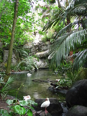 They also tend to be the most overtly commercialized sections in the park, and as such the most easily forgettable in their stale reiterations of façades hiding a row of overpriced shops filled with generic merchandise. How radical then is Animal Kingdom’s opening midway is a set of small winding trails through lush vegetation and past intimate animal exhibits, and there’s not a retail store, food truck, or edifice in sight?
As mentioned earlier I’d argue that the central idea of Animal Kingdom can be called “The Love of Life”, and The Oasis emphasizes from the very beginning that means the love of all life. Instead of the spectacle (i.e. the sublime impression of grandiosity that so dwarves our mental capacities to comprehend the entirety of we see before us that our mind simply surrenders to the phenomenon; that’s what gives Cinderella Castle or Spaceship Earth their subjectively “unreal” quality), The Oasis turns it on its head and becomes a place about details, of being aware of the living things around you no matter how small, and taking the time to stop and appreciate something as ordinarily beautiful as a bird or a palm frond. And instead of funneling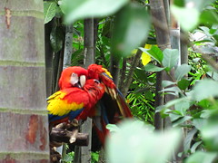 the crowds down a single major midway in a sea of humanity, The Oasis emphasizes the value of our individual agency by designing the pathways like river tributaries through the jungle, requiring us to continually choose which of several branches to explore next. Equally free we are to draw our own interpretations from this as-yet wordless introduction. For me it’s a place to reflect on the intrinsic value of simply being alive to witness all the other living things we share this planet with, which is probably true whenever I get to go exploring out in the woods, but I’ll take a theme park approximation as well. It’s a simple design concept that plays off the natural fact that the wonders of ecology and human curiosity go hand-in-hand together, but I honestly don’t believe that a better entryway has ever been designed in the history of theme parks.
Discovery Island
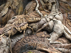
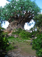
After the natural impressionism of The Oasis, the designers take more of an active role on Discovery Island, the park’s hub that connects the other five themed areas around the central Tree of Life icon. It’s the one place where Disney’s Animal Kingdom expresses its own unique identity through design, unlike the other themed areas which the artfulness tries to disappear beneath photoreal renditions of other cultures, fantasies, or nature itself. The Tree of Life wants us to look at it as a Work Of Art, distinctly separate from the natural phenomena surrounding it,4 so that we can marvel at this accomplishment of human ingenuity and ponder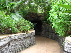 the meaning its makers intended.
The best place to do this is from the Discovery Island Trails, a network of small pathways and animal exhibits around and underneath the Tree of Life that are often regarded as Animal Kingdom’s best kept secret. Like The Oasis, these trails again are a chance to exercise our free agency and affirm the value of exploration, possibly even more so since these trails are formed in a circular web with no predefined beginning or end to defer to. (Unfortunately the trails have recently been compromised by the installation of protective overhead netting that was installed after a branch fell off The Tree of Life, which not only impedes sightlines and sanitizes the trail’s spirit of close contact with nature, but also resulted in entirely cordoning off several small side paths.)
Apart from the tree and trails, the rest of Discovery Island consists of a more typical collection of food and retail shops organized around a central thoroughfare. Unfortunately the design of these buildings is less than inspired, hewing closely to standard architectural features while coating it all in bright pastel colors and stylized animal decorations. While functional, it’s hardly more distinguished than any other contemporary themed children’s zoo, and it seems like a missed opportunity for the creators to get really innovative with their sense of magical realism expressed through design. The island’s theme of discovery doesn’t require (perhaps even discourages) copying existing architectural styles, which is what Imagineering has historically proven themselves so adept at.
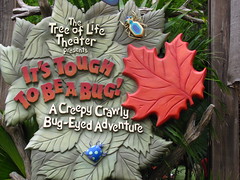
By all rational accounts this should have been a terrible choice for the park’s centerpiece. Imagine the pitch: a comical 4D film with gross out gags and intermittent elementary school bug facts, all based on an animated franchise. It might have been sacrilege to house this in a structure as holy as the Tree of Life, yet, pushing past the obvious synergistic branding on display, It’s Tough to Be a Bug actually manages to tie together several central themes of Animal Kingdom quite perfectly. Picking up from The Oasis, the show reiterates the theme that the marvel of nature starts from the bottom up by a life as simple as an ant’s, and further reflected in the attraction’s tone that favors humble small-scale jokiness and puns over Disney’s typical modus operandi of earth-shaking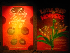 spectacle.
No, the writing isn’t nearly as sharp as Muppet*Vision 3D, but at least they took the effort to not only craft an original script that branches off from the primary A Bug’s Life narrative, but even introduces a mostly new cast of animated characters. This is all before the huge emotional dynamic contrast kicks in, which turns It’s Tough to Be a Bug into one of the scariest rides in the park, possibly even more so than Expedition Everest. I’m already a bit on edge from Cheech Marin’s Chili the tarantula flicking quills at my face and then getting acid-blasted by a termite in the first act, even though it’s all in good fun… but then Hopper shows up to announce that he’s going to murder the entire audience, and things turn serious very quickly. Fog rolls in, the theater is plunged into darkness, massive black widows descend from the ceiling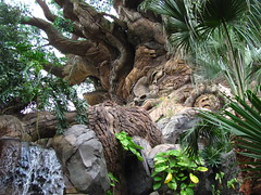 to spit venom at us, and an army of wasps jabs us in the back.5 Surprisingly I saw very few weeping children or grandparents when the show was over, which I can only interpret as a bit of real Disney magic.
Grade: B-
Camp Minnie-Mickey
This was supposed to be a temporary placeholder environment until the funds could be shored up to build the originally intended Beastly Kingdom, thus completing Animal Kingdom’s three-act story about animals real, extinct, and imaginary, and also explaining the presence of the dragon silhouette in the park’s logo. Then the turnstiles didn’t click as fast as the executives had hoped, other parks in the resort got tied up in their own expansion plans, and, oh yeah, those laid-off Imagineers who had drawn up the plans for the signature dragon-themed inverted roller coaster ended up finding employment with another nearby theme park company.
Camp Minnie-Mickey offers a lesson plan on how to do theme park design on the cheap and easy, mainly by repurposing existing props and materials into new uses, using an Adirondack summer camp theme as an excuse to use simple prefab wooden structures, and calling a queue next to a costumed character photo booth an “attraction”. As a themed area it’s pleasantly harmless enough, and if there’s any particular reason to hold a grudge against Camp Minnie-Mickey it’s for how it represents missed opportunity 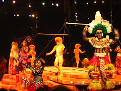 and the conflicting corporate and design philosophies that battle internally at Disney to the detriment of everyone else.6
Festival of the Lion King
Hmm, maybe Disney should produce more of their live entertainment on shoestring budgets at the last minute? Not only is Festival of the Lion King quite good considering that it’s made out of recycled parade floats, auditorium bleachers, and movie soundtrack, I daresay it might even be better than if it had been given a full Broadway treatment similar to the Theater in the Wild at the opposite end of the park.
The Festival largely forgoes narrative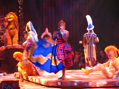 in favor of rhythm and dance, using a large cast of performers and acrobats in colorful African-inspired dress to create a powerful kinetic appeal, especially when the fire twirlers take to the stage. The circular auditorium with a central stage is a much more intimate setting, letting us witness the show and each other’s reactions simultaneously like a community gathered around a campfire rather than anonymous spectators ensconced behind a fourth wall, and for once the “audience participation” elements are not completely annoying. More annoying is the obligatory comic relief character, in this case played by someone in what seems like a repurposed Timon meet-and-greet costume who seems very out of place amid the impressionistic tribal dress of the rest of the cast, and who I can only imagine is there to fulfill some sort of IP quota that Disney’s marketing department
 enforces. Otherwise this is possibly one of the better examples of economic constraints benefiting the creative process at Disney, and despite its modest premise is probably the first show at Disney World I’d recommend to try for visitors who don’t normally have an interest in live entertainment.
Grade: C+
Africa
A word of warning to the designers: be very careful about the 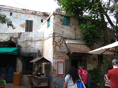 aestheticization of poverty. I’ll never forget the time a girl from my social studies class who, when presented with a picture of a woman in customary African dress holding a cell phone, complained that the intrusion of modern technology in such places was wrong and corrupting of her natural beauty. Yes, maybe certain types of poverty look pretty to the rest of us who want to be reminded that history and culture are still real things in the world, but for those among us who don’t have regular access to antibiotics and modern plumbing, a rich foreigner’s aesthetic compliments are of pretty marginal value. The last thing we need is for a theme park to perpetuate that condescending attitude.
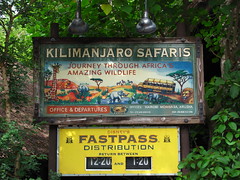
For the most part I think the designers are responsible about their role as placemakers recreating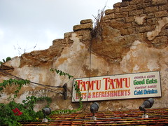 real(ish) locales, and their composite of East African villages into a single fictional entity called Harambe successfully evokes a sense of pride for the imaginary Africans who live there, despite the architecture’s copious cracks and rust that invite the fetishistic ogling of many “detail enthusiasts” (admittedly including yours truly). Many of the signs that direct traffic, list menus, or fill in backstory are stylized as authentic English-language advertisements, suggesting that tourism is this artificial postcolonial port town’s primary economic engine, and thus the ghost inhabitants have found a way to integrate themselves into the modern capitalist world while retaining (or, more cynically, selling out) their localized sense of culture and tradition.
Like it or not, this is what a lot of real world travel is like: filled with other tourists and permeated by a lingua franca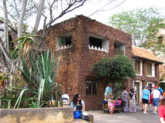 for ease of commerce. By defining our role in the fictional narrative as tourists (and thus narrowing the gap of cognitive dissonance between our actual and role-played selves, since we really are tourists) we’re made to think of ourselves as “foreign visitors to a place”, instead of as “visitors to a foreign place”, as is wont to happen in many theme park depictions of uncharted Zululand where the appearance of so many other whities on vacation is more suspect. I’ve never been to Africa, but there were moments where the simulation was so convincing that I almost could believe that I was there, in part because if I were to go I would expect to visit similar western-friendly tourist establishments that the designers likely visited for their inspiration of Harambe. Maybe I’ll discover with further research just how manipulated this sensation
 actually is, and I do wonder if having this experience already in Orlando will maybe lessen my motivation to buy a plane ticket to Cairo or Johannesburg later in my life, but in the moment I appreciated the strong sense of international travel without the usual costs involved.
Kilimanjaro Safaris
A too-easy critique of Animal Kingdom’s (now co-)signature attraction could have been that an imitation of a real Tanzanian safari simultaneously cheapens the value of the authentic by making it more affordably accessible from home shores, while gypping tourists who believe the experience is a close enough substitute for actually going out on the veldt.
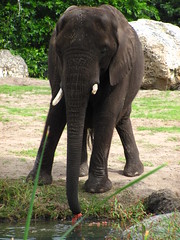
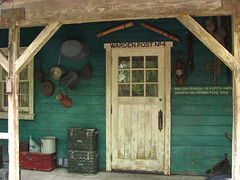 Apparently anticipating this criticism, the Kilimanjaro Safaris originally tried to differentiate itself by using theatrical elements that a theme park allows for to give the tour an explicit narrative; namely, a commentary on the harms of illegal animal poaching by including a storyline in which our caravan “rescues” an elephant from villainous poachers near the end of the tour. Apart from the heavy handed moralizing, this attempt largely failed because, juxtaposed against the real animals we had been observing peacefully for the past half hour, the scenario was too obviously counterfeit, attempting to manufacture a sense of peril and righteous desserts when there was none.
Recently this storyline has been discontinued in favor of an approach that mostly eliminates narrative in favor of an amorphous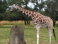 approach defined mostly by mood and setting which we can project our own interpretations over. It’s a move that while I definitely think was for the best, nevertheless recalls echoes of the original criticism over the purpose of an African safari simulation when you can still get the real thing in Africa. Granted there are still remnants of the older, more explicit show writing, however most of which add almost nothing to the experience of watching real animals. The disclaimer at the beginning of the tour that we’re about to embark on a four-week safari is mostly played for laughs; our tour guide casually tuning into a “local” African radio station is a moment of attempted authenticity7 that instead only highlights its absolute artificiality (although the music by itself is nice); and a fake collapsing bridge is there for zero reason other than to randomly elicita cheap shock
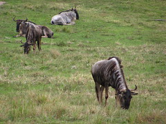 along an otherwise boring home stretch.
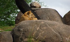
Still, I like watching animals free to do their animal business in reasonable approximations of their natural habitats, and in that regard the Kilimanjaro Safari is no disappointment. The length and scale of the safari is truly admirable, at least relative to other theme park standards. The safari area for this attraction alone takes up as much space as the entire Magic Kingdom, and just when I thought we were getting close to the end we wound up getting another ten minutes of tour time.
However, being a Disney E-Ticket, the attraction is also necessarily handicapped by high capacity requirements, such as the many times when our safari truck anxiously lingers at a scene for two seconds before hitting the gas to avoid blocking the next vehicle. It can sometimes feel more like we’re rolling down an assembly line than roaming freely across the savannah, especially at the beginning and end where a few exhibits have that “animals-sitting-in-a-pen/pit” vibe associated with lesser zoos. While it’s probably as good a safari ride as you’ll ever find at a theme park,8 I’m still not convinced that these types of safari experiences are best suited as theme park attractions (with their consumer demands for big spectacle and high capacity) when compared to similar experiences offered by zoos, reserves, and, you know, real nature.
Grade: C+
Pangani Forest Exploration Trail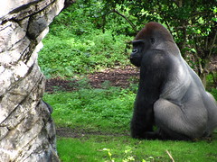
Disney went to great lengths to convince us that Animal Kingdom is more than just a zoo, but it turns out the parts that really are just a zoo are pretty good, too. Pangani Forest Exploration Trail acts as a nice post-script to the Kilimanjaro Safaris, allowing a chance to observe several species up-close and at our own pace in a way that the bouncing truck ride was unable to satisfy, as well as fleshing out the educational component of the experience with a small field museum and various notes on evolutionary biology.9 The lowland gorillas, not seen on the safari, make this trail a must especially for shutterbugs, although the linear pathway can cause some crowding issues and also somewhat betrays the promise of a true “exploration” trail. Even carefully taking my time I reached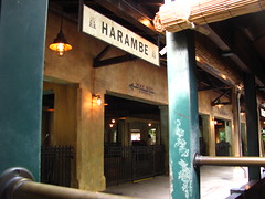 the end in under a half hour, so while the trail is far from exhaustive (both in fauna and on feet) anything you never have to wait in line for is okay in my book.
Grade: C+
Rafiki’s Planet Watch
Theoretically this could have been a good idea. Accessible only by a roundtrip steam train departing from a beautifully detailed Colonial African railroad station, Planet Watch is initially given an aura of mystery and adventure by the fact that it must be reached only at the end of a long journey. This aura is promptly obliterated when we discover cartoon cutout boards welcoming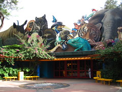 our arrival to the colorfully sterile Planet Watch station set along a backstage area of the park that leads to three subsections punnily called Habitat Habit, Conservation Station, and the Affection Section. Yep.
Basically the area serves to strip away all the nuanced placemaking from the rest of the park so that even the most dunderheaded among us can understand Animal Kingdom’s core ecobabble messages and be made to feel enlightened and pandered to at the same time. If Disney’s Animal Kingdom is a multi-part story, then Planet Watch is the footnote that forces you to navigate away mid-narrative in order to be explained everything that might have been the least bit ambiguous… an ambiguity that’s still not particularly elucidated by the display signs’ terse orders to conserve more and be aware that animals have ecosystems, duh.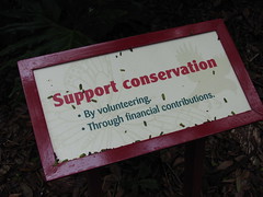 Has a single person ever been inspired by these signs to change their lifestyle? No wonder it had to be confined so far away from the rest of the park.
To be sure, this area’s odd contrast of nature with colorful two-dimensional design is definitely intended for kids, particularly evident in the Affection Section petting zoo… but then why the mandatory train ride to test those with short attention spans? There are a few decent animal exhibits along Habitat Habit and Conservation Station, including a station where you can observe the park’s residents getting their medical checkups done, unfortunately not in use as I passed by. Like any interactive educational exhibit what you put in partially determines how much you get out of it, but I’m uncertain if it’s worth the effort given how much this Epcot-reject zoo exhibit is ironically burdened by so much creative waste.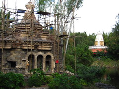
Grade: D
Asia
From the perspective of technical craftsmanship, this is quite possibly the best themed environment built at any theme park in North America, maybe even the world.10 Animal Kingdom’s Asia is represented by a fictional amalgam known as the Kingdom of Anandapur, which is so impressively convincing in details that the majority of American eyes will probably never realize how carelessly it steamrolls South, Southeast, and Central Asian cultures on top of each other.
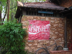 Like Africa, Asia defines the visitor’s point of view as that of a contemporary world traveler, which I think helps fill in some of the gap across which we suspend our disbelief, if not by making Asia seem more real then at least by making our simulated and actual roles closer together. At times it so effectively simulates actual world travel and the sense of curiosity and adventure that comes from simply recognizing one’s displacement in a different culture (compressed into a potent capsulated form by designers who are themselves expert world travelers), that I even became a little annoyed that a place so easily accessible by the masses on my home shores could superficially feel so similar to my own hard-fought solo trip to western China from a year earlier.
However, unlike the more scientifically precise Harambe,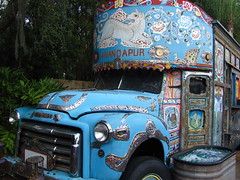 there’s a little more mysticism mixed beneath the surface of Anandapur’s otherwise documentary-like presentation, perhaps to allow its authors more creative freedom as storytellers, or perhaps to pander more to a Western audience’s expectations that the East must be mystical.11 If the subtext of Africa is about modern human’s ever-fluctuating relationship to a fragile nature (manifest both creatively through science and destructively through commerce), then Asia seems to be about nature’s immutability and mankind’s timeless connection to it, an expression of spiritual values stemming from ancient universal archetypes that we can intuit but not comprehend… at least when the designers aren’t hitting over the head with an explicit “message” and simply let the aesthetic impression of their world stand on its own.

Oddly enough, despite the area’s deep focus on history and mythology, one of my favorite aspects of Anandapur was the live DJ playing a mix of Bhangra music, in part simply because it was refreshingly modern for a Disney park, and the hard-edged electronic dance beat was an enjoyable change from the respectably anemic “themed” background music normally heard on Disney’s midways.
Flights of Wonder
Disney’s entry into the genre of bird shows, popular at zoos and animal theme parks the world over, is capable, enjoyable, and not entirely original. Before the show starts we already know the drill: a trainer brings out a bird, the trainers talks for a bit,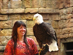 and the bird flies around or performs some behavioral trick for a bit. Repeat with different species, and maybe call a couple of audience members to the stage or have a bunch of birds fly around at once to a big musical cue. Most of the animals are quite amazing to watch, proving that Mother Nature typically gives Disney good material to work with.
Unfortunately Disney felt the need to augment it with their own material in the form of Guano Joe, a lost tour guide character whose sole purpose seems to be to pad out the show’s running time with comic relief, mostly achieved by heckling the main trainer and injecting a tired and unnecessary subplot about Joe’s ornithophobia. Still definitely worth a watch if the show times work with your schedule… and be sure to wave your hand high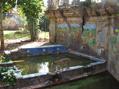 in the air when they ask for a volunteer with a camera.
Grade: C
Maharajah Jungle Trek
This walking trail allows you to admire up-close several beautiful tiger exhibits. Of course there are tigers living inside the beautiful tiger exhibits, but it wouldn’t be in the Disney tradition if the frame didn’t upstage the picture. There’s probably a backstory somewhere that explains how this south Asian palatial animal sanctuary came to be, although I doubt it also explains why it’s so important to build such a fanciful story to enhance our appreciation of animals.
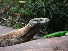 The tigers and vegetation are already regionally authentic, so why risk distracting us with so many fictional design elements? If animals are supposed to seem “better” if we feel like we’ve been transported to observe them in their natural environment, what then does the reality of their situation in Florida conversely imply? I merely note more than I grumble about the excess, although I will also note that the informational aspect is less present in comparison to the Pangani Forest Trail. On the plus side the walk takes a bit longer and there’s a greater diversity of species represented, including the totally badass Komodo dragon and flying fox.
Grade: C+
Kali River Rapids
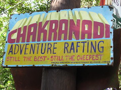 Given that theme parks have nearly no precedent as a medium for political allegory, it’s perhaps unsurprising that a message-driven themed attraction would view subtlety as an unaffordable luxury, lest the designer’s statement is lost on an audience who fails to understand their ambitions. Yet despite the fact that Kali River Rapids telegraphs its message about the ravages of deforestation from a mile away, it still manages to critically undermine its argument for conservation by appealing to our aesthetic sensibilities rather than any categorical imperative.
A key scene presents us with the smoldering remains of rainforest caused by a fiendishly heard-but-not-seen logging operation. The Imagineers expect us to be repulsed by this image, yet I suspect that many will instead admire the stark, moody landscape,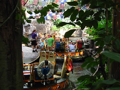 not least because we appreciate the technical craft required to create such atmospheric artifice. Once we realize our mistake that we’re supposed to feel melancholy by this faux eco-horror, the attraction evidently decides it’s time to punish our complacency12 by opening up the metaphorical floodgates to wash away our sin, dunking half the raft underwater at the base of a waterfall and then returning us damp pilgrims to the pristine green bosom of mother nature for the final leg of the journey to redemption.
Yes, that’s right, the Disney Company just lectured and shamed you about corporate externalities that harm the environment while you were trying to enjoy a raft ride. Never mind that for many people from impoverished regions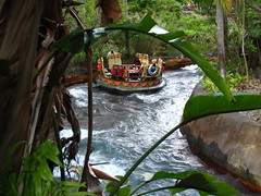 in south-central Asia, such logging operations are seen as a necessary economic resource to improve their standard of living, and are thus tragically and inescapably victim to the cycle of harm that such activities will perpetuate. Their continued vilification by first world eco-tourists likely does more harm than good, as such Rousseauian “enlightenment” of the ugliness of industrialization only serves to reinforce our post-industrial privilege over the rest of the world.13
Kali River Rapids would like us to think it noble, but the message is pat, the tone is hypocritically holier-than-thou, and, worst of all, the rapids aren’t even that long or fun on their own merits. A shame, as the concept if done correctly could have held so much promise. Well, at least the queue is good.
Expedition Everest
One hundred million dollars. That’s what you pay for a quality attraction like Expedition Everest, or so says Disney. Ignoring issues of quality for a moment, it’s worth questioning if any theme park attraction, even of the highest caliber, can be worth an investment of that magnitude?
Unlike a $100,000,000-budgeted feature film which can be released simultaneously to millions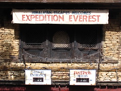 of paying moviegoers worldwide at relatively little marginal cost per customer, a roller coaster can only entertain two thousand paying customers each hour while it adds to the operational expenses. Simple economics already puts Expedition Everest at the outer limits of what money can be spent on a roller coaster, so it’s reason to wonder if it’s also the highest quality of what money can buy for a roller coaster.
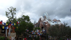
While I normally find “attention to detail” a meaningless phrase of praise,14 Expedition Everest displays such a high level of research married to craft that the purpose of the detailing becomes to evince a genuine and even contagious love for Tibetan culture. Every particular opens up a whole new microcosm ready to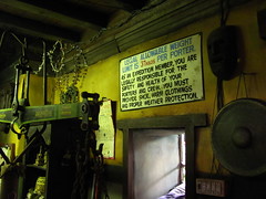 pique the curiosity of anyone who takes a moment to look: from the red paint marked over the forehead of each yeti shrine hinting to unfamiliar spiritual customs, to a sign reading “welcome here this way” that seems born from the pages of a delighted amateur linguist’s notebook among Imagineering’s field research team. But despite the numberless small eclectic touches seemingly strewn happenstance, every element has in fact been carefully storyboarded to achieve an exacting dramatic arc that’s refreshingly classical in design: you journey outward, are tested, confront the Other, and finally return.
And yet…
Undoubtedly Expedition Everest is a landmark in themed entertainment design, but somehow I found the story-roller-coaster fusion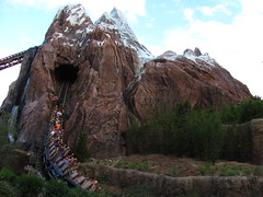 surprisingly ineffectual in its ability to stir many raw visceral emotions common to both good stories and good roller coasters. The reverse switchtrack is a nice narrative twist, but it’s hardly at the level of Hitchcock. We spend so much time staring at the broken bridge ahead of us that when the switchtrack finally does clear everyone has already figured out what must happen next, if such attempted drama even still matters when so many people are likely to be repeat riders already attuned to the ride’s every movement.
Then there’s the issue that when we are moving either forward or backward, it’s usually in circles. Helices are popular with engineers because they’re simple to design, look cool in photographs, and can easily extend the length of the layout within a compact space, but for everyone else they’re a loss.
For fans of themed storytelling, helices conflict with the ride’s spirit of expedition; they always double back and return us to where we were in the plotline moments earlier, disrupting the sense of “going out” that’s necessary for adventure, and look inherently unnatural for a railroad even in a place mythological. And for roller coaster fans, helices are dynamically uneventful; their first-derivative circular elegance gives way to a second-derivative flat force output that only becomes more nauseating the longer it’s sustained, and it fails to achieve anything that couldn’t be accomplished with a simple spin-and-spew flat ride. Expedition Everest spends so much time building up the story that when it finally gets to the coaster thrills it’s either fleeting or filler.
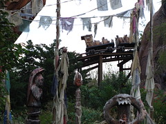 By my hypothesis, roller coasters are a kinetic art that depends on the aesthetics of movement and form, which makes the “mine train” treatment a vulgarization of the form by masking the ride as if it were a natural accident. The movement must be subdued or arbitrarily lurch around in order to be “believable” as a real railroad, and every bit of structure that holds the form together must be hidden beneath a fake “natural” landscape out of shame of being seen. It’s like trying to write a symphony by using only diegetic sounds. By their nature roller coasters create such a strong sensory impression that integrating the mechanics of traditional narrative into it only serves to redirect our attention away from the phenomenal immediacy to a parallel storyline that solely our superego cares about. Or maybe it’s just because Disco Yeti
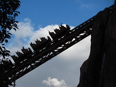 is a lesser climax than all the rising narrative action had led me to anticipate, but my own pallid response sitting on the final brake run after several rides suggested that Expedition Everest’s interpretation of coaster design as story form is easier to appreciate (and I appreciate it a lot!) than to be genuinely enthused by.
Grade: B
Finding Nemo – The Musical
It sells what the name implies. Performed in the “Theater in the Wild” situated on the no-man’s land between Asia and DinoLand U.S.A, Finding Nemo – The Musical seems glad to be identified as the loner attraction that refuses to fit in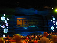 with the rest of the park, boasting a hot IP that’s too cool to be bothered with superficial things like thematic cohesion or originality.
The resplendent production values (similarly stylized to the Broadway Lion King musical but anchored by a colder blue palate) mask the fact that basically everything about it is cribbed from the feature film, only with all the dialogue unnecessarily forced to fit a generic singsong meter. I get the appeal, and I can appreciate that Disney’s storytelling philosophy seems to borrow something from the oral tradition by continually retelling their stories in different contexts so that the characters and morals can transcend the static confines of a singular creative work.
The problem is that by compressing the exact same story beats into a third of the time, The Musical only ends up competing for our affection against the The Film in a contest that it’s rarely going to win. It demands that we replay the movie along in our heads to fill in the many continuity gaps in its Odyssean narrative, and so naturally we’re also going to be immediately comparing the subtleties of line intonations, comedic timing, visual set pieces, etc.15 This is such an arduous (yet seemingly involuntary) mental task that in the single instance when they completely break away from the screenplay for an original sight gag about flying penguins, the moment surprisingly delights because it’s the first time I could enjoy the show without the filmic specter lurking in the backdrops.
Grade: D+
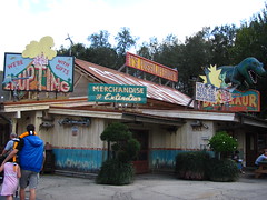 DinoLand U.S.A.
Possibly the most frequently misunderstood themed environment in a Disney park. This is perhaps unsurprising given its intentionally lowbrow aesthetic, but also disappointing given that this is one of the most original and personal treatments of the dino-genre ever committed within a theme park.
Essentially DinoLand is the origins story chapter of Animal Kingdom. The most literal reading is that it examines the history of biological life as well as the extinction events and evolutionary processes that have paved the way for today’s living creatures. However it’s also about the origin of human fascination with dinosaurs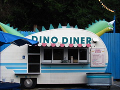 and the life sciences in general, told from the perspective of a child on vacation with his or her parents who first discovered the world through the prism of American kitsch… an experience I suspect is shared between many adult theme park fans. I’d like to imagine that DinoLand U.S.A. is for Joe Rohde what Main Street U.S.A. was for Walt Disney; both nostalgic representations of their childhood that act as a primer for the fantastic places and ideas waiting to be discovered beyond these familiar boundaries.
Unfortunately DinoLand’s portrait of American roadside culture is the very same culture that Walt Disney stigmatized when he built Disneyland to counterpoint the “dirty” tourist attractions of his day. I’ve done a fair amount of travel and I’ve never encountered a roadside attraction that’s quite like DinoLand’s idealized version of popular trash,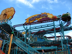 and thus I am tempted to also interpret it as a loving in memoriam to a cultural extinction that Disney World itself played a role in killing off.
Primeval Whirl
Bwahahahaha! In an odd way, this is the most authentically themed roller coaster Disney has ever built. Primeval Whirl wants the appearance of a cheap traveling carnival ride, and so Imagineers went straight to the source and bought a pair of cheap traveling carnival rides; this is the guilty pleasure amid Animal Kingdom’s attraction oeuvre. I actually admire the Reverchon spinning mouse layout even though there are dozens if not hundreds of copies worldwide. That moment halfway that finally introduces the spinning element is always an effective dramatic twist, and the entire layout builds excitement quite nicely since it’s always adding or changing developments until the frantic spinning-and-bunny-hopping finish mixes it all together. What’s ironic is that Disney’s attempt to spice up the mouse coaster contributes relatively little to the canon, and in fact many better installations can be found at competing parks. For much more ambitious immersion into story, see Kennywood’s wonderful Exterminator dark ride-spinning coaster hybrid, or indeed even look down the road at Fun Spot America’s Power Trip Coaster which, while missing the elaborate Dino-Signage, at least remembers to be a fun, disorienting ride that doesn’t come to a near-halt at every block brake like Primeval Whirl does. But even as much as I like the rest of DinoLand U.S.A.’s kitsch appeal, I’ll admit that Primeval Whirl and the rest of the
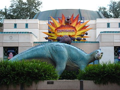 Chester & Hester’s Dino-Rama add-on is probably a little too much.
Grade: D+
DINOSAUR
At first the stately paleontology museum that composes the queue and entrance to DINOSAUR16 might seem wholly out of place against the gaudy, self-referential tourist trappings just outside the doors, and one might accuse the designers of DinoLand of trying to eat their pop-cultural cake and have it too. Indeed, if there’s one major flaw with DINOSAUR it’s that the upfront grandiosity easily makes too many people think it’s actually trying to be serious.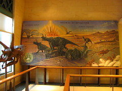
However by the time we meet Dr. Grant Seeker in the preshow who explains his utterly batshit plot to send us back in time on a “Saving Private Iguanodon” mission, we should start to be clued in that DINOSAUR is in fact just a big budget reinterpretation of the same old pulp dino stories and kitsch dark rides we’ve been consuming for decades. This hunch seems to be confirmed as the rest of the high speed EMV ride seems to take place in a hallucinogenic blacklight poster come to life, filled with zooming meteor fields, alien space bats, and all manner of toothy beasts that would feel at home in a Bill Tracy dark ride likely found in Hester & Chester’s Dino-Rama.17 The only established rule in this phantasmagoria is that big things get to eat little things, and right now we’re the little things. It’s all a garish chaos of colliding visual and aural elements, but similar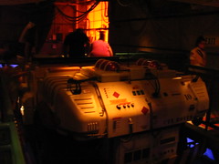 to a blacklight poster if you relax your mind enough your eyes will eventually be drawn through it to a natural focal point.
This is what I think DINOSAUR does surprisingly well; it uses the story to let us emotionally structure these random encounters in a way that builds action and raises the stakes all the way to the very end… even if the content of the story is largely disposable, filled as it is with unbelievable coincidences and a worthless MacGuffin.
There are three plot threads, each of which underscores a specific emotional motif: One, the impending meteor strike, which is our awareness of time; we’re already anxious about time since we don’t like it when rides end, so tying the ending to an impending doomsday explosion converts this anxiety into anticipation,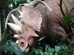 as each reminder that the seconds are ticking by (faster than they really are) further raises dramatic tensions.
Two, the Carnotaurus which manifests fear; this unsightly horned demon is a recurring motif that gets a little closer and meaner each time. Sitting in the front right side of the vehicle, that last encounter with the Carnotaurus almost made me want to recoil a bit. Almost.
And three, the Iguanodon search, which is the phenomenon of negation; each encounter that isn’t our MacGuffin is defined by his absence, reminding us of the unfulfilled potential that prevents the story from ending but is in conflict with the countdown timer of the meteor, thus spiking each encounter with a background of suspense. Especially as the vehicle enters the extremely dark sections in the second half lit only by the occasional meteor fragment, Dr. Seeker’s futile searching in the face of death and enduring nothingness starts to take on an eerily mad, near-Herzogian quality in the final moments, like Aguirre on the search for El Dorado.
All three of these motifs dovetail together quite nicely at the end to make a climax that’s as satisfying as it is (in all honesty) just a lot of noise… but the noise is like a good post-rock track that gradually charges the emotions even if it doesn’t mean anything at the end.18
Grade: B+
Summary
An honest attempt to elevate theme parks from the consciousness of pop-entertainment to pop-art, Animal Kingdom’s lack of love from both financiers and the public at large have unfortunately kept it from realizing its potential, although the common claim that it’s only a “half day” park is as big a myth as the Yeti.
Overall Grade: B


Comments