Disneyland – Anaheim, California
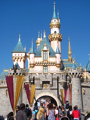 With so much simulated history saturating the always pristine and perfectly maintained Disneyland, it can be easy to forget that this place has a real historical legacy of its own. Any place else in the world with a pop-culture pedigree as powerful as Disneyland’s would do everything they could to preserve and advertise that history, but Disneyland always looks like it was built yesterday even when it looks like it was built in the 1870’s. However, one look at the diminutive Sleeping Beauty Castle centerpiece, not even 80 feet tall and rather square in appearance, reminds us that
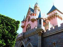 Disneyland had (relatively) humble beginnings. It wouldn’t be difficult to replace this castle with one of the larger, more elegant designs found in Paris or Shanghai; but to do so would be sacrilege, this tiny castle must be preserved for future generations, and everyone at Disneyland knows that. It’s the most photographed structure in the park not because it has a remarkably sublime presence or beautifully replicates any European landmarks, but because it represents its own history as the icon of Disneyland. Looking at it in person I thought that anything
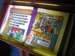 more would have been less, because perfection would have made it blend in too easily and I never would have stopped to realize these were the same walls Walt used as the backdrop when he inaugurated the park over half a century ago. You can even walk inside the castle through a stylized diorama of the Sleeping Beauty story, although it has clearly been updated with modern holographic technology.
Just as the castle is the most famous visual landmark at Disneyland, Dumbo is probably the most famous attraction, despite being one of the smallest and simplest in the park’s line-up. I don’t know why it’s so famous. It must have been when Harry Truman visited the park and refused to ride anything that was a symbol for the GOP. This fame can cause problems because the popularity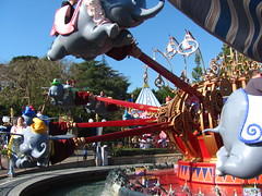 of the attraction easily exceeds the low capacity that’s inherent in these types of circular flat rides, mitigated only by the fact that it runs very short ride cycles. With half-hour queues for a minute-long circular flight that could be found at any other amusement park or carnival, the balance of customer cost-benefit is tipped heavily towards the unfavorable side making Dumbo quite possibly the worst attraction at Disneyland. I did not bother to test this hypothesis for myself as my interest was as limited as my time, especially as the original iconic attraction built by a fledgling Arrow Dynamics was removed by the early 80’s with the current generation model opening in 1990. Does anyone know if the 1955 equipment still exists in a museum anywhere? If you’re going to wait that long in line, make sure it’s for something that is completely unique to Disneyland.
It’s a similar song over at King Arthur Carousel, except: A; there are more than 16 seats. B; the ride lasts longer than a minute. C; Not only has it operated continuously since Disneyland Day 1, it’s a relocated antique Dentzel model dating back to 1922. Normally Disney attractions try to embellish their sense of history through weathering techniques to give a greater sense of gravitas, but here is the rare (and somewhat bizarre) case in which the reverse is true, as Disney’s efforts to keep the machine looking fresh renders a weightlessly ahistorical, indifferent impression at first glance.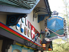
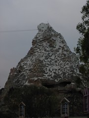
If there is one attraction at Disneyland with a lasting historical legacy that it proudly wears on its sleeve, it would have to be the Matterhorn Bobsleds. Walt Disney was notoriously adamant that the loud, visually intrusive wooden roller coasters of his day had no place in his Disneyland, but also realized paradoxically that his park would not be complete without a roller coaster, and so he challenged Arrow Development to devise a system that would be smooth, quiet, and easily disguisable within the alpine mountain structure envisioned for the empty space between Fantasyland and Tomorrowland.1 The result of this experiment was that the 1959-built attraction became the first tubular steel tracked roller coaster ever built, a designation that makes riding its rails feel akin to witnessing the first screening of the Jazz Singer. Considering how radically tubular steel coaster technology has permeated and shaped the entire theme park landscape today, it seems almost miraculous that we still have the originating design, largely unchanged from its first format.2 The rails maintain a delightfully quirky quality that predates computer design, and the braking mechanisms consist of small under friction skid pads not dissimilar to traditional wood coaster technology. The mountain exterior is almost the same as it was in 1959 save for minor cosmetics and plugging a few holes, and the interior retains the powder blue cavern walls with cartoonishly oversized illuminated crystals and icicles that make modern-day hyperrealists cringe with embarrassment (although these features were part of a 1978
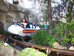 refurbishment, as the original mountain had an empty interior that was more Space Mountain than Expedition Everest). The rolling stock, also necessarily redesigned over the years, maintains the tradition of simplicity and freedom that characterized roller coaster vehicles before speeds, g-forces, and the accompanying litigation required riders to be boxed in and shielded from the onrushing reality around them. The seating design is so low and minimalistic we sit nearly flat on the floor, either with plenty of room to stretch our legs, or snug and cozy if shared with a riding partner on our lap.3 Buckling the singular seatbelt, the brake pads release and we begin our alpine expedition.
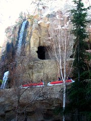
We climb the lift hill in almost complete darkness through the center of the mountain, and at the top is a long plateau where the howl of a nearby yeti is heard. Reaching daylight, our bobsled glides around the precipice over the whole of Disneyland before curving downward and gaining momentum. A surprise encounter with the abominable snowman causes a last-second defense maneuver deeper down into the mountain. The convoluted track dips and twists along a high-speed chase in and out of the Matterhorn, sometimes dangling over the edge of a cliff in broad daylight, sometimes threatening to file our digits down through tight rock and ice caverns, sometimes submerging us into an impenetrable fog of darkness, and frequently playing tag with competing bobsled teams as we all run away from a second yeti attack.
Towards the end we open up into the outdoor section of the bobsled run, racing for the home stretch while dodging a few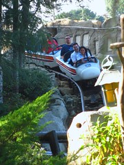 waterfalls. Approaching the base of the mountain, our bobsled hones in on a small lake as a landing spot and we brace ourselves for impact. Ker-sploosh! Sorry Big Thunder Mountain, but this is a splashdown finale done right. Fully submerged track with water displaced
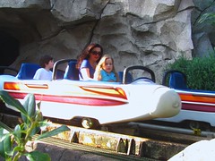 by nothing other than the force of the vehicle nose hitting it, it feels uncontrolled and comes with a real sense of danger that a rogue splash could find its way squarely into our face (my worry is fueled by those earlier waterfalls that weren’t shy about their disrespect for the vehicle clearance envelope). It’s a genuine final highlight to an always superb ride that creates the singular lasting impression for the roller coaster to be remembered by.
After only one ride I had no question that the Matterhorn Bobsleds would be my single most favorite attraction at the Disneyland Resort. It’s not just the retro charm that appeals to me (although that’s obviously a valuable dimension), but the Matterhorn is simply a really good roller coaster design, irrelative of the era it was built.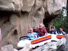
It starts with the rolling stock, of which I am always an advocate for unrestrictive, minimalistic designs. The spacious inline seating maintains comfort and smoothness while creating a high degree of exposure that dramatically heightens the visceral experience, wherein 27 miles per hour never felt so fast. The layout is another success, a long, intricate design that emphasizes flow and continuity over a sequence of divisible big moments. There are no pauses in pacing thanks to a single lift and the use of small skid brake pads for the ride’s blocking, which are installed along any sort of bend or slope where needed, creating uninterrupted action without sacrificing dispatch frequency. (Why have ‘advances’ in block braking technology worsened roller coasters in this regard?)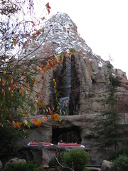
Yet despite the layout’s simplistic continuity and limited range of maneuvers, the non-computer aided track design imbues the experience with plentiful character (and a few occasions when you may need to brace yourself) that assures no two moments are ever alike, especially when variations in the indoor/outdoor thematic setting are introduced. I would have imagined the first tubular steel coaster would have been full of perfectly straight rails bridged by simple geometric curves, much like the steel wild mice of the era, to save on bending costs. But the track on the Matterhorn seems to have been personally sculpted by Karl Bacon and Ed Morgan’s own hands, such is the array of uniquely shaped curves, dips, and banking transitions that all flow into each other. The top-to-bottom descending layout also manages to hold speed from beginning to end so the thrills don’t start to wear off as it progresses; in fact it sometimes may feel like it’s getting faster the closer we get to the finish line. Because the layout is hidden by the mountain and the two track layouts are completely different, I can never memorize the Matterhorn no matter how many times I’ve ridden it or viewed the video, which always renews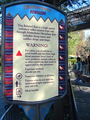 a sense of discovery and suspense before each ride that is missing from most coasters.
This would not have been possible without the alpine mountain design, which beautifully hides the layout from view so the coaster’s exact nature is never completely understood in its entirety without access to the blueprints. More than just a façade or a series of props distributed along the track, the mountain represents a perfect fusion is achieved between the theming and the roller coaster, such that it’s nearly impossible to imagine one without the other. Theme and ride are dual aspects of the same singular entity, with the former providing shape and structure for the latter, and the latter providing purpose for the former. Visually the ride is extremely economical, adding only exactly what is needed at each point along our journey, and indulging in nothing more. The retro-stylized interior (the “ice” on the cave walls looks more like icing on a cake) makes for a more humbled ride, one that shifts attention onto the experience itself rather than constantly beckoning us to remark on how clever the Imagineers are.
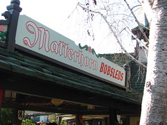 I realize that so far I have done nothing but gush praise about the Matterhorn, which might not make for the most interesting of reviews, but I don’t know what else to say since the Matterhorn is just about perfect for what it does. It is a fun, joyful roller coaster that I could probably ride a hundred times over and it would never fail to bring a smile to my face. How do I criticize that? The only thing I could possibly imagine adding to the Matterhorn
 would be an onboard soundtrack, but even that could go wrong in about a million different ways if the music isn’t perfect… and even if it was I’d still be slightly hesitant about it.
Actually, there is one thing I can criticize the Matterhorn for. It was the first modern attraction to regard a traditional exposed roller coaster structure as shameful or aesthetically displeasing. While a wooden coaster probably would not have been appropriate for Disneyland and the Matterhorn is perfect the way it is, its success also introduced and reinforced this notion that a roller coaster is made better by hiding it or making it appear to be something it really isn’t (this is true even of California Screamin’, a steel coaster disguised as a woodie). It’s a sentiment that remains subtly ingrained in nearly all dialogues concerning theme parks to this very day, and I don’t think that’s a healthy attitude for roller coaster enthusiasts to have about their own hobby.
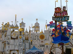
“it’s a small world” was closed for refurbishment on the day of my visit. This might have been a stroke of luck for me, as not only did it mean I wouldn’t feel obligated to ride it and could use that time for an additional lap or two on the Matterhorn, but I also wouldn’t have to write another confused impression in my review and risk a backlash as happened last time. Be that as it may, I should mention that in the time since Disneyland Paris I’ve come to the realization that, despite spontaneously developing acute symptoms of wannabe hipster cynicism when I’m nearby this happiest cruise that ever sailed, from a creative design philosophy “it’s a small world” might very well be my ideal Disney dark ride.4
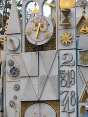 The reason I say this is because “it’s a small world” is one of the few rides (if not the only) in Disneyland that clearly subscribes to the auteur theory. This is a concept within cinema that states there should be a single individual responsible for the creative direction of a work (the author, aka “auteur” in French). Doing so makes the final product become a personally expressive work of art rather than an industrialized process in which everyone labors as an assigned task and creative vision arrives through committee consensus. In this case, one recognizes that “it’s a small world” very much ‘belongs’
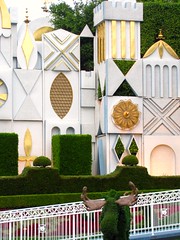 to Mary Blair, even though many other people were involved in the creative process. It has a distinctive visual appearance makes it a genuine work of art, unaffected by cliché and the creative constraints of hyperrealism. This authorship gives the ride a warmer, more humanist feel since it functions as an act of personal expression. Although the status of auteur theory within cinema has more recently been questioned, I think at this stage in the history of theme park design a more powerful presence of auteur theory could only result in a very positive evolution in the creative quality of attractions and settings, especially as so many new theme parks spend millions of dollars to create disappointing, uninspired products. I’m still about as interested in Small World as I am in really good children’s picture books (translation: I am not interested), but that doesn’t mean I’ll deny the effort of artistry of either.
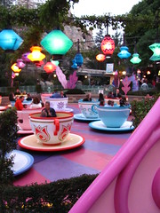 With Small World down my search for dark ride perfection at Disneyland seems to be running out of options. The question of whether it’s possible for a theme park attraction to use the grammar of dark rides to construct a compelling narrative and aesthetic experience that’s able to stand toe-to-toe with similar great works on the screen, stage, and page has so far turned up empty. Although I’ve found aspects to be admired in Small World, Pirates, and Haunted Mansion, I can’t say that any of them answers everything I’ve been looking for. Pirates’ success in framing the attraction as an act of storytelling becomes undone with a third-act emphasis on hyperreal imitation in the Uncanny Valley; Mansion’s brilliant narrative arc via the careful cultivation and transformation of mood is overshadowed by its hyperactive technophilia; and Small World’s artistic merits are in service of an idea that’s too twee and simplistic for my tastes (I have to judge on content as well as style). Looking toward the future, Tomorrowland appears fairly barren in high quality dark ride offerings, so if I’m going to find an 11th hour savior it’s going to have to be in one of Fantasyland’s old-school animated film based attractions.
I’ll start with the largest and most sophisticated, Peter Pan’s Flight. This attraction’s most obvious selling point is the inverted seating arrangement in “flying ships” suspended beneath an overhead track. This allows a greater level of immersion as the scenery envelopes us on all sides including below us, which allows for a particularly nifty scene when we soar higher and higher over an expansive model of London aglow after nightfall, seemingly carried aloft as much by the overhead track as by the ebullient “You Can Fly!” musical theme. While the technology and quality of a few of the sets are impressive considering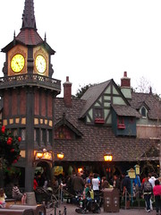 this is an opening day original (although I do wonder how much of the ride today bears any resemblance to the version that debuted in 1955) it’s still a far cry from the efforts seen on later endeavors within the park, and the story does nothing for me. Basically re-creating the feature film in three minutes, my brain was put on overload trying to recall vague bits and pieces from childhood memories that could assemble the mad rush of images and sound clips into anything remotely resembling a coherent story. No doubt there’s a degree of unimpeachability in any attraction that’s managed to last for over half a century, but the ride is a direct precursor to trash like the Monster’s Inc. dark ride in neighboring California Adventure: both attractions that leech off their host movies for storytelling survival. While respecting this attraction’s heritage, I also think the suspended flying mechanism could use a little more updating. The cars occasionally bump and jerk around on the track in a way that’s not conducive to the illusion of sailing on a current of air. Factor in a low capacity that frequently is the cause of long queues, and we’ve got a ride that’s best not duplicated and left alone as the historical relic it is.
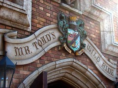 Mr. Toad’s Wild Ride is another “classic” dark ride with little electric buggies that buzz around past 2D sets on a journey to nowhere in particular. It has one major advantage over its contemporaries in the fact that almost no one who rides it has seen the movie it’s based on, and so the story is allowed to stand on its own two webbed feet. The narrative structure is more aptly suited to the dark ride format, being an episodic series of mostly unrelated misadventures that don’t require complex character motivations to explain the plot. It’s also decidedly more “PG” than one might believe. Aside from a nightmarishly psychedelic cartoon visual design throughout the entire attraction, the wild ride ends with a deadly train wreck, where we are then sent to (this is true) a fire and brimstone spewing Hell. And then the ride is over.
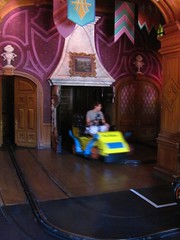
After initial reactions of “what the hell” (literally) I realized that this was exactly the sort ending that should please all the arty-farty pseudo-intellectuals like myself who always characterizes Disney as wimpy storytellers who only produce unrealistically happy endings. We exit in a state of aporia, the illusion of stasis as we giddily boarded our vehicle now shattered and replace with a sense of disresolve. It forces us to confront the experience after it’s over, and we can either deny that it had any significance or accept the absurdity of Mr. Toad’s scenario. This sounds like a gold mine for any theme park philosopher to discuss. So, have I found my masterwork dark ride at Disneyland?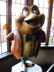
The mere presence of an edgy, unhappy conclusion and an impressionistic acid-trip visual design shouldn’t by itself make the ride particularly deep, especially when every creative writing and art student has at some point in their academic career experimented and failed with such tactics. The attraction is definitely one of the better dark rides at Disneyland, and is willing to go to some darker places to make a lasting impression on the children and adults who ride it, but apart from binding the scenes and gags together with a central character and a vague story arc, does it have any significant value that elevates it above similarly oriented classic dark rides, such as Knoebel’s Haunted Mansion? Given that much of Mr. Toad could be interchanged with its spiritual successor, Roger Rabbit’s Car Toon Spin, without significant alteration to either attraction’s mood or tempo, I’m inclined to answer “no”.
Snow White’s Scary Adventures takes nearly the same technology from Mr. Toad’s Wild Ride and applies it across the Fantasyland plaza to a story that everyone is familiar with, based on Walt Disney’s biggest critical and commercial cinematic success. Like Mr. Toad, Snow White’s Scary Adventures pushes the threshold on whether parental guidance should be recommended for young children. In particular a scene in which we navigate through a dark forest of rotting trees with knotted bark frozen into menacing faces and branches extended as spindly fingers is far ghastlier than anything found inside Indiana Jones’ Temple of Cartoon Doom.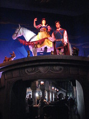
While the storyline is slightly better paced than Peter Pan, with more emphasis on mood than action, it suffers from the same setback where many of the events require our knowledge of the movie to draw the proper causal connections between scenes. Who’s the hag with the apple, what are the dwarfs’ roles in all of this, and why does Snow White spontaneously get a sparkly new boy toy at the end? Our experience is greatly enhanced if we’re familiar with the film to bridge the unexplained storyline gaps, but if we do have that familiarity then the dark ride feels derivative. (Although I’m not certain if even the movie adequately explains that last question…) Not that it matters too much since the moral of the story basically is to reaffirm our presumed heteronormative values, which is about as much depth as we could ever hope to extract from any of the myriad Disney princess-snags-a-prince movies. I’ll pass.
And then there was one.
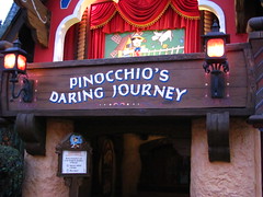 Although it shares most of the same technology and storytelling methods as the other Fantasyland dark rides, Pinocchio’s Daring Journey does not have nearly as rich a pedigree. Walt Disney was never involved in this attraction’s creation, as it opened nearly three decades after the others, copied from a plan designed to fill out Tokyo Disneyland which had opened a few months earlier, and replacing the former Fantasyland Theater. It was yet another attraction designed to strictly copy the key scenes of the film it was based upon, an indication that it was probably the result of a by-the-numbers committee decision rather than an impassioned creative spark of an Imagineer burning to tell a story.
Yet unlike Snow White there’s no major psychosexual subtext,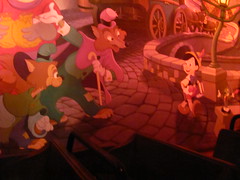 and the villainous characters have been reduced to minor background roles where they act at most as modifiers, rather than drive the narrative. The first couple of scenes are a bit confusing, but the ride quickly finds its rhythm, focusing on images and emotions rather than trying to string together a series of events. Once it does this, Pinocchio’s Daring Journey somehow manages to become a little bit of a masterpiece, one that exceeds the film it is based on.
Pinocchio’s journey is fundamentally an existential quest for authentic being; his desire is to become “a real boy”. Whenever Pinocchio tells a lie and betrays his authenticity, he experiences the horror of being forever publicly marked by his transgression as his nose grows another inch. The story’s Italian origins imbue it with strongly Catholic themes, most notably the idea of original sin and the collective guilt it inspires. At the center of this story is Pleasure Island, a not-too-subtle metaphor for at least a couple of deadly sins, and as we later learn, the price of admission to indulging in this electric playground’s many pleasures is very steep to pay. It is here that the story of Pinocchio becomes most perfectly fitted to a dark ride specifically at Disneyland: a place where everything is a lie and its citizens are all marionettes attempting to pass as humans. Unlike in a movie or novel, inhabiting the three-dimensional space of Pleasure Island implicates us all as equal sinners within the story, our status as silent observers removed as soon as we realize that right now at this very moment we’re participating in the exact same activity that’s about to condemn Pinocchio. The following scene as we pass by crates of naughty children transformed into donkeys sobbing for their mothers as they’re about to be shipped off into a hellish eternity of indentured slavery never ceases to turn my blood cold, and anyone that can ride through this and not feel a little bit like a scared, helpless child again must already be dead.
After that, only a confrontation on the dark, turbulent open seas with the leviathan itself can save our souls, even as it threatens to swallow us whole…
The only thing I could do without is Jiminy Cricket’s “wish upon a star” morale at the very end,5 but otherwise the happy ending feels rightfully deserved for once, as the proper resolution after being taken to some very dark corners during Pinocchio’s search for meaning and truth. Imagine how many children would be emotionally scarred if it were to end with the whale? But Pinocchio does manage to become a real boy, and we may feel as though we’ve shared in the same emotional growth. The attraction has the right balance between technology and simplicity, using only what is needed to make the story come to life while never distracting us from the experience by calling our attention to the Imagineer as the clever special effects wizard (here the Imagineer is only the humble artist and storyteller). Pinocchio’s Daring Journey is a truly great dark ride, quite possibly my favorite dark ride in all of Disneyland, and I think it should be one of the first examples referred to if anyone is interested in making a new dark ride into a genuine work of art.
Comments