|
|
 
It took me long enough, but I finally made it to the Magic Kingdom. I’ve been to Disneyland in California, Disneyland Paris, Tokyo Disneyland, and even held a season pass for Hong Kong Disneyland, but somehow it took until 2012 to check off my list the most popular theme park in the world, even though it’s the only Disney resort located in the same time zone as my hometown. My Magic Kingdom abstinence even turned into something I was oddly proud of, since there was nothing unique to claim from being counted among the millions of Disney World customers that can make the hobby of tracking down obscure parks and coasters so addictive, but I could claim something unique about the chronology through which I would eventually visit the parks. Before taking off for Florida I joked that being a theme park critic and having never been to the Magic Kingdom is a bit like being a film critic and having never seen Star Wars. It was finally time that I rectified this oversight. And now that I have, this begs the question: how does the Magic Kingdom fare against its counterparts, and did it serve as a suitable finale to my two-and-a-half year, round-the-world tour of Disney parks and resorts?
 To answer: not that well; and no, I visited the Disney parks in the opposite order I probably should have. This isn’t to say that the Magic Kingdom is a bad park, or even bad for a Disney park. It’s probably the best overall introduction for newcomers to the (Not-Always) Wonderful World of Disney. It summarizes the best aspects of each of the Disneylands in Anaheim, Tokyo, Paris, and Hong Kong, without actually doing better in any category than what each of those other parks specializes in. Anaheim has the best overall collection of rides, Paris has the most detailed and beautiful landscapes, Tokyo has a scale and tech advantage in many of its attractions and entertainment, Hong Kong has much more intimacy and (more recently) originality, and the Magic Kingdom has…? Truth be told I had a hard time coming up with any aspect of the Magic Kingdom that I liked more than at any of the other parks, and the short list that I could manage are only the exceptions that prove the rule. It might have the best Haunted Mansion version in the world, although this win is slight in comparison to the landslide victories that Anaheim’s Pirates of the Caribbean, Tokyo’s Splash Mountain, or Paris’ Big Thunder Mountain have over the Floridian versions (among many others). The Carousel To answer: not that well; and no, I visited the Disney parks in the opposite order I probably should have. This isn’t to say that the Magic Kingdom is a bad park, or even bad for a Disney park. It’s probably the best overall introduction for newcomers to the (Not-Always) Wonderful World of Disney. It summarizes the best aspects of each of the Disneylands in Anaheim, Tokyo, Paris, and Hong Kong, without actually doing better in any category than what each of those other parks specializes in. Anaheim has the best overall collection of rides, Paris has the most detailed and beautiful landscapes, Tokyo has a scale and tech advantage in many of its attractions and entertainment, Hong Kong has much more intimacy and (more recently) originality, and the Magic Kingdom has…? Truth be told I had a hard time coming up with any aspect of the Magic Kingdom that I liked more than at any of the other parks, and the short list that I could manage are only the exceptions that prove the rule. It might have the best Haunted Mansion version in the world, although this win is slight in comparison to the landslide victories that Anaheim’s Pirates of the Caribbean, Tokyo’s Splash Mountain, or Paris’ Big Thunder Mountain have over the Floridian versions (among many others). The Carousel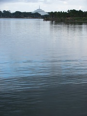 of Progress, PeopleMover, and Country Bear Jamboree are three charming curios from an earlier era that can no longer be found at Disneyland, and thus are some of the only “Only in Florida” attractions that the Kingdom can lay claim to. (Tokyo also has a Jamboree, but that’s the better version only if your first language is Japanese.) And I suppose there will be a few good things to say about the additions in New Fantasyland once that’s completed, however I didn’t find the dress rehearsal that fantastic, and Shanghai Disneyland might very well steal the land’s thunder in a couple of years anyway. of Progress, PeopleMover, and Country Bear Jamboree are three charming curios from an earlier era that can no longer be found at Disneyland, and thus are some of the only “Only in Florida” attractions that the Kingdom can lay claim to. (Tokyo also has a Jamboree, but that’s the better version only if your first language is Japanese.) And I suppose there will be a few good things to say about the additions in New Fantasyland once that’s completed, however I didn’t find the dress rehearsal that fantastic, and Shanghai Disneyland might very well steal the land’s thunder in a couple of years anyway.
Come to think of it, the biggest distinguishing characteristic that sets the Magic Kingdom apart from other theme parks is located outside the park boundaries. To reach the front gates from either the parking lot or Ticket & Transportation Center you have to cross the Seven Seas Lagoon by ferryboat. The intended effect of this nautical journey is most likely to create a sense of removal from the outside world by crossing over a (meta)physical barrier into a separate magical realm. Disney’s design philosophy has long placed tremendous value on barriers and gateways, for the way that they help us realize the exact point at which we change cognitive paradigms. Possibly the most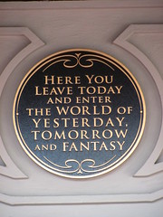 famous is the railway tunnel separating the ticket booths and Main Street, U.S.A. with a plaque indicating “Here you leave today and enter the world of yesterday, tomorrow, and fantasy”, but you’ll also notice tunnels, bridges, special doorways, or bodies of water in the queues or at the start of the layout of most attractions in the park. The Seven Seas Lagoon ferry ride is by far the largest scale example of this design theory put into practice at a Disney park, making it a perfect example of how important this feature is to Disney’s design philosophy, especially since the ferry ride comes at the expense of the practicality. Arriving early in the morning a half hour before the gates are set to open while the mist is still hovering above the water’s surface: that’s Disney magic, and it’s achieved just through placement and timing, without needing any expensive themed props to dress it up. Trying to get back to the TTC after a long, tiring day and ten minutes before the bus is scheduled to depart: that’s Disney frustration, the kind that has given many stand-up comedians fodder for a routine about the toils and contradictions of taking the family on vacation. famous is the railway tunnel separating the ticket booths and Main Street, U.S.A. with a plaque indicating “Here you leave today and enter the world of yesterday, tomorrow, and fantasy”, but you’ll also notice tunnels, bridges, special doorways, or bodies of water in the queues or at the start of the layout of most attractions in the park. The Seven Seas Lagoon ferry ride is by far the largest scale example of this design theory put into practice at a Disney park, making it a perfect example of how important this feature is to Disney’s design philosophy, especially since the ferry ride comes at the expense of the practicality. Arriving early in the morning a half hour before the gates are set to open while the mist is still hovering above the water’s surface: that’s Disney magic, and it’s achieved just through placement and timing, without needing any expensive themed props to dress it up. Trying to get back to the TTC after a long, tiring day and ten minutes before the bus is scheduled to depart: that’s Disney frustration, the kind that has given many stand-up comedians fodder for a routine about the toils and contradictions of taking the family on vacation.
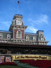 Yet there’s no denying that, for whatever its faults (and there are many), the Magic Kingdom is a cultural experience of nearly unrivaled magnitude. It singularly reassures more people than anywhere else in the world that the American dream can come true, and it’s nothing if not fascinating to watch others have a minor spiritual revelation in the presence of such sublime kitsch. While people used to travel just to see the image of the Madonna, or even as recently as a film society screening of Carl Theodor Dreyer’s “La passion de Jeanne d’Arc” before the introduction of VHS, now theme parks like the Magic Kingdom fill the role of the irreplicable work of art that becomes a pilgrimage site for the masses. Immersing an audience for twelve consecutive hours in an environment where every perception is controlled by the artist is a degree of creative control that the avant-gardes of the 1920’s could only fantasize about, and especially as other media become increasingly digitized and oversaturated in their channels of mass distribution, in the coming decades the Magic Kingdom could become one of the last vestiges of society where the artist’s message is received as a postmodern “holy experience.” Yet there’s no denying that, for whatever its faults (and there are many), the Magic Kingdom is a cultural experience of nearly unrivaled magnitude. It singularly reassures more people than anywhere else in the world that the American dream can come true, and it’s nothing if not fascinating to watch others have a minor spiritual revelation in the presence of such sublime kitsch. While people used to travel just to see the image of the Madonna, or even as recently as a film society screening of Carl Theodor Dreyer’s “La passion de Jeanne d’Arc” before the introduction of VHS, now theme parks like the Magic Kingdom fill the role of the irreplicable work of art that becomes a pilgrimage site for the masses. Immersing an audience for twelve consecutive hours in an environment where every perception is controlled by the artist is a degree of creative control that the avant-gardes of the 1920’s could only fantasize about, and especially as other media become increasingly digitized and oversaturated in their channels of mass distribution, in the coming decades the Magic Kingdom could become one of the last vestiges of society where the artist’s message is received as a postmodern “holy experience.”
 Main Street, U.S.A. Main Street, U.S.A.
The “opening credits” for the Magic Kingdom are found in Main Street U.S.A. Literally. The names painted on the second floor windows are all for Disney Imagineers, although I was too thick to notice this until I read about it after I returned home. The concept of public authorship is strangely absent from theme parks when compared to other creative arts and entertainments,1 so I appreciate the effort Disney puts into it even though their idea of title cards is still my idea of Easter Eggs for fans. I suspect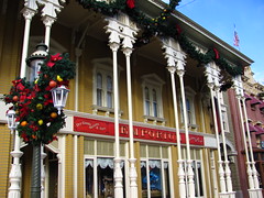 this goes back to the distinction between art and hyperreality. If we recognize something as art we demand that an artist is presented along with it (even if that name is unrecognized to us; “who directed this”, “who painted that”, etc), but a hyperreal theme park environment demands that its makers remain hidden behind the curtain of conscious thought, lest the illusion of hyperreality is destroyed. Thus I think Main Street is probably better categorized as the “prologue” or “introduction” to the Magic Kingdom. It’s the “once upon a time” origins story for Disney: a familiar everyday setting (although still a little fantastical) which inspires the daydreams of the fantastical worlds we’re about to springboard off to, either by foot or by train. That, and it’s also where you can go to eat and buy stuff you probably shouldn’t eat or buy, at least not during this goes back to the distinction between art and hyperreality. If we recognize something as art we demand that an artist is presented along with it (even if that name is unrecognized to us; “who directed this”, “who painted that”, etc), but a hyperreal theme park environment demands that its makers remain hidden behind the curtain of conscious thought, lest the illusion of hyperreality is destroyed. Thus I think Main Street is probably better categorized as the “prologue” or “introduction” to the Magic Kingdom. It’s the “once upon a time” origins story for Disney: a familiar everyday setting (although still a little fantastical) which inspires the daydreams of the fantastical worlds we’re about to springboard off to, either by foot or by train. That, and it’s also where you can go to eat and buy stuff you probably shouldn’t eat or buy, at least not during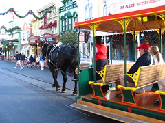 this economic recession. This is now the fifth Disney Main Street (or equivalent) that I’ve briskly walked through on my way to better things. Sure, once the afternoon crowds fill in I’ll return to fulfill the geek’s duty to look at all the detail, but after a half hour I still can’t find very much that isn’t cover-up for a gift shop. I’ll take the next train that comes in, going clockwise around the park for the rest of the review. Just as Main Street is the prologue, Tomorrowland is definitely supposed to be the final act before the curtain call, right? this economic recession. This is now the fifth Disney Main Street (or equivalent) that I’ve briskly walked through on my way to better things. Sure, once the afternoon crowds fill in I’ll return to fulfill the geek’s duty to look at all the detail, but after a half hour I still can’t find very much that isn’t cover-up for a gift shop. I’ll take the next train that comes in, going clockwise around the park for the rest of the review. Just as Main Street is the prologue, Tomorrowland is definitely supposed to be the final act before the curtain call, right?
Walt Disney World Railroad
Whenever I encounter a theme park attraction that takes the form of public transportation, the most crucial factor for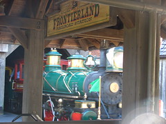 me is that it needs to function efficiently as such. I loved trains as a kid, but I still knew that if it wasn’t taking the scenic route (while aboard the Walt Disney World Railroad you spend a lot of time looking at subtropical shrubs, maintenance roads, and a few weathered dioramas while a narrator describes the much more exciting attractions remotely passing by) it had to get us from Point A to Point B faster than we could have managed by walking. Where the Main Street Vehicles fail in this regard, the Walt Disney World Railroad is a moderately useful piece of infrastructure if approached with a proper strategy. If the locomotive has arrived just as you’re getting off Splash Mountain and Storybook Circus was already your next intended destination, then the railroad will momentarily seem like the best ride you’ve ever taken at the Magic Kingdom. If you want to go me is that it needs to function efficiently as such. I loved trains as a kid, but I still knew that if it wasn’t taking the scenic route (while aboard the Walt Disney World Railroad you spend a lot of time looking at subtropical shrubs, maintenance roads, and a few weathered dioramas while a narrator describes the much more exciting attractions remotely passing by) it had to get us from Point A to Point B faster than we could have managed by walking. Where the Main Street Vehicles fail in this regard, the Walt Disney World Railroad is a moderately useful piece of infrastructure if approached with a proper strategy. If the locomotive has arrived just as you’re getting off Splash Mountain and Storybook Circus was already your next intended destination, then the railroad will momentarily seem like the best ride you’ve ever taken at the Magic Kingdom. If you want to go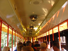 from Main Street to Space Mountain and the train has just left the station, then you’re better off hiking it. Some might insist that the railroad’s “Disney magic” can’t be quantified using such utilitarian standards, but considering the average visitor will only ride nine attractions in a day I suspect more people use the train in the second scenario rather than the first. And that’s a shame. from Main Street to Space Mountain and the train has just left the station, then you’re better off hiking it. Some might insist that the railroad’s “Disney magic” can’t be quantified using such utilitarian standards, but considering the average visitor will only ride nine attractions in a day I suspect more people use the train in the second scenario rather than the first. And that’s a shame.
Grade: C-
Adventureland
In a post-Animal Kingdom Walt Disney World, it might be reasonable to wonder if Adventureland still has the same relevancy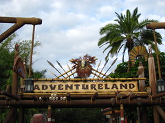 for audiences. Of course the two are very different; Adventureland is a bit like reading a comic book, while Animal Kingdom tries to be like a National Geographic documentary. Still, I can’t help but shake the feeling (especially in the inevitable comparison between the Jungle Cruise and the Kilimanjaro Safaris) that Adventureland was designed for a different generation than those who visit today. Mixing African, Polynesian, Caribbean, and even Arabian influences under one generic label could easily be regarded as a mistake by today’s more culturally sensitive audiences… and probably more by kids than adults. As a 1990’s kid when environmentalism and conservation became really mainstream, you had to know things like the difference African and Indian elephants to do your kid duties correctly, and any anachronisms or anatopisms for audiences. Of course the two are very different; Adventureland is a bit like reading a comic book, while Animal Kingdom tries to be like a National Geographic documentary. Still, I can’t help but shake the feeling (especially in the inevitable comparison between the Jungle Cruise and the Kilimanjaro Safaris) that Adventureland was designed for a different generation than those who visit today. Mixing African, Polynesian, Caribbean, and even Arabian influences under one generic label could easily be regarded as a mistake by today’s more culturally sensitive audiences… and probably more by kids than adults. As a 1990’s kid when environmentalism and conservation became really mainstream, you had to know things like the difference African and Indian elephants to do your kid duties correctly, and any anachronisms or anatopisms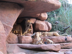 were to be immediately called on with that smarty-pants attitude kids have. (Okay, maybe not all kids were this way, but still…) Today Adventureland is probably the most self-consciously comedic of the Magic Kingdom’s lands, to distinguish itself from the “authenticity” of the Animal Kingdom, and the theme is more a pastiche of American popular cultural (especially between the 1930’s to 1970’s) than it is about the “real” foreign cultures it caricatures. were to be immediately called on with that smarty-pants attitude kids have. (Okay, maybe not all kids were this way, but still…) Today Adventureland is probably the most self-consciously comedic of the Magic Kingdom’s lands, to distinguish itself from the “authenticity” of the Animal Kingdom, and the theme is more a pastiche of American popular cultural (especially between the 1930’s to 1970’s) than it is about the “real” foreign cultures it caricatures.
Jungle Cruise
On the surface the Jungle Cruise is a guided tour of a hyperreal tropical river basin with numerous robotic animals and exotic sets to look at, but there are a couple layers of subtext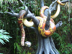 to peel back to understand what the Jungle Cruise is really about. First it’s kind of a corny, outdated attraction, so the skippers tell a continuous line of jokes either to poke fun at or distract us from the obvious fakeness of the sets and stiff movements of the creatures. The skippers know it’s all a hoax, the passengers know it’s all a hoax, and both sides know that the other side knows they know, but this knowledge can only be indirectly acknowledged through the metaphorical wink-winks that are exchanged after every punch line. However, since the jokes are also kind of corny and obviously recycled, there becomes a second layer of subtext on top of this. The skippers know the jokes they’re telling are lame (revealed by their droll delivery of obviously scripted material); the audience knows the jokes are lame (watch folk’s faces for the slight “so-bad-it’s-good” cringe to peel back to understand what the Jungle Cruise is really about. First it’s kind of a corny, outdated attraction, so the skippers tell a continuous line of jokes either to poke fun at or distract us from the obvious fakeness of the sets and stiff movements of the creatures. The skippers know it’s all a hoax, the passengers know it’s all a hoax, and both sides know that the other side knows they know, but this knowledge can only be indirectly acknowledged through the metaphorical wink-winks that are exchanged after every punch line. However, since the jokes are also kind of corny and obviously recycled, there becomes a second layer of subtext on top of this. The skippers know the jokes they’re telling are lame (revealed by their droll delivery of obviously scripted material); the audience knows the jokes are lame (watch folk’s faces for the slight “so-bad-it’s-good” cringe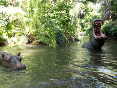 while forcing a laugh at the skipper’s “you must be in da-Nile” punch line); and each side knows the other side knows they know… yet we continue to mutually play along and pretend it’s all a laugh riot. Maybe this format of employing multiple layers of metatextual irony to avoid actually making a better attraction could work if the skippers were given more freedom to experiment with their own material (surely plenty of skippers must be aspiring stand-up comics in need of a day job?), but after several laps the only variable I encountered was the guides’ level of perkiness brought to the same series of worn out puns, which varied Goldilocks style between gratingly chipper, tiredly sarcastic, and one that was “just right”. while forcing a laugh at the skipper’s “you must be in da-Nile” punch line); and each side knows the other side knows they know… yet we continue to mutually play along and pretend it’s all a laugh riot. Maybe this format of employing multiple layers of metatextual irony to avoid actually making a better attraction could work if the skippers were given more freedom to experiment with their own material (surely plenty of skippers must be aspiring stand-up comics in need of a day job?), but after several laps the only variable I encountered was the guides’ level of perkiness brought to the same series of worn out puns, which varied Goldilocks style between gratingly chipper, tiredly sarcastic, and one that was “just right”.
Grade: C-
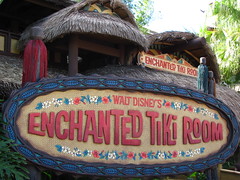 Walt Disney’s Enchanted Tiki Room Walt Disney’s Enchanted Tiki Room
This was on my list of must-do’s for its long history dating back to the Golden Age of Disney in 1963 at the California park and copied for the Magic Kingdom’s debut in 1971. This audio-animatronic musical show feels distinctly a product of the 1960’s, and not in an entirely good way. The show’s “cast” consists of 150 robotic birds suspended from the ceiling that sing songs with several tiki heads and jumping fountains, and most of these figures are limited to binary position flapping mouths and one or two other simple movements. Thus when the entire chorus joins in on “The Tiki Tiki Tiki Room”, part of the music’s instrumentation is supplied from the sounds of hundreds of air pistons and clacking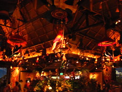 plastic parts triggering in (near) unison. Focusing on so many small moving parts from a distance can get tiresome after more than one song, so it’s probably better to just relax and listen to the music and comedy sketch interludes, both of which are also somewhat dated. Cultural stereotypes are a dominant form of the Tiki Room’s humor (the center four “host” parrots are indistinguishable apart from their strong Mexican, Irish, French, or German accents), while the music is firmly in the Disney tradition of feel-good sing-a-long-songs with a Polynesian inflection. It’s too bad the show’s best joke doesn’t happen until we’re already on our way out, when the birds sing an alternative version of “Heigh-Ho” that urges us out the door we go. plastic parts triggering in (near) unison. Focusing on so many small moving parts from a distance can get tiresome after more than one song, so it’s probably better to just relax and listen to the music and comedy sketch interludes, both of which are also somewhat dated. Cultural stereotypes are a dominant form of the Tiki Room’s humor (the center four “host” parrots are indistinguishable apart from their strong Mexican, Irish, French, or German accents), while the music is firmly in the Disney tradition of feel-good sing-a-long-songs with a Polynesian inflection. It’s too bad the show’s best joke doesn’t happen until we’re already on our way out, when the birds sing an alternative version of “Heigh-Ho” that urges us out the door we go.
Grade: D
 Pirates of the Caribbean Pirates of the Caribbean
Vastly inferior to the much longer California version, and the updated Jack Sparrow/Blackbeard overlay hasn’t helped matters in Florida either. Even in California I find Pirates to be a ride (institution, really) that starts strong but fizzles into tedium by the end, and shortening the layout in Florida has only compressed the timeline rather than trim out the fluff. The first several scenes form one of the best dark ride sequences ever built, establishing the attraction as not simply another pirate yarn but something that could speak deeply to the nature of one’s childhood stories and dreams, as well as the hopes and fears they inspire. The pirate’s voyage begins in the dark of night across moonlit water and in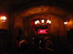 the deep recesses of a cave… all Jungian archetypal symbols that represent the unconscious. The nightmarish quality to this opener makes it so that when we finally dock in Puerto Dorado it feels less like a scene change in a literal narrative than the arrival in our own metaphysical dreamscape. Sadly this sensation is fleeting, as the narrative devolves into a standard-issue (and, honestly, kind of dull) treasure hunt story told with stiff robotic figures that can only convey emotion through raised eyebrows, cocked heads, or other exaggerated motions that a programmer can substitute in the absence of living facial expressions. Despite the obvious potential for this story to be a morality play about the greed and recklessness of a pirate’s life,2 it instead ends with Jack Sparrow sitting atop a pile of gold and loot victoriously, a decidedly materialist “happy ending” the deep recesses of a cave… all Jungian archetypal symbols that represent the unconscious. The nightmarish quality to this opener makes it so that when we finally dock in Puerto Dorado it feels less like a scene change in a literal narrative than the arrival in our own metaphysical dreamscape. Sadly this sensation is fleeting, as the narrative devolves into a standard-issue (and, honestly, kind of dull) treasure hunt story told with stiff robotic figures that can only convey emotion through raised eyebrows, cocked heads, or other exaggerated motions that a programmer can substitute in the absence of living facial expressions. Despite the obvious potential for this story to be a morality play about the greed and recklessness of a pirate’s life,2 it instead ends with Jack Sparrow sitting atop a pile of gold and loot victoriously, a decidedly materialist “happy ending”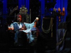 that contradicts the abstract journey through the collective unconscious required to get there. The happy ending becomes all the happier when we’re spat out into a gift shop a few moments later so that we may collect our own pirate’s loot, although the only take-home for me was a nagging feeling that I had witnessed a potentially good attraction that had been compromised by outside interests uncommitted to making a truly great attraction. that contradicts the abstract journey through the collective unconscious required to get there. The happy ending becomes all the happier when we’re spat out into a gift shop a few moments later so that we may collect our own pirate’s loot, although the only take-home for me was a nagging feeling that I had witnessed a potentially good attraction that had been compromised by outside interests uncommitted to making a truly great attraction.
Grade: C
Frontierland
Of the original lands that opened in Anaheim in 1955,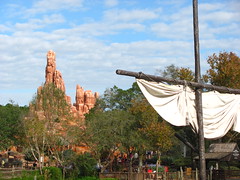 I think Frontierland benefited the most from the move eastward when Walt Disney World opened in 1971. The Magic Kingdom is a much more spacious park than Disneyland, and while some areas lose their energy or intimacy within the additional negative space, the extra breathing room vastly improves a naturally themed environment like Frontierland’s American west. Helping matters is the fact that real ghost towns and sun-baked desert landscapes are a considerable rarity in Florida compared to California, thus giving more purpose to paying to see a theme park’s interpretation of the material. Also the attraction selection is an marked improvement: In addition to Big Thunder Mountain, Magic Kingdom’s Frontierland has Splash Mountain, the Country Bear Jamboree, and Tom Sawyer Island, whereas Disneyland’s Frontierland has the Rivers of America, a kid’s playground, and pirates (?). During a day at each park I think Frontierland benefited the most from the move eastward when Walt Disney World opened in 1971. The Magic Kingdom is a much more spacious park than Disneyland, and while some areas lose their energy or intimacy within the additional negative space, the extra breathing room vastly improves a naturally themed environment like Frontierland’s American west. Helping matters is the fact that real ghost towns and sun-baked desert landscapes are a considerable rarity in Florida compared to California, thus giving more purpose to paying to see a theme park’s interpretation of the material. Also the attraction selection is an marked improvement: In addition to Big Thunder Mountain, Magic Kingdom’s Frontierland has Splash Mountain, the Country Bear Jamboree, and Tom Sawyer Island, whereas Disneyland’s Frontierland has the Rivers of America, a kid’s playground, and pirates (?). During a day at each park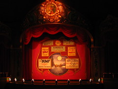 I “stop by” Disneyland’s Frontierland, and “go to” the Magic Kingdom’s. I “stop by” Disneyland’s Frontierland, and “go to” the Magic Kingdom’s.
The Country Bear Jamboree
This is yet another Disney-produced musical show that can be performed by pushing a start button. While I’m not typically a fan of the genre, I was most keen to try it out after being told by David Younger (of Theme Park Theory) that Marc Davis’ work on the Country Bear Jamboree perhaps best represents an example of auteur theory as applied to a theme park attraction. Although I’m uncertain how much I can attribute the presence of an auteur to this show’s successfulness, it does have a unique brand of off-beat humor that I honestly found fairly charming. The show and its creators seem deeply endeared to the tradition of American folk and country music, even as they simultaneously finds ways to mock its eclectic cast of performers. (My favorite bit: the deadpan performance of “Blood on the Saddle” by the oblivious Big Al character with his out-of-tune guitar.) It also helps that the bears’ cartoon expressiveness is brought to life by some of the most detailed and elaborate audio-animatronics in the Magic Kingdom, and there are nearly twenty different performers brought on and off stage ensuring that the show never becomes repetitive. Apparently the Jamboree has been shortened by about six minutes after a recent refurbishment; I’d be curious to see the material I missed. of off-beat humor that I honestly found fairly charming. The show and its creators seem deeply endeared to the tradition of American folk and country music, even as they simultaneously finds ways to mock its eclectic cast of performers. (My favorite bit: the deadpan performance of “Blood on the Saddle” by the oblivious Big Al character with his out-of-tune guitar.) It also helps that the bears’ cartoon expressiveness is brought to life by some of the most detailed and elaborate audio-animatronics in the Magic Kingdom, and there are nearly twenty different performers brought on and off stage ensuring that the show never becomes repetitive. Apparently the Jamboree has been shortened by about six minutes after a recent refurbishment; I’d be curious to see the material I missed.
 Grade: B- Grade: B-
Big Thunder Mountain Railroad
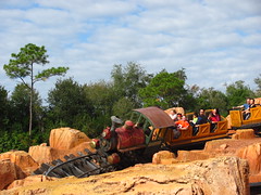
The physics that govern roller coaster designs are the opposite of what their dramatic structure should be. A good show needs to have a big finish, but roller coasters by their nature usually start with their biggest tricks and then become tamer near the end as energy is lost to friction. Despite WED Enterprises’ intense focus on story and the advantage of having three lift hills to moderate the energy throughout the ride, Big Thunder Mountain Railroad still falls victim to this common mistake of coaster design. The first cavernous lift hill that’s threaded through a split waterfall: spectacular.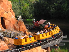 The first gravity-driven section with several drops and tight curves including a trick-track past a ghost town: pretty fun. The second gravity-driven section with the one hill that almost produces airtime and a couple close headchopper effects: getting a bit repetitive, but still fun. The third lift, with the ominous tremors and off-kilter rails: good, now the tension is mounting. And then the final gravity driven section: wait, that’s it? It’s over? It’s not a particularly thrilling coaster before that point yet I’m willing to enjoy it for what it is, but in the last act the themed storyline is horribly at odds with the actual coaster experience. The setting around the third lift seems intended to build tension, while the final gravity-driven section on the other side (by far the slowest and gentlest part of the layout) functions as the coaster’s denouement. Missing from this arc is any sort The first gravity-driven section with several drops and tight curves including a trick-track past a ghost town: pretty fun. The second gravity-driven section with the one hill that almost produces airtime and a couple close headchopper effects: getting a bit repetitive, but still fun. The third lift, with the ominous tremors and off-kilter rails: good, now the tension is mounting. And then the final gravity driven section: wait, that’s it? It’s over? It’s not a particularly thrilling coaster before that point yet I’m willing to enjoy it for what it is, but in the last act the themed storyline is horribly at odds with the actual coaster experience. The setting around the third lift seems intended to build tension, while the final gravity-driven section on the other side (by far the slowest and gentlest part of the layout) functions as the coaster’s denouement. Missing from this arc is any sort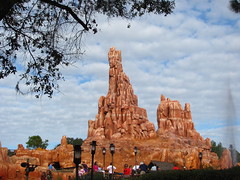 of emotional climax, which is a gaping big hole to have from a story structure perspective. Even many of the Arrow Dynamics mine trains built for regional amusement parks up to a decade prior to BTM’s debut usually had a better sense of dramatic layout construction, and using a tighter budget than Disney. California’s version is the same way, although it seems Imagineers did realize the problem and took steps to correct it on subsequent international entries in the Big Thunder canon by including a bat cave (Tokyo), an underwater drop (Paris), and finally a “dynamite” LIM launch (Hong Kong, as Big Grizzly Mountain). Of course there’s the theming on Big Thunder: there’s more of it, but it’s just more that whizzes by, and apart from the first lift it does little to transcend the original mine train coasters at Six Flags besides distracting us with more visual clutter. of emotional climax, which is a gaping big hole to have from a story structure perspective. Even many of the Arrow Dynamics mine trains built for regional amusement parks up to a decade prior to BTM’s debut usually had a better sense of dramatic layout construction, and using a tighter budget than Disney. California’s version is the same way, although it seems Imagineers did realize the problem and took steps to correct it on subsequent international entries in the Big Thunder canon by including a bat cave (Tokyo), an underwater drop (Paris), and finally a “dynamite” LIM launch (Hong Kong, as Big Grizzly Mountain). Of course there’s the theming on Big Thunder: there’s more of it, but it’s just more that whizzes by, and apart from the first lift it does little to transcend the original mine train coasters at Six Flags besides distracting us with more visual clutter.
Grade: C
Splash Mountain
If there’s something in the nature of roller coasters that works against the rules of theatricality, then inversely there also seems to be something in the nature of log flumes and water attractions that fits naturally to dramatic structuring. Since log flumes can’t easily sustain high speeds and navigate complex maneuvers, they instead rely on only a couple of big drops that can be used to signify key dramatic points in the narrative where an “emotional shock” is needed, particularly if placed towards the end to function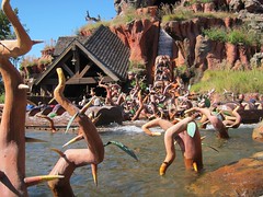 as a grand climax (adjusting the drop height is an easy way to quantify the emotional impact of a plot point), and the rest of the slow-moving trough sections can be used to develop and flesh out other elements of the themed storyline without rushing by them. Although Knott’s Timber Mountain Log Ride established the basic principles of the log flume in a theme park setting, it was Splash Mountain that cemented the rules of the genre by carefully integrated the flume dynamics to fit Freytag’s pyramid of dramatic structure: Introduction (“How Do You Do?”, with the outdoor establishment of the rural Georgia setting, Slippin’ Falls, and indoor establishment of the principal characters); Rising Action (“Ev’rybody Has a Laughing Place”, the double indoor drops and dark cave sequences); Climax (the iconic drop into the briar patch); and Resolution as a grand climax (adjusting the drop height is an easy way to quantify the emotional impact of a plot point), and the rest of the slow-moving trough sections can be used to develop and flesh out other elements of the themed storyline without rushing by them. Although Knott’s Timber Mountain Log Ride established the basic principles of the log flume in a theme park setting, it was Splash Mountain that cemented the rules of the genre by carefully integrated the flume dynamics to fit Freytag’s pyramid of dramatic structure: Introduction (“How Do You Do?”, with the outdoor establishment of the rural Georgia setting, Slippin’ Falls, and indoor establishment of the principal characters); Rising Action (“Ev’rybody Has a Laughing Place”, the double indoor drops and dark cave sequences); Climax (the iconic drop into the briar patch); and Resolution (“Zip-A-Dee-Doo-Dah”, the return trough channel to the station). At over ten minutes in length it has plenty of time to immerse riders each of these story chapters so the emotional transformation from beginning to end can be noticeably felt, even if it suffers from a few issues such as an overly long delay between the drop climax and the final show scenes, or some animatronics and set pieces that seem in dire need of a refurbishment. Nevertheless Splash Mountain is a prime example of how to merge traditional amusement park thrills with immersive story-based entertainment, and has helped cement the log flume attraction as a neoclassical Disney favorite. (“Zip-A-Dee-Doo-Dah”, the return trough channel to the station). At over ten minutes in length it has plenty of time to immerse riders each of these story chapters so the emotional transformation from beginning to end can be noticeably felt, even if it suffers from a few issues such as an overly long delay between the drop climax and the final show scenes, or some animatronics and set pieces that seem in dire need of a refurbishment. Nevertheless Splash Mountain is a prime example of how to merge traditional amusement park thrills with immersive story-based entertainment, and has helped cement the log flume attraction as a neoclassical Disney favorite.
Grade: B
 Tom Sawyer Island Tom Sawyer Island
As the welcum sign says, if’n you like dark caves, mystery mines, bottomless pits, shakey bridges n big rocks, you’re probably bound to enjoy spending some time on Frontierland’s Tom Sawyer Island. The river rafts required to reach the island act as a natural choke point for the entrance so it should usually be one of the least crowded areas in the Magic Kingdom, and the unpolished rustic appeal of trails through the trees with various gags to explore at your own pace in whatever order you’d like makes it a refreshingly different kind of activity for the Magic Kingdom. The paths are even made with real dirt and woodchips, now that’s what I call “attention to detail”! Of course it could be easy to argue that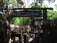 this is no substitute for hiking in an actual National Park, but since it’s at Disney I think it’s perfectly fine to have someplace where you can momentarily escape when you start to feel overwhelmed by how much “Disney” there is everywhere else. A word of warning, the floating barrel bridge should not be attempted to cross by anyone who’s recently thrown back a few bottles. this is no substitute for hiking in an actual National Park, but since it’s at Disney I think it’s perfectly fine to have someplace where you can momentarily escape when you start to feel overwhelmed by how much “Disney” there is everywhere else. A word of warning, the floating barrel bridge should not be attempted to cross by anyone who’s recently thrown back a few bottles.
Grade: C+
Liberty Square
If the overall tone of Adventureland is “silly” and the tone of Frontierland “romantic”, then Liberty Square must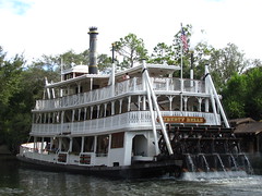 represent the Magic Kingdom’s morbid side. By my count there are at least 1038 dead people in Liberty Square: the 999 ghosts haunting the mansion, plus 39 dead presidents in the Hall of Presidents. How else to make the thematic connection between this small area’s most important attractions than that they all feature old American buildings filled with magically reanimated corpses? The Revolutionary American architecture is a nice diversion from the cartoonish fantasy in the rest of the park, and is completely unique to the Magic Kingdom, although there are already a lot of tourist attractions that do this sort of thing on a larger scale, and with more educational value, too. Not that it matters much as Liberty Square is also home to one of my favorite attractions in central Florida. represent the Magic Kingdom’s morbid side. By my count there are at least 1038 dead people in Liberty Square: the 999 ghosts haunting the mansion, plus 39 dead presidents in the Hall of Presidents. How else to make the thematic connection between this small area’s most important attractions than that they all feature old American buildings filled with magically reanimated corpses? The Revolutionary American architecture is a nice diversion from the cartoonish fantasy in the rest of the park, and is completely unique to the Magic Kingdom, although there are already a lot of tourist attractions that do this sort of thing on a larger scale, and with more educational value, too. Not that it matters much as Liberty Square is also home to one of my favorite attractions in central Florida.
 The Hall of Presidents The Hall of Presidents
I suspect many patrons enter the Hall of Presidents out of a sense of civic duty rather than from any innate desire to sit through an austere 20 minute multi-media presentation on American history when they could have ridden the Haunted Mansion within the same timeframe. I don’t “want to” see the Hall of Presidents, I “should” see the Hall of Presidents. Of course we could also be there from an innate desire to gawk at the spectacle of technology that seemingly lets dead presidents return from the grave, even though Disney tries to underplay the significance of our collective tech fetishism to the show’s patriotic importance (perhaps similar to the way Nascar might try to gloss over the universal appeal of watching their race cars crash and burn). However, be forewarned that the majority of the show’s running time is devoted to a Ken Burns style documentary (narrated by Morgan Freeman) that briefly summarizes the presidencies of Washington, Jackson, Lincoln, Roosevelt, the other Roosevelt, and Kennedy. When they finally do bring the presidents onstage there’s little more than a spotlight roll call with Freeman reading down the list while each man only gives a subtle nod, seemingly underutilizing the hi-tech figures especially since we can’t observe them up close in detail. Obama (and an earlier bit by Lincoln) are the only two AAs that are ever given talking time, and the format oddly seems to encourage the interpretation that 200+ years of presidential history were all quietly anticipating the eventual Obama administration, their race cars crash and burn). However, be forewarned that the majority of the show’s running time is devoted to a Ken Burns style documentary (narrated by Morgan Freeman) that briefly summarizes the presidencies of Washington, Jackson, Lincoln, Roosevelt, the other Roosevelt, and Kennedy. When they finally do bring the presidents onstage there’s little more than a spotlight roll call with Freeman reading down the list while each man only gives a subtle nod, seemingly underutilizing the hi-tech figures especially since we can’t observe them up close in detail. Obama (and an earlier bit by Lincoln) are the only two AAs that are ever given talking time, and the format oddly seems to encourage the interpretation that 200+ years of presidential history were all quietly anticipating the eventual Obama administration, although most likely this is an accidental by-product of Disney’s showmanship tendencies that require a big grand finale. Credit goes to at least attempting to make the show as non-partisan as possible, and Walt Disney’s message that every president has been equally important to the success of the American democratic experiment is a noble one, even if most informed people in the audience are likely to subtitle the show in their own minds as “The Good, the Bad, and the Ugly”. although most likely this is an accidental by-product of Disney’s showmanship tendencies that require a big grand finale. Credit goes to at least attempting to make the show as non-partisan as possible, and Walt Disney’s message that every president has been equally important to the success of the American democratic experiment is a noble one, even if most informed people in the audience are likely to subtitle the show in their own minds as “The Good, the Bad, and the Ugly”.
Grade: C
The Haunted Mansion
 Before anything else we first must face the question of suicide. It is only after we fully confront this unanswerable problem that we can start the party that is life. More than forty years since its debut, the Haunted Mansion (along with its western and eastern counterparts) remains the most radical attraction ever built at a Disney theme park due to its complete reversal of the traditional ghost story arc. Here it begins with the macabre death of the main character (the suicidal remains of the mansion’s “ghost host” narrator dangling above our heads) and then rewinds the horror backward until we’re dancing along with the undead in a jazzy graveyard jam. Where a lesser attraction might have tried to use the “hitchhiking ghost” illusion in a serious context, in the Haunted Mansion we’re obviously meant to laugh at the final reflected image of ourselves Before anything else we first must face the question of suicide. It is only after we fully confront this unanswerable problem that we can start the party that is life. More than forty years since its debut, the Haunted Mansion (along with its western and eastern counterparts) remains the most radical attraction ever built at a Disney theme park due to its complete reversal of the traditional ghost story arc. Here it begins with the macabre death of the main character (the suicidal remains of the mansion’s “ghost host” narrator dangling above our heads) and then rewinds the horror backward until we’re dancing along with the undead in a jazzy graveyard jam. Where a lesser attraction might have tried to use the “hitchhiking ghost” illusion in a serious context, in the Haunted Mansion we’re obviously meant to laugh at the final reflected image of ourselves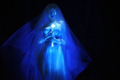 as we seemingly become undead spirits, a final gag that becomes the punchline to one long joke about mortality. This isn’t to say that every element of the Mansion fits perfectly to the story – there’s an attic scene between the ballroom and graveyard filled with trick portrait photographs that disrupts the continuity of the mansion’s transformation into a lively and festive atmosphere (Roland Barthes wrote that death is implicit in every photograph due to the way they consciously remind us of the person or world “that-has-been”, so such a scene would have been more appropriate towards the beginning of the storyline), and I still think the rooms are filled with a little too much technological showmanship for the mansion to ever feel truly haunted (compared to the creaky low-tech as we seemingly become undead spirits, a final gag that becomes the punchline to one long joke about mortality. This isn’t to say that every element of the Mansion fits perfectly to the story – there’s an attic scene between the ballroom and graveyard filled with trick portrait photographs that disrupts the continuity of the mansion’s transformation into a lively and festive atmosphere (Roland Barthes wrote that death is implicit in every photograph due to the way they consciously remind us of the person or world “that-has-been”, so such a scene would have been more appropriate towards the beginning of the storyline), and I still think the rooms are filled with a little too much technological showmanship for the mansion to ever feel truly haunted (compared to the creaky low-tech spooks that inhabit, say, Knoebel’s Haunted Mansion, where the ride’s history and thus the presence of death become omnipresent). Still, these are relatively minor shortcomings for an attraction that daringly manages to transform our initial existential dread into something that eventually becomes quietly life-affirming. In the end the Haunted Mansion offers no answer for how to best “find a way out”, but it doesn’t matter so long as it helps us live to laugh another day. spooks that inhabit, say, Knoebel’s Haunted Mansion, where the ride’s history and thus the presence of death become omnipresent). Still, these are relatively minor shortcomings for an attraction that daringly manages to transform our initial existential dread into something that eventually becomes quietly life-affirming. In the end the Haunted Mansion offers no answer for how to best “find a way out”, but it doesn’t matter so long as it helps us live to laugh another day.
Grade: A-
_______Fantasyland_______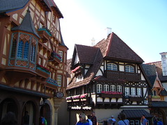
It seems ironic that “fantasy” has become such a narrow genre label within contemporary usage. Nowadays if you label something “fantasy” that always, always, always implies a setting in (or loosely resembling) Medieval Europe (maybe Classical or Renaissance Europe if it’s particularly imaginative fantasy), and you can be sure that you can’t throw a stone without hitting an elf, dwarf, wizard, or dragon… yet flying spaghetti monsters remain completely invisible. Since when did we become so dependent on the brothers Grimm and J.R.R. Tolkien to feed our imaginations? I applaud attractions like “it’s a small world” if only because they try to escape the confines of old Europe in creating a unique aesthetic setting that can still be called “fantasy”. Then again, I absolutely do not want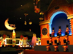 to see Figment from Epcot’s Imagination pavilion anywhere near the Magic Kingdom, so perhaps I should be careful in what I ask for. to see Figment from Epcot’s Imagination pavilion anywhere near the Magic Kingdom, so perhaps I should be careful in what I ask for.
“it’s a small world”
“it’s a small world” is the one attraction at Disney parks that has given me more grief in my role as a critic than any other attraction. On the one hand, it has a completely original artistic style that rejects hyperreal simulacra while conveying a simple, non-pandering message for world peace that resonates across generational divides, and in the process has made one of the deepest footprints on the pop-cultural landscape of any theme park attraction ever built. But on the other hand… it’s a small world.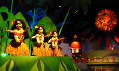 A small world where the music is stuck in an endless reprise and the thousands of dolls will never cease dancing like they’re at a house party thrown by Sisyphus. A small world where no matter what country I’m in it all looks like a jellybean factory recently blew up nearby, and the kaleidoscopic shapes and colors will burn imprints into my retinas after ten minutes of exposure. And a small world where no matter how slow my boat seems to be floating down the channel it will still inevitably get backed up for several minutes behind other boats just before reaching the unload platform. Perhaps the solution to my grief is to not approach “it’s a small world” as a critic, but simply as myself. In that case, A small world where the music is stuck in an endless reprise and the thousands of dolls will never cease dancing like they’re at a house party thrown by Sisyphus. A small world where no matter what country I’m in it all looks like a jellybean factory recently blew up nearby, and the kaleidoscopic shapes and colors will burn imprints into my retinas after ten minutes of exposure. And a small world where no matter how slow my boat seems to be floating down the channel it will still inevitably get backed up for several minutes behind other boats just before reaching the unload platform. Perhaps the solution to my grief is to not approach “it’s a small world” as a critic, but simply as myself. In that case,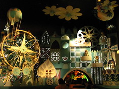 speaking for myself, on the outside I probably appear with glazed eyes and mouth slightly agape, but inside I’m still smiling a bit at the excessively simple and simply excessive pageantry of the whole ride. I guess that means that I must enjoy it on some level, even if I’m never going to be its target audience. However, also speaking for myself, I find that the world usually seems the most wondrous when I’m aware of its vastness, not its smallness. speaking for myself, on the outside I probably appear with glazed eyes and mouth slightly agape, but inside I’m still smiling a bit at the excessively simple and simply excessive pageantry of the whole ride. I guess that means that I must enjoy it on some level, even if I’m never going to be its target audience. However, also speaking for myself, I find that the world usually seems the most wondrous when I’m aware of its vastness, not its smallness.
Grade: C+
Peter Pan’s Flight
At most other parks the longest lines usually come before the newest and biggest rides. But the Magic Kingdom isn’t like most other parks, and here the longest line usually comes before Peter Pan’s Flight, which is neither the park’s newest, nor biggest. This is one of the original “drive-thru movie” style dark rides, and I’ve honestly never had much love for the genre so its “classic” status means little to me. As a form of storytelling, it’s only a little more effective than a movie trailer. While trailers and dark rides are each a unique medium with their own special rulebooks for the delivery of a neatly crafted emotional arc over a brief span of a couple minutes, both are ultimately subservient to the originating feature length film, unable to stand on their own artistic merits without it. Peter Pan’s Flight is a small but detailed ride with only a couple memorable effects, cast in the shadow of a giant name that seems before the newest and biggest rides. But the Magic Kingdom isn’t like most other parks, and here the longest line usually comes before Peter Pan’s Flight, which is neither the park’s newest, nor biggest. This is one of the original “drive-thru movie” style dark rides, and I’ve honestly never had much love for the genre so its “classic” status means little to me. As a form of storytelling, it’s only a little more effective than a movie trailer. While trailers and dark rides are each a unique medium with their own special rulebooks for the delivery of a neatly crafted emotional arc over a brief span of a couple minutes, both are ultimately subservient to the originating feature length film, unable to stand on their own artistic merits without it. Peter Pan’s Flight is a small but detailed ride with only a couple memorable effects, cast in the shadow of a giant name that seems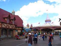 to be the real reason for drawing in the longest lines in the park. Or the long lines are because it’s indoors, there’s no minimum height limit, and single-bench vehicles provide less than ideal throughput. Either way, FastPass is highly recommended. to be the real reason for drawing in the longest lines in the park. Or the long lines are because it’s indoors, there’s no minimum height limit, and single-bench vehicles provide less than ideal throughput. Either way, FastPass is highly recommended.
Grade: C-
Mickey’s PhilharMagic
Here’s a litmus test for the quality of any theme park 4D cinema: would you want to watch the same short film if it were offered as a DVD extra for your home television? It’s all too easy for such attractions to gloss over a weak story with an abundance of 4D special effects, in which the hero’s conquest over the evil villain becomes a barely memorable plot hiccup in comparison to that time the comic relief guy spit his drink on the audience. Mickey’s PhilharMagic would probably fail such a test, although part of that might be because I’ve already seen roughly 80% of the material on DVD (well, VHS). Most of the short film consists of a musical medley from their most popular animated films, tied together by a plot involving Donald Duck becoming a mistaken sorcerer’s apprentice to a magical orchestra. (Despite the title, Mickey remains off-screen for the vast majority of the show’s runtime.) It recalls enough Saturday morning cartoons that I can find it relatively entertaining, although I’d be lying if I didn’t admit its biggest appeal is the chance to sit in the dark air conditioning for a few minutes. of 4D special effects, in which the hero’s conquest over the evil villain becomes a barely memorable plot hiccup in comparison to that time the comic relief guy spit his drink on the audience. Mickey’s PhilharMagic would probably fail such a test, although part of that might be because I’ve already seen roughly 80% of the material on DVD (well, VHS). Most of the short film consists of a musical medley from their most popular animated films, tied together by a plot involving Donald Duck becoming a mistaken sorcerer’s apprentice to a magical orchestra. (Despite the title, Mickey remains off-screen for the vast majority of the show’s runtime.) It recalls enough Saturday morning cartoons that I can find it relatively entertaining, although I’d be lying if I didn’t admit its biggest appeal is the chance to sit in the dark air conditioning for a few minutes.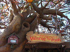 The other parks at the Disney World resort have much better 4D cinema attractions. The other parks at the Disney World resort have much better 4D cinema attractions.
Grade: D+
The Many Adventures of Winnie the Pooh
This is a competently-made dark ride that uses a variety of artistically inspired set pieces and special effects to tell a compelling story in the 100 Acre Woods about the perils of hard drug abuse. In it, Pooh ignores his neighbor’s pleas for help during a hurricane that threatens to destroy his community so that he can find his next fix from his recently depleted honey stash. When none is to be found, his charlatan friend Tigger convinces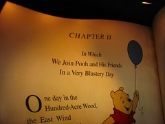 him to steal honey from his neighbors. After surviving an out-of-body hallucination caused by honey withdrawal, Pooh wakes to find his community underwater and his best friend about to drown. He again ignores this when he discovers a stash of honey in a tree large enough to put his whole body inside. The community eventually reconstructs, and Pooh finds that the best way to manage his honey addiction is to consume even more honey. It’s like the family friendly version of “Requiem for a Dream”, except Pooh doesn’t have to have his paw amputated at the end. (Um, spoiler alert.) And yet people still think Universal is the edgier of the major theme park operators in Florida… him to steal honey from his neighbors. After surviving an out-of-body hallucination caused by honey withdrawal, Pooh wakes to find his community underwater and his best friend about to drown. He again ignores this when he discovers a stash of honey in a tree large enough to put his whole body inside. The community eventually reconstructs, and Pooh finds that the best way to manage his honey addiction is to consume even more honey. It’s like the family friendly version of “Requiem for a Dream”, except Pooh doesn’t have to have his paw amputated at the end. (Um, spoiler alert.) And yet people still think Universal is the edgier of the major theme park operators in Florida…
Grade: C+
 Mad Tea Party Mad Tea Party
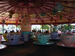
Interactivity can improve almost any flat ride experience, a claim of universality which cannot be made by most other categories of amusement attractions. The more intense interactive flat rides can become a first-person physics experiment, while the gentler rides can become a social activity; both types possibly benefit from increased mental stimulation over the monotonous motions of non-interactive flat ride counterparts. With an inert disk at the center of the seating that requires riders to join together to set their tea cup in motion (the amount of muscle you put into it directly controls how fast the cup spins; no button pushing or cord yanking here), the Mad Tea Party is an enduring example of rider interaction done right, even decades before “interactivity” became an amusement industry buzzword. rider interaction done right, even decades before “interactivity” became an amusement industry buzzword.
Grade: C-
Dumbo the Flying Elephant
Some theme park fans might like to think that Disney’s storytelling and placemaking abilities allow their parks to completely transcend the ordinary amusement park experience, yet this possibly ignores the fact that at least two of their most iconic and popular attractions are essentially glamorized carnival rides (Dumbo and the Mad Tea Party, maybe a few others). This isn’t to denigrate these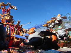 rides at all, only to point out that even at Disney you can’t deny the simple pleasures of spinning around in circles that make fairgrounds so popular. Of course the Magic Kingdom does it with a lot more class, and I even get an odd satisfaction just from thinking about all the extra capacity the new dueling arrangement offers. I can only assume this comes from spending too much time in slow-moving queues at other parks where I must entertain myself by mentally calculating the estimated throughput numbers. Still, regardless of how classy the presentation is within the Storybook Circus of New Fantasyland and how fast the line moves, I must ask now that I’ve done it once: am I ever going to voluntarily ride Dumbo again? rides at all, only to point out that even at Disney you can’t deny the simple pleasures of spinning around in circles that make fairgrounds so popular. Of course the Magic Kingdom does it with a lot more class, and I even get an odd satisfaction just from thinking about all the extra capacity the new dueling arrangement offers. I can only assume this comes from spending too much time in slow-moving queues at other parks where I must entertain myself by mentally calculating the estimated throughput numbers. Still, regardless of how classy the presentation is within the Storybook Circus of New Fantasyland and how fast the line moves, I must ask now that I’ve done it once: am I ever going to voluntarily ride Dumbo again?
Grade: D+
 The Barnstormer The Barnstormer
It’s not Disney’s fault that the Vekoma Roller Skater would go on to become more popular than head lice since the Barnstormer’s 1996 debut, with a total of four now residing in central Florida alone. But even if Disney had signed an exclusivity contract with Vekoma (which would have been a bum deal for Vekoma, as they’ve managed to sell 75 other Roller Skaters worldwide, with a third of those being identical clones to the Barnstormer, sans chain lift and transfer track), it still would have been identifiable as a stock product. It’s one of the few Walt Disney World attractions that seems to exist first and foremost to fill a generic ride category (Magic Kingdom doesn’t have a children’s coaster, so let’s add one), with the details of where, how, and why it should fit in the rest of the themed environment being a secondary concern. (Even the much maligned Primeval Whirl had more thematic justification of the stock model spinning mouse choice in the context of the roadside Americana theme.) It’s not even defensible as a way to absorb capacity on a busy day since a maximum of 16 riders per dispatch still sucks by Disney standards. What sane individual waits an hour in line to experience twenty seconds of weaving helices? At least with the Great Goofini makeover and second train it’s leagues better than its single train, looney tunes styled Anaheim cousin, but that isn’t saying much. add one), with the details of where, how, and why it should fit in the rest of the themed environment being a secondary concern. (Even the much maligned Primeval Whirl had more thematic justification of the stock model spinning mouse choice in the context of the roadside Americana theme.) It’s not even defensible as a way to absorb capacity on a busy day since a maximum of 16 riders per dispatch still sucks by Disney standards. What sane individual waits an hour in line to experience twenty seconds of weaving helices? At least with the Great Goofini makeover and second train it’s leagues better than its single train, looney tunes styled Anaheim cousin, but that isn’t saying much.
Grade: D
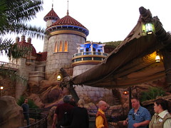 Under the Sea: Journey of the Little Mermaid Under the Sea: Journey of the Little Mermaid
Well… it has a good queue line. Once we board the clamshell vehicles we’re then treated to a four minute thesis on the shortcomings of theme park attractions as a narrative art form. Much of it is technical in analysis: omnimovers demonstrate the completely the wrong choice of ride system for this particular story. Unlike the Haunted Mansion or Pirates of the Caribbean, which are very open-ended stories told via mood across space, the story of the Little Mermaid is mediated by events across time, and therefore requires a much more linear sequential ride format with clearly defined scene changes to advance the narrative. Both Peter Pan’s Flight and Adventures of Pooh are reasonably competent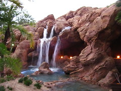 at this; the individual cars enter a room, a short scene plays out in front of them, and then you exit into the next room, where each door or dark threshold between scenes acts like the spatial equivalent of a cinematic cut. However, with a continuous chain of omnimovers it’s impossible to present any completed action directly to the audience for more than two seconds. Events and dialogue have to be open-ended and unfold in an infinite loop, so that you can enter and exit the scene at any moment and still have it work. But it doesn’t work with this story. Much of the action driving the plot on Under the Sea is still “closed”; meaning, as you enter Ursula’s chamber, you’re likely to hear the second half of a certain line of dialogue, followed by an empty pause (where in film we might expect a cut), and then only catch the first half of her next line (which must at this; the individual cars enter a room, a short scene plays out in front of them, and then you exit into the next room, where each door or dark threshold between scenes acts like the spatial equivalent of a cinematic cut. However, with a continuous chain of omnimovers it’s impossible to present any completed action directly to the audience for more than two seconds. Events and dialogue have to be open-ended and unfold in an infinite loop, so that you can enter and exit the scene at any moment and still have it work. But it doesn’t work with this story. Much of the action driving the plot on Under the Sea is still “closed”; meaning, as you enter Ursula’s chamber, you’re likely to hear the second half of a certain line of dialogue, followed by an empty pause (where in film we might expect a cut), and then only catch the first half of her next line (which must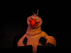 convey the same basic idea as the first line we partially missed) before being scooted out into the next scene. This short-form narrative doesn’t even play like a trailer for the feature film; it’s more like randomly skipping ahead on the playback bar of the movie. So incoherent is the plot in Under the Sea that I had to read a synopsis afterward to figure out that Ursula is not the one responsible for the celebratory ending where Ariel and Prince Eric are united. Thus the thesis ends with a basic question of aesthetics: why retell this story at all if it wasn’t going to be retold well? The answer, however, is only too obvious; it simply has nothing to do with aesthetics. convey the same basic idea as the first line we partially missed) before being scooted out into the next scene. This short-form narrative doesn’t even play like a trailer for the feature film; it’s more like randomly skipping ahead on the playback bar of the movie. So incoherent is the plot in Under the Sea that I had to read a synopsis afterward to figure out that Ursula is not the one responsible for the celebratory ending where Ariel and Prince Eric are united. Thus the thesis ends with a basic question of aesthetics: why retell this story at all if it wasn’t going to be retold well? The answer, however, is only too obvious; it simply has nothing to do with aesthetics.
Grade: D
Tomorrowland
Apparently the future already happened and we all missed it. Ignoring the quality of the attractions within it and just focusing on the environment, I think this might be one of my least favorite themed lands anywhere on Walt Disney World property. The main midway in particular is very visually cluttered, and despite the futurist theme it feels like the most outdated section of the park. This outdatedness would have been okay if it was the future as envisioned by a previous generation; perhaps from Walt’s perspective in the 1960’s as seen in the Carousel of Progress, or from Jules Verne’s fiction as seen at Disneyland Paris’ magnificent Discoveryland? However, here it’s not a coherent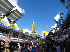 representation of anyone’s vision of the future, either past, present, or fictional. Cartoonish flourishes interrupt the sleek chrome aesthetic, advertisements for attractions (or even vacation properties) compete for precious attention resources, and after navigating through the dense black hole of tourists bottlenecked in the narrow arcade midway, the space then opens up in the back with Space Mountain and Carousel of Progress both seemingly located way out in the middle of the Florida swamplands. Movie-based attractions have become popular in recent years, yet proper science-fiction stories are almost completely extinct in Tomorrowland. Of the Pixar films they chose to include both Monsters, Inc. and Toy Story, but not WALL-E? A revamp is rumored once New Fantasyland is complete, and I say it can’t come soon enough. representation of anyone’s vision of the future, either past, present, or fictional. Cartoonish flourishes interrupt the sleek chrome aesthetic, advertisements for attractions (or even vacation properties) compete for precious attention resources, and after navigating through the dense black hole of tourists bottlenecked in the narrow arcade midway, the space then opens up in the back with Space Mountain and Carousel of Progress both seemingly located way out in the middle of the Florida swamplands. Movie-based attractions have become popular in recent years, yet proper science-fiction stories are almost completely extinct in Tomorrowland. Of the Pixar films they chose to include both Monsters, Inc. and Toy Story, but not WALL-E? A revamp is rumored once New Fantasyland is complete, and I say it can’t come soon enough.
Monsters, Inc. Laugh Floor
This interactive comedy club using digital puppet technology based on characters from Monsters, Inc.3 will most likely require some patience from its audience members. Comedy is a subtle art that thrives on spontaneity and subversiveness, both increasingly hard resources to cultivate at the Magic Kingdom. The show is padded with a lot of pretty tepid puns and corny one-liners (the staged bits involving the curmudgeonly Roz seem particularly uninspired and stagnate the show’s pacing considerably). However, if you’re lucky your patience will be rewarded (hopefully more than once) during an interactive segment when an unexpected reply from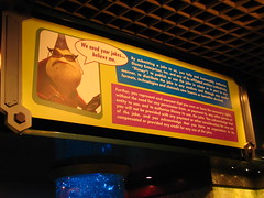 the audience is met with a perfectly timed ad-lib from on stage (or, more accurately, from behind stage). Who knows, maybe you’ll also discover a gem from the audience-submitted jokes they read at the end, but the legal disclaimer during the preshow warning of the many rights given up by participating (including human) meant that the best texted-in joke they could collect from our group was the one asking how to make a hanky dance. Yeah, you can show us the exit now, thanks. the audience is met with a perfectly timed ad-lib from on stage (or, more accurately, from behind stage). Who knows, maybe you’ll also discover a gem from the audience-submitted jokes they read at the end, but the legal disclaimer during the preshow warning of the many rights given up by participating (including human) meant that the best texted-in joke they could collect from our group was the one asking how to make a hanky dance. Yeah, you can show us the exit now, thanks.
Grade: D+
Stitch’s Great Escape
 This is an excellent attraction for people who are either at a third grade maturity level or who might get enjoyment out of S&M activities. First you’re strapped down to your seat by a rigid horsecollar, then the lights are turned off, whereupon you’re subjected to five minutes of being sneezed on, jumped on, burped on, and sometimes spit on by a hyperactive blue creature called Stitch (voiced by a guy who has evidently swallowed an entire helium balloon). If that all sounds like too much fun, don’t worry because there are plenty of laborious talking exposition scenes added to the beginning and end of this experiential show to keep it from ever getting too exciting. However, to my eyes the best part of this attraction is that the authoritarian intergalactic penal system depicted in this story could potentially inspire a This is an excellent attraction for people who are either at a third grade maturity level or who might get enjoyment out of S&M activities. First you’re strapped down to your seat by a rigid horsecollar, then the lights are turned off, whereupon you’re subjected to five minutes of being sneezed on, jumped on, burped on, and sometimes spit on by a hyperactive blue creature called Stitch (voiced by a guy who has evidently swallowed an entire helium balloon). If that all sounds like too much fun, don’t worry because there are plenty of laborious talking exposition scenes added to the beginning and end of this experiential show to keep it from ever getting too exciting. However, to my eyes the best part of this attraction is that the authoritarian intergalactic penal system depicted in this story could potentially inspire a lively discussion about Michel Foucault’s thesis in “Discipline and Punish” afterward. This is how you make Disney magic, people. lively discussion about Michel Foucault’s thesis in “Discipline and Punish” afterward. This is how you make Disney magic, people.
Grade: F
Buzz Lightyear’s Space Ranger Spin
It’s a first person shooter video game layered on top of an omnimover dark ride, and it gives you a joystick that lets you spin your car in circles as much as you want, whenever you want. How can this not be fun? Well, it’s not quite as fun at the very end when they rank your final score, and I realize that where I thought I had spent the last five minutes gunning down baddies like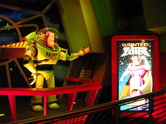 a mofo, in reality I rated only a few levels above Helen Keller. C’mon, Disney is supposed to be the place where dreams come true, so why do they have to shatter my delusion that I have a secret special ability that can make me a ninja assassin the first time I pick up a plastic laser gun? Of course I suppose that they shouldn’t make you feel good about your high score achievements too easily because apparently there are people who really can max out the score to 999,999. At that point I say they deserve to feel truly special at the end of the ride and are free to gloat over my paltry five-digit score, because what else can such people possibly have in their life that’s good? a mofo, in reality I rated only a few levels above Helen Keller. C’mon, Disney is supposed to be the place where dreams come true, so why do they have to shatter my delusion that I have a secret special ability that can make me a ninja assassin the first time I pick up a plastic laser gun? Of course I suppose that they shouldn’t make you feel good about your high score achievements too easily because apparently there are people who really can max out the score to 999,999. At that point I say they deserve to feel truly special at the end of the ride and are free to gloat over my paltry five-digit score, because what else can such people possibly have in their life that’s good?
Grade: C
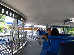 Tomorrowland Transit Authority PeopleMover Tomorrowland Transit Authority PeopleMover
True to its name, the Tomorrowland PeopleMover is able to move a lot of people in a short amount of time, which makes it a great attraction to fill between Fast Passes during the afternoon rush. The LSM-powered cars serve little practical purpose beyond letting you rest your feet for a few minutes in the shade while being chauffeured in circles around Tomorrowland at a breezy golf cart-paced clip, but honestly that alone is more than enough to make the PeopleMover better than the majority of mass transit themed attractions. While getting to take a tour through the inside of Space Mountain is cooler in concept than it is in reality (it’s dark and there’s a lot of screaming pre-teens, like you’re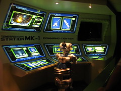 watching the worst slasher movie ever), the ride is well worth it just for including along the route the original EPCOT “Progress City” diorama envisioned by Walt Disney, back when the concept was still a fully functioning master-planned city rather than an educational theme park. The model is a little dim and dusty looking today; the forgotten promise of a future where we could all live happily together in a poverty-free, centrally organized, and technocratic community that had absolutely no similarities to communism. watching the worst slasher movie ever), the ride is well worth it just for including along the route the original EPCOT “Progress City” diorama envisioned by Walt Disney, back when the concept was still a fully functioning master-planned city rather than an educational theme park. The model is a little dim and dusty looking today; the forgotten promise of a future where we could all live happily together in a poverty-free, centrally organized, and technocratic community that had absolutely no similarities to communism.
Grade: C-
Space Mountain
 I suspect that for many people Space Mountain was their first time ever on a “grown-up” roller coaster, meaning it was also the ride in which they decided whether to ride any more roller coasters in the future. While it’s a very fun ride that has justifiably earned it many adoring fans, it also has to be said that it can be a very intense and sometimes jarring ride as well, since roller coaster design in 1975 was still not much more advanced than plugging radians into straight lines and then hoping the steel fabricated product can complete the circuit successfully without killing anyone (at least outside of Germany). I personally enjoy the extra aggressiveness and retro quirks, but I worry that the experience might be “too much” for a first-timer assigned to the back row, prompting them to stay away from larger (but gentler) coasters they I suspect that for many people Space Mountain was their first time ever on a “grown-up” roller coaster, meaning it was also the ride in which they decided whether to ride any more roller coasters in the future. While it’s a very fun ride that has justifiably earned it many adoring fans, it also has to be said that it can be a very intense and sometimes jarring ride as well, since roller coaster design in 1975 was still not much more advanced than plugging radians into straight lines and then hoping the steel fabricated product can complete the circuit successfully without killing anyone (at least outside of Germany). I personally enjoy the extra aggressiveness and retro quirks, but I worry that the experience might be “too much” for a first-timer assigned to the back row, prompting them to stay away from larger (but gentler) coasters they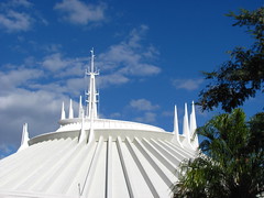 might encounter elsewhere in Florida. Despite technically being the largest of the five Space Mountains built around the world, I also think this one is probably the worst.4 More than the outdated engineering and special effects, it’s the absence of a soundtrack giving the layout a sense of organization and meaning that is most critically absent; the freely echoing sounds throughout the dome always subtly reinforce the perception that it’s all a very chaotic experience. A much more literal space travel theme (seemingly not updated since the Apollo space program, minus some colorful in-queue videogames) isn’t enough to hide the fact that Florida’s Space Mountain isn’t about anything, other than to deliver some roller coaster-type thrills in the dark. By the way, whose bright idea was it to put the loading and unloading platforms on the far side of the dome away might encounter elsewhere in Florida. Despite technically being the largest of the five Space Mountains built around the world, I also think this one is probably the worst.4 More than the outdated engineering and special effects, it’s the absence of a soundtrack giving the layout a sense of organization and meaning that is most critically absent; the freely echoing sounds throughout the dome always subtly reinforce the perception that it’s all a very chaotic experience. A much more literal space travel theme (seemingly not updated since the Apollo space program, minus some colorful in-queue videogames) isn’t enough to hide the fact that Florida’s Space Mountain isn’t about anything, other than to deliver some roller coaster-type thrills in the dark. By the way, whose bright idea was it to put the loading and unloading platforms on the far side of the dome away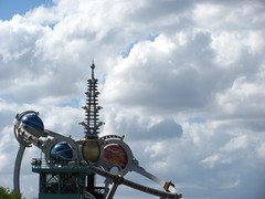 from the rest of the park? from the rest of the park?
Grade: C+
Walt Disney’s Carousel of Progress
In the queue and during the introductory show scene there are several reminders that the Carousel of Progress was originally designed for the 1964 World Fair. These messages partly function as an advisory implying that we should be prepared for a lot of cultural outdatedness, but also to justify that it’s okay because this was one of Walt’s most personal projects he worked on before his death, and so the message behind it is timeless. Thus begins the audio-animatronic show in four acts, in which we move from scene to scene (each representing the American family home during different eras of the 20th century) via a carousel mechanism. Perhaps tellingly, the early (and relatively unchanged) scenes taking place in the 1900’s and 1920’s are the most convincing in part because we can barely even apprehend the gulf of time from our perspective at the present, while it’s the final scene (updated several times, most recently in the 1990’s to predict what the year 2000 might look like) that earns the most unintentional guffaws. While the presentation is uniquely and delightfully “Disney”, the philosophical message behind it is in support of some pretty hardcore technological determinism. Maybe that’s a good thing? After all, the Carousel seems to propose an Thus begins the audio-animatronic show in four acts, in which we move from scene to scene (each representing the American family home during different eras of the 20th century) via a carousel mechanism. Perhaps tellingly, the early (and relatively unchanged) scenes taking place in the 1900’s and 1920’s are the most convincing in part because we can barely even apprehend the gulf of time from our perspective at the present, while it’s the final scene (updated several times, most recently in the 1990’s to predict what the year 2000 might look like) that earns the most unintentional guffaws. While the presentation is uniquely and delightfully “Disney”, the philosophical message behind it is in support of some pretty hardcore technological determinism. Maybe that’s a good thing? After all, the Carousel seems to propose an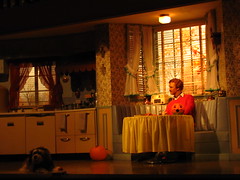 extremely optimistic interpretation of modern human existence: our lives will be continually made better by technology as we age, so like the narrator we can happily sit around enjoying our increasingly automated homes, waiting for the linear trajectory of science and industry to arrive at a singular conclusion that somehow always remains just out of reach within our lifetimes. Well, it’s optimistic depending on what you want out of life. The script suggests that the value of progress is as an abstract cultural force (there’s always a great big beautiful tomorrow to look forward to) rather than any specific concrete result of progress, although it leaves open the question of how we determine the value created by technological development (either in concrete or abstract) in the first place. In the 1940’s our narrator optimistically speculates that extremely optimistic interpretation of modern human existence: our lives will be continually made better by technology as we age, so like the narrator we can happily sit around enjoying our increasingly automated homes, waiting for the linear trajectory of science and industry to arrive at a singular conclusion that somehow always remains just out of reach within our lifetimes. Well, it’s optimistic depending on what you want out of life. The script suggests that the value of progress is as an abstract cultural force (there’s always a great big beautiful tomorrow to look forward to) rather than any specific concrete result of progress, although it leaves open the question of how we determine the value created by technological development (either in concrete or abstract) in the first place. In the 1940’s our narrator optimistically speculates that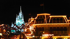 households will soon be able to use the newly-invented television to learn Greek and Latin. By the last scene the family decides that soon everything will become so automated that they won’t have to do anything for the rest of their lives except exist as a nuclear family unit of happy consumers. This leaves me to assume that they’re close to realizing the ultimate of all human values, upon which point the carousel of progress will finally come to a stop. households will soon be able to use the newly-invented television to learn Greek and Latin. By the last scene the family decides that soon everything will become so automated that they won’t have to do anything for the rest of their lives except exist as a nuclear family unit of happy consumers. This leaves me to assume that they’re close to realizing the ultimate of all human values, upon which point the carousel of progress will finally come to a stop.
Grade: B-
Summary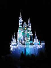
The world’s most popular theme park is proof that popularity is not purely a factor of quality, although as one of the ultimate products of pop culture there’s no reason to delay twenty years before finally taking the trip across the Seven Seas Lagoon.
Overall Grade: C+
Urayasu, Chiba, Japan – Monday, June 27th, 2011
 My visit to Tokyo Disneyland is tinged with a slight feeling of guilt. In 2011, shortly after the park reopened following damage sustained by one of the largest earthquakes to ever hit Japan, and with the Fukushima nuclear disaster still unfolding every day. These events were not only a stark reminder of “the world of today” outside the gates that I was privileged to leave behind, but also, due to the accompanying tourist slump, led to the realization that the seemingly ideal conditions I got to enjoy at the (once) most popular theme park on earth were made possible because of the catastrophic humanitarian situation unfolding elsewhere. My visit to Tokyo Disneyland is tinged with a slight feeling of guilt. In 2011, shortly after the park reopened following damage sustained by one of the largest earthquakes to ever hit Japan, and with the Fukushima nuclear disaster still unfolding every day. These events were not only a stark reminder of “the world of today” outside the gates that I was privileged to leave behind, but also, due to the accompanying tourist slump, led to the realization that the seemingly ideal conditions I got to enjoy at the (once) most popular theme park on earth were made possible because of the catastrophic humanitarian situation unfolding elsewhere.
Of course there was little need to actually feel guilty, since at that point in time the stress was on the Japanese economy, including its tourist sector, needing all the help it could get. But in traumatic times people want to unify around shared experiences, and an escape to a theme park becomes a symbol of hope and reassurance that exists outside the bounds of ordinary discourse, lest that symbolism starts to shatter. So it made me feel just a bit guilty, with everything else happening in the background, to not only take the resources to go to Tokyo Disneyland, but to come away from it just to say that this theme park is honestly kinda shit. including its tourist sector, needing all the help it could get. But in traumatic times people want to unify around shared experiences, and an escape to a theme park becomes a symbol of hope and reassurance that exists outside the bounds of ordinary discourse, lest that symbolism starts to shatter. So it made me feel just a bit guilty, with everything else happening in the background, to not only take the resources to go to Tokyo Disneyland, but to come away from it just to say that this theme park is honestly kinda shit.
In my view, Tokyo Disneyland is bottom-ranked of the Disney “castle” theme parks, and second-to-last out of the entire collection, clearly besting only the Walt Disney Studios Park in Paris. The park looks a lot like one of those bad “Asian knock-off Disneyland parks,” and that’s because in some ways… that’s actually what it is!
Licensed by the Oriental Land Company, Disney only agreed to the deal because they were hurting for cash while trying to finish Epcot, which opened the year before Tokyo Disneyland’s debut in 1983. WED Enterprises kept all their A-list talent with experience from the previous two Anaheim and Orlando theme parks busy on Epcot, while a less-experienced team was assigned to Tokyo, asked to design a park that was a mix of copied elements from Disneyland and the Magic Kingdom but with little understanding of the philosophy that made those parks actually work. In essence, the same process used by any number of fake Disney-inspired copycat parks out there, only bearing the imprimatur of the real D.
The result is a park full of awkward “knock-off-isms”: weird juxtapositions and sightlines from reshuffled elements, a focus on operations and capacity over show quality, vestigial features copied from elsewhere that have lost their original purpose, and a general lack of care, cleverness, and charm that indicates real thought went into the design. The challenges are most obvious right from the entrance, a copy version of Main Street U.S.A. bizarrely renamed World Bazaar. A steel and glass canopy was added overhead, ostensibly to protect pedestrians from the rain, although it introduces multiple unfavorable consequences:
- It forces the compression of the land to keep it all under a manageable roof size.
- It still ate most of the land’s budget, leaving a Main Street without detail, grandeur, or even street curbs.
- It creates an echoing din that kills any attempt at good music and sound design for arriving guests.
- It’s fugly.
And as if the design wasn’t bad enough, look at a map and that dumb, thematically mismatched name really seals it as exactly what you’d expect from a “cheap Disney knock-off” park… and frankly, there are real fake Disney parks out there that have a better entry zone than this.
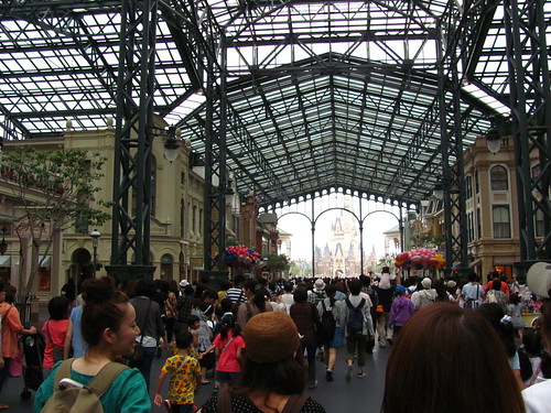 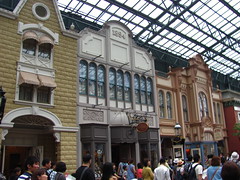    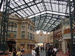 
From that low, the rest of the park represents somewhat of an improvement, mostly by virtue of having seen more updates since the original 1983 design after Disney got serious about the potential of Tokyo Disneyland. But that also means the boundaries between the old and the new become more conspicuous, and the obviously band-aided and patchworked park suffers from an inconsistent identity as a result. Unlike Hong Kong Disneyland, where the biggest issue was that it opened too small, Tokyo Disneyland was cursed with scale, leaving the sprawling park with infrastructural issues that can’t be ameliorated just by building beyond the original berm.
 One of those issues is that the park was built almost completely flat. Other theme parks use gentle elevation changes to create sight blocks and moments of reveal, and to prevent a distant horizon point to create the impression of an endless mob of people. Tokyo Disneyland not only is mostly on level, but it also intentionally built its pathways to be as wide and unadorned as possible, apparently to accommodate crushing holiday crowds and large parades. An agoraphobe’s nightmare. The themed environmental design suffers as well, as the facades have been pushed far apart from each other with little sense of depth or intimacy, often functioning more like themed backdrops at the borders of the endless paved seas. Despite having lands themed to the old west or the uncharted jungle, natural landscape design is relatively minimal compared One of those issues is that the park was built almost completely flat. Other theme parks use gentle elevation changes to create sight blocks and moments of reveal, and to prevent a distant horizon point to create the impression of an endless mob of people. Tokyo Disneyland not only is mostly on level, but it also intentionally built its pathways to be as wide and unadorned as possible, apparently to accommodate crushing holiday crowds and large parades. An agoraphobe’s nightmare. The themed environmental design suffers as well, as the facades have been pushed far apart from each other with little sense of depth or intimacy, often functioning more like themed backdrops at the borders of the endless paved seas. Despite having lands themed to the old west or the uncharted jungle, natural landscape design is relatively minimal compared to other parks, often relegated to planters and small tree clusters along the edges when needed to conceal buildings or transition spaces. And those massive midways themselves are, inexplicably, painted in flat, textureless mono-colors that correspond to the land identification guide, as if the designers literally referenced a Disneyland fun map for their color studies. to other parks, often relegated to planters and small tree clusters along the edges when needed to conceal buildings or transition spaces. And those massive midways themselves are, inexplicably, painted in flat, textureless mono-colors that correspond to the land identification guide, as if the designers literally referenced a Disneyland fun map for their color studies.
While expansions have improved things (and this analysis is obviously from well before the Fantasyland expansion was ever a thing) Tokyo Disneyland feels hopelessly stuck in the 80’s, the Disney theme park equivalent of one of those old dinosaurs of a shopping mall. Even if some of the store tenants have tried to update to the 21st century, it only underscores the anachronism of the whole thing. Not aiding these perceptions of outdatedness is the fact that OLC has also resisted many of Disney’s initiatives to update insensitive cultural content from many of their older attractions, reasoning that concerns around representation and inclusion aren’t as important for a Japanese audience, which… isn’t how that works… but at least western fans can continue to celebrate these parks for having more orderly queues and parade crowds? Not aiding these perceptions of outdatedness is the fact that OLC has also resisted many of Disney’s initiatives to update insensitive cultural content from many of their older attractions, reasoning that concerns around representation and inclusion aren’t as important for a Japanese audience, which… isn’t how that works… but at least western fans can continue to celebrate these parks for having more orderly queues and parade crowds?
For a lot of people Tokyo Disneyland offers a specific kind of 80’s nostalgia that’s not so different from the eras of 50’s nostalgia or even turn-of-the-century nostalgia that have informed so much of the Disney parks’ identity. Even old shopping malls still have dedicated connoisseurs working to preserve their memories. I might have been more amenable to the quirkiness of this particular kind of nostalgic character if Tokyo Disneyland didn’t also demand so much, overwhelm so much, intimidate so much, with its huge size and complex crowd dynamics. Nostalgia is always better in small doses (and without the lingering taint of racism that usually goes with those older eras). I might have been more amenable to the quirkiness of this particular kind of nostalgic character if Tokyo Disneyland didn’t also demand so much, overwhelm so much, intimidate so much, with its huge size and complex crowd dynamics. Nostalgia is always better in small doses (and without the lingering taint of racism that usually goes with those older eras).
But certainly my explanation of Tokyo Disneyland is missing many of the details that have won it legions of fans, which I suspect may be found more within the “soft tissue” of the park: the characters, shows, parades, foods, and the hyper-local park culture, which I’ll admit were not my main focus. And some of the individual rides are pretty good… but let’s not get carried away just yet. That’s what the rest of this review is for.

Adventureland
Basically a version of the Magic Kingdom’s Adventureland, but with a section of New Orleans Square around Pirates of the Caribbean, primarily to include the Blue Bayou restaurant popular on the Disneyland version. Equating New Orleans and the jungle together in the same “Adventure” category is one of those things that I can’t help but feel might indicate a slightly problematic intent, even if it will probably be that way forever so long as pink stucco and wrought iron next to tropical palm planters continues to look cute to Japanese teen girls.
 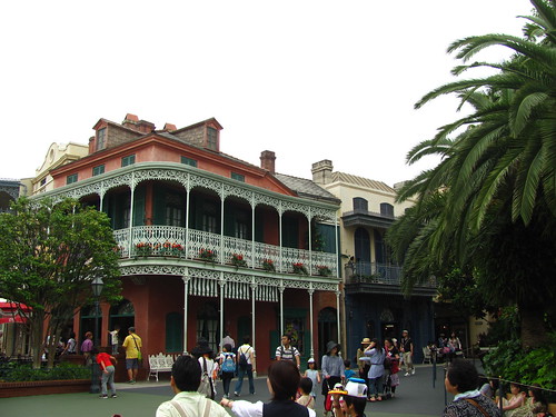  
Pirates of the Caribbean
Halfway between the Disneyland and Magic Kingdom versions, but the pirates still chase the women on turntables in this version. (Japan’s gender gap also continues to rank at or near the bottom among developed economies, so there’s that.) Oddly, the detail I most remember about this version was it was the first time I took notice of the then-recently added fog screen where Davy Jones appears and, in response to the haunting refrain of “dead men tell no tales…”, says:
“Ah! But they do tell tales! So says I, Davy Jones!”
Really an all-timer for the worst line of show writing in an attraction script. Just in awe at how succinctly each word is unwanted and unnecessary. The fact that you can watch the fog screen media reset several times is the icing on the cake. (Thankfully this effect has been removed from the Anaheim version in more recent years.)
Jungle Cruise
The only version of the Jungle Cruise in the world not offered in English. But chances are you already know the spiel, as all the classic gags are here in this version largely similar to the Magic Kingdom installation. More than an opportunity to see funny animatronic animals and cringey animatronic natives, it’s refreshing to enjoy being surrounded by real trees and foliage for a little while within this otherwise very urbanized Adventureland.
  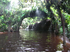    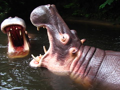 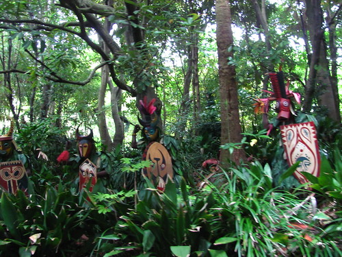 
Western River Railroad
Is this attraction part of Adventureland or Westernland? The theming is definitely meant for Westernland and the track is mostly routed through Westernland. But it’s smack dab in the middle of Adventureland, sharing part of the station with the Jungle Cruise on one side and the Enchanted Tiki Room on the other. My guess is a train had to go somewhere because that’s what the other two prior Disney parks had, even though it couldn’t have multiple stations (apparently due to Japanese regulations that would qualify it as public rail transport, thus requiring a set timetable and fares) or even fit the one station it did have inside Westernland. Attractions getting placed in the wrong theme zone, even if they no longer serve their original purpose, just so they could be checked off the list… another telltale “knock-off-ism.” (Also it was closed for refurbishment during my visit so it was all a moot point anyway.)
 
Westernland
Not Frontierland, but Westernland, since “frontier” doesn’t adequately translate in Japanese. (Little wonder, as each culture has its own history and geography for a very different sense of what frontier could mean. One of China’s greatest literary works, Journey to the West, may momentarily confuse western readers when they learn it refers to a journey to India.) Anyway, this land is largely a cul-de-sac leading to Big Thunder Mountain. The design is tighter and more carefully thought-through than pretty much any other land, and the broad paved spaces sorta work to evoke the open expanses of the west. Combined with a few nice corners of natural landscaping around the riverfront and Critter County immediately next to it, this is likely the most successful of the original themed zones at Tokyo Disneyland. Still a far cry from, say, Disneyland Paris’ Frontierland.
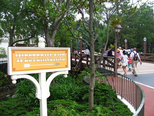        
Big Thunder Mountain
Fairly similar to the Disneyland Big Thunder Mountain Railroad, but it fixes the third act problem by actually giving some meat to the section after the third lift. This finale segment kicks off with a drop down into a tunnel infested with flying bats, a great special effect I’m surprised to see was never replicated in the stateside versions. After this tunnel the dinosaur skeleton splashdown is still used to signify the finale, but is combined with a much steeper drop concealing one last speed run through a narrow mine shaft. While not quite on the level of the magnificent Parisian version with its bottomless drop underneath the river, the Tokyo version probably represents the ideal of what the archetypal Big Thunder Mountain experience should have always been. One of my picks for the top three attractions in the park.
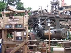   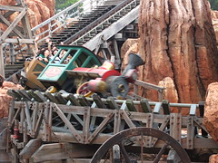 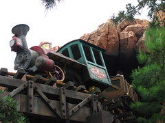  
Rivers of America & Mark Twain Riverboat
Along with Jungle Cruise, this is one of the best places to enjoy a sense of nature inside Tokyo Disneyland, making it a welcome respite from the crowds and hot pavement that define much of this park.
  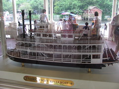          
Splash Mountain
Turns out, the best ride in the park is the racist one! Back in 2011 I wondered how long Splash Mountain would be sustained in Japan given the very particular cultural meaning behind its Southern folklore storyline that was certainly lost on the Japanese audience. It turns out, being able to understand and remember the cultural significance of its references is precisely what ended the U.S. versions and allowed the Japanese iteration to continue for another zip-a-dee-doo-dah day. Indeed, the Japanese audience seems to have an attachment to their Splash Mountain even more than American audiences do. In the 1998 Japanese movie After Life, the recently deceased are asked to pick one memory to replay for the rest of eternity, to which one teen girl’s first choice was her ride on Splash Mountain at Tokyo Disneyland. That’s just the reputation it has! Whether or not it should eventually lose the Song of the South storyline is not something I’ll take a position on here, but I’m still glad I got to appreciate the weird glory of this ambitious log flume, which is by far the most elaborate of the three worldwide installations (especially for its breathtaking queue). It’s also the only Splash Mountain performed in deep-fried southern-accented Japanese, certainly a zenith of globalism’s effect on culture. to their Splash Mountain even more than American audiences do. In the 1998 Japanese movie After Life, the recently deceased are asked to pick one memory to replay for the rest of eternity, to which one teen girl’s first choice was her ride on Splash Mountain at Tokyo Disneyland. That’s just the reputation it has! Whether or not it should eventually lose the Song of the South storyline is not something I’ll take a position on here, but I’m still glad I got to appreciate the weird glory of this ambitious log flume, which is by far the most elaborate of the three worldwide installations (especially for its breathtaking queue). It’s also the only Splash Mountain performed in deep-fried southern-accented Japanese, certainly a zenith of globalism’s effect on culture.
Fantasyland
Emblematic of the type of park Tokyo Disneyland is, you turn the corner from one of the park’s best areas, Splash Mountain and Critter County, and are suddenly confronted with: an unadorned Dumbo spinner sadly sitting in the middle of a giant asphalt pad like a parking lot carnival ride, situated in front of an airlifted Haunted Mansion facade from Florida. Putting the Haunted Mansion in Fantasyland is weird but not inconceivable (imagine having “the spooky house at the edge of the woods” as it often goes in these stories) but the whole thing is such a jarring juxtaposition of incompatible elements with second-rate execution it’s hard to believe this is part of what many fans rave to be Disney’s best resort. I’m also not convinced that the large Beauty & The Beast village expansion on the opposite end of Fantasyland will improve the underlying problems with this land; if anything, I might expect it to get worse by further heightening the contrast in build quality and decentering the placemaking by putting a second big castle weenie behind the first one. But I guess I’ll need to return to judge for myself…
    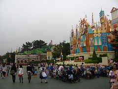   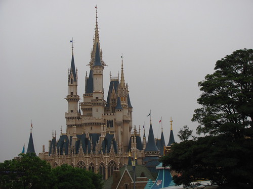
The Haunted Mansion
Despite being a massive abode, to me this attraction never seemed to find its home within the Disney parks. Disneyland’s is a New Orleans plantation house, which promises Southern Gothic mystery until you go inside and it’s all the generic haunted house architecture and tropes from northeastern and European roots. The Mansion at least looks the part in Florida, but as the major E-ticket anchor to Liberty Square it twists that land’s patriotic theme into a slightly unsettling and sinister read of American history (certainly not helped following the 2017 renovations to the Hall of Presidents). Paris had to twist the theme into the more story-heavy Phantom Manor to make its western setting work, and Hong Kong invented a whole separate standalone land for it’s Mystic Manor despite looking a lot like neighboring Adventureland. Tokyo’s is certainly the most out-of-place of the global set from the outside, but once you get inside it’s possibly the best preserved of the classic Haunted Mansion experience, including the screaming pop-up ghosts that made for the closest thing to a real jump-scare I’ve ever experienced on one of Disney’s Mansions.
  
Fantasyland Dark Rides
Three classic dark rides are found in the main plaza of Fantasyland, which still retains its medieval faire appearance of banners and tents rather than the quaint European village update that came to Disneyland the same year Tokyo Disneyland opened its gates. Peter Pan’s Flight is pretty similar to the Magic Kingdom version, while Pinocchio’s Daring Journey is much the same as Disneyland’s. Snow White’s Adventures, while losing the “Scary” from the title as in the Disneyland version, actually puts even more emphasis on the spookiness of the adventure. Riders begin inside the witch’s chambers and save the house and mine scenes for the middle, at which point the danger lurking outside is much more apparent. The layout even finds ways to further shorten the time between offing the witch and unloading the passengers by skipping the simple “they lived happily ever after” title card that was at least a nod to a happier resolution after the act of geronticide. I never expected Snow White to be one of Disney’s most hardcore attractions, but here we are.
It’s a Small World
The fourth version of It’s a Small World I’d ridden in just over a year. At least it has the full facade, unlike the Magic Kingdom version, which would be the final version I’d ride the following year. I have nothing more to add. I’ll yield any extra words for this one to give more to say on the next attraction.
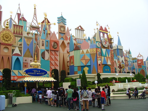  
Pooh’s Hunny Hunt
 The world’s first trackless dark ride, with vehicles so fleet and agile it’s astonishing to believe it was made all the way back in the year 2000. It’s the rare example of a technologically ambitious prototype where the technology itself still holds up well twenty years later. Often regarded as the best attraction at Tokyo Disneyland with queues to match, as well as the go-to example used to shame the shortcomings of the four tracked “Many Adventures of Winnie the Pooh” versions of the ride around the world, Pooh’s Hunny Hunt has no shortage of adoring fans either in Japan or from abroad. Which is just fine, as it doesn’t need me to count myself among them. The world’s first trackless dark ride, with vehicles so fleet and agile it’s astonishing to believe it was made all the way back in the year 2000. It’s the rare example of a technologically ambitious prototype where the technology itself still holds up well twenty years later. Often regarded as the best attraction at Tokyo Disneyland with queues to match, as well as the go-to example used to shame the shortcomings of the four tracked “Many Adventures of Winnie the Pooh” versions of the ride around the world, Pooh’s Hunny Hunt has no shortage of adoring fans either in Japan or from abroad. Which is just fine, as it doesn’t need me to count myself among them.
Pooh’s Hunny Hunt is a prime example of a themed attraction getting hijacked by an exciting technology and over-generous budget, which ultimately leads to distractions and the detriment of the story it should be telling. After a boarding procedure intended to trick people into thinking it’s a familiar tracked dark ride experience, the first scene very intentionally blows out those expectations during the reveal of the massive scope of the sets and technological ability of the trackless vehicles. This is a ride that’s not shy to show off its $130 million budget, which really begs the question if the charming, humble stories A. A. Milne are the right fit for such a bombastic modus operandi. More than for the story, so many features of this ride mostly seem included for the intent to make riders think what an elaborate and cleverly designed attraction this is.
The story beats are ostensibly all familiar to the Many Adventures of Winnie the Pooh rides, which themselves are based on the classic Winnie the Pooh and the Blustery Day animated featurette. However, Pooh’s Hunny Hunt differs by mostly excising the blustery day elements from the storyline. To fill the gap it extends the scenes for the initial character introductions in the 100 Acre Woods and, more significantly, the Heffalumps & Woozles “honey hallucination” scene, both of which get massively amped up to show off the capabilities of the trackless technology and increased show budget.
Look, I get it. Everyone loves the Heffalumps & Woozles scene. I like it too. It was Disney’s attempt to explore the psychedelic aesthetics of the acid-induced counter-cultural movement when the original animation was made in 1968. But when that scene alone becomes a full two-fifths of the entire narrative duration, it indicates that the ride both, A): is missing the point of it, and B): has major pacing issues overall. Heffalumps & Woozles drags on way past the point at which the point has been made, thus elevating it from a symbolic third-act turning point into the crux of the entire story. And it’s not like the blustery day scenes are the problem with the other installations. They drive the dramatic conflict, provide the story its moral bearings, and ultimately offer Pooh’s reconnection to his community. Remove that and it becomes a sickly-sweet wish fulfillment narrative. It ultimately gives Pooh all the honey he wants just because he can have it, a moral that underscores the attraction’s own inability to know when to cut back on the sweet stuff.
   
Toontown
 I might have skipped this land if it didn’t have Gadget’s Go Coaster that I needed to add to the list. Largely identical to the Disneyland version but with a chain lift instead of tire drives and Japanese-mandated catwalks along most of the layout. Why these parks that attract visitation in excess of 15 million per year think a children’s coaster with a single 16-passenger train is a good use of space and resources, I’m not certain. While I was at it, I also checked out Roger Rabbit’s Car Toon Spin. I don’t know if this is the apex of 90’s Disney dark rides, but it’s certainly among the “most 90’s” of 90’s Disney dark rides. The vertical falling scene and stretching portable hole are both simple effects done very well. I never know if I should try to steer my car straight to appreciate the scenes or crank in like a tilt-a-whirl, which it obviously challenges you to do. I might have skipped this land if it didn’t have Gadget’s Go Coaster that I needed to add to the list. Largely identical to the Disneyland version but with a chain lift instead of tire drives and Japanese-mandated catwalks along most of the layout. Why these parks that attract visitation in excess of 15 million per year think a children’s coaster with a single 16-passenger train is a good use of space and resources, I’m not certain. While I was at it, I also checked out Roger Rabbit’s Car Toon Spin. I don’t know if this is the apex of 90’s Disney dark rides, but it’s certainly among the “most 90’s” of 90’s Disney dark rides. The vertical falling scene and stretching portable hole are both simple effects done very well. I never know if I should try to steer my car straight to appreciate the scenes or crank in like a tilt-a-whirl, which it obviously challenges you to do.
 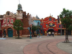          
Tomorrowland
For better or worse, Tomorrowland is the land that feels most distinctly specific to Tokyo Disneyland in all its dated, boxy cream-white modular futurism glory. Although the land shows its age in a way that’s still a little too recent to lean fully into the nostalgic fun of retro-futurism, it at least has managed to maintain its consistency and avoid the onslaught of random neon and awkward character placement that other Tomorrowlands have had to contend with. Plus, it actually manages to make the multi-level design work.
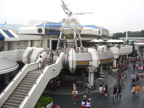    
Space Mountain
After riding the slick, smooth, soundtrack-synched versions of Space Mountain in Anaheim and Hong Kong, I was excited to see what the original vintage Space Mountain experience would be like. Unfortunately this was the one major attraction on the refurbishment schedule during my week in Tokyo, making it the final coaster (out of many, many before it) that I missed during my Asia travels.
  
Buzz Lightyear’s Astro Blasters
Rode it because as an omni-mover dark ride it’s a capacity sponge and thus I didn’t have to wait long at the end of the day. I spent five minutes of my life on this version of the attraction, and I don’t feel like spending more than that amount of time ten years later to write about it. This ride grows like a weed at every Disney park around the world, and I don’t know if there’s a way to get rid of it (other than unleashing the ants).
   
Star Tours
 The second and final time I got to ride the original version of Star Tours, both times narrated in languages I didn’t understand after being introduced to the ride in Paris the year before. For all the debate over the value of introducing lateral content in the newest incarnations of Disney’s Star Wars attractions, it’s interesting to note how much of the original Star Tours was also invention, even as its reputation became a poster child for the ethos of “give the people what they want.” Named for and based around a space tourism agency (which is a level of capitalist development unlike anything seen in any of the movies), featuring a new original character as the lead (voiced by Pee-wee Herman himself), it really ought to feel entirely separate from the Star Wars galaxy seen on film. But you still get to fly around in space and you even get to do the Death Star trench run, which our pilot has “always wanted to do”, a sentiment shared by most riders. No, Star Tours didn’t include everything one might expect from a Star Wars experience, but it did seem to do the most important things near the top of the list, so fans got off satisfied and the new ideas introduced are today largely celebrated rather than scorned. Which begs the question whether there’s a crucial difference in design philosophy between then and now, or if it’s the audience expectations that have changed? The second and final time I got to ride the original version of Star Tours, both times narrated in languages I didn’t understand after being introduced to the ride in Paris the year before. For all the debate over the value of introducing lateral content in the newest incarnations of Disney’s Star Wars attractions, it’s interesting to note how much of the original Star Tours was also invention, even as its reputation became a poster child for the ethos of “give the people what they want.” Named for and based around a space tourism agency (which is a level of capitalist development unlike anything seen in any of the movies), featuring a new original character as the lead (voiced by Pee-wee Herman himself), it really ought to feel entirely separate from the Star Wars galaxy seen on film. But you still get to fly around in space and you even get to do the Death Star trench run, which our pilot has “always wanted to do”, a sentiment shared by most riders. No, Star Tours didn’t include everything one might expect from a Star Wars experience, but it did seem to do the most important things near the top of the list, so fans got off satisfied and the new ideas introduced are today largely celebrated rather than scorned. Which begs the question whether there’s a crucial difference in design philosophy between then and now, or if it’s the audience expectations that have changed?
Captain EO Tribute
Jackson. Coppola. Lucas. Huston. Has there ever been an attraction that had this much starpower behind it, or one that has relied so much on the names of its A-list talent as the primary reason to get people in the door? Originally running from 1986 to 1998 and brought back for a few years after Michael Jackson’s death in 2009, Captain EO, like so much else in Tokyo Disneyland, was very distinctly an 80’s product, but one with more warmth and heart than most other attractions from that era. I can’t tell how much of the cheesiness of this 4D film was an artifact of its age or a deliberate creative choice by its creators. It’s easy to laugh when Michael uses his energy palm beams to transform the menacing sci-fi henchmen into a dancing troupe with big hair and tight pants. But for the most part, the creative talent involved was all given the budget and freedom to do what they do best on screen, and once Jackson has the space to fully command the stage on screen, it’s hard to be cynical. (Of course, that was a decade ago; there’d be a lot more reasons to be cynical if Disney ever tried to bring the show back for a third run today.) I’m all for giving people more creative freedom to make weirdly personal stuff for theme parks, so I certainly can’t fault Captain EO for that, even if it’s not the kind of weird stuff I’d personally ever think to make.
  
Monsters, Inc. Ride & Go Seek
This ride had the longest lines all day, so I didn’t get to it until relatively late in the evening. Staring up at the monster-sized corporate atrium inside the queue, I was worried that Ride & Go Seek might suffer the same downfall as Pooh’s Hunny Hunt as a modest ride in story and concept that’s brought down under the weight of its own inflated budget and expectations for itself. Fortunately that ended up not being the case. Here, the technological innovation was an interactive dark ride quite literally made dark, with interactive flashlights for riders to illuminate the scenes by their own hand, and with certain effects reacting when lit up. While the ride is no less ambitious than Pooh’s Hunny Hunt, by turning the lights down it brings the focus in much closer, allowing riders to delight in the small discoveries that they themselves feel they’ve made. It’s not interactive in the sense that you’re gunning for a high score, but rather the flashlight mechanic serves as a kind of editing device, allowing riders to direct their own story in real time by finding and framing each scene. And on a more primal level, isn’t playing flashlight hide-and-seek or imagining monsters in the dark exactly the type of childhood fun (completely innocent but has the feeling of danger and transgression if you’re under ten) that a family theme park ride should evoke for people of all ages, especially suited for a story like Monster’s Inc.? A real winner and one of my top three rides at Tokyo Disneyland. the same downfall as Pooh’s Hunny Hunt as a modest ride in story and concept that’s brought down under the weight of its own inflated budget and expectations for itself. Fortunately that ended up not being the case. Here, the technological innovation was an interactive dark ride quite literally made dark, with interactive flashlights for riders to illuminate the scenes by their own hand, and with certain effects reacting when lit up. While the ride is no less ambitious than Pooh’s Hunny Hunt, by turning the lights down it brings the focus in much closer, allowing riders to delight in the small discoveries that they themselves feel they’ve made. It’s not interactive in the sense that you’re gunning for a high score, but rather the flashlight mechanic serves as a kind of editing device, allowing riders to direct their own story in real time by finding and framing each scene. And on a more primal level, isn’t playing flashlight hide-and-seek or imagining monsters in the dark exactly the type of childhood fun (completely innocent but has the feeling of danger and transgression if you’re under ten) that a family theme park ride should evoke for people of all ages, especially suited for a story like Monster’s Inc.? A real winner and one of my top three rides at Tokyo Disneyland.
   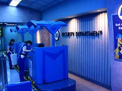   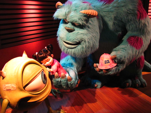
Evening at Tokyo Disneyland
As evening approached I made my final strategy to complete the park. To be honest, I had to learn the crowd dynamics while I was at the park and in retrospect made some downright embarrassing strategic blunders. In the morning I had skipped FastPasses for Pooh’s Hunny Hunt or Monsters, Inc. and got my first for Splash Mountain instead, which I later discovered was one of the few rides that had an even quicker single rider line. Normally if that was the case it’d be difficult to complete the full attraction roster in a single day, yet I didn’t wait more than 30 to 45 minutes for anything, even riding Hunny Hunt twice using the standby queue both times, and had time for several more re-rides.
 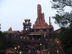
The first time I queued for Big Thunder Mountain in the morning I ended up next to a large friend group visiting the park who were interested in the lone gaijin in line with them and got to asking me a bunch of questions. Later that evening, in a stroke of pure coincidence, I somehow ended up in line again next to the same group, also for Big Thunder Mountain. After getting a photo together and entertaining them with some more stories and conversation, one of the girls of the group who had been leading the conversations, Aoi, suddenly got embarrassed and had to admit something to me. In what I recall were close to her exact words:
“I just want to say… I love you. Do you want a Japanese girlfriend?”
Wow, I… didn’t know what to say! A little concerned about the apparent age differential (not to mention that I was leaving Japan in 36 hours) I avoided committing to any sort of relationship while offering several compliments, and suggested that we could ride the coaster together. We all had a grand ol’ time together on the wildest ride in the wilderness, but as we disembarked it became clear that our paths were not aligned and it was never meant to be; they were going for dinner, while I had already eaten and had a FastPass to burn. We all bid our farewells, and thus concluded the story of how I had a 15 minute relationship at Tokyo Disneyland.

With the sun fully set and the lights flickering on, Tokyo Disneyland becomes a marginally more attractive space with the darkness hiding more of the ugly corners, although the wide pathways with limited lighting near the center at times feels like wandering into a dark abyss.
   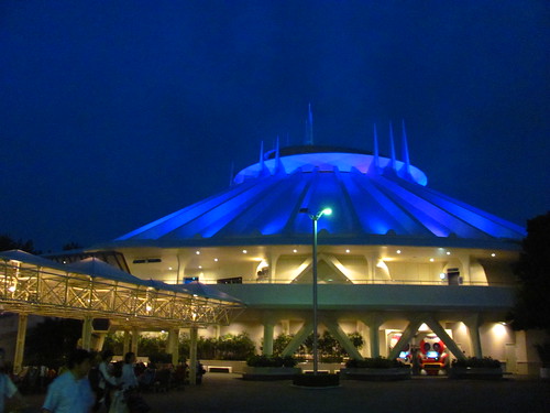          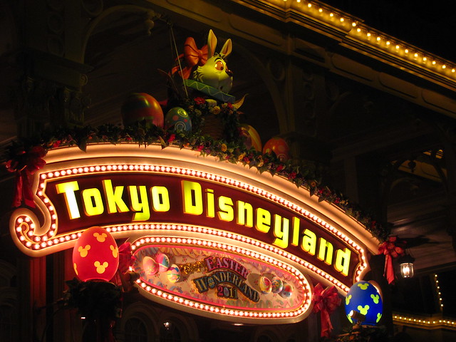 After making my way back down World Bazaar (that will never not sound weird) it was time to call it a wrap on my day at Tokyo Disneyland. While certainly far from my favorite Disney parks in the world, it was still one of the world’s largest theme parks with plenty of good among the not-as-good. It’s a park that clearly understands its niche with local visitors even if more traveled theme park fans might find areas to critique. The final park on my Asia tour scheduled for tomorrow, however, was more clearly designed to please the taste of serious theme park aesthetes. Would it live up to its promise? After making my way back down World Bazaar (that will never not sound weird) it was time to call it a wrap on my day at Tokyo Disneyland. While certainly far from my favorite Disney parks in the world, it was still one of the world’s largest theme parks with plenty of good among the not-as-good. It’s a park that clearly understands its niche with local visitors even if more traveled theme park fans might find areas to critique. The final park on my Asia tour scheduled for tomorrow, however, was more clearly designed to please the taste of serious theme park aesthetes. Would it live up to its promise?
Disneyland – Anaheim, California
 Emerging from the untamed jungles of themed hyperreality in its rawest, most base form, we encounter a time and a place in which man was able to discover something beautiful out of the primordial soup. Just as the real New Orleans created a rich cultural paradise in the Louisiana swamplands, so too did Walt Disney manage to craft an environment slightly more conducive to the emotional riches of storytelling from a swampland of sterilized imitation. While both attractions ostensibly belong in the same “adventure” genre and use many of the same techniques, Pirates of the Caribbean gets right much of what Indiana Jones Adventure got wrong, despite the difference of nearly thirty years of innovation between the two. Emerging from the untamed jungles of themed hyperreality in its rawest, most base form, we encounter a time and a place in which man was able to discover something beautiful out of the primordial soup. Just as the real New Orleans created a rich cultural paradise in the Louisiana swamplands, so too did Walt Disney manage to craft an environment slightly more conducive to the emotional riches of storytelling from a swampland of sterilized imitation. While both attractions ostensibly belong in the same “adventure” genre and use many of the same techniques, Pirates of the Caribbean gets right much of what Indiana Jones Adventure got wrong, despite the difference of nearly thirty years of innovation between the two.
A book is not afraid to show that it has a cover and is made of bounded paper, nor is a stage play afraid to call intermission or bring the cast to the stage for a round of applause, even if their characters are supposed to be dead. A good story is never ruined by the conscious revelation that it is, in fact, an invented work of fiction. By contrast, Indiana Jones Adventure was deathly afraid anyone would realize it was actually an amusement park ride, and went to great expense to make sure every loose end was covered up or accounted for so that one might be tricked into believing the adventure was real. But unlike the newer effort, Pirates of the Caribbean is not ashamed of the fact that it peddles in fiction, and in fact it even contextualizes the story in a way that openly acknowledges the dark ride medium it uses. and went to great expense to make sure every loose end was covered up or accounted for so that one might be tricked into believing the adventure was real. But unlike the newer effort, Pirates of the Caribbean is not ashamed of the fact that it peddles in fiction, and in fact it even contextualizes the story in a way that openly acknowledges the dark ride medium it uses.
The entrance façade has nothing to do with pirates or the Caribbean, instead designed with a lovely pastel and wrought-iron French Quarter architectural style, and once inside the building the queue runs past the return channel in which the boats carousel around a small beach diorama. It resembles a high-class Tunnel of Love more than what I traditionally conceive of as theme park ride, feeling as at home at Disneyland as I suspect it could feel if it were a classic at Kennywood or Blackpool Pleasure Beach. This unaffected introduction caught me off-guard, as I was half expecting something that tried to remove the attraction from the world outside and set us in the Caribbean before we even boarded the attraction, much like the version at Disneyland Paris. Even though the lack of building space was as much a necessary blueprint restriction as anything intentionally envisioned by Walt, I actually liked this approach better than the more grandiose Parisian Pirates entrance. of as theme park ride, feeling as at home at Disneyland as I suspect it could feel if it were a classic at Kennywood or Blackpool Pleasure Beach. This unaffected introduction caught me off-guard, as I was half expecting something that tried to remove the attraction from the world outside and set us in the Caribbean before we even boarded the attraction, much like the version at Disneyland Paris. Even though the lack of building space was as much a necessary blueprint restriction as anything intentionally envisioned by Walt, I actually liked this approach better than the more grandiose Parisian Pirates entrance.
The atmosphere changes as we move deeper into the building, with low light levels magnifying the perceived amount of space inside the station as we wait for our pupils to adjust, the loading area lit only by orange, glowing lanterns. Taking a seat on the six bench boat (an absence of seatbelts make for extremely fast dispatch times) we’re set adrift on a very slow current through an idle Louisiana bayou on a summer night. The amount of measured restraint with this early scene is impressive. Rather than a constant supply of stimuli out of fear we might become bored, the opening scene trusts its audiences will be engaged with the attraction lit only by orange, glowing lanterns. Taking a seat on the six bench boat (an absence of seatbelts make for extremely fast dispatch times) we’re set adrift on a very slow current through an idle Louisiana bayou on a summer night. The amount of measured restraint with this early scene is impressive. Rather than a constant supply of stimuli out of fear we might become bored, the opening scene trusts its audiences will be engaged with the attraction and takes a good two or three minutes to complete, giving ample time to establish the atmosphere, with fireflies dancing in marshes, a dinner party in progress on a nearby plantation house, and the gentle twangs of a banjo plucked by an old resident of a small wooden shack (the vaguely recognizable ‘pirates life’ theme foreshadows the upcoming action in a way that’s not clunky or obvious). The limited color palate of dark black shadows and backlit, swamp haze blues, accented only by the occasional orange firefly or lantern, creates an indelibly impressionistic scene, aided by the equally sparse but effective aural elements. It’s a creative introduction, obviously in part designed to integrate the ride into the New Orleans motif, but it should also call to mind the rich history of American literature that takes place in the waterways of the American south, and frames Pirates as an extension of that literary context. and takes a good two or three minutes to complete, giving ample time to establish the atmosphere, with fireflies dancing in marshes, a dinner party in progress on a nearby plantation house, and the gentle twangs of a banjo plucked by an old resident of a small wooden shack (the vaguely recognizable ‘pirates life’ theme foreshadows the upcoming action in a way that’s not clunky or obvious). The limited color palate of dark black shadows and backlit, swamp haze blues, accented only by the occasional orange firefly or lantern, creates an indelibly impressionistic scene, aided by the equally sparse but effective aural elements. It’s a creative introduction, obviously in part designed to integrate the ride into the New Orleans motif, but it should also call to mind the rich history of American literature that takes place in the waterways of the American south, and frames Pirates as an extension of that literary context.
 Then as we leave behind the bayou, the peaceful tranquility slowly gives way as the rumble of a waterfall grows nearer. We tip over the edge and are sent hurdling to the bottom with a real splashdown that somehow manages to avoid spraying any water onto the riders. We have now left behind the world of old pirate stories shared around a Louisiana campfire, and have been forcibly flung into the mysterious world of pirate stories itself. We are hit with a second waterfall; these feel much steeper and faster than they really are due to the open, restraintless seating. We navigate an array of flooding caverns, a metaphysical dreamscape seemingly halfway between the realms of the living and the dead, between reality and memories. Populated by skeletons frozen in time, the slow, haunted rendition of the famous theme song and disembodied warning that “dead men tell no tales” betrays the fact that, in this universe, dead men can tell tales. A lightning flash over a sinking ship in the middle of a torrential storm, the skeletal remains of its captain still standing at the helm, is perhaps one of the most lasting images to be found anywhere in the canon of Disney dark rides. Then as we leave behind the bayou, the peaceful tranquility slowly gives way as the rumble of a waterfall grows nearer. We tip over the edge and are sent hurdling to the bottom with a real splashdown that somehow manages to avoid spraying any water onto the riders. We have now left behind the world of old pirate stories shared around a Louisiana campfire, and have been forcibly flung into the mysterious world of pirate stories itself. We are hit with a second waterfall; these feel much steeper and faster than they really are due to the open, restraintless seating. We navigate an array of flooding caverns, a metaphysical dreamscape seemingly halfway between the realms of the living and the dead, between reality and memories. Populated by skeletons frozen in time, the slow, haunted rendition of the famous theme song and disembodied warning that “dead men tell no tales” betrays the fact that, in this universe, dead men can tell tales. A lightning flash over a sinking ship in the middle of a torrential storm, the skeletal remains of its captain still standing at the helm, is perhaps one of the most lasting images to be found anywhere in the canon of Disney dark rides.
But you know what they say, it’s not the destination that matters, it’s how you get there. That’s true of Pirates of the Caribbean. From this brilliantly imagined netherworld we eventually emerge at our story’s destination, the “real” world of pirates, where we at first find ourselves caught in a cannon battle between two warring galleons. We then enter the town of Puerto Dorado, which has been overrun with robotic pirates doing what pirates do best: pillaging, plundering, swashbuckling, and attempted gang-raping, just like you’d find in any good family theme park. It’s everything we had been waiting and hoping to find when we first set sail, yet now that it was actually in front of me and we had left the atmospheric, slow-simmering first act behind that made Pirates so unique, I felt a little bit deflated. Where will the story take us from here? What compels the narrative now that we’ve discovered the lost world we were searching for? There are bits and snippets of exposition happening in individual scenes, but nothing to tie it all together. It seems our story is resolved by getting to point at the different gags, and comment on how amazing the audio-animatronics are.
To be sure, these scenes are technically the most amazing in the entire ride experience. Some are fairly rudimentary (the “chasing wenches on rotating turntables” gag is quite obvious to everyone) but others are quite impressive (sword fighting pirates rock!). Some effects have been updated, most notably including some newer figures from the film series, and you can see the evolution of the technical design work lined up next to each other. Historically this is the primary reason the ride was developed: to be a showcase for the burgeoning craft of animatronic design, as the originally proposed viewing gallery would not have been sufficient.
What I find most interesting about this sequence is that the development and reliance on audio-animatronics is generally assumed to have been initiated because hiring real actors would have been too expensive. If it weren’t economically unfeasible, populating pirates with living thespians seems like it would result in a better, more realistic pirates ride. That real humans are better than fake humans is only a logical outcome, right?
But then when we actually imagine how the ride would feel if there were live actors in those pirate costumes, paradoxically the attraction seems like it would be worse off. Part of it is because despite the nuanced first act and noble theme park geek delusions, the element of storytelling is not all that important, and the ride is still judged by a technocentric aesthetic criterion where everyone is commenting or thinking about how creative the designers were to be able to manufacture this environment. “How’d they do that?” Fake humans are better than real humans because fake humans are modern marvels of technology that, most importantly, appear expensive. Real humans are ordinary and stupid, and nobody wants to pay just to watch them stand around at their job like we do every other day of the year unless their job involves them taking off some or all of their clothes.
But it’s also because there’s also something discomforting in imagining that these pirates had a brain behind their eyes and could feel feelings. We embark on this journey to the artificial Caribbean to become voyeurs of sorts, to curiously watch a stranger world up close but without becoming a part of it. It’s the same with cinema: we want to have the solipsistic satisfaction that our perspective is the only one that truly matters in this fictional universe, and the people we’re watching can’t watch us back. The pirates are things, representational objects, and they must not have their own subjective content. If they do, then our awareness of things is reflected back on ourselves. We become another physical prop in this setting rather than a non-positional camera obscura, and this world is suddenly haunted by the awareness of the other’s foreign perspective. It is only of robots whose glassy irises you can look deep into and never sense a motivation to avert eye contact.
It’s been nearly a quarter of an hour by the time the pirates decide to torch the place, at which point it’s becoming time for us to escape back into the world from which we came. Now how are we supposed to do that? According to the logic of Walt Disney, because we discovered this world by going down a waterfall, the only way to get back out must be to go up a waterfall. This is exactly what we do. Just as the first waterfalls are narrative devices to signal the boundary lines between reality and fiction, so does this final effect signal a return from the fictional world of pirates to the slightly less fictional world outside of New Orleans. It’s an inspired idea, although unfortunately it doesn’t work as well in practice as it does in theory. The way they manage to create this ‘magic’ is by pulling the boats uphill with a standard chain lift while water pours down and around the incline. It’s not immediately obvious what purpose this lift has besides the immediate mechanical benefit to solve the spatial problem of getting us back to ground level, and it takes several moments to work backwards to figure out what it represents for the overall story arc.
Rather than unnecessary Johnny Depp animatronics, I’d rather a significant upgrade be applied to this last effect. First of all, to ease the intuition over this backwards logic, the water should flow upward rather than downward so we’re not sailing ‘against current’, which I imagine wouldn’t be too difficult to figure out. Secondly, it should hopefully be as exciting a finale as the first two plunges are. Chain lifts are not exciting, and it was at this point that I was starting to get a bit fidgety with the whole ride. To help heighten the illusion that we’re falling up a waterfall, the boats should be quickly whisked to the top at a variable speed that accelerates as we approach the top (but nothing more than 10-15mph, to be sure). I think LSM technology is far enough along that they could easily appropriate the systems used on the uphill waterslides on a larger scale to achieve this effect, with all the appropriate anti-rollback and blocking safety measures. It would give our voyage the rousing, magical finish Walt Disney intended it to have, would help curb the tediousness that starts to grate after a quarter hour sitting on the same ride, and could even give capacity a slight boost (or at least there wouldn’t need to be as many rafts in service at the same time).
Overall the Disneyland version of Pirates of the Caribbean remains one of the best rides in the park, as well as one of the best dark rides you’ll find anywhere in the world. It’s one of the rare few dark rides that are allowed to breathe as they tell their stories, taking ample time to establish setting and mood. Unfortunately, as lovely and accomplished as the narrative framing is to create a compelling story, the picture inside the frame is only a hologram: lightweight, and not really there when you examine it closely. They’re pirates. The name is the story. It’s an attraction in which both creators and spectators value technology above all else,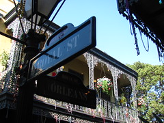 and for everything Walt Disney was able to get right on his last theme park attraction, it’s missing that key ingredient that distinguishes real human storytelling from a series of human-initiated events. What that ingredient is, I’m not certain. But if I want dark rides to compete with other artistic narrative media, I’m going to have to keep looking elsewhere. and for everything Walt Disney was able to get right on his last theme park attraction, it’s missing that key ingredient that distinguishes real human storytelling from a series of human-initiated events. What that ingredient is, I’m not certain. But if I want dark rides to compete with other artistic narrative media, I’m going to have to keep looking elsewhere.
Our search took us through the heart of New Orleans Square, an extremely impressive avenue that’s lined edge-to-edge with French-Creole architecture, and festooned with glittery bead strings and ornaments celebrating a never-ending Mardi Gras. Part of me wishes New Orleans Square could serve as a model for every other themed environment, as they got the intimacy level perfect. Rather than a large, centralized midway designed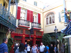 from the utilitarian perspective of crowd flow control, there’s a series of smaller pathways that wind and curlicue around buildings and under balconies and promenades, keeping the energy levels from dispersing over a wide open field, especially as we are dazzled by the ornate, colorful details that are typical of Royal Street. It invites a desire for exploration as well as an appreciation of the fine details in a way that other themed environments often fail to do. from the utilitarian perspective of crowd flow control, there’s a series of smaller pathways that wind and curlicue around buildings and under balconies and promenades, keeping the energy levels from dispersing over a wide open field, especially as we are dazzled by the ornate, colorful details that are typical of Royal Street. It invites a desire for exploration as well as an appreciation of the fine details in a way that other themed environments often fail to do.
Yet at the same time New Orleans Square is also one of the worst Disney theme zones because it’s a simple imitation that imagines nothing new or original. It’s so close a copy of the real French Quarter New Orleans that Louisiana politicians have been able to film their campaign commercials here, and no one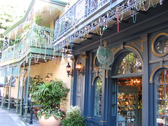 was the wiser until someone noticed the Disneyland trash cans in the background. (Really.) The question becomes, why am I enjoying this city architecture in Disneyland when I can get the real thing without a passport or gated admission ticket? Convenience is the only answer I can think of, as well as not having to deal with some of the less savory element of modern New Orleans. That’s reasonable, but not very romantic. Ideally a themed environment this immersive should spark a desire to return to Disneyland as soon as possible, but instead I found New Orleans Square made me long for Rome, Paris or Barcelona, places which look just as amazing as the Disneyland version, but also have the advantage of being real and letting me explore for more than a minute or two before I reach the outer boundaries into Frontierland._______________ was the wiser until someone noticed the Disneyland trash cans in the background. (Really.) The question becomes, why am I enjoying this city architecture in Disneyland when I can get the real thing without a passport or gated admission ticket? Convenience is the only answer I can think of, as well as not having to deal with some of the less savory element of modern New Orleans. That’s reasonable, but not very romantic. Ideally a themed environment this immersive should spark a desire to return to Disneyland as soon as possible, but instead I found New Orleans Square made me long for Rome, Paris or Barcelona, places which look just as amazing as the Disneyland version, but also have the advantage of being real and letting me explore for more than a minute or two before I reach the outer boundaries into Frontierland._______________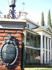
Granted, those cities don’t have an iconic dark ride built in the middle of them, let alone two. At the far end of New Orleans Square we come upon an elegant white plantation house that, without the demarcation sign, one would never guess was actually The Haunted Mansion. It seems so characteristic that Walt Disney could not tolerate anything remotely imperfect or blemished in his park that even an abandoned house of the undead must be presented in pristine condition. Why pirates and ghosts were tolerable inside the buildings when no traces of them were allowed to tarnish anyplace reachable by daylight remains a mystery to me. Yet in retrospect I’m quite glad Disney’s Imagineering team chose the exterior look that they did. Ramshackled haunted houses have become such a theme park cliché, and it’s made more foreboding by the fact that it appears like a normal house on the outside, the sort of place you remember as a child spending the summer weekend with relatives, with all the creaky doors and portraits of dead great-grandparents.
Once we step inside the aesthetic quickly changes,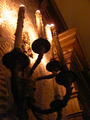 I would argue too dramatically as it doesn’t match up with the building outside. We’re led into an antechamber where we’re given a cordial introduction from our disembodied ghost host. As he speaks there room begins to stretch vertically, the ordinary portraits on the wall revealing a gruesome scene as their bottoms are elongated… and in a particularly dark twist atypical of Disney, the voice suggests there’s always his method as a means of escape from the mansion, whereupon the lights cut out and a flash of lightning reveals for a split second the corporal remains of our host dangling from a noose directly over our heads. It’s a powerful, macabre image that not even the more ‘serious’ Tower of Terror next door is willing to go quite as far to achieve. I would argue too dramatically as it doesn’t match up with the building outside. We’re led into an antechamber where we’re given a cordial introduction from our disembodied ghost host. As he speaks there room begins to stretch vertically, the ordinary portraits on the wall revealing a gruesome scene as their bottoms are elongated… and in a particularly dark twist atypical of Disney, the voice suggests there’s always his method as a means of escape from the mansion, whereupon the lights cut out and a flash of lightning reveals for a split second the corporal remains of our host dangling from a noose directly over our heads. It’s a powerful, macabre image that not even the more ‘serious’ Tower of Terror next door is willing to go quite as far to achieve.
It is curious, then, that the Haunted Mansion never attempts to out-shock this initial effect once we’re loaded into the ride’s omnimover “Doom Buggy” carriages. Even though the Mansion’s debut in 1969 makes it one of the original ghost trains, to this day it still manages to quietly upend theme park conventions beyond merely the unexpectedly clean façade. The narrative trajectory of most horror stories generally starts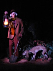 with a lighthearted, normalized ethos, and eventually progresses into a deathly dark pathos. We’ve all seen those movies: a laughing, playful family or group of friends walks into the creaky old house, and later they walk out transformed into a scarred and bloodied (if not very dead) set of individuals. The moral of this story is always the same. Life is fragile and death is Serious; the grave is more for the dead than it is for the living. with a lighthearted, normalized ethos, and eventually progresses into a deathly dark pathos. We’ve all seen those movies: a laughing, playful family or group of friends walks into the creaky old house, and later they walk out transformed into a scarred and bloodied (if not very dead) set of individuals. The moral of this story is always the same. Life is fragile and death is Serious; the grave is more for the dead than it is for the living.
How radical, then, is the Haunted Mansion, which starts with a dramatic, silent suicide, followed by the undead spirits rapping at the door and a séance, then progresses to a full-scale ballroom dance, and finally concludes with a graveyard bash teeming with dancing and singing undead revelers to an upbeat, jazzy performance of ‘Grim Grinning Ghosts’? In this mansion, it is life that is Serious and a confrontation with death is the only way to finally ‘escape’ and have a bit of fun; the grave is more for the living than it is for the dead. By the time we reach the end the humor has gone straight slapstick. We approach a set of three comical-looking hitchhiking ghosts, the setup to a joke where the punchline is we round the corner and see a reflection of our buggy in which the ghost appears to be sitting right between us. This hallway is otherwise completely barren and fits nowhere in the mansion. It’s just one last special effect joke for its own sake, a final gotcha moment so that everyone who steps off the platform is grinning and laughing as much as the mansion’s residents are.
Still, if there’s one fatal drawback to the Haunted Mansion, it’s that too many visitors are going to be on the edge of their seats not because these themes of life, death, and life-after-death energize the narrative arc so much we can’t wait to find out how it ends, but because they’re trying to figure out if they can spot the riggings that show how they achieved the ballroom hologram effects. As fond as I am of my quasi-Heideggerian death-begets-life interpretation of the Haunted Mansion, it’s unlikely the majority of other riders will even consciously notice the shift in emotional tone between beginning and end. Everywhere we look, technology abounds, begging us to admire it. The special effects are so numerous and varied that it’s impossible to not develop an appreciation for the Imagineer’s work while one is still on the ride. While I’m sure the Imagineers appreciate this recognition (hell, that’s probably why half the effects got included, just to prove to themselves and the world they could build them), it’s very difficult to get lost in the fictive dream of a ghost story if the technical details of the format itself are more attention grabbing than the story itself.
 A real ghost story should feel spontaneous, and we watch scary movies half-believing that the events are happening as we witness them (certainly that explains the initial runaway success of the Blair Witch Project). I can’t speak for everyone, but I was always conscious of how precise and scripted every element of the Haunted Mansion had to be. The rising narrative action tends to correlate exactly to the size and complexity of the special effects, and I think it is no coincidence our emotional state seems directly dependent upon how much money and research we believe was spent before us. To find out the house is haunted by real magic would almost be disappointing, as working within the confines of normal physical laws seems far more improbable. By no means is this problem new for Disneyland, nor (I’m sure many would argue) A real ghost story should feel spontaneous, and we watch scary movies half-believing that the events are happening as we witness them (certainly that explains the initial runaway success of the Blair Witch Project). I can’t speak for everyone, but I was always conscious of how precise and scripted every element of the Haunted Mansion had to be. The rising narrative action tends to correlate exactly to the size and complexity of the special effects, and I think it is no coincidence our emotional state seems directly dependent upon how much money and research we believe was spent before us. To find out the house is haunted by real magic would almost be disappointing, as working within the confines of normal physical laws seems far more improbable. By no means is this problem new for Disneyland, nor (I’m sure many would argue)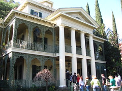 is it even a particularly bad problem to be cursed with… but that doesn’t make it go away. is it even a particularly bad problem to be cursed with… but that doesn’t make it go away.
Somehow, between the Haunted Mansion and Pirates of the Caribbean, I think there exists a dark ride that’s approaching the ideal I’m searching for. Pirates is able to frame the dark ride experience as an original mode of storytelling such that the symbolic intent is better understood, and Haunted Mansion uses the progression of effects to create an emotional narrative arc that’s not completely devoid of intellectual content if you know how to interpret it. If we could somehow contextualize the Haunted Mansion as a symbolic ghost story and make the special effect techniques feel organic rather than attention-grabbing, then I think Disney would have a true masterpiece that would deserve attention from art critics and the non-geek world at large. As it is right now, we’ve got two fairly decent mechanical magic shows saturated with accomplished set designs and plenty of childhood nostalgia. Since my first time with both these rides was necessarily absent of nostalgia, my personal sojourn for the ideal themed attraction would continue. the dark ride experience as an original mode of storytelling such that the symbolic intent is better understood, and Haunted Mansion uses the progression of effects to create an emotional narrative arc that’s not completely devoid of intellectual content if you know how to interpret it. If we could somehow contextualize the Haunted Mansion as a symbolic ghost story and make the special effect techniques feel organic rather than attention-grabbing, then I think Disney would have a true masterpiece that would deserve attention from art critics and the non-geek world at large. As it is right now, we’ve got two fairly decent mechanical magic shows saturated with accomplished set designs and plenty of childhood nostalgia. Since my first time with both these rides was necessarily absent of nostalgia, my personal sojourn for the ideal themed attraction would continue.
Marne la Vallée, France – Tuesday, March 23rd, 2010
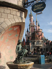 Three days at Disney was probably overdoing it. By comparison, I only allotted myself one full day to see Paris, and yet for some reason I felt three would be needed to fully see Disney. That is not an itinerary one should admit to other people when they ask about how you’ll be allocating your time during your four days in Paris. Now to justify this slightly, originally I had been planning to only see Disneyland over a three-day weekend and not even step foot inside the city, which I wanted to save for another time (i.e. when Parc Astérix and Parc Saint Paul would be open). Then plans changed and after deciding I needed to buy my tickets at the Disney Store on the Champs-Élysées for the best discount and that I could make a stop to try out Jardin d’Acclimatation’s three coasters, I said, “alright, I’ll spend a day in Paris, too.” Just to get a taste of the city to motivate me even more to return one day. Meanwhile Disney I wanted to make sure I would have ample time to explore every nook and cranny and get so many re-rides on the coasters until I was sick of them that I would thereafter have absolutely no motivation to ever return ever again. But still, three days at Disney was probably overdoing it… Three days at Disney was probably overdoing it. By comparison, I only allotted myself one full day to see Paris, and yet for some reason I felt three would be needed to fully see Disney. That is not an itinerary one should admit to other people when they ask about how you’ll be allocating your time during your four days in Paris. Now to justify this slightly, originally I had been planning to only see Disneyland over a three-day weekend and not even step foot inside the city, which I wanted to save for another time (i.e. when Parc Astérix and Parc Saint Paul would be open). Then plans changed and after deciding I needed to buy my tickets at the Disney Store on the Champs-Élysées for the best discount and that I could make a stop to try out Jardin d’Acclimatation’s three coasters, I said, “alright, I’ll spend a day in Paris, too.” Just to get a taste of the city to motivate me even more to return one day. Meanwhile Disney I wanted to make sure I would have ample time to explore every nook and cranny and get so many re-rides on the coasters until I was sick of them that I would thereafter have absolutely no motivation to ever return ever again. But still, three days at Disney was probably overdoing it…
 After wrapping up a brief two hours spent in the Walt Disney Studios Park getting caught up on some of the things I missed out on the day prior, I made my way to the entrance of Disneyland by noon. I quickly found the fastest route to the Big Thunder Mountain fast pass ticket dispensers, and then hopped After wrapping up a brief two hours spent in the Walt Disney Studios Park getting caught up on some of the things I missed out on the day prior, I made my way to the entrance of Disneyland by noon. I quickly found the fastest route to the Big Thunder Mountain fast pass ticket dispensers, and then hopped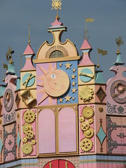 aboard the Disneyland Railroad from the Frontierland depot to take me back to Fantasyland to kill the time before my fast pass return time was ready. There was still one major dark ride in the park I had not been on the first day and it was located in Fantasyland. Let me check my park guide to see what it could be… it’s not the Snow White or Pinocchio rides, although those need to be done as well. Already did Peter Pan two days ago, which leaves me with… oh, dear God, no. The Happiest Ride on Earth, “it’s a small world”. aboard the Disneyland Railroad from the Frontierland depot to take me back to Fantasyland to kill the time before my fast pass return time was ready. There was still one major dark ride in the park I had not been on the first day and it was located in Fantasyland. Let me check my park guide to see what it could be… it’s not the Snow White or Pinocchio rides, although those need to be done as well. Already did Peter Pan two days ago, which leaves me with… oh, dear God, no. The Happiest Ride on Earth, “it’s a small world”.
It’s not just the song, which repeats the same chords over and over and over and won’t leave your head afterward no matter what you try. It’s not just the sets, which for ten minutes you float by the same candy-colored scenes of multi-ethnic children joined in song. It’s the fact that the whole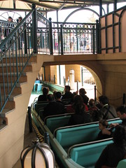 thing feels so… innocently happy. To put this in perspective, my idea of a good time in the recent past has included attending a double feature of The Road and Antichrist, in which the first movie set in the post-apocalyptic world about a father and son resisting the urge to become cannibals like everyone else in the country as they futilely search for safety was, to me, the cheerful, uplifting film between the two. This has just always been a ‘thing’ with me; that is, I hear people say “oh, such-and-such movie or book was good but it’s also really depressing, I’d rather have one that lifts my spirits up and makes me feel happy at the end,” I don’t know how to reply because for me it’s the opposite. ‘Happy’ stories are inherently depressing because the narrative manipulations only highlight the fictional nature of the experience in contrast with real life; meanwhile those that other people label as depressing I would label as exhilarating simply because I’ve been in the presence of great art. If it’s ‘depressing’ and a bad work of art, then why should I feel depressed by it when all I should be is sharply critical of its faults. Hopefully that explains where I’m coming from when I stepped onto the boat of “it’s a small world” thing feels so… innocently happy. To put this in perspective, my idea of a good time in the recent past has included attending a double feature of The Road and Antichrist, in which the first movie set in the post-apocalyptic world about a father and son resisting the urge to become cannibals like everyone else in the country as they futilely search for safety was, to me, the cheerful, uplifting film between the two. This has just always been a ‘thing’ with me; that is, I hear people say “oh, such-and-such movie or book was good but it’s also really depressing, I’d rather have one that lifts my spirits up and makes me feel happy at the end,” I don’t know how to reply because for me it’s the opposite. ‘Happy’ stories are inherently depressing because the narrative manipulations only highlight the fictional nature of the experience in contrast with real life; meanwhile those that other people label as depressing I would label as exhilarating simply because I’ve been in the presence of great art. If it’s ‘depressing’ and a bad work of art, then why should I feel depressed by it when all I should be is sharply critical of its faults. Hopefully that explains where I’m coming from when I stepped onto the boat of “it’s a small world”
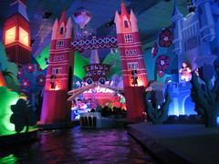 But okay, so it’s a ride that celebrates the economic push for globalization that robs nations of their political sovereignty while promoting superficial cultural differences that should exist only as a novelty for the industrialized western world to gawk at. That seems like a perfect fit for Disney. And actually for what it’s worth I did not regret the experience at all, although perhaps for not the right reasons. Technically there’s some pretty interesting stuff in there, and so I spent most of the ride snapping pictures and marveling over the sheer amount of labor hours that must have gone into building each of these sets. Pleasing colors, well-proportioned sets, perfectly blocked animatronics… it could have been an attraction showcasing the wonderful world of tort reform and it wouldn’t have made any difference just as long as the sets were designed But okay, so it’s a ride that celebrates the economic push for globalization that robs nations of their political sovereignty while promoting superficial cultural differences that should exist only as a novelty for the industrialized western world to gawk at. That seems like a perfect fit for Disney. And actually for what it’s worth I did not regret the experience at all, although perhaps for not the right reasons. Technically there’s some pretty interesting stuff in there, and so I spent most of the ride snapping pictures and marveling over the sheer amount of labor hours that must have gone into building each of these sets. Pleasing colors, well-proportioned sets, perfectly blocked animatronics… it could have been an attraction showcasing the wonderful world of tort reform and it wouldn’t have made any difference just as long as the sets were designed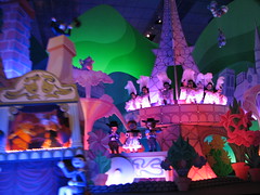 with the same level of care and precision. That’s the thing I’ve found out about Disney, most of the time it doesn’t even matter what the subject material is, the spectacle is simply being immersed in the presence of such an overwhelming display of technical craft (or, at the very least, an impressive capital budget) that all other concerns seem to float out the door. with the same level of care and precision. That’s the thing I’ve found out about Disney, most of the time it doesn’t even matter what the subject material is, the spectacle is simply being immersed in the presence of such an overwhelming display of technical craft (or, at the very least, an impressive capital budget) that all other concerns seem to float out the door.
So did I enjoy “it’s a small world”? Let the fact that despite a less than 10 minutes queue I only rode it once during my entire stay at Disney speak for itself. My immediate repulsion towards the concept of the attraction did make me stop for a moment to consider what does seem to be a rather odd sociological trend. Consider an individual who is always happy.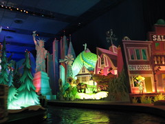 No matter the circumstances, they always come to work with a smile on their face and song in their heart, and whose only unrequited desire is the ability to lift the spirits of coworkers who have the misfortune of lacking the same quantities of mirth as themselves have the good fortune to be bestowed with. If you’re like most adults, your impression of this individual will not be, “what a kind, strong-willed personality; I wish I could always be as happy as they!” Your impression will be to keep as far away from this individual as possible, and perhaps to even wish some ill-fortune to befall them in order for the sake of everyone else around them to stop acting so silly and start behaving like a real human being, with the proper amounts of depression, doubt and self-loathing that should always entail. And there you have the reaction to “it’s a small world”. No matter the circumstances, they always come to work with a smile on their face and song in their heart, and whose only unrequited desire is the ability to lift the spirits of coworkers who have the misfortune of lacking the same quantities of mirth as themselves have the good fortune to be bestowed with. If you’re like most adults, your impression of this individual will not be, “what a kind, strong-willed personality; I wish I could always be as happy as they!” Your impression will be to keep as far away from this individual as possible, and perhaps to even wish some ill-fortune to befall them in order for the sake of everyone else around them to stop acting so silly and start behaving like a real human being, with the proper amounts of depression, doubt and self-loathing that should always entail. And there you have the reaction to “it’s a small world”.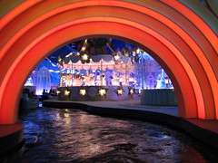
Where does this attitude come from? Is it just a general hatred of happiness in many of us? It seems the repulsion to anything in a perpetual state of cheer is automatic and unquestioned, suggesting it may stem from cultural conditioning. Perhaps the percentage of the population suffering from anhedonia collectively decided to make it appear ‘cool’ to hate on anyone displaying needless happiness, and so snark and sarcasm became the new dominant forms of humor in mass media rather than good old-fashioned song-and-dance and knock-knock jokes. Or perhaps there is legitimacy to this prevailing skepticism against happiness. For most of the corporate world the concept of ‘happiness’ has been objectified into a consumer product ready to be packaged, marketed and sold to the general public, with Disney most likely being at the forefront of this campaign. It’s nothing against happiness in and of itself, but the sentiment is that real happiness has to be earned; a severely handicapped person who finds picking up and dropping leaves to be the greatest fulfillment in the world may in fact be the happiest person alive, but we would almost never say that this person is leading the ideal of a ‘good life’. When I see joy and celebration simply floating around with no apparent reason, I find there is something greatly suspect about that, and it therefore rides such as “it’s a small world” become a target of derision in order to see if any holes can be poked through the joyful façade to discover what underlying machinations exist. marketed and sold to the general public, with Disney most likely being at the forefront of this campaign. It’s nothing against happiness in and of itself, but the sentiment is that real happiness has to be earned; a severely handicapped person who finds picking up and dropping leaves to be the greatest fulfillment in the world may in fact be the happiest person alive, but we would almost never say that this person is leading the ideal of a ‘good life’. When I see joy and celebration simply floating around with no apparent reason, I find there is something greatly suspect about that, and it therefore rides such as “it’s a small world” become a target of derision in order to see if any holes can be poked through the joyful façade to discover what underlying machinations exist.
After “it’s a small world” I still had a bit more time until my Big Thunder Mountain fast pass was ready so I made a stop at the Fantasia Gelati to pick up a snack to tide me over until later in the day. The map was indicating that this was the only food location in the entire park that served crêpes, and seeing as I skipped ordering one during my one day in the city, it seemed it would be a great injustice for myself to leave France without having tried a crêpe. I only mention this because here’s where I easily had my worst customer service experience while at Disney: staffed by only one employee who had clearly already become too disillusioned with the futility of his task that he made no effort to hurry, I had at least a twenty minute wait for what ended up being a €3 soggy, extra thin pancake that was barely able to fill the size of the smallest diameter Dixie paper plate they served it on. I didn’t even get to enjoy a moment’s rest on a shaded table because by the time I finally was served I needed to make haste over to Big Thunder Mountain so I could pick up my next fast pass.
It was soon determined that after experiencing “it’s a small world” I needed a dark ride with hair on it, one that wasn’t themed to a celebration of singing children and world peace, but rather a celebration of looting, arson and rape. Thankfully Disney has an answer to my needs not far away in the form of Pirates of the Caribbean.
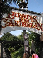 The queue for this was one of the longer ones between both days I was there but it moved fast enough (as is the case with most Disney attractions) and is also one of the better places to spend waiting in line. After a small outdoor switchback section we’re channeled into the Caribbean stone castle, winding our way through some dark corridors with an occasional display chamber featuring the skeletal remains of inmates. Near the terminus of the queue is the final loading platform showroom, and this represented one of the couple of places in the park in which I could truly understand why Disney attracts such a rabid fanbase. You know how in dark rides that are supposed to have night scenes the lighting technicians always get too proud and decide to put show lighting in every single corner of the room, resulting in too bright of a setting while also illuminating all the wiring and prop backings that are not supposed to be seen? That is not the case with this room, which uses just enough yellow and red lighting exclusively from the lanterns set along the pathway to create an exotic glow against the stonework walls and tropical foliage, while not enough to reach to the ceiling, which my eyes were telling me was a authentic starry night sky and not just a ceiling The queue for this was one of the longer ones between both days I was there but it moved fast enough (as is the case with most Disney attractions) and is also one of the better places to spend waiting in line. After a small outdoor switchback section we’re channeled into the Caribbean stone castle, winding our way through some dark corridors with an occasional display chamber featuring the skeletal remains of inmates. Near the terminus of the queue is the final loading platform showroom, and this represented one of the couple of places in the park in which I could truly understand why Disney attracts such a rabid fanbase. You know how in dark rides that are supposed to have night scenes the lighting technicians always get too proud and decide to put show lighting in every single corner of the room, resulting in too bright of a setting while also illuminating all the wiring and prop backings that are not supposed to be seen? That is not the case with this room, which uses just enough yellow and red lighting exclusively from the lanterns set along the pathway to create an exotic glow against the stonework walls and tropical foliage, while not enough to reach to the ceiling, which my eyes were telling me was a authentic starry night sky and not just a ceiling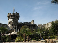 painted black and with small LED lights implanted into it. (After enough time had elapsed and my eyes adjusted from the outdoor brightness to this low-light interior I could see the outlines of some ventilation units next to Ursa Major.) The humidity and that aroma of running water from the nearby flume channel (I know water is technically odorless but hopefully you kind of know what I’m talking about) contribute to the creation of what many themed attractions seem to be sorely missing: atmosphere. Yes, for a few moments in that showroom I felt as though I really could have been transported to a different time and place, and without an overload of different props and effects whizzing around my head as on Phantom Manor I was able to simply take it all in. And now we board the boats. painted black and with small LED lights implanted into it. (After enough time had elapsed and my eyes adjusted from the outdoor brightness to this low-light interior I could see the outlines of some ventilation units next to Ursa Major.) The humidity and that aroma of running water from the nearby flume channel (I know water is technically odorless but hopefully you kind of know what I’m talking about) contribute to the creation of what many themed attractions seem to be sorely missing: atmosphere. Yes, for a few moments in that showroom I felt as though I really could have been transported to a different time and place, and without an overload of different props and effects whizzing around my head as on Phantom Manor I was able to simply take it all in. And now we board the boats.
 Out of the loading platform, the first part of the flume channel is mostly a quiet rainforest lagoon with waterfalls, no swashbuckling yet. A terrace for the Blue Lagoon restaurant is built inside this environment as well, and everyone on the boat sees this and thinks, “ah, I’d like to have dinner there tonight but it’s probably too expensive!” Past the waterfall we begin to climb upward while the famous Yo Ho theme song begins the fill in the background over the roar of rushing water. The adventure is about to begin. Out of the loading platform, the first part of the flume channel is mostly a quiet rainforest lagoon with waterfalls, no swashbuckling yet. A terrace for the Blue Lagoon restaurant is built inside this environment as well, and everyone on the boat sees this and thinks, “ah, I’d like to have dinner there tonight but it’s probably too expensive!” Past the waterfall we begin to climb upward while the famous Yo Ho theme song begins the fill in the background over the roar of rushing water. The adventure is about to begin.
I am told by television theme park specials that what makes a Disney ride such as Pirates of the Caribbean so special is the fact that it’s not just a series of elaborate gags as you will find at other theme parks, but that huge amounts of time and energy are spent in making sure a story is told throughout the attraction. Once the bulk of the story’s action starts, as we float by I can imagine in my head the pitch originally made to sell this story to guests: are spent in making sure a story is told throughout the attraction. Once the bulk of the story’s action starts, as we float by I can imagine in my head the pitch originally made to sell this story to guests:
“Okay, so there’s these pirates, right? But they’re not just any kind of pirate, they’re Caribbean pirates! And these pirates, you know, they’re making a mess of things. Pillaging. Plundering. The works. Now, I know what you’re thinking, ‘I’ve seen pillage and plunder before!’ Here’s the twist. You also have insobriety and attempted rape. Ah, bet you weren’t seeing those things coming! Now, you might be thinking to yourself, ‘okay, there’s the characters, but where’s the story?’ That’s coming, believe me, but first – and I think this is the thing that makes or breaks this whole idea,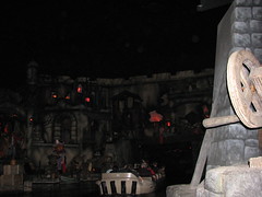 it’s not just something to have in there for laughs but is really the, uh, you-know – that’s having the audience come to understand and connect with the psychology of these characters first. I’m being really serious right now. Because, you know, these character can initiate events in the plot, but what does it matter if we don’t know why they had the need for such actions. So here’s that burning psychology summed up in four simple words: “A pirate’s life for me!” Five simple words. That doesn’t count the apostrophe since it’s a possessive. So, we have the characters and we have the motivation… do we have a girl? You betcha, several in fact! Alright, so now to answer the question, where’s the story? It’s, um, well, you know, I should tell you first off that it’s not really all about the story, you know, like with plot point A, B, climax, denouement, it’s not just something to have in there for laughs but is really the, uh, you-know – that’s having the audience come to understand and connect with the psychology of these characters first. I’m being really serious right now. Because, you know, these character can initiate events in the plot, but what does it matter if we don’t know why they had the need for such actions. So here’s that burning psychology summed up in four simple words: “A pirate’s life for me!” Five simple words. That doesn’t count the apostrophe since it’s a possessive. So, we have the characters and we have the motivation… do we have a girl? You betcha, several in fact! Alright, so now to answer the question, where’s the story? It’s, um, well, you know, I should tell you first off that it’s not really all about the story, you know, like with plot point A, B, climax, denouement,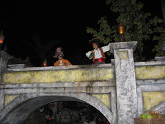 etc. That’s a very Hollywood way of storytelling, and I think our audience wants something a bit deeper than that. Pirates of the Caribbean, to me, is more of a character study, or just a kind of quiet, contemplative reflection on a certain state of humanity. In a way I would sort of liken it to being something akin to Yasujirô Ozu’s Floating Weeds. But with pirates. Anyway, I can see you’re starting to glaze, so I’ll wrap this up quick. They set a building on fire, and then everyone falls down a waterfall for some reason. Kids and adults love it, and then there’s the buried treasure discovered at the end to tie up any loose ends, the boat gets back to the station, people get off and go home, satisfied with how they spent their 8 bucks admission. So there you have it. End o’ pitch.” etc. That’s a very Hollywood way of storytelling, and I think our audience wants something a bit deeper than that. Pirates of the Caribbean, to me, is more of a character study, or just a kind of quiet, contemplative reflection on a certain state of humanity. In a way I would sort of liken it to being something akin to Yasujirô Ozu’s Floating Weeds. But with pirates. Anyway, I can see you’re starting to glaze, so I’ll wrap this up quick. They set a building on fire, and then everyone falls down a waterfall for some reason. Kids and adults love it, and then there’s the buried treasure discovered at the end to tie up any loose ends, the boat gets back to the station, people get off and go home, satisfied with how they spent their 8 bucks admission. So there you have it. End o’ pitch.”
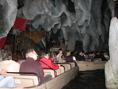 Was I satisfied? Wait, where was that story I had heard so much hype over? I counted many gags. Chasing wenchs on a turntable gags, cats on a floating barrel gags, dogs holding keys in its mouth gags, drunken bottle-tipping near my head in a way that reminds me of several college roommates I’ve had gags, but I had a hard time finding a story linked between all of those gags. To be sure, some are very expensive gags. Engineering two animatronics to sync a swordfight between the two left me feeling very satisfied that the money I put down on my admission ticket was being used for something. But in the end I sort of felt the question of “how can we showcase our technical animatronics skills” preceded that of “what sort of narrative/emotional experience do we want to provide our guests?” It’s not like this is the first and only P Was I satisfied? Wait, where was that story I had heard so much hype over? I counted many gags. Chasing wenchs on a turntable gags, cats on a floating barrel gags, dogs holding keys in its mouth gags, drunken bottle-tipping near my head in a way that reminds me of several college roommates I’ve had gags, but I had a hard time finding a story linked between all of those gags. To be sure, some are very expensive gags. Engineering two animatronics to sync a swordfight between the two left me feeling very satisfied that the money I put down on my admission ticket was being used for something. But in the end I sort of felt the question of “how can we showcase our technical animatronics skills” preceded that of “what sort of narrative/emotional experience do we want to provide our guests?” It’s not like this is the first and only P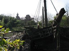 irates ride, so maybe I should try out the original California version which Walt Disney himself actually had a hand in before making any more judgments about the attraction myself. irates ride, so maybe I should try out the original California version which Walt Disney himself actually had a hand in before making any more judgments about the attraction myself.
My first reaction was that Adventureland was the overlooked white elephant between all of Disneyland Paris’s themed lands. Checking the park guide for ride listings I discovered only two fully fledged mechanical rides in Adventureland, Pirates of the Caribbean and the Indiana Jones coaster, and the latter is of very dubious quality at least in terms of Disney’s standard of judgment. Everything else to me appeared to just be jungle-themed walkthroughs or interactive children’s exhibits, nothing that should have been of any real interest to park-goers in my demographics. But after crossing by the area several times to get to Pirates or Indiana Jones, both of which are located on the far back edge of Adventureland, I came under the impression that there was an awful lot of land in between the main walkways, and I wasn’t altogether sure what was contained within it. So I decided to explore. But after crossing by the area several times to get to Pirates or Indiana Jones, both of which are located on the far back edge of Adventureland, I came under the impression that there was an awful lot of land in between the main walkways, and I wasn’t altogether sure what was contained within it. So I decided to explore.
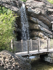 Much of the land contained in Adventureland is dedicated to Adventure Isle. It’s basically a never-ending series of narrow, winding pathways interlocking in and around caves, rope bridges, waterfalls and tropical foliage. It’s not a maze, per se (although make sure you plan at least five to ten minutes’ escape time should you need to reconvene with a group or find the nearest restroom facilities) nor are there really any exhibits or other displays to be found. It’s just a chance to get off the main midways Much of the land contained in Adventureland is dedicated to Adventure Isle. It’s basically a never-ending series of narrow, winding pathways interlocking in and around caves, rope bridges, waterfalls and tropical foliage. It’s not a maze, per se (although make sure you plan at least five to ten minutes’ escape time should you need to reconvene with a group or find the nearest restroom facilities) nor are there really any exhibits or other displays to be found. It’s just a chance to get off the main midways and go exploring, to try to see if you can possibly find every pathway, and then leave wondering if you somehow missed an entire corner. It’s a touch that seems distinctly European, a chance to discover things and go exploring, to try to see if you can possibly find every pathway, and then leave wondering if you somehow missed an entire corner. It’s a touch that seems distinctly European, a chance to discover things which one would never be able to point out on a map. Nearby is also La Cabane des Robinson, another entirely walk-through attraction, this one in an even more breathtaking setting (high up in a man-made tree overlooking the entire park) although this is sacrificed for a purely linear pathway route that doesn’t provide a chance to explore. Various sets are inspired by the Swiss Family Robinson story but unfortunately there’s never a completely clear vantage point from the top. which one would never be able to point out on a map. Nearby is also La Cabane des Robinson, another entirely walk-through attraction, this one in an even more breathtaking setting (high up in a man-made tree overlooking the entire park) although this is sacrificed for a purely linear pathway route that doesn’t provide a chance to explore. Various sets are inspired by the Swiss Family Robinson story but unfortunately there’s never a completely clear vantage point from the top.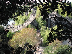 For me the main curiosity is figuring out how we’re supposed to believe that a family living in economic autarky could produce for themselves so many items of convenience. I suppose this does still leave Adventureland to be a little underdeveloped in comparison to the other lands, however, having a chance to fully explore this land I no longer believe this was wholly unintentional or due to neglect from the park’s Imagineers, not that an additional D- or C-ticket attraction wouldn’t be unwelcomed somewhere back by the pathway to Indiana Jones which currently forms an awkward cul-de-sac. For me the main curiosity is figuring out how we’re supposed to believe that a family living in economic autarky could produce for themselves so many items of convenience. I suppose this does still leave Adventureland to be a little underdeveloped in comparison to the other lands, however, having a chance to fully explore this land I no longer believe this was wholly unintentional or due to neglect from the park’s Imagineers, not that an additional D- or C-ticket attraction wouldn’t be unwelcomed somewhere back by the pathway to Indiana Jones which currently forms an awkward cul-de-sac.
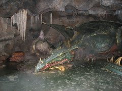 Looking over the guide to attractions I noticed something; many of the attractions listed were not even attractions but simply extensions of the main midways meant to explore without having to wait in line. Apparently there was an additional Aladdin walk-through I never saw, a barracks built over the entrance of Frontierland I did have the chance to climb over, the Nautilus attraction in Discoveryland I didn’t think too much of, and several built throughout Fantasyland, the principle of which was the ability to climb in and around Le Château de la Belle au Bois Dormant. Unfortunately since this was still technically the off-season, the majority of the castle was closed for renovations works and not open to the public to walk around, save for some of the caves built beneath it, one featuring a large, slumbering dragon Looking over the guide to attractions I noticed something; many of the attractions listed were not even attractions but simply extensions of the main midways meant to explore without having to wait in line. Apparently there was an additional Aladdin walk-through I never saw, a barracks built over the entrance of Frontierland I did have the chance to climb over, the Nautilus attraction in Discoveryland I didn’t think too much of, and several built throughout Fantasyland, the principle of which was the ability to climb in and around Le Château de la Belle au Bois Dormant. Unfortunately since this was still technically the off-season, the majority of the castle was closed for renovations works and not open to the public to walk around, save for some of the caves built beneath it, one featuring a large, slumbering dragon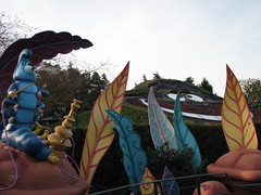 animatronic (thankfully the only other victims of off-season rehab during my visit was the Casey Jr. Train powered roller coaster, and honestly I had a hard time guessing where in the park it was even located that had to be closed off, as it’s sort of way back in its own corner of Fantasyland.) Also in Fantasyland was Alice’s Curious Labyrinth, a sort of hedge maze with interactive figures based on Alice in Wonderland, my favorite always being the smoking caterpillar. This is one walkthrough that, before entering, you need to calculate two things: will you have enough time to complete this before you need to use the restroom and before you need to be back at Big Thunder Mountain for (another) Fast Pass? I very nearly failed on both counts, such did the complexity of this labyrinth exceed my expectations. animatronic (thankfully the only other victims of off-season rehab during my visit was the Casey Jr. Train powered roller coaster, and honestly I had a hard time guessing where in the park it was even located that had to be closed off, as it’s sort of way back in its own corner of Fantasyland.) Also in Fantasyland was Alice’s Curious Labyrinth, a sort of hedge maze with interactive figures based on Alice in Wonderland, my favorite always being the smoking caterpillar. This is one walkthrough that, before entering, you need to calculate two things: will you have enough time to complete this before you need to use the restroom and before you need to be back at Big Thunder Mountain for (another) Fast Pass? I very nearly failed on both counts, such did the complexity of this labyrinth exceed my expectations.
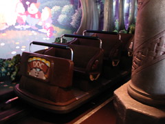 Before wrapping up any and all Fantasyland reporting, I must add a few notes on two more dark rides to be found in the area: Blanche-Neige et les Sept Nains (Snow White’s Scary Adventures), and Les Voyages de Pinocchio (Pinocchio’s Daring Journey). I liked these dark rides. They’re humble. That’s what makes them so great, unlike every other ride in the park where the Imagineers working on terra firma aimed for distant galaxies with their ambitions and the result is somewhere in between. They also remind me of the joy of watching one of the classic Disney animated films back when the company was still all about Walt’s dream of creating hand-drawn magic, and nothing else. The ride vehicles are simple, 6-person Sally-esque buggies that hum along an electric track past hand-painted scenes with simple 2D cutouts, retelling in five minutes the classic Disney movies of Snow White and Pinocchio. Before wrapping up any and all Fantasyland reporting, I must add a few notes on two more dark rides to be found in the area: Blanche-Neige et les Sept Nains (Snow White’s Scary Adventures), and Les Voyages de Pinocchio (Pinocchio’s Daring Journey). I liked these dark rides. They’re humble. That’s what makes them so great, unlike every other ride in the park where the Imagineers working on terra firma aimed for distant galaxies with their ambitions and the result is somewhere in between. They also remind me of the joy of watching one of the classic Disney animated films back when the company was still all about Walt’s dream of creating hand-drawn magic, and nothing else. The ride vehicles are simple, 6-person Sally-esque buggies that hum along an electric track past hand-painted scenes with simple 2D cutouts, retelling in five minutes the classic Disney movies of Snow White and Pinocchio.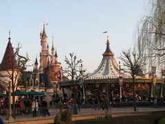 The queues aren’t long because they’re so out of the way, tucked in a small thatched of fantasy-Germanic buildings behind the Sleeping Beauty Castle. There are some happy sets, but also some scary, dark ones, which are effective not so much because of what is represented on the sets but through that aura associated with being on a simple dark ride such as these. Worth riding just because in their simplicity they are possibly two of the most authentically real feeling attractions in the park. The queues aren’t long because they’re so out of the way, tucked in a small thatched of fantasy-Germanic buildings behind the Sleeping Beauty Castle. There are some happy sets, but also some scary, dark ones, which are effective not so much because of what is represented on the sets but through that aura associated with being on a simple dark ride such as these. Worth riding just because in their simplicity they are possibly two of the most authentically real feeling attractions in the park.
However, if there is one attraction in the park that I would return to Marne la Vallée just to ride, it would undoubtedly be Space Mountain: Mission 2. This thing flat-out rocks.
 The first time I boarded it two days prior in the front row, I knew only a few things to expect: there was a launched lift hill to the top of the mountain, there were three inversions, the last of which is called a ‘tongue’ and you want to be especially careful when that one rolls around (think of the cutback on the ill-fated Drachen Fire and you’ve got the same idea). It’s built by Vekoma, meaning it’s rough-as-hell, and no one that’s ever been on it has a clue what goes on inside between the launch and the brakes. As we were dispatched from the station, all I really knew was, “this could potentially go many different ways. Literally and figuratively”. When I got back to the station with my hair blown back, tears streaming behind my eyes and the quiet realization that I had just experienced one of the better steel looping coasters I’ve ever been on. Needless to say it went the way I was hoping, although I wasn’t sure why. The first time I boarded it two days prior in the front row, I knew only a few things to expect: there was a launched lift hill to the top of the mountain, there were three inversions, the last of which is called a ‘tongue’ and you want to be especially careful when that one rolls around (think of the cutback on the ill-fated Drachen Fire and you’ve got the same idea). It’s built by Vekoma, meaning it’s rough-as-hell, and no one that’s ever been on it has a clue what goes on inside between the launch and the brakes. As we were dispatched from the station, all I really knew was, “this could potentially go many different ways. Literally and figuratively”. When I got back to the station with my hair blown back, tears streaming behind my eyes and the quiet realization that I had just experienced one of the better steel looping coasters I’ve ever been on. Needless to say it went the way I was hoping, although I wasn’t sure why.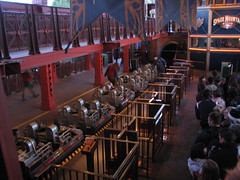
First of all, was it Vekoma rough? Not at all. Okay, back-axel seat rows, maybe a little bit; and more-so the further back in the train you get. If you’re in the back part of the car, it’s more a case of watching your knees on the seatback in front of you than worrying about an increased rattle which contributes to only a few jarring moments in some of the more dynamic transitions. During front row rides my ears never once made a connection with the harness due to any cause other than my own moral agency. It’s not too difficult getting front since there’s an attendant assigning seats but they’re pretty flexible towards requests to wait an extra cycle to grab the next train out.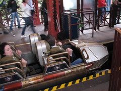
We roll around the turn, make a small dip under the exit platform, and then come to a sudden halt on the upward inclined brakes. For some reason, despite having made a transformation into Mission 2 a few years back, there are no special effects or decorations inside the launch cannon apart from a few simple strips of Christmas tree lights. The acceleration isn’t particularly fast but the g-forces are increased due to the slope. This is the only part of the ride in which you can see the outside world, at the top, it’s a plunge into blackness. I think there’s also supposed to be a pop of airtime on the crest to signify the weightlessness experienced upon our entry to space, but it wasn’t launching fast enough.
So far the coaster is only a few seconds in and there are already several critical counts against it. However, once we crest that hill and the beat from the soundtrack kicks in, the lead car hangs over the precipice of a black abyss for a split moment before diving downward, and here’s where the fun begins.
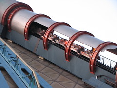 Honestly, I rode Space Mountain over 20 times between my three days at the Disneyland Resort, and even I can’t tell you exactly what’s going on in there, at least in a way in which I can picture the entire layout in my head. However, I did gather enough that I can at least describe a general sequence of events for those of you wanting to know but can’t see anything off the POVs (anyone know if there’s a lights-on POV video floating around teh interwebz anywhere?) Here’s my take on what happens: descending left-hand drop to ground level, continuing up around a high-speed banked turn, eventually leveling out for a moment before pounding into the first inversion, a sidewinder type element which pushes the limits of positives and forward inverting rotational movement through its tight circumference, and then throwing a sideways Honestly, I rode Space Mountain over 20 times between my three days at the Disneyland Resort, and even I can’t tell you exactly what’s going on in there, at least in a way in which I can picture the entire layout in my head. However, I did gather enough that I can at least describe a general sequence of events for those of you wanting to know but can’t see anything off the POVs (anyone know if there’s a lights-on POV video floating around teh interwebz anywhere?) Here’s my take on what happens: descending left-hand drop to ground level, continuing up around a high-speed banked turn, eventually leveling out for a moment before pounding into the first inversion, a sidewinder type element which pushes the limits of positives and forward inverting rotational movement through its tight circumference, and then throwing a sideways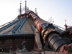 twist out of the maneuver. From here I recall another tighter, elevated turn or two before it slides onto the first midcourse. If there was any slowness in the launch, it certainly wasn’t to the detriment of the ride on the inside of the dome. The midcourse grabs hard, nearly bringing us to a halt, the soundtrack changing tempo to reflect this lost pace, but the fact that the music seems perfectly synced to our trains rolling off the midcourse back into the ride action suggests this heavy breaking may be intentional. twist out of the maneuver. From here I recall another tighter, elevated turn or two before it slides onto the first midcourse. If there was any slowness in the launch, it certainly wasn’t to the detriment of the ride on the inside of the dome. The midcourse grabs hard, nearly bringing us to a halt, the soundtrack changing tempo to reflect this lost pace, but the fact that the music seems perfectly synced to our trains rolling off the midcourse back into the ride action suggests this heavy breaking may be intentional.
Off the midcourse brake there is a curving triple down in the dark. Wait, what? I thought the Voyage invented that? Apparently Disneyland Paris and Vekoma beat Holiday World and the Gravity Group to that one by a good eleven years. It actually took me a good four or five rides before I realized all those dips were continuous, and while it doesn’t produce any extreme forces itself, the sensual effect of diving down three times in a row while rounding a right-hand bend can feel a bit unusual by itself once you know to look for it. At the base of the triple down is the ride’s second inversion, a basic corkscrew threaded between a couple day-glo asteroids. It then wraps around a bit more before feeding It actually took me a good four or five rides before I realized all those dips were continuous, and while it doesn’t produce any extreme forces itself, the sensual effect of diving down three times in a row while rounding a right-hand bend can feel a bit unusual by itself once you know to look for it. At the base of the triple down is the ride’s second inversion, a basic corkscrew threaded between a couple day-glo asteroids. It then wraps around a bit more before feeding into the second midcourse block, this one in the form of a minor lift hill (à la Loch Ness Monster’s midcourse lift), something else I was not expecting my first time through the ride. Projected on a screen in front of us as the motors work to quickly get us over the top is a short clip of a supernova going off, the soundtrack synced to produce rumbling sounds and the music score fades out before diving back to its frantic beat. into the second midcourse block, this one in the form of a minor lift hill (à la Loch Ness Monster’s midcourse lift), something else I was not expecting my first time through the ride. Projected on a screen in front of us as the motors work to quickly get us over the top is a short clip of a supernova going off, the soundtrack synced to produce rumbling sounds and the music score fades out before diving back to its frantic beat.
Another diving curve, followed by, I think, a second banked turn (somewhere around here I was really wondering when that tongue I was warned about would happen, or if it had already gone by and I somehow hadn’t registered it). Bam, small dip and then we’re twisting up, upside-down, making a sudden and slightly unintuitive direction change right as we’re at our most precarious a full 180° turned away from gravity. The train rotates back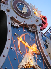 out of the inversion, and then follows the floor of the mountain closely as it navigates a slightly undulating ground-level turn. While the dome has been rather sparse on custom themeing so far, a tunnel of spiraling red tracer light closes out this final turn, and the mindbending effect this produces makes me wish Disney decided to build this near a coffee shop in Amsterdam instead. The train plows into the braking area (viewable from the queue), and without even coming to a full stop it prowls around a couple flat turns as it navigates us back to our home port. At this point, if I was in the front seat, I was whipping the tears which had streamed from my eyes and fingering through my hair. out of the inversion, and then follows the floor of the mountain closely as it navigates a slightly undulating ground-level turn. While the dome has been rather sparse on custom themeing so far, a tunnel of spiraling red tracer light closes out this final turn, and the mindbending effect this produces makes me wish Disney decided to build this near a coffee shop in Amsterdam instead. The train plows into the braking area (viewable from the queue), and without even coming to a full stop it prowls around a couple flat turns as it navigates us back to our home port. At this point, if I was in the front seat, I was whipping the tears which had streamed from my eyes and fingering through my hair.
Alright, so sounds like a pretty cool ride, right? Why do I give it such particular praise? Well, for one, I like the fact that this is a layout I have never seen before and has a completely non-standard sequencing pattern from every other multilooper. Things like the first inversion taking place later in the layout and not being a vertical loop, the triple down off the first midcourse, the cutback and effects tunnel, it all stands out above the competition as having an original bag of trick up its sleeve.
 Secondly, it’s intense without ever being rough. Especially in the dark setting, it’s easy to get really disoriented in there, and apart from the crest of the main hill I never felt like any element was slower paced than it was intended to be. The era of construction may be a factor, as designers had figured out force engineering and calculus by that point to build layouts that didn’t hold back on pace or intensity for fear that they may unexpectedly go too far. But they still retained a bit of a raw, untamed edge which would eventually disappear from their designs, plus the standards of what constituted “too intense” hadn’t yet been lowered to the level they are today. So it also has all of that going for it, which is generally all I ask from a good looping coaster. Secondly, it’s intense without ever being rough. Especially in the dark setting, it’s easy to get really disoriented in there, and apart from the crest of the main hill I never felt like any element was slower paced than it was intended to be. The era of construction may be a factor, as designers had figured out force engineering and calculus by that point to build layouts that didn’t hold back on pace or intensity for fear that they may unexpectedly go too far. But they still retained a bit of a raw, untamed edge which would eventually disappear from their designs, plus the standards of what constituted “too intense” hadn’t yet been lowered to the level they are today. So it also has all of that going for it, which is generally all I ask from a good looping coaster.
 But thirdly, and this is what really gave it the extra push over other like-minded designs and put it in the bottom of my Top Ten, is that it knows how to sequence itself properly, and it uses the let-ups in pacing to its advantage. While some designs pride themselves on no-holds-barred intensity from lift to brakes, Space Mountain is wise enough to strategically allow a couple moments’ pauses. They don’t come off as dead moments, but more like calms between storms (possibly aided by the soundtrack and visual effects which try to make these moments ‘fit’ with the rest of the action around it). I can always appreciate how much I enjoyed the previous section and how much I’m looking forward to the next, which is harder to do when the pacing is non-stop. The layout is divided into three thirds, and no one section outshines the others, But thirdly, and this is what really gave it the extra push over other like-minded designs and put it in the bottom of my Top Ten, is that it knows how to sequence itself properly, and it uses the let-ups in pacing to its advantage. While some designs pride themselves on no-holds-barred intensity from lift to brakes, Space Mountain is wise enough to strategically allow a couple moments’ pauses. They don’t come off as dead moments, but more like calms between storms (possibly aided by the soundtrack and visual effects which try to make these moments ‘fit’ with the rest of the action around it). I can always appreciate how much I enjoyed the previous section and how much I’m looking forward to the next, which is harder to do when the pacing is non-stop. The layout is divided into three thirds, and no one section outshines the others, and yet they’re all very different and unique. Each has a singular, original inversion sandwiched by various forms of curving and or dropping motions with some scant special effects. And unlike Rock ‘n’ Roller Coaster next door, which is mostly just meandering turnarounds, here the layout feels like it’s actually setting out to accomplish something (anything!) for the riders. and yet they’re all very different and unique. Each has a singular, original inversion sandwiched by various forms of curving and or dropping motions with some scant special effects. And unlike Rock ‘n’ Roller Coaster next door, which is mostly just meandering turnarounds, here the layout feels like it’s actually setting out to accomplish something (anything!) for the riders.
If there is one point of criticism I’d have to take with Space Mountain it’s the conception of outer space present here. This is actually true of nearly all themed attractions that involve space travel, as well as the majority of Hollywood movies and other media involving the final frontier. It’s the failure to realize that what makes space so awe-inspiring isn’t improved by the 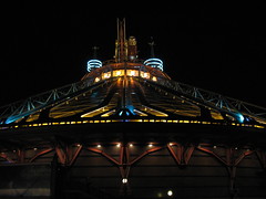 ability to zoom past stars at “light speed” and hear a supernova explode just so you can fly away from it in the nick of time, nor is it using black holes as convenient teleportation devices or island hopping alien planets like you’re taking a drive down the neighborhood. What makes space so amazing is the inconceivably vast emptiness of it, the incredible inertia of the relatively microscopic heavenly bodies that occupy it, and the seemingly infinite quantities of time these bodies have at their disposal to get anything done. Why it is that popular culture feels these attributes need to be subverted rather than embraced is mystery only behind what shape the plane of the universe occupies. Personally, I always find these attempts to take space and make it more ‘exciting’ or ‘thrilling’ in fact just make it pedestrian and banal (the recent Star Trek reboot is only ability to zoom past stars at “light speed” and hear a supernova explode just so you can fly away from it in the nick of time, nor is it using black holes as convenient teleportation devices or island hopping alien planets like you’re taking a drive down the neighborhood. What makes space so amazing is the inconceivably vast emptiness of it, the incredible inertia of the relatively microscopic heavenly bodies that occupy it, and the seemingly infinite quantities of time these bodies have at their disposal to get anything done. Why it is that popular culture feels these attributes need to be subverted rather than embraced is mystery only behind what shape the plane of the universe occupies. Personally, I always find these attempts to take space and make it more ‘exciting’ or ‘thrilling’ in fact just make it pedestrian and banal (the recent Star Trek reboot is only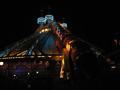 one of many suffering from this problem). Thankfully, DLP’s Space Mountain is a lesser offender since the retro-futuristic use of the Jules Verne story (and subsequent Georges Méliès film adaptation in 1902) gives the ride more of a historical, literary theme rather than one grounded in so-called science fiction. The transformation into Mission 2 was most likely not a step in the right direction, however, since from my understanding it replaced the iconic image of the spaceship landing in the moon’s eye with a supernova explosion, and –hello!– you can’t hear a supernova! I guess for a ride as fast-paced as Space Mountain an attempt to try to accurately capture those qualities of space would be misfit, so this is more of a general cultural criticism rather than anything to say about this particular attraction. one of many suffering from this problem). Thankfully, DLP’s Space Mountain is a lesser offender since the retro-futuristic use of the Jules Verne story (and subsequent Georges Méliès film adaptation in 1902) gives the ride more of a historical, literary theme rather than one grounded in so-called science fiction. The transformation into Mission 2 was most likely not a step in the right direction, however, since from my understanding it replaced the iconic image of the spaceship landing in the moon’s eye with a supernova explosion, and –hello!– you can’t hear a supernova! I guess for a ride as fast-paced as Space Mountain an attempt to try to accurately capture those qualities of space would be misfit, so this is more of a general cultural criticism rather than anything to say about this particular attraction.
 After a final ride in the front row of Space Mountain, my time at Disney was now over. As I walked down Main Street USA, stopping in the emporium to pick up a cheap refrigerator magnet souvenir, I asked myself whether or not I enjoyed Disneyland Paris. After a final ride in the front row of Space Mountain, my time at Disney was now over. As I walked down Main Street USA, stopping in the emporium to pick up a cheap refrigerator magnet souvenir, I asked myself whether or not I enjoyed Disneyland Paris.
Yes, I concluded. I genuinely did. While it might be easy to find criticism against the Disney Corporation as a whole, I think it’s clear that the people that work in and design these parks have a genuine love for what they do and for creating the best guest experience they possibly know how. While that might sound like an obvious observation, one look at other branches of the Disney Empire might not so quickly reveal the same thing, pretty much across the globe save for a certain studio in Emeryville, California. It was also more of a European experience than I may have imagined, taking some considerations of the continent’s culture and fitting it into the equation, rather than simply trying to export an American product to France with no 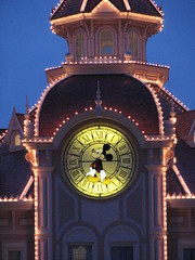 afterthought. Surprisingly, this would be more of a problem at many European-owned parks I would later travel to, which seemed to be attempting to replicate the American model of theme park as closely as they could only with less success. afterthought. Surprisingly, this would be more of a problem at many European-owned parks I would later travel to, which seemed to be attempting to replicate the American model of theme park as closely as they could only with less success.
The story will not end there. Unfortunately I do not have enough time or patience to continue it with this review, but neither do I suspect most readers so I think it will be best to leave my final social and aesthetic critique of the “themed experience” for a later time and as its own special feature. To preface what’s to come: as I left the park my thoughts were as many enthusiasts, “wow, the themeing is some of the best I’ve seen anywhere.” But then a voice in the back of my head asked a follow-up question.
“So what?”
How do I answer?
|
|
 To answer: not that well; and no, I visited the Disney parks in the opposite order I probably should have. This isn’t to say that the Magic Kingdom is a bad park, or even bad for a Disney park. It’s probably the best overall introduction for newcomers to the (Not-Always) Wonderful World of Disney. It summarizes the best aspects of each of the Disneylands in Anaheim, Tokyo, Paris, and Hong Kong, without actually doing better in any category than what each of those other parks specializes in. Anaheim has the best overall collection of rides, Paris has the most detailed and beautiful landscapes, Tokyo has a scale and tech advantage in many of its attractions and entertainment, Hong Kong has much more intimacy and (more recently) originality, and the Magic Kingdom has…? Truth be told I had a hard time coming up with any aspect of the Magic Kingdom that I liked more than at any of the other parks, and the short list that I could manage are only the exceptions that prove the rule. It might have the best Haunted Mansion version in the world, although this win is slight in comparison to the landslide victories that Anaheim’s Pirates of the Caribbean, Tokyo’s Splash Mountain, or Paris’ Big Thunder Mountain have over the Floridian versions (among many others). The Carousel
 of Progress, PeopleMover, and Country Bear Jamboree are three charming curios from an earlier era that can no longer be found at Disneyland, and thus are some of the only “Only in Florida” attractions that the Kingdom can lay claim to. (Tokyo also has a Jamboree, but that’s the better version only if your first language is Japanese.) And I suppose there will be a few good things to say about the additions in New Fantasyland once that’s completed, however I didn’t find the dress rehearsal that fantastic, and Shanghai Disneyland might very well steal the land’s thunder in a couple of years anyway.
 famous is the railway tunnel separating the ticket booths and Main Street, U.S.A. with a plaque indicating “Here you leave today and enter the world of yesterday, tomorrow, and fantasy”, but you’ll also notice tunnels, bridges, special doorways, or bodies of water in the queues or at the start of the layout of most attractions in the park. The Seven Seas Lagoon ferry ride is by far the largest scale example of this design theory put into practice at a Disney park, making it a perfect example of how important this feature is to Disney’s design philosophy, especially since the ferry ride comes at the expense of the practicality. Arriving early in the morning a half hour before the gates are set to open while the mist is still hovering above the water’s surface: that’s Disney magic, and it’s achieved just through placement and timing, without needing any expensive themed props to dress it up. Trying to get back to the TTC after a long, tiring day and ten minutes before the bus is scheduled to depart: that’s Disney frustration, the kind that has given many stand-up comedians fodder for a routine about the toils and contradictions of taking the family on vacation.
 Yet there’s no denying that, for whatever its faults (and there are many), the Magic Kingdom is a cultural experience of nearly unrivaled magnitude. It singularly reassures more people than anywhere else in the world that the American dream can come true, and it’s nothing if not fascinating to watch others have a minor spiritual revelation in the presence of such sublime kitsch. While people used to travel just to see the image of the Madonna, or even as recently as a film society screening of Carl Theodor Dreyer’s “La passion de Jeanne d’Arc” before the introduction of VHS, now theme parks like the Magic Kingdom fill the role of the irreplicable work of art that becomes a pilgrimage site for the masses. Immersing an audience for twelve consecutive hours in an environment where every perception is controlled by the artist is a degree of creative control that the avant-gardes of the 1920’s could only fantasize about, and especially as other media become increasingly digitized and oversaturated in their channels of mass distribution, in the coming decades the Magic Kingdom could become one of the last vestiges of society where the artist’s message is received as a postmodern “holy experience.”
 Main Street, U.S.A.
 this goes back to the distinction between art and hyperreality. If we recognize something as art we demand that an artist is presented along with it (even if that name is unrecognized to us; “who directed this”, “who painted that”, etc), but a hyperreal theme park environment demands that its makers remain hidden behind the curtain of conscious thought, lest the illusion of hyperreality is destroyed. Thus I think Main Street is probably better categorized as the “prologue” or “introduction” to the Magic Kingdom. It’s the “once upon a time” origins story for Disney: a familiar everyday setting (although still a little fantastical) which inspires the daydreams of the fantastical worlds we’re about to springboard off to, either by foot or by train. That, and it’s also where you can go to eat and buy stuff you probably shouldn’t eat or buy, at least not during
 this economic recession. This is now the fifth Disney Main Street (or equivalent) that I’ve briskly walked through on my way to better things. Sure, once the afternoon crowds fill in I’ll return to fulfill the geek’s duty to look at all the detail, but after a half hour I still can’t find very much that isn’t cover-up for a gift shop. I’ll take the next train that comes in, going clockwise around the park for the rest of the review. Just as Main Street is the prologue, Tomorrowland is definitely supposed to be the final act before the curtain call, right?
 me is that it needs to function efficiently as such. I loved trains as a kid, but I still knew that if it wasn’t taking the scenic route (while aboard the Walt Disney World Railroad you spend a lot of time looking at subtropical shrubs, maintenance roads, and a few weathered dioramas while a narrator describes the much more exciting attractions remotely passing by) it had to get us from Point A to Point B faster than we could have managed by walking. Where the Main Street Vehicles fail in this regard, the Walt Disney World Railroad is a moderately useful piece of infrastructure if approached with a proper strategy. If the locomotive has arrived just as you’re getting off Splash Mountain and Storybook Circus was already your next intended destination, then the railroad will momentarily seem like the best ride you’ve ever taken at the Magic Kingdom. If you want to go
 from Main Street to Space Mountain and the train has just left the station, then you’re better off hiking it. Some might insist that the railroad’s “Disney magic” can’t be quantified using such utilitarian standards, but considering the average visitor will only ride nine attractions in a day I suspect more people use the train in the second scenario rather than the first. And that’s a shame.
 for audiences. Of course the two are very different; Adventureland is a bit like reading a comic book, while Animal Kingdom tries to be like a National Geographic documentary. Still, I can’t help but shake the feeling (especially in the inevitable comparison between the Jungle Cruise and the Kilimanjaro Safaris) that Adventureland was designed for a different generation than those who visit today. Mixing African, Polynesian, Caribbean, and even Arabian influences under one generic label could easily be regarded as a mistake by today’s more culturally sensitive audiences… and probably more by kids than adults. As a 1990’s kid when environmentalism and conservation became really mainstream, you had to know things like the difference African and Indian elephants to do your kid duties correctly, and any anachronisms or anatopisms
 were to be immediately called on with that smarty-pants attitude kids have. (Okay, maybe not all kids were this way, but still…) Today Adventureland is probably the most self-consciously comedic of the Magic Kingdom’s lands, to distinguish itself from the “authenticity” of the Animal Kingdom, and the theme is more a pastiche of American popular cultural (especially between the 1930’s to 1970’s) than it is about the “real” foreign cultures it caricatures.
 to peel back to understand what the Jungle Cruise is really about. First it’s kind of a corny, outdated attraction, so the skippers tell a continuous line of jokes either to poke fun at or distract us from the obvious fakeness of the sets and stiff movements of the creatures. The skippers know it’s all a hoax, the passengers know it’s all a hoax, and both sides know that the other side knows they know, but this knowledge can only be indirectly acknowledged through the metaphorical wink-winks that are exchanged after every punch line. However, since the jokes are also kind of corny and obviously recycled, there becomes a second layer of subtext on top of this. The skippers know the jokes they’re telling are lame (revealed by their droll delivery of obviously scripted material); the audience knows the jokes are lame (watch folk’s faces for the slight “so-bad-it’s-good” cringe
 while forcing a laugh at the skipper’s “you must be in da-Nile” punch line); and each side knows the other side knows they know… yet we continue to mutually play along and pretend it’s all a laugh riot. Maybe this format of employing multiple layers of metatextual irony to avoid actually making a better attraction could work if the skippers were given more freedom to experiment with their own material (surely plenty of skippers must be aspiring stand-up comics in need of a day job?), but after several laps the only variable I encountered was the guides’ level of perkiness brought to the same series of worn out puns, which varied Goldilocks style between gratingly chipper, tiredly sarcastic, and one that was “just right”.
 Walt Disney’s Enchanted Tiki Room
 plastic parts triggering in (near) unison. Focusing on so many small moving parts from a distance can get tiresome after more than one song, so it’s probably better to just relax and listen to the music and comedy sketch interludes, both of which are also somewhat dated. Cultural stereotypes are a dominant form of the Tiki Room’s humor (the center four “host” parrots are indistinguishable apart from their strong Mexican, Irish, French, or German accents), while the music is firmly in the Disney tradition of feel-good sing-a-long-songs with a Polynesian inflection. It’s too bad the show’s best joke doesn’t happen until we’re already on our way out, when the birds sing an alternative version of “Heigh-Ho” that urges us out the door we go.
 the deep recesses of a cave… all Jungian archetypal symbols that represent the unconscious. The nightmarish quality to this opener makes it so that when we finally dock in Puerto Dorado it feels less like a scene change in a literal narrative than the arrival in our own metaphysical dreamscape. Sadly this sensation is fleeting, as the narrative devolves into a standard-issue (and, honestly, kind of dull) treasure hunt story told with stiff robotic figures that can only convey emotion through raised eyebrows, cocked heads, or other exaggerated motions that a programmer can substitute in the absence of living facial expressions. Despite the obvious potential for this story to be a morality play about the greed and recklessness of a pirate’s life,2 it instead ends with Jack Sparrow sitting atop a pile of gold and loot victoriously, a decidedly materialist “happy ending”
 that contradicts the abstract journey through the collective unconscious required to get there. The happy ending becomes all the happier when we’re spat out into a gift shop a few moments later so that we may collect our own pirate’s loot, although the only take-home for me was a nagging feeling that I had witnessed a potentially good attraction that had been compromised by outside interests uncommitted to making a truly great attraction.
 I think Frontierland benefited the most from the move eastward when Walt Disney World opened in 1971. The Magic Kingdom is a much more spacious park than Disneyland, and while some areas lose their energy or intimacy within the additional negative space, the extra breathing room vastly improves a naturally themed environment like Frontierland’s American west. Helping matters is the fact that real ghost towns and sun-baked desert landscapes are a considerable rarity in Florida compared to California, thus giving more purpose to paying to see a theme park’s interpretation of the material. Also the attraction selection is an marked improvement: In addition to Big Thunder Mountain, Magic Kingdom’s Frontierland has Splash Mountain, the Country Bear Jamboree, and Tom Sawyer Island, whereas Disneyland’s Frontierland has the Rivers of America, a kid’s playground, and pirates (?). During a day at each park
 I “stop by” Disneyland’s Frontierland, and “go to” the Magic Kingdom’s.
 of off-beat humor that I honestly found fairly charming. The show and its creators seem deeply endeared to the tradition of American folk and country music, even as they simultaneously finds ways to mock its eclectic cast of performers. (My favorite bit: the deadpan performance of “Blood on the Saddle” by the oblivious Big Al character with his out-of-tune guitar.) It also helps that the bears’ cartoon expressiveness is brought to life by some of the most detailed and elaborate audio-animatronics in the Magic Kingdom, and there are nearly twenty different performers brought on and off stage ensuring that the show never becomes repetitive. Apparently the Jamboree has been shortened by about six minutes after a recent refurbishment; I’d be curious to see the material I missed.
 The first gravity-driven section with several drops and tight curves including a trick-track past a ghost town: pretty fun. The second gravity-driven section with the one hill that almost produces airtime and a couple close headchopper effects: getting a bit repetitive, but still fun. The third lift, with the ominous tremors and off-kilter rails: good, now the tension is mounting. And then the final gravity driven section: wait, that’s it? It’s over? It’s not a particularly thrilling coaster before that point yet I’m willing to enjoy it for what it is, but in the last act the themed storyline is horribly at odds with the actual coaster experience. The setting around the third lift seems intended to build tension, while the final gravity-driven section on the other side (by far the slowest and gentlest part of the layout) functions as the coaster’s denouement. Missing from this arc is any sort
 of emotional climax, which is a gaping big hole to have from a story structure perspective. Even many of the Arrow Dynamics mine trains built for regional amusement parks up to a decade prior to BTM’s debut usually had a better sense of dramatic layout construction, and using a tighter budget than Disney. California’s version is the same way, although it seems Imagineers did realize the problem and took steps to correct it on subsequent international entries in the Big Thunder canon by including a bat cave (Tokyo), an underwater drop (Paris), and finally a “dynamite” LIM launch (Hong Kong, as Big Grizzly Mountain). Of course there’s the theming on Big Thunder: there’s more of it, but it’s just more that whizzes by, and apart from the first lift it does little to transcend the original mine train coasters at Six Flags besides distracting us with more visual clutter.
 as a grand climax (adjusting the drop height is an easy way to quantify the emotional impact of a plot point), and the rest of the slow-moving trough sections can be used to develop and flesh out other elements of the themed storyline without rushing by them. Although Knott’s Timber Mountain Log Ride established the basic principles of the log flume in a theme park setting, it was Splash Mountain that cemented the rules of the genre by carefully integrated the flume dynamics to fit Freytag’s pyramid of dramatic structure: Introduction (“How Do You Do?”, with the outdoor establishment of the rural Georgia setting, Slippin’ Falls, and indoor establishment of the principal characters); Rising Action (“Ev’rybody Has a Laughing Place”, the double indoor drops and dark cave sequences); Climax (the iconic drop into the briar patch); and Resolution
 (“Zip-A-Dee-Doo-Dah”, the return trough channel to the station). At over ten minutes in length it has plenty of time to immerse riders each of these story chapters so the emotional transformation from beginning to end can be noticeably felt, even if it suffers from a few issues such as an overly long delay between the drop climax and the final show scenes, or some animatronics and set pieces that seem in dire need of a refurbishment. Nevertheless Splash Mountain is a prime example of how to merge traditional amusement park thrills with immersive story-based entertainment, and has helped cement the log flume attraction as a neoclassical Disney favorite.
 this is no substitute for hiking in an actual National Park, but since it’s at Disney I think it’s perfectly fine to have someplace where you can momentarily escape when you start to feel overwhelmed by how much “Disney” there is everywhere else. A word of warning, the floating barrel bridge should not be attempted to cross by anyone who’s recently thrown back a few bottles.
 represent the Magic Kingdom’s morbid side. By my count there are at least 1038 dead people in Liberty Square: the 999 ghosts haunting the mansion, plus 39 dead presidents in the Hall of Presidents. How else to make the thematic connection between this small area’s most important attractions than that they all feature old American buildings filled with magically reanimated corpses? The Revolutionary American architecture is a nice diversion from the cartoonish fantasy in the rest of the park, and is completely unique to the Magic Kingdom, although there are already a lot of tourist attractions that do this sort of thing on a larger scale, and with more educational value, too. Not that it matters much as Liberty Square is also home to one of my favorite attractions in central Florida.
 their race cars crash and burn). However, be forewarned that the majority of the show’s running time is devoted to a Ken Burns style documentary (narrated by Morgan Freeman) that briefly summarizes the presidencies of Washington, Jackson, Lincoln, Roosevelt, the other Roosevelt, and Kennedy. When they finally do bring the presidents onstage there’s little more than a spotlight roll call with Freeman reading down the list while each man only gives a subtle nod, seemingly underutilizing the hi-tech figures especially since we can’t observe them up close in detail. Obama (and an earlier bit by Lincoln) are the only two AAs that are ever given talking time, and the format oddly seems to encourage the interpretation that 200+ years of presidential history were all quietly anticipating the eventual Obama administration,
 although most likely this is an accidental by-product of Disney’s showmanship tendencies that require a big grand finale. Credit goes to at least attempting to make the show as non-partisan as possible, and Walt Disney’s message that every president has been equally important to the success of the American democratic experiment is a noble one, even if most informed people in the audience are likely to subtitle the show in their own minds as “The Good, the Bad, and the Ugly”.
 Before anything else we first must face the question of suicide. It is only after we fully confront this unanswerable problem that we can start the party that is life. More than forty years since its debut, the Haunted Mansion (along with its western and eastern counterparts) remains the most radical attraction ever built at a Disney theme park due to its complete reversal of the traditional ghost story arc. Here it begins with the macabre death of the main character (the suicidal remains of the mansion’s “ghost host” narrator dangling above our heads) and then rewinds the horror backward until we’re dancing along with the undead in a jazzy graveyard jam. Where a lesser attraction might have tried to use the “hitchhiking ghost” illusion in a serious context, in the Haunted Mansion we’re obviously meant to laugh at the final reflected image of ourselves
 as we seemingly become undead spirits, a final gag that becomes the punchline to one long joke about mortality. This isn’t to say that every element of the Mansion fits perfectly to the story – there’s an attic scene between the ballroom and graveyard filled with trick portrait photographs that disrupts the continuity of the mansion’s transformation into a lively and festive atmosphere (Roland Barthes wrote that death is implicit in every photograph due to the way they consciously remind us of the person or world “that-has-been”, so such a scene would have been more appropriate towards the beginning of the storyline), and I still think the rooms are filled with a little too much technological showmanship for the mansion to ever feel truly haunted (compared to the creaky low-tech
 spooks that inhabit, say, Knoebel’s Haunted Mansion, where the ride’s history and thus the presence of death become omnipresent). Still, these are relatively minor shortcomings for an attraction that daringly manages to transform our initial existential dread into something that eventually becomes quietly life-affirming. In the end the Haunted Mansion offers no answer for how to best “find a way out”, but it doesn’t matter so long as it helps us live to laugh another day.
 to see Figment from Epcot’s Imagination pavilion anywhere near the Magic Kingdom, so perhaps I should be careful in what I ask for.
 A small world where the music is stuck in an endless reprise and the thousands of dolls will never cease dancing like they’re at a house party thrown by Sisyphus. A small world where no matter what country I’m in it all looks like a jellybean factory recently blew up nearby, and the kaleidoscopic shapes and colors will burn imprints into my retinas after ten minutes of exposure. And a small world where no matter how slow my boat seems to be floating down the channel it will still inevitably get backed up for several minutes behind other boats just before reaching the unload platform. Perhaps the solution to my grief is to not approach “it’s a small world” as a critic, but simply as myself. In that case,
 speaking for myself, on the outside I probably appear with glazed eyes and mouth slightly agape, but inside I’m still smiling a bit at the excessively simple and simply excessive pageantry of the whole ride. I guess that means that I must enjoy it on some level, even if I’m never going to be its target audience. However, also speaking for myself, I find that the world usually seems the most wondrous when I’m aware of its vastness, not its smallness.
 before the newest and biggest rides. But the Magic Kingdom isn’t like most other parks, and here the longest line usually comes before Peter Pan’s Flight, which is neither the park’s newest, nor biggest. This is one of the original “drive-thru movie” style dark rides, and I’ve honestly never had much love for the genre so its “classic” status means little to me. As a form of storytelling, it’s only a little more effective than a movie trailer. While trailers and dark rides are each a unique medium with their own special rulebooks for the delivery of a neatly crafted emotional arc over a brief span of a couple minutes, both are ultimately subservient to the originating feature length film, unable to stand on their own artistic merits without it. Peter Pan’s Flight is a small but detailed ride with only a couple memorable effects, cast in the shadow of a giant name that seems
 to be the real reason for drawing in the longest lines in the park. Or the long lines are because it’s indoors, there’s no minimum height limit, and single-bench vehicles provide less than ideal throughput. Either way, FastPass is highly recommended.
 of 4D special effects, in which the hero’s conquest over the evil villain becomes a barely memorable plot hiccup in comparison to that time the comic relief guy spit his drink on the audience. Mickey’s PhilharMagic would probably fail such a test, although part of that might be because I’ve already seen roughly 80% of the material on DVD (well, VHS). Most of the short film consists of a musical medley from their most popular animated films, tied together by a plot involving Donald Duck becoming a mistaken sorcerer’s apprentice to a magical orchestra. (Despite the title, Mickey remains off-screen for the vast majority of the show’s runtime.) It recalls enough Saturday morning cartoons that I can find it relatively entertaining, although I’d be lying if I didn’t admit its biggest appeal is the chance to sit in the dark air conditioning for a few minutes.
 The other parks at the Disney World resort have much better 4D cinema attractions.
 him to steal honey from his neighbors. After surviving an out-of-body hallucination caused by honey withdrawal, Pooh wakes to find his community underwater and his best friend about to drown. He again ignores this when he discovers a stash of honey in a tree large enough to put his whole body inside. The community eventually reconstructs, and Pooh finds that the best way to manage his honey addiction is to consume even more honey. It’s like the family friendly version of “Requiem for a Dream”, except Pooh doesn’t have to have his paw amputated at the end. (Um, spoiler alert.) And yet people still think Universal is the edgier of the major theme park operators in Florida…
 rider interaction done right, even decades before “interactivity” became an amusement industry buzzword.
 rides at all, only to point out that even at Disney you can’t deny the simple pleasures of spinning around in circles that make fairgrounds so popular. Of course the Magic Kingdom does it with a lot more class, and I even get an odd satisfaction just from thinking about all the extra capacity the new dueling arrangement offers. I can only assume this comes from spending too much time in slow-moving queues at other parks where I must entertain myself by mentally calculating the estimated throughput numbers. Still, regardless of how classy the presentation is within the Storybook Circus of New Fantasyland and how fast the line moves, I must ask now that I’ve done it once: am I ever going to voluntarily ride Dumbo again?
 add one), with the details of where, how, and why it should fit in the rest of the themed environment being a secondary concern. (Even the much maligned Primeval Whirl had more thematic justification of the stock model spinning mouse choice in the context of the roadside Americana theme.) It’s not even defensible as a way to absorb capacity on a busy day since a maximum of 16 riders per dispatch still sucks by Disney standards. What sane individual waits an hour in line to experience twenty seconds of weaving helices? At least with the Great Goofini makeover and second train it’s leagues better than its single train, looney tunes styled Anaheim cousin, but that isn’t saying much.
 Under the Sea: Journey of the Little Mermaid
 at this; the individual cars enter a room, a short scene plays out in front of them, and then you exit into the next room, where each door or dark threshold between scenes acts like the spatial equivalent of a cinematic cut. However, with a continuous chain of omnimovers it’s impossible to present any completed action directly to the audience for more than two seconds. Events and dialogue have to be open-ended and unfold in an infinite loop, so that you can enter and exit the scene at any moment and still have it work. But it doesn’t work with this story. Much of the action driving the plot on Under the Sea is still “closed”; meaning, as you enter Ursula’s chamber, you’re likely to hear the second half of a certain line of dialogue, followed by an empty pause (where in film we might expect a cut), and then only catch the first half of her next line (which must
 convey the same basic idea as the first line we partially missed) before being scooted out into the next scene. This short-form narrative doesn’t even play like a trailer for the feature film; it’s more like randomly skipping ahead on the playback bar of the movie. So incoherent is the plot in Under the Sea that I had to read a synopsis afterward to figure out that Ursula is not the one responsible for the celebratory ending where Ariel and Prince Eric are united. Thus the thesis ends with a basic question of aesthetics: why retell this story at all if it wasn’t going to be retold well? The answer, however, is only too obvious; it simply has nothing to do with aesthetics.
 representation of anyone’s vision of the future, either past, present, or fictional. Cartoonish flourishes interrupt the sleek chrome aesthetic, advertisements for attractions (or even vacation properties) compete for precious attention resources, and after navigating through the dense black hole of tourists bottlenecked in the narrow arcade midway, the space then opens up in the back with Space Mountain and Carousel of Progress both seemingly located way out in the middle of the Florida swamplands. Movie-based attractions have become popular in recent years, yet proper science-fiction stories are almost completely extinct in Tomorrowland. Of the Pixar films they chose to include both Monsters, Inc. and Toy Story, but not WALL-E? A revamp is rumored once New Fantasyland is complete, and I say it can’t come soon enough.
 the audience is met with a perfectly timed ad-lib from on stage (or, more accurately, from behind stage). Who knows, maybe you’ll also discover a gem from the audience-submitted jokes they read at the end, but the legal disclaimer during the preshow warning of the many rights given up by participating (including human) meant that the best texted-in joke they could collect from our group was the one asking how to make a hanky dance. Yeah, you can show us the exit now, thanks.
 This is an excellent attraction for people who are either at a third grade maturity level or who might get enjoyment out of S&M activities. First you’re strapped down to your seat by a rigid horsecollar, then the lights are turned off, whereupon you’re subjected to five minutes of being sneezed on, jumped on, burped on, and sometimes spit on by a hyperactive blue creature called Stitch (voiced by a guy who has evidently swallowed an entire helium balloon). If that all sounds like too much fun, don’t worry because there are plenty of laborious talking exposition scenes added to the beginning and end of this experiential show to keep it from ever getting too exciting. However, to my eyes the best part of this attraction is that the authoritarian intergalactic penal system depicted in this story could potentially inspire a
 lively discussion about Michel Foucault’s thesis in “Discipline and Punish” afterward. This is how you make Disney magic, people.
 a mofo, in reality I rated only a few levels above Helen Keller. C’mon, Disney is supposed to be the place where dreams come true, so why do they have to shatter my delusion that I have a secret special ability that can make me a ninja assassin the first time I pick up a plastic laser gun? Of course I suppose that they shouldn’t make you feel good about your high score achievements too easily because apparently there are people who really can max out the score to 999,999. At that point I say they deserve to feel truly special at the end of the ride and are free to gloat over my paltry five-digit score, because what else can such people possibly have in their life that’s good?
 Tomorrowland Transit Authority PeopleMover
 watching the worst slasher movie ever), the ride is well worth it just for including along the route the original EPCOT “Progress City” diorama envisioned by Walt Disney, back when the concept was still a fully functioning master-planned city rather than an educational theme park. The model is a little dim and dusty looking today; the forgotten promise of a future where we could all live happily together in a poverty-free, centrally organized, and technocratic community that had absolutely no similarities to communism.
 I suspect that for many people Space Mountain was their first time ever on a “grown-up” roller coaster, meaning it was also the ride in which they decided whether to ride any more roller coasters in the future. While it’s a very fun ride that has justifiably earned it many adoring fans, it also has to be said that it can be a very intense and sometimes jarring ride as well, since roller coaster design in 1975 was still not much more advanced than plugging radians into straight lines and then hoping the steel fabricated product can complete the circuit successfully without killing anyone (at least outside of Germany). I personally enjoy the extra aggressiveness and retro quirks, but I worry that the experience might be “too much” for a first-timer assigned to the back row, prompting them to stay away from larger (but gentler) coasters they
 might encounter elsewhere in Florida. Despite technically being the largest of the five Space Mountains built around the world, I also think this one is probably the worst.4 More than the outdated engineering and special effects, it’s the absence of a soundtrack giving the layout a sense of organization and meaning that is most critically absent; the freely echoing sounds throughout the dome always subtly reinforce the perception that it’s all a very chaotic experience. A much more literal space travel theme (seemingly not updated since the Apollo space program, minus some colorful in-queue videogames) isn’t enough to hide the fact that Florida’s Space Mountain isn’t about anything, other than to deliver some roller coaster-type thrills in the dark. By the way, whose bright idea was it to put the loading and unloading platforms on the far side of the dome away
 from the rest of the park?
 Thus begins the audio-animatronic show in four acts, in which we move from scene to scene (each representing the American family home during different eras of the 20th century) via a carousel mechanism. Perhaps tellingly, the early (and relatively unchanged) scenes taking place in the 1900’s and 1920’s are the most convincing in part because we can barely even apprehend the gulf of time from our perspective at the present, while it’s the final scene (updated several times, most recently in the 1990’s to predict what the year 2000 might look like) that earns the most unintentional guffaws. While the presentation is uniquely and delightfully “Disney”, the philosophical message behind it is in support of some pretty hardcore technological determinism. Maybe that’s a good thing? After all, the Carousel seems to propose an
 extremely optimistic interpretation of modern human existence: our lives will be continually made better by technology as we age, so like the narrator we can happily sit around enjoying our increasingly automated homes, waiting for the linear trajectory of science and industry to arrive at a singular conclusion that somehow always remains just out of reach within our lifetimes. Well, it’s optimistic depending on what you want out of life. The script suggests that the value of progress is as an abstract cultural force (there’s always a great big beautiful tomorrow to look forward to) rather than any specific concrete result of progress, although it leaves open the question of how we determine the value created by technological development (either in concrete or abstract) in the first place. In the 1940’s our narrator optimistically speculates that
 households will soon be able to use the newly-invented television to learn Greek and Latin. By the last scene the family decides that soon everything will become so automated that they won’t have to do anything for the rest of their lives except exist as a nuclear family unit of happy consumers. This leaves me to assume that they’re close to realizing the ultimate of all human values, upon which point the carousel of progress will finally come to a stop.


Comments