
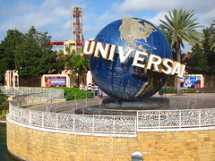
 Let’s be honest: as a themed park, Universal Studios Florida kinda sucks. There are only a small handful of ill-defined themed areas, mostly based on real life urban centers like New York, Los Angeles, San Francisco, or, most thrillingly, the sterile warehouse environment of a Hollywood backlot. It used to be that the attractions in each area were based on movies filmed in each city, but now that most of the original rides have been replaced with newer IPs the connective tissues between ride and setting have become more and more stretched. Often is the line blurred between raw hyperrealism, e.g. simulating the real New York City; and a loose form of deconstructionism, e.g. at first appearing to be New York but on closer inspection revealed to be the edifice for a movie backdrop (although since the Florida park is not
 actually used as production facility as is the case in Hollywood I would still categorize these areas as a second-tier hyperrealism rather than actual deconstructivist themed design). Regardless, as an endless array of square edifices the results are distinctly hollow and inert, lacking the aesthetic appeal of traditional fantastically themed environments or even the basic kinetic appeal of an unthemed carnival park (Hollywood Rockit notwithstanding). It’s no surprise that there’s almost always some party, parade, or special seasonal event going on at Universal Studios Florida, otherwise it could be one of the most lifeless major theme parks in the world.
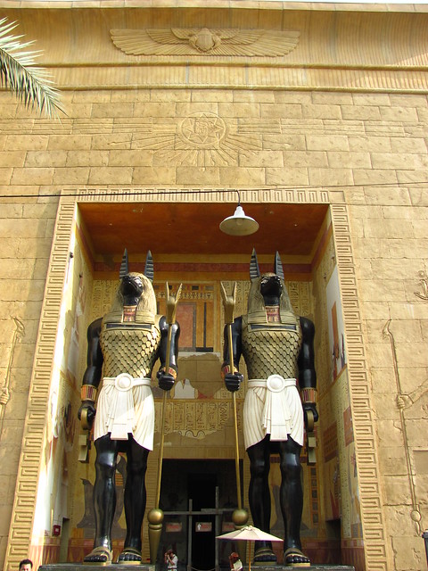
The New York area in particular is an interesting case study. Technically at surface level it is quite accomplished, and could easily receive praise lavished with terms such as “immersive”, “attention to detail”, “authentic”, and so on. Yet it is also experientially empty, and consists of nothing more than a series of very elaborate façades to wander through and disguise the area’s two main attractions (Twister and Mummy), neither of which has any relationship on the inside to the Brooklyn exteriors. I think there might be two or three shops or food outlets that maintain continuity with the themeing on the outside, but otherwise this area is just there to please the picture-takers as everyone else shuffles by on their way to the rides. This is before we even consider a larger issue at stake, which is: does a “realistic” or “authentic” re-creation of New York City have any place in a theme park in the first place? The real New York is also a major tourist zone, and there are many neighborhoods
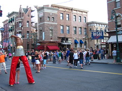 that I suspect look very much like the ones on display at Universal Studios Florida. Should the fake Brooklyn in Florida be an adequate replacement for visiting the real Brooklyn in New York? If not, then what is its purpose? The architectural quirks and cultural heritage that create a city’s identity are embellished to draw attention to the area’s perceived realism. USF’s New York is an attempt to celebrate what is real about human experience by promoting the absolute fake. It is a fetishization of the authentic, and intends to reify the concept of “authenticity” into a vacationer’s commodity. Informally judging from the crowd patterns, which seemed dense around attraction plazas while leaving the side streets relatively empty, I’m not the only one who isn’t buying it.
 At the end of the day what saves Universal Studios Florida is its collection of rides hidden behind the façades. Unlike most theme parks which have a range of attractions from world-class thrill rides to filler sideshow amusements (most famously utilizing Disney’s A- to E-Ticket scale), here every attraction is branded as a major headlining act for whomever its target audience happens to be. That isn’t to say that there isn’t still a hierarchy of must-rides and skippables, it’s just that the weaknesses are in execution or outdating rather than smallness of concept. Even the failures at least tend to fail interestingly.
Hollywood Rip, Ride, Rockit
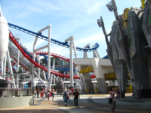
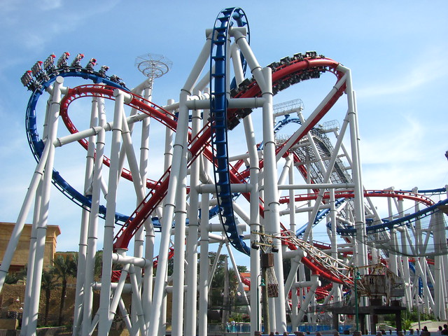
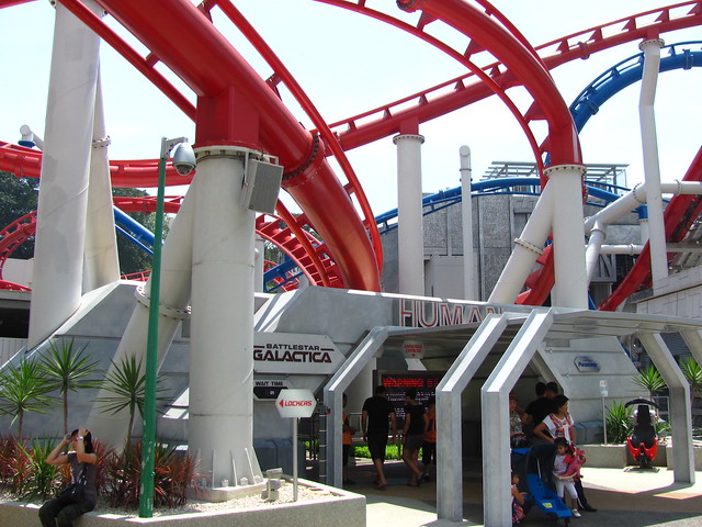
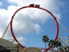 It’s been a long time coming for the Florida themer: a roller coaster that isn’t just “musically themed” but is a fusion of music and roller coaster into one entity, where song narrative could enhance layout narrative and elements are designed to match rhythmical analogies… and, of course, Universal still gets it all wrong. You know you’ve got problems right from the start when the lift hill is steeper than the first drop. The on-board soundtrack, although extremely customizable, is limited to a selection of popular tunes that by their nature have few synchronized qualities with the track layout beyond the first drop (if that much), and we’re left to scrolling through a list of titles that all contribute less to the overall ride experience than other coasters manage with one fixed choice. Naming elements things like the “treble clef” or “jump cut”
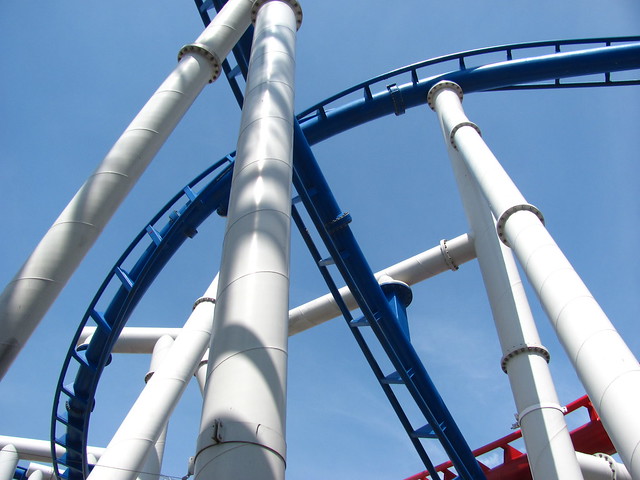
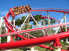 made the aesthetic theorist in me sit up, but I sat right back down when I realized these were nothing more than gimmick names based on physical steel appearances. I’ve long railed against coaster layouts that only get progressively weaker with each subsequent element, and Hollywood Rockit’s meandering track that starts with it’s one really good maneuver and sleepwalks back home in the second half has become my new posterchild for this trend. It’s therefore testament to the power good music has on humans that the coaster isn’t a total bomb, and in fact might be the most re-rideable attraction on Universal property by the virtue that there’s always a different song to try each time that can change the emotional tenor of the attraction in slight but significant ways (mostly through the unlockable “secret tracks”), and for that I absolve
 the Rockit with the best grade it could have hoped for given every other count against it. While Led Zeppelin, Pink Floyd, and Modest Mussorgsky are all fine choices, the best overall match-up between artist and coaster I sampled was #112: Freebird by Lynyrd Skynyrd.
Grade: B-
Twister… Ride It Out
Bill Paxton and Helen Hunt have a message that they want to share with you. It’s an important message for society, one that they hope will help shake us from our complacency and open our eyes in the same way theirs were first opened from their work on what at first seemed to be just another disaster film. They don’t want to proselytize; they simply want to pay tribute to a powerful, majestic, yet underappreciated force of nature. This message appeals not as much to our logos, but to our pathos, and what medium is better suited to communicating such an emotionally charged message to the masses than the experiential storytelling of a theme park? Of course I cannot do justice to this important message in words alone, but shall nevertheless try my best to briefly summarize:
“Tornados are BAMFs that will seriously fuck your shit straight up. (Also, cows are funny.)”__________
Universal should be proud of the fact that they’ve successfully used their artistic medium to not only entertain, but also to inform and expand social consciousness of Bill and Helen’s important message, even if the best they could do is have us all stand around taking pictures of a glorified dust devil.
Grade: D+
Revenge of the Mummy
Alton Towers can say whatever they want, but the fact is Universal had laid claim to the world’s first “Psychological Roller Coaster” at least six years before Thirteen decided that contracting the term to “Psycoaster” counted as a separate world’s first… and I’m still convinced neither marketing team had any concrete idea of what exactly they were talking about when they realized that Greek prefixes could also have a nice buzz if spun correctly. Apparently something going wrong in a room that’s kind-of dark is “psychological”, in which case I’ve got a horror script I wrote ten minutes ago that Universal execs should find psychologically taut as well. Okay, bonus points are awarded for not one but two moments of bona-fide airtime (more than IOA’s coasters combined), and the pyromaniac in all of us will find much to like about this coaster (though prepare to silently curse if the weather’s already hot and muggy outside). But if it really wants to be judged as a “psychological roller coaster”, then why is the fakeout
 ending so predictable, why do the monologues for Imhotep sound like a broken record, and why is the grand finale where “death is only the beginning” such a toothless coda? True psychological manipulation is a subtle art, one that the big budget bombast of major theme parks is not well tuned for.
Grade: C+
Disaster!
Universal Studios theme parks were conceived during a time when the disaster genre was doing big business at the box office, and the thrills such movies produced on the screen might easily be doubled if they could be witnessed live in a controlled environment. However, the genre has been in a rut the past decade and the “Ride the Movies” slogan doesn’t have the pull it used to now that the movies we like to watch are more than ever about characters and ideas rather than events and dumb spectacle. Several years ago Universal Studios Florida was tasked with the question of how to revive the old Earthquake attraction so it was still relevant with modern audiences while taking advantage of the existing hardware, and I’m pleased to say the result is the creative flash of genius Universal always promises but only occasionally delivers. Here’s a test: if you think Michael Bay movies can be pompous, this is the attraction for you. Disaster is total a deconstruction of the blockbuster genre that once made the Studios
 so much money, poking fun at every outlandish plotline, stilted performance, and ego-stoked “auteur” to have ever worked on the silver screen. Although the humor is mostly broad and zany, it can also feel a little subversive just from the knowledge that there are several attractions on Universal Orlando property that are still perfect targets for Disaster’s satire. It’s also the rare themed attraction in which I must give special commendations the acting, especially Christopher Walken’s recorded (or is it?) role, and the in-person “assistant director”, whom I was convinced must moonlight as a stand-up comedian by the way he had a perfect zinger prepared no matter what the response from an audience member. (That, or he had been through the routine so often that he had already heard every imaginable reply under the sun.) It’s telling that
 once we finally get to the old Earthquake portion of the attraction (relatively unchanged in special effects or emotional tone), the audience becomes conspicuously silent and maybe even a bit bored. Just wait for the movie trailer at the very end, the culmination of everything Disaster had been building towards, and can best be described as a minute of avant-garde comedy mayhem. “Hoe, granny, hoe!” It’s difficult to go back to the self-serious Twister after this.
Grade: B+
Men in Black: Alien Attack
Interactive dark rides are a frequently maligned genre amongst purists. Although greater levels of interactivity and immersion are generally viewed as a good thing, putting a plastic gun in our hands and our mental focus on the blinking light targets usually does much more to pull us out of the story than put us deeper into it. Men in Black: Alien Attack is one of the elite few dark rides that would have still been a fairly decent attraction just as a ride-though story (the 60’s inspired art direction alone is, if not the most elaborate or detailed, at least the smartest of any attraction by Universal Creative), but the inclusion of an interactive feature unquestionably bumps it up another level. The difference seems to be that the shooter element is given a specific purpose that relates not just to the ride’s backstory (there are baddies that need to be shot by someone), but also to our own backstory of why it is uniquely
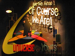 us that are in this scenario in the first place (we’re taking part of MIB’s infamous “recruitment” process, in itself a decently entertaining storyline with or without aliens attacking). There’s enough variety between scenes with different objectives that the game doesn’t develop a monotonous point-and-click arcade shooter grind after a few minutes, although the fact that our six-person vehicle’s average score is given precedence in the debriefing room over individual scores is likely to be a major turn-off for a number of competitive gamers who vote libertarian.
Grade: B
The Simpsons Ride
 “Welcome to a magical journey through my mouth.” That line spoken at Krustyland, among several others, always gets me to crack a smile. It’s not the cutting edge of satire, and it’s been a long time since the series and its many multimedia spin-offs have rivaled the great humanist comedy that defined the early seasons… but at least The Simpsons Ride is still funny. And not with the weak, avuncular “yuk yuk” humor that characterizes so many themed attractions, but with a bit of barbing added to many of the one-liners and sight gags. At first. After a bit the motion simulator falls into its rhythms as the comedic timing gets stuck at the same beats… then the colorful CGI cartoon imagery projected on a wraparound screen starts burning imprints on my retinas… pretty soon I’m holding on trying to steady the argument between my eyes and
 inner ears as our vehicles ceaselessly lurch to and fro… and the relief I feel at the end has nothing to do with any catharsis from the kitchen sink storyline on screen, and everything to do with finding solid footing and getting out an attraction whose ironic lampooning of theme parks soon becomes sadly on-point.
Grade: C-
E.T. Adventure
Here is a ride of grand ambitions that has been humbled by time. As the only remaining attraction that opened with the park in 1990, it perhaps unfairly suffers from low ridership due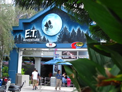 to perceptions of technological outdatedness and a Gen X appeal in a Gen Y era, with an entrance hidden off the side of the main midway not helping matters. Yet the physical themeing and ride system is actually in quite good condition, not cutting edge, but it retains a certain ‘timeless’ appeal that I’m sure has made many parents more emotional than their children by the end. The biggest problem is that Steven Spielberg typically likes making audiences feel good with story endings that contain a ‘magical’ touch, but he goes too far in this attraction by actually taking us all the way back to E.T.’s home planet. Not only do the last few scenes overstay their welcome and play like the bad acid trip version of It’s a Small World, but by letting us escape from earth for the alternate utopian (?) planet, it also subtly undermine the moral of the original film which,
 for all its magical flourishes, was always grounded in a down-to-earth humanism that emphasized the importance of even the dysfunctional family, and our need to always eventually “phone home”. Also, do we really want to ride the movies if no one gets to say “penis breath”?
Grade: C-
Woody Woodpecker’s Nuthouse Coaster
This is the same exact thing as Flight of the Hippogriff across the divide at Islands of Adventure, just a 207 meter instead of a 335 meter model. Yet, because it’s painted bright blue and red instead of a subdued brown and grey, I have to feel socially awkward about riding it alone.
Grade: D-
Animal Actors On Location!
There were several other shows or multimedia attractions I could have reviewed but didn’t. I ended up at this one because it was about to start just as I was walking by and it had an exclamation point in the title, so why not? The real star of this show must be the stage manager, as there are hundreds of cues for each of the different species to hit, and of course we in the audience are all channeling our psychic energies against this individual as we secretly hope to witness one of the dogs doing an ‘improvisation’ that the stagehands will have to clean up afterward. Alas, the show went without hitch and ultimately provided nothing unexpected, either off or on-script.
Grade: D+
Terminator 2: 3-D
Credit where credit’s due: James Cameron is one heck of a showman. Ever the technology nerd, no small ideas are allowed on the set of a Cameron production, as is the case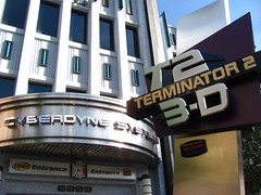 where T2:3D’s modus operandi is to start huge and then gradually expand from there. Given how many thrill rides tend to falter in their final act, it’s supremely satisfying to encounter an attraction where you know the moment when you’ve witnessed the grand finale; not that there weren’t several occasions prior to this that might have served as a suitable dramatic climax on lesser rides. Also interesting to note are the different spatial relationships the audience has with the action: it starts as a live theatrical performance that includes us as ‘actors’ in the same space the fictional narrative, but halfway through there’s an abrupt shift to cinematic space (including cross cuts in perspective and hard cuts that signify an elapse of time) that removes us from the story and reduces our role as the 3rd person witness. The big final act then becomes an unusual
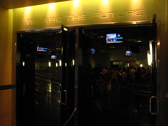 fusion of the two media, where the cinematic space is expanded both literally (the frame pulls away to completely engulf us in the image) and figuratively (live actors and theatrical components are re-introduced), so it’s as if we’ve re-entered the movie from 3rd to 1st person perspective, but still occupy an indeterminate distance from the action. Fortunately, like the use/absence of sound in The Jazz Singer or the use/absence of color in The Wizard of Oz, these spatial shifts are presented as integral to the story and aren’t simply included as a technological gimmick. It’s therefore a real shame that all the human (or humanoid) characters seemingly left their personalities behind in the film franchise and require a corny “re-cap” video before the main show to remind us why we’re supposed to care about them. “Big, bigger, biggest”
 is a great structure for thrill rides but not as much for character driven narratives, and caught between both T2:3D ultimately demonstrates a clear favoritism for thrills but not the people being thrilled.
Grade: B-
Summary
Come for the handful of good attractions and/or seasonal event, stay for that exact same handful of good attractions and/or seasonal event. The rest hasn’t mattered since the Clinton administration.
Overall Grade: C


















Comments